Show Off Your Dashboards!

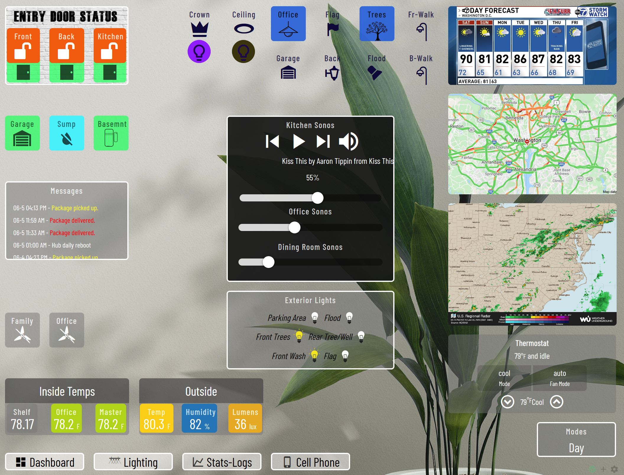
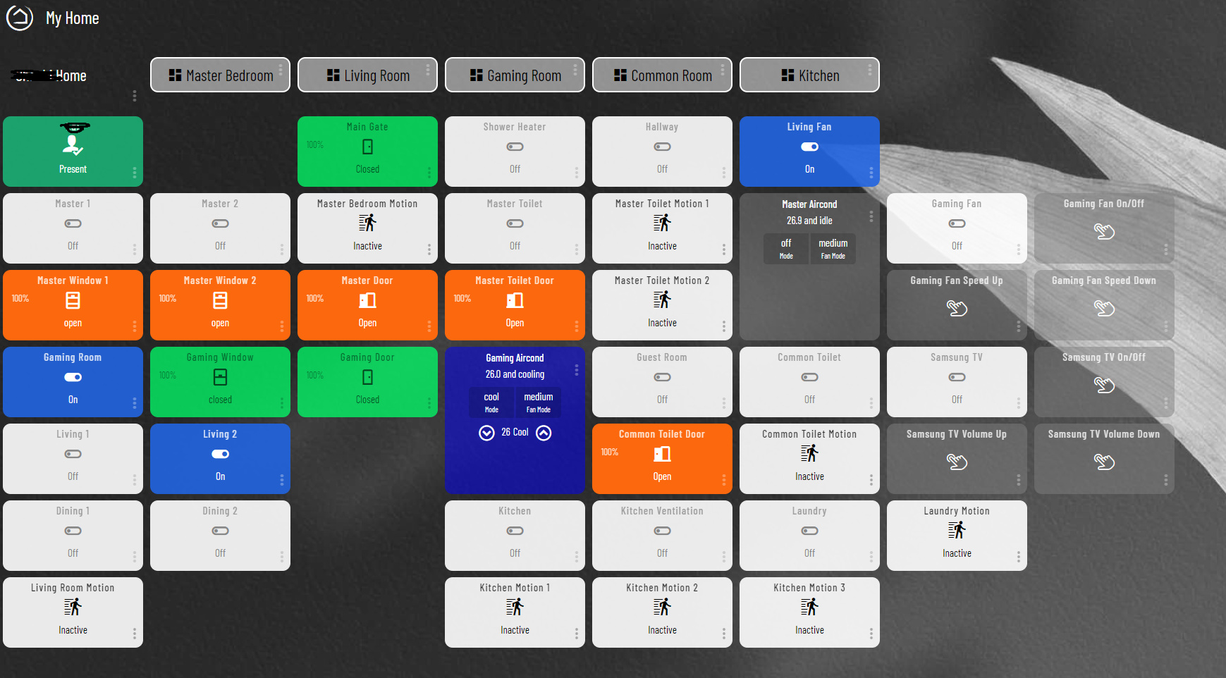
I finally have a scalable dashboard, using the built-in dashboard app.

Here are two screenshots of the exact same dashboard. First, on my PC monitor:

Second, my mounted tablets (actually, Web Developer responsive design mode):

The fonts and icons all scale. The tile width/height are unset, so their sizes are responsive. I got rid of the header bar and put the check mark and gear in the bottom right. The top is a consistent dashboard bar. A lot of the tile titles are replaced with shorter names via CSS. I'm glad I can use the same designs on all my landscape screens. It would get pretty cramped on a landscaped phone, but it's possible. I have another, simpler phone dashboard. A lot of text is removed. I don't need to see "Open" or "Closed" on a window. The icon and tile color handle that. The scaling of font sizes is done by using vh or vw units. I'm not sure I got all of them, but all the ones that show up on my dashboard are scaled now.

Everything this does is with custom CSS:

Summary
.tile-title { 
  line-height: 1.1;
  bottom: 0.1vh;
}


.vue-slider {
  margin-top: 1vh !important;
  margin-bottom: 0vh !important;
  height: 2vh !important;
  margin-right: 2vw !important;
  margin-left: 2vw !important;
  padding: 0.75vh 0vh !important;
}
.vue-slider-rail {
  border-radius: 1.5vh !important;
}
.vue-slider-dot {
  width: 3vh !important;
  height: 3vh !important;
}

.tile.dashboard > .tile-title {
  display: none;
}


.tile-contents {
  padding: 0;
  display: table;
  width: 100%;
  height: 100%;
}


.dashboard div .header {
    position: fixed;
    bottom: -0.5em;
    right: 0.5em;
    z-index: 999;
    opacity: 1.0;
    zoom: 1.0;
    -moz-transform:scale(1.0);
}
.wrapper {
    height: 100%;
    margin-top: 0;
    padding-top: 0.5em;
}
.dashBack,
.dashName {
    display: none;
}
.dashboard div .header>.flex-auto.justify-end,
.dashboard div .header>.flex-auto.justify-end>.flex {
    display: block;
}


.tile-title::after {
    visibility: visible;
    position: absolute;
    text-align: center;
    left: inherit;
    right: 0;
    bottom: 0;
    white-space: pre-wrap;
}
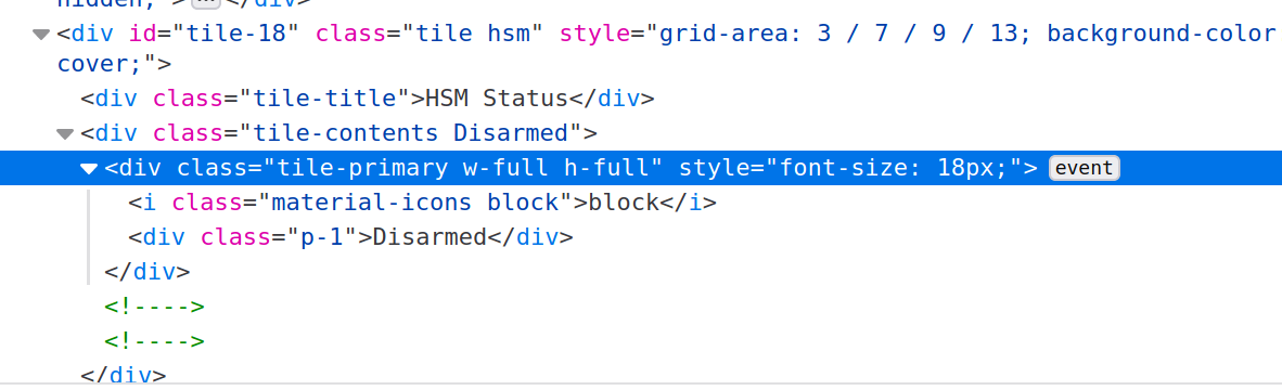
#tile-44 .tile-title, #tile-46 .tile-title, .tile.motion .tile-title, #tile-35 .tile-title, #tile-35 .tile-title, #tile-29 .tile-title, #tile-16 .tile-title, #tile-37 .tile-title, #tile-33 .tile-title, #tile-2 .tile-title, #tile-1 .tile-title, #tile-17 .tile-title, #tile-31 .tile-title {
    visibility: hidden;
    white-space: nowrap !important;
    overflow: unset;
}
#tile-1 .tile-title:after {
    content: 'Porch';
}
#tile-2 .tile-title:after {
    content: 'Kitchen';
}
#tile-16 .tile-title:after {
    content: 'Basemt';
}
#tile-17 .tile-title:after {
    content: 'Floods';
}
#tile-29 .tile-title:after {
    content: 'Liv.Rm';
}
#tile-31 .tile-title:after {
    content: 'Basemt';
}
#tile-33 .tile-title:after {
    content: 'Fam.Rm';
}
#tile-35 .tile-title:after {
    content: 'Din/M.Ba';
}
#tile-37 .tile-title:after {
    content: 'Sunrm';
}
#tile-44 .tile-title:after {
    content: 'Downstairs Humidity';
}
#tile-46 .tile-title:after {
    content: 'Upstairs Humidity';
}
#tile-34 .tile-title:after {
    content: 'Motion';
}
#tile-47 .tile-title:after {
    content: 'Entry';
}
#tile-48 .tile-title:after {
    content: 'Mudroom';
}
#tile-49 .tile-title:after {
    content: 'Upstairs';
}


div {
    font-size: 2.25vh;
}
.material-icons {
    font-size: 5vh !important;
}
.material.icons {
    font-size: 4vh !important;
}
.tile-tertiary {
    font-size: 2vh;
}
.tile.dashboard .tile-primary {
    font-size: 3.5vh !important;
}
.tile.humidity .tile-primary {
    font-size: 3.5vh !important;
}
.tile.thermostat .inline-block {
    font-size: 2.25vh !important;
}
.tile.thermostat .inline-block .no-wrap.overflow-hidden {
    font-size: 2.25vh !important;
}
#tile-39 .tile-primary {
    font-size: 3.5vh !important;
}
.hsm .tile-primary > div:nth-child(2) {
    font-size: 1.5vw !important;
}


.closed > div {
    display: none;
}
.open > div {
    display: none;
}
.motion .tile-primary > div:nth-child(2) {
    display: none !important;
}
.smoke .tile-primary > div:nth-child(2) {
    display: none;
}

It's just a matter of finding the CSS selectors needed to change all the fonts. The "div { font-size: 2.25vh; }" does a lot, but not everything. I also was frugal with real estate, changing some margins, etc. I really wish the default allowed responsive design. The HE web interface is responsive, you'd think there could be a responsive dashboard. I guess that might be hard for the average user to understand how to lay out.

On this my smallest tile is 4x4 (though dashboard links are 2x12). Really helps make use of space. I am expecting to add more, so I'm glad I have some blank space here. My Weather dashboards haven't been migrated to this design yet, but they do have the top nav panel. It's just a bit thicker since I didn't set them up with a big grid. They are next...

8 Likes

I am keen to make my layouts responsive as well, probably a way off from tackling it, but good to have a reference to come back to. It would be good to not have to redevelop my dashboards for the different devices. Nice work.

@BrianP how did you set your custom tile sizes. Is there CSS that will take a tile and chop it down to a quarter size or something custom?

Make the dashboard have really large values for columns/rows like this:

Now my smallest square tiles are 4x4. Here's the setting for my "Basemt" window tile:

My Dashboard links are 2x12, which ends up being "half-height." My largest tiles (surveillance cameras and thermostats) are 10x12. This gives you a lot more control over position and size. You could go way up into the hundreds, but then it's really hard to move things around. It ends up taking lots of clicks on the position arrows when you're moving tiles. That's why I ended up with 32x48 for this. Some of my other dashboards had 5 equal tiles across (but still with 4 dashboard links at top), so I ended up making those 32x40, which made my dashboard tiles 2x10 instead of 2x12.

1 Like

other than the tile names is there anything else that would need to change in the CSS? ( my CSS-fu is not strong :slight_smile: )

Some tile templates have hard-coded font-size or other style information. Those need some individual attention. For example:

.tile.thermostat .inline-block {
    font-size: 2.25vh !important;
}
.tile.thermostat .inline-block .no-wrap.overflow-hidden {
    font-size: 2.25vh !important;
}

Those both modify parts of the Thermostat tiles. I had to do both, since there are two places with hard-coded font size. The Thermostat templates wouldn't respond to changes in the font size in the dashboard settings.

#tile-39 .tile-primary {
    font-size: 3.5vh !important;
}

That one is for my Disarm tile that sets a global variable to do the HSM disarm. I ended up using the div ID for that tile (tile-39). If the CSS selector starts with '#' it's the ID. If it starts with '.' it's the class.

.hsm .tile-primary > div:nth-child(2) {
    font-size: 1.5vw !important;
}

That one is for the HSM tile. It also had hard-coded font size on part of it. The important thing to understand when you're adapting this to other dashboards is how the CSS selector statement works. It's the thing before the brackets. Then you can use something like Web Developer in FireFox to inspect the elements like this:


That's my HSM tile in the div with id "tile-18."

My selector is .hsm .tile-primary > div:nth-child(2) which selects first any div with class="hsm" (there can be multiple classes, this one is class="tile" and class="hsm" which ends up being class="tile hsm" in the code). Then it has to be a "tile-primary" class within the "hsm" class (at any level), then lastly the div element which is the 2nd child element of the "tile-primary" class element. That ends up selecting the div that contains "Disarmed." There are other ways that could have been written to get the same result. For example:

#tile-18 .tile-primary > div {
  font-size: 1.5vw !important;
}

since there is only one div inside the selected .tile-primary div within tile-18.

The !important makes sure that the CSS overrides any style information contained in the HTML.

Hopefully that helps a little. This would not be something you could just copy-paste to fix your own dashboard, though a lot of it would work. I'd say look at w3schools to review some CSS concepts, then hopefully you could adapt it to your dashboards.

2 Likes

thanks for the detailed walk through! looks like I know what I am doing this weekend

2 Likes

@John.Herron first time I have seen smartly running on a car HUD. Nicely done sir! Project time!!

Here is my newest main dashboard rendition using @spelcheck smartly with the 1/2 width mod.

Recently added automatic color changing tiles, Follow Me from @bptworld for dashboard log messages, and the new @Cobra Sonos Dashboard Controller app with virtual music player tile. (additional player tiles add via custom CSS)

Thanks to you all, and everyone that volunteers their time to make HE great!!

5 Likes

That's sweet! I don't have Android Auto on my head unit but I do use Android Auto on my phone and have car-specific dashboards. They are probably my most-used dashboards.

Is there a way to show HE dashboards on AA? How to do?

1 Like

Not natively unfortunately. I had to use Tasker to do it. See my explanation from another thread.

EDIT: @john.herron How did you open the dashboard in Android Auto head unit because AA does not allow any web browsers as far as I know nor would it open the HE app.

2 Likes

@stephen_nutt, this running directly on Android, not Android Auto, so I just run the cloud URL in an app called "Full Screen Browser". Nothing fancy. My HU supports Android Auto, but since it runs everything natively, and has plenty of storage/memory, I just run the apps natively. It also has two micro sd slots so I copied all of my music, playlists and offline maps to it. I can even monitor my Blink, Ring & Amcrest cameras on it (outside of Hubitat of course); but in that regard I mostly use it for Ring doorbell announcements.

I'm hoping later this year or early next to get a 13" / higher resolution unit. That will allow for nicer dashboards (etc). But for a "Chinese unit" I really like this one, there is nothing it can't do (Android wise) and sound great.

Sorry didn't mean to start a HU thread. But I do love having the Hubitat dashboard on it.

2 Likes

recently switched to smartly. loving it

2 Likes

What head unit

Not sure if I have read your comment correctly or not, but a head unit is what the radio in modern cars is called. It encompasses the screen and the bulky (compared to old school radios of cars) box it is attached to.

Pumpkin is the mfg. Chinese made but works great. It is running Android 9, 7" screen. Really not much it can't do. Already considering getting a 13" when Pumpkin come out with one. I can display live weather radar, home cameras, Ring app, radio stations from around the world (plus AM/FM), even recorded Xfinity cable recordings if I want. Nice backup camera integration, front DVR integration. Mine has a DVD/CD player. Built in GPS for Goole maps, Sygic, etc. WiFi for using my phone as a hotspot. Etc. Etc. And, of course, Habitat Dashboards.

Btw: not all mfgs are the same. I tried an Xtron, one built for my vehicle. It was a peice of crap, I had to return it, and glad I did.

2 Likes

Any chance it takes a sim card so I can enable it with its own LTE

Yes, it can use a 4G dongle. Pumpkin recommended a "Huawei e8372 dongle" when I asked them about it. I decided to just use my cell phone to save some money. It has two USB ports out the back, and one in the front. It comes with two USB cables for those in the back that can be routed out of the way.

Does it have wifi support? I have a hotspot on my phone which i could use for it to access the net via wifi.

Yes, most Android head units have Wifi support, this Pumpkin model does. It comes with a little Wifi antenna that I've stuck inside dash (in between the dash and some sound insulation). This is how I'm using it, WiFi to my phone that is acting as a hotspot. btw: Your vehicle may need a wiring harness and fascia mounting kit for a clean installation.