Show Off Your Dashboards!

Thats amazing, hats off to you bud.

1 Like

This is friggin awesome. :beers:

1 Like

Hi Mark. In case it's of any additional help (or to others) I just tried using the tinyCam motion detection using Maker API get command to a Virtual Motion Semsor. It is working great (click on the image to see the get command I used down at the bottom)...

But the really great thing (that surprised me to be honest) is while there is only the option in tinyCam to send the command when motion occurs, it automatically sends a motion inactive command when motion stops. For free, no setup required (I though I'd have to manage that in a little rule since it isn't specified in tinyCam). It just works. And if I windup the sensitivity it means a camera will function in a room probably more reliably (but for sure more slowly) than a motion sensor. I do get many instances of light going off because motion sensors didn't see small movements. I think this will help keep the lights on without extending the rule cancel times. Will be testing that the next few days by integrating these virtual motion sensors into my rules.

Sweeeet!

2 Likes

Very very cool dashboard. You guys are amazing at creating stuffs out of thin air :astonished:

2 Likes

I had a lot of help from this amazing community, especially @markus to get me started on my bespoke dashboard journey...

4 Likes

It's been a while since I posted here, thought I'd share some of my progress, what I've used and to give a shout out to all those who have helped...

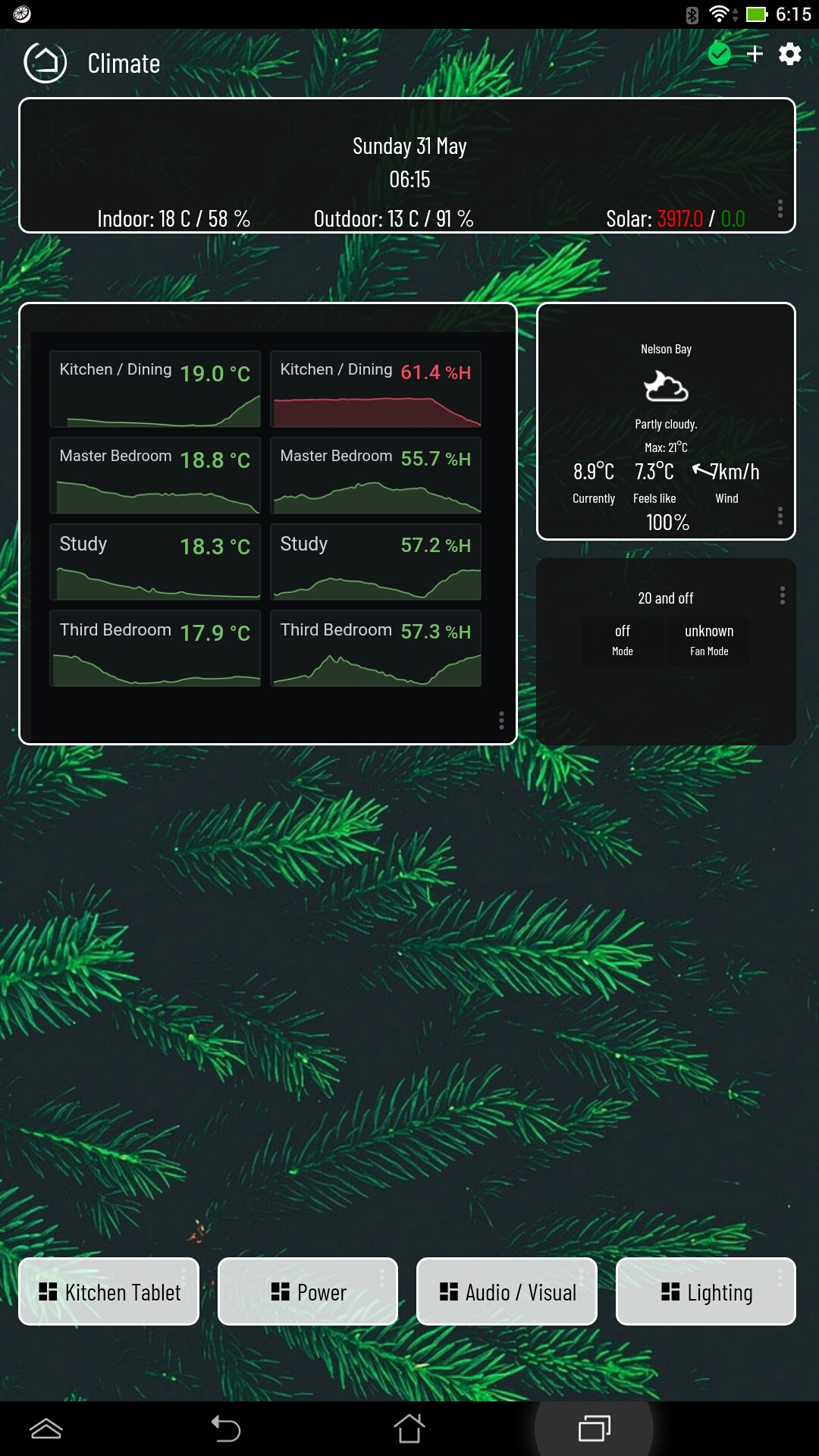
  • Smartly - The biggest change to the two dashboards below was using Smartly for the first time, well done to all those involved, in particular @spelcheck and @TechMedX.

  • Summary Bar - I took inspiration from @northan 's simplified dashboard and introduced a summary bar at the top of each dashboard, using my date / time formatting driver, @Cobra 's Average All App/driver for producing the indoor and outdoor results, plus @funzie 's Solar Edge Monitoring to give me my Solar export and grid import results. The entire bar is constructed using multiple Tile Master tiles, with the app/driver developed by @bptworld.

  • Temperature and Humidity - I recently upgraded my Grafana install to version 7 and have made use of their updated Stat visualisation to show not only the current reading but also a trend line in the background for the last 1 hour. I captured a lot of my own setup here, including references to @asj 's MakerAPI / influxdb / grafana integration.

  • EDIT - Almost forgot, I also used a modified version of @cometfish 's Australian BOM Weather integration

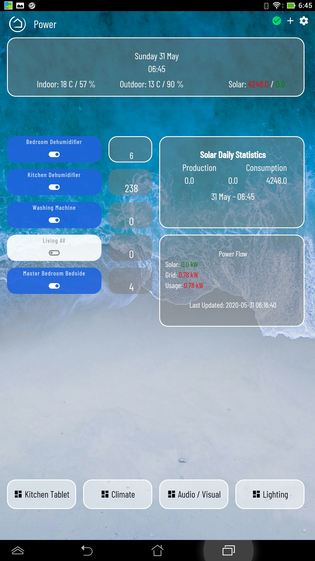
  • The Power dashboard uses much of what I described above, with the addition of readouts of my TP-Link HS110 energy monitoring plugs using @djgutheinz 's integration. I also have this data flowing to influxdb and grafana, so plan to add some visualisations at some point.

There's still plenty of minor cosmetic tweaks I want to do, as well as properly setting up my A/V dashboard for my Harmony activities and other controls, revisit my main dashboard to simplify and "smartify" it... there's always something else to tinker with...

Thanks to all the people mentioned above.

Simon

9 Likes

@sburke781 Looks great!

1 Like

My car dashboard running on a full screen browser on my car's Android head unit (this screenshot taken from my phone in landscape mode). On the car screen the toolbars don't show unless I drag down, its true full screen. Love being able to check the garage door and HSM status while on the road. Enhanced with Smartly.

I still wish there was a Hubitat Android widget for dashboards! Imagine what could be done on a 13" screen (which I hope to get for Christamas :blush:), this is running on a 7" (with no widget).

6 Likes

I'm going to set that up on my DB soon, was curious as to what changes you made.

Very nice DB too, I must try out grafana too! (so the multiple graphs within the tile is done via tile master?)

1 Like

Thanks. The only changes I made to the bom code locally on my HE was to include the location at the top and the relative humidity. I want to eventually look at doing more on the forecast data and show maybe a 5 or 7 day forecast view.

The multiple graphs on the DB are done inside Grafana, i.e. it's one Grafana dashboard with multiple charts, then embedded as a single iframe on a TM tile. One of the links talks about how I did the embedding. The multiple tiles were used to achieve the banner across the top, so I could do the three readouts for indoor, outdoor and solar.

1 Like

This is the same dashboard as above on my car head unit. Great for returning home late at night.

10 Likes

I finally have a scalable dashboard, using the built-in dashboard app.

Here are two screenshots of the exact same dashboard. First, on my PC monitor:

Second, my mounted tablets (actually, Web Developer responsive design mode):

The fonts and icons all scale. The tile width/height are unset, so their sizes are responsive. I got rid of the header bar and put the check mark and gear in the bottom right. The top is a consistent dashboard bar. A lot of the tile titles are replaced with shorter names via CSS. I'm glad I can use the same designs on all my landscape screens. It would get pretty cramped on a landscaped phone, but it's possible. I have another, simpler phone dashboard. A lot of text is removed. I don't need to see "Open" or "Closed" on a window. The icon and tile color handle that. The scaling of font sizes is done by using vh or vw units. I'm not sure I got all of them, but all the ones that show up on my dashboard are scaled now.

Everything this does is with custom CSS:

Summary
.tile-title { 
  line-height: 1.1;
  bottom: 0.1vh;
}


.vue-slider {
  margin-top: 1vh !important;
  margin-bottom: 0vh !important;
  height: 2vh !important;
  margin-right: 2vw !important;
  margin-left: 2vw !important;
  padding: 0.75vh 0vh !important;
}
.vue-slider-rail {
  border-radius: 1.5vh !important;
}
.vue-slider-dot {
  width: 3vh !important;
  height: 3vh !important;
}

.tile.dashboard > .tile-title {
  display: none;
}


.tile-contents {
  padding: 0;
  display: table;
  width: 100%;
  height: 100%;
}


.dashboard div .header {
    position: fixed;
    bottom: -0.5em;
    right: 0.5em;
    z-index: 999;
    opacity: 1.0;
    zoom: 1.0;
    -moz-transform:scale(1.0);
}
.wrapper {
    height: 100%;
    margin-top: 0;
    padding-top: 0.5em;
}
.dashBack,
.dashName {
    display: none;
}
.dashboard div .header>.flex-auto.justify-end,
.dashboard div .header>.flex-auto.justify-end>.flex {
    display: block;
}


.tile-title::after {
    visibility: visible;
    position: absolute;
    text-align: center;
    left: inherit;
    right: 0;
    bottom: 0;
    white-space: pre-wrap;
}
#tile-44 .tile-title, #tile-46 .tile-title, .tile.motion .tile-title, #tile-35 .tile-title, #tile-35 .tile-title, #tile-29 .tile-title, #tile-16 .tile-title, #tile-37 .tile-title, #tile-33 .tile-title, #tile-2 .tile-title, #tile-1 .tile-title, #tile-17 .tile-title, #tile-31 .tile-title {
    visibility: hidden;
    white-space: nowrap !important;
    overflow: unset;
}
#tile-1 .tile-title:after {
    content: 'Porch';
}
#tile-2 .tile-title:after {
    content: 'Kitchen';
}
#tile-16 .tile-title:after {
    content: 'Basemt';
}
#tile-17 .tile-title:after {
    content: 'Floods';
}
#tile-29 .tile-title:after {
    content: 'Liv.Rm';
}
#tile-31 .tile-title:after {
    content: 'Basemt';
}
#tile-33 .tile-title:after {
    content: 'Fam.Rm';
}
#tile-35 .tile-title:after {
    content: 'Din/M.Ba';
}
#tile-37 .tile-title:after {
    content: 'Sunrm';
}
#tile-44 .tile-title:after {
    content: 'Downstairs Humidity';
}
#tile-46 .tile-title:after {
    content: 'Upstairs Humidity';
}
#tile-34 .tile-title:after {
    content: 'Motion';
}
#tile-47 .tile-title:after {
    content: 'Entry';
}
#tile-48 .tile-title:after {
    content: 'Mudroom';
}
#tile-49 .tile-title:after {
    content: 'Upstairs';
}


div {
    font-size: 2.25vh;
}
.material-icons {
    font-size: 5vh !important;
}
.material.icons {
    font-size: 4vh !important;
}
.tile-tertiary {
    font-size: 2vh;
}
.tile.dashboard .tile-primary {
    font-size: 3.5vh !important;
}
.tile.humidity .tile-primary {
    font-size: 3.5vh !important;
}
.tile.thermostat .inline-block {
    font-size: 2.25vh !important;
}
.tile.thermostat .inline-block .no-wrap.overflow-hidden {
    font-size: 2.25vh !important;
}
#tile-39 .tile-primary {
    font-size: 3.5vh !important;
}
.hsm .tile-primary > div:nth-child(2) {
    font-size: 1.5vw !important;
}


.closed > div {
    display: none;
}
.open > div {
    display: none;
}
.motion .tile-primary > div:nth-child(2) {
    display: none !important;
}
.smoke .tile-primary > div:nth-child(2) {
    display: none;
}

It's just a matter of finding the CSS selectors needed to change all the fonts. The "div { font-size: 2.25vh; }" does a lot, but not everything. I also was frugal with real estate, changing some margins, etc. I really wish the default allowed responsive design. The HE web interface is responsive, you'd think there could be a responsive dashboard. I guess that might be hard for the average user to understand how to lay out.

On this my smallest tile is 4x4 (though dashboard links are 2x12). Really helps make use of space. I am expecting to add more, so I'm glad I have some blank space here. My Weather dashboards haven't been migrated to this design yet, but they do have the top nav panel. It's just a bit thicker since I didn't set them up with a big grid. They are next...

8 Likes

I am keen to make my layouts responsive as well, probably a way off from tackling it, but good to have a reference to come back to. It would be good to not have to redevelop my dashboards for the different devices. Nice work.

@BrianP how did you set your custom tile sizes. Is there CSS that will take a tile and chop it down to a quarter size or something custom?

Make the dashboard have really large values for columns/rows like this:

Now my smallest square tiles are 4x4. Here's the setting for my "Basemt" window tile:

My Dashboard links are 2x12, which ends up being "half-height." My largest tiles (surveillance cameras and thermostats) are 10x12. This gives you a lot more control over position and size. You could go way up into the hundreds, but then it's really hard to move things around. It ends up taking lots of clicks on the position arrows when you're moving tiles. That's why I ended up with 32x48 for this. Some of my other dashboards had 5 equal tiles across (but still with 4 dashboard links at top), so I ended up making those 32x40, which made my dashboard tiles 2x10 instead of 2x12.

1 Like

other than the tile names is there anything else that would need to change in the CSS? ( my CSS-fu is not strong :slight_smile: )

Some tile templates have hard-coded font-size or other style information. Those need some individual attention. For example:

.tile.thermostat .inline-block {
    font-size: 2.25vh !important;
}
.tile.thermostat .inline-block .no-wrap.overflow-hidden {
    font-size: 2.25vh !important;
}

Those both modify parts of the Thermostat tiles. I had to do both, since there are two places with hard-coded font size. The Thermostat templates wouldn't respond to changes in the font size in the dashboard settings.

#tile-39 .tile-primary {
    font-size: 3.5vh !important;
}

That one is for my Disarm tile that sets a global variable to do the HSM disarm. I ended up using the div ID for that tile (tile-39). If the CSS selector starts with '#' it's the ID. If it starts with '.' it's the class.

.hsm .tile-primary > div:nth-child(2) {
    font-size: 1.5vw !important;
}

That one is for the HSM tile. It also had hard-coded font size on part of it. The important thing to understand when you're adapting this to other dashboards is how the CSS selector statement works. It's the thing before the brackets. Then you can use something like Web Developer in FireFox to inspect the elements like this:


That's my HSM tile in the div with id "tile-18."

My selector is .hsm .tile-primary > div:nth-child(2) which selects first any div with class="hsm" (there can be multiple classes, this one is class="tile" and class="hsm" which ends up being class="tile hsm" in the code). Then it has to be a "tile-primary" class within the "hsm" class (at any level), then lastly the div element which is the 2nd child element of the "tile-primary" class element. That ends up selecting the div that contains "Disarmed." There are other ways that could have been written to get the same result. For example:

#tile-18 .tile-primary > div {
  font-size: 1.5vw !important;
}

since there is only one div inside the selected .tile-primary div within tile-18.

The !important makes sure that the CSS overrides any style information contained in the HTML.

Hopefully that helps a little. This would not be something you could just copy-paste to fix your own dashboard, though a lot of it would work. I'd say look at w3schools to review some CSS concepts, then hopefully you could adapt it to your dashboards.

2 Likes

thanks for the detailed walk through! looks like I know what I am doing this weekend

2 Likes

@John.Herron first time I have seen smartly running on a car HUD. Nicely done sir! Project time!!

Here is my newest main dashboard rendition using @spelcheck smartly with the 1/2 width mod.

Recently added automatic color changing tiles, Follow Me from @bptworld for dashboard log messages, and the new @Cobra Sonos Dashboard Controller app with virtual music player tile. (additional player tiles add via custom CSS)

Thanks to you all, and everyone that volunteers their time to make HE great!!

5 Likes

That's sweet! I don't have Android Auto on my head unit but I do use Android Auto on my phone and have car-specific dashboards. They are probably my most-used dashboards.