Some people have asked how I did my dashboard that I have posted images of on different threads.
Here is the start of those notes. The dashboard itself isn't finished, so there are still some things I want to add to it, plus setup similar dashboards for each zone. It is a blatent copy of the design posted here.
Almost forgot to include a big thanks to all those who have contributed on the CSS thread, I wouldn't have even come close to any of this without all that wonderful detail:
I haven't finished all the instructions, so will keep adding to it over time. I also haven't followed these instructions myself, so may have missed some steps or made one or two mistakes, just let me know and I can update them.
I think that's enough caveats....
Thanks,
Simon
Basic Preparation
These are some of the core elements required, some more involved steps are outlined later.
For Date / Time display, create a virtual device utilising my Date Format driver
https://raw.githubusercontent.com/sburke781/hubitat/master/UtilityDrivers/DateFormat.groovy
Open Settings -> File Manager on the HE hub (http : ///hub/fileManager) and upload
- DashboardBackground.jpg
https://github.com/sburke781/hubitat/raw/master/Images/DashboardBackground.jpg - DashboardBackgroundAccent.jpg
https://github.com/sburke781/hubitat/raw/master/Images/DashboardBackgroundAccent.jpg - Room photos to use as backgrounds for Zone Tiles
Download and install the Poiret One font on any devices being used to display the dashboard. I haven't actually looked at installing this on my tablet, still need to work that out or a way of hosting the font on the HE hub. Any assistance on this would be appreciated.
Configuring the Dashboard
Create a dashboard, including all the devices you wish to display / control on the dashboard, including any temperature / humidity sensors, weather devices, blinds / shades, A/V devices, general switches, virtual devices created earlier, etc.
Some of the basic dashboard settings are below:
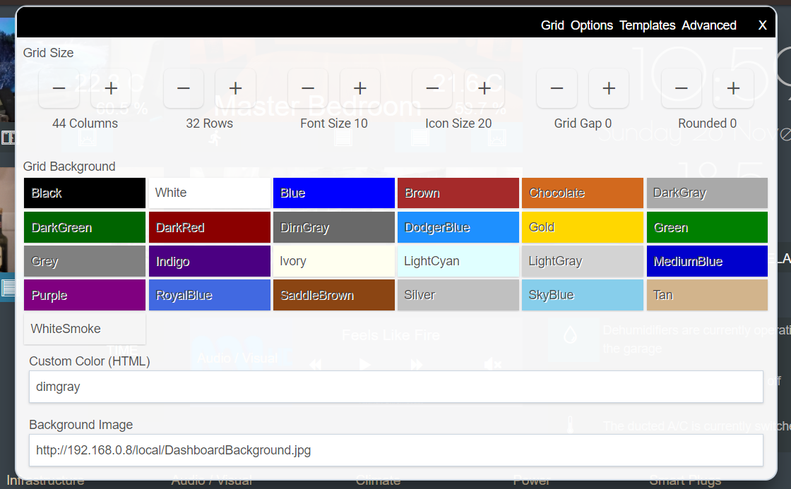
Grid:
Columns: 44
Rows: 32
Font Size: 10
Icon Size: 20
Grid Gap: 0
Rounded: 0
Custom Color (HTML) dimgray
Background Image: http : //HE-Hub-IP/local/DashboardBackground.jpg
Options:
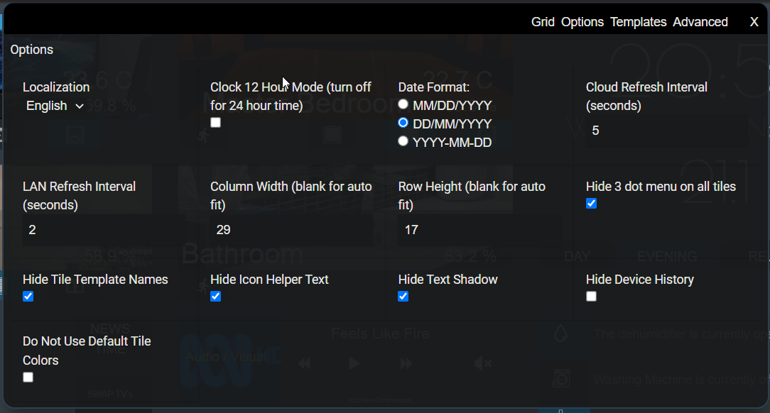
Hide Tile Template Names: Ticked
Hide Icon Helper Text: Ticked
Column Width: 30
Row Height: 20
Hide 3 dot menu on all tiles: Leave this unticked while modifying the dashboard, then ticked when finished
Adjust other options to suit your needs, such as date formats and localisation
Custom Template Colours
I have overridden some of the colours for various templates. I can't remember which one's are actively used, so have included the full list below from the Layout CSS. You should be able to paste this over the top of the existing customColors entry.
"customColors": [
    {
      "template": "attribute",
      "bgColor": "rgba(0,0,0,0)",
      "iconColor": "rgb(0,0,0)",
      "state": "default",
      "customIcon": ""
    },
    {
      "template": "dashboard",
      "bgColor": "rgba(0,97,255,0.29)",
      "iconColor": "rgb(237,219,186)",
      "state": "default",
      "customIcon": ""
    },
    {
      "template": "multi",
      "bgColor": "rgba(255,89,0,0.27)",
      "iconColor": "",
      "state": "open",
      "customIcon": ""
    },
    {
      "template": "multi",
      "bgColor": "rgba(42,242,0,0.28)",
      "iconColor": "",
      "state": "closed",
      "customIcon": ""
    },
    {
      "template": "texttile",
      "bgColor": "rgba(0,0,0,0)",
      "iconColor": "",
      "state": "default",
      "customIcon": ""
    },
    {
      "template": "temperature",
      "bgColor": "rgba(0,0,0,0)",
      "iconColor": "",
      "state": "default",
      "customIcon": ""
    },
    {
      "template": "humidity",
      "bgColor": "rgba(0,0,0,0)",
      "iconColor": "",
      "state": "default",
      "customIcon": ""
    },
    {
      "template": "switches",
      "bgColor": "rgba(28,184,255,0.41)",
      "iconColor": "",
      "state": "on",
      "customIcon": ""
    },
    {
      "template": "window",
      "bgColor": "rgba(28,184,255,0.41)",
      "iconColor": "",
      "state": "open",
      "customIcon": ""
    },
    {
      "template": "window",
      "bgColor": "rgb(52,60,63)",
      "iconColor": "",
      "state": "closed",
      "customIcon": ""
    },
    {
      "template": "acceleration",
      "bgColor": "rgba(0,0,0,0)",
      "iconColor": "rgb(230,230,230)",
      "state": "inactive",
      "customIcon": ""
    },
    {
      "template": "acceleration",
      "bgColor": "rgba(0,0,0,0)",
      "iconColor": "rgb(230,230,230)",
      "state": "active",
      "customIcon": ""
    },
    {
      "template": "buttons",
      "bgColor": "rgba(0,0,0,0)",
      "iconColor": "",
      "state": "default",
      "customIcon": ""
    },
    {
      "template": "switches",
      "bgColor": "rgb(52,60,63)",
      "iconColor": "",
      "state": "off",
      "customIcon": ""
    },
    {
      "template": "shades",
      "bgColor": "rgba(28,184,255,0.4)",
      "iconColor": "",
      "state": "open",
      "customIcon": ""
    },
    {
      "template": "shades",
      "bgColor": "rgba(28,184,255,0.44)",
      "iconColor": "",
      "state": "on",
      "customIcon": ""
    },
    {
      "template": "shades",
      "bgColor": "rgb(52,60,63)",
      "iconColor": "",
      "state": "off",
      "customIcon": ""
    }
  ]
The Fun Bits....
TIP: Note down the tile id's for each tile, either as you go or when it comes to adding the custom CSS further down. The Id is displayed in the top left of the Edit Tile dialog, where you can also skip through the tiles with the arrows on either side of the tile id.
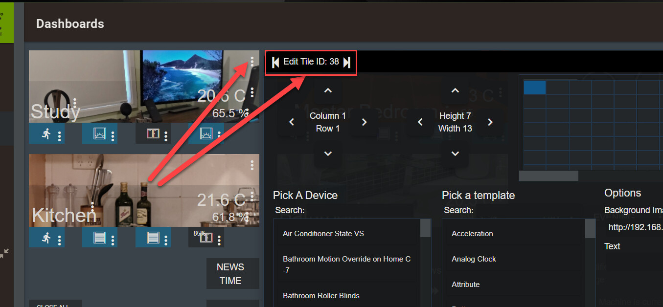
Where I talk about updating the CSS for the dashboard, note that the tile-XX references are the Ids of the tiles in my dashboard, you will need to replace these with the Id's on your own dashboard.
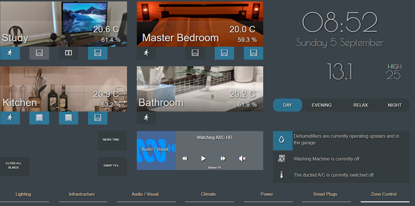
4 Zone Tiles
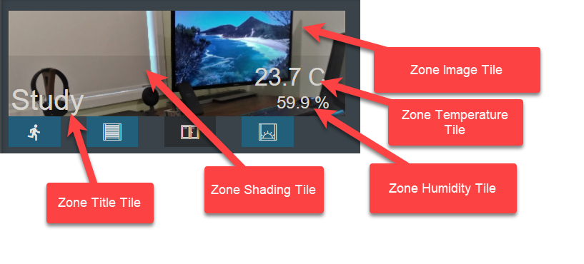
Add a New Tile (Zone 1 Image):
Column: 1, Row: 1
Height: 7, Width: 13
Device: None
Template: Text
Text:
Background Image URL: Photo for the room, e.g. http : ///local/StudyTileBackground.jpg
Add a New Tile (Zone 1 Shading):
Column: 1, Row: 4
Height: 4, Width: 13
Device: None
Template: Text
Text:
Add a New Tile (Zone 1 Title):
Column: 1, Row: 5
Height: 3, Width: 3 (the width may need to vary depending on the name of the room)
Device: None
Template: Text
Text: Name of the room, e.g. Study
Add a New Tile (Zone 1 Temperature):
Column: 10, Row: 4
Height: 3, Width: 4
Device: Zone 1 Temperature Sensor
Template: Temperature
Add a New Tile (Zone 1 Humidity):
Column: 11, Row: 6
Height: 2, Width: 3
Device: Zone 1 Humidity Sensor
Template: Humidity
Repeat this for 3 additional Zones, with image tiles positioned at:
Zone 1 (above): Column: 1, Row: 1
Zone 2 : Column: 15, Row: 1
Zone 3 : Column: 1, Row: 11
Zone 4 : Column: 15, Row: 11
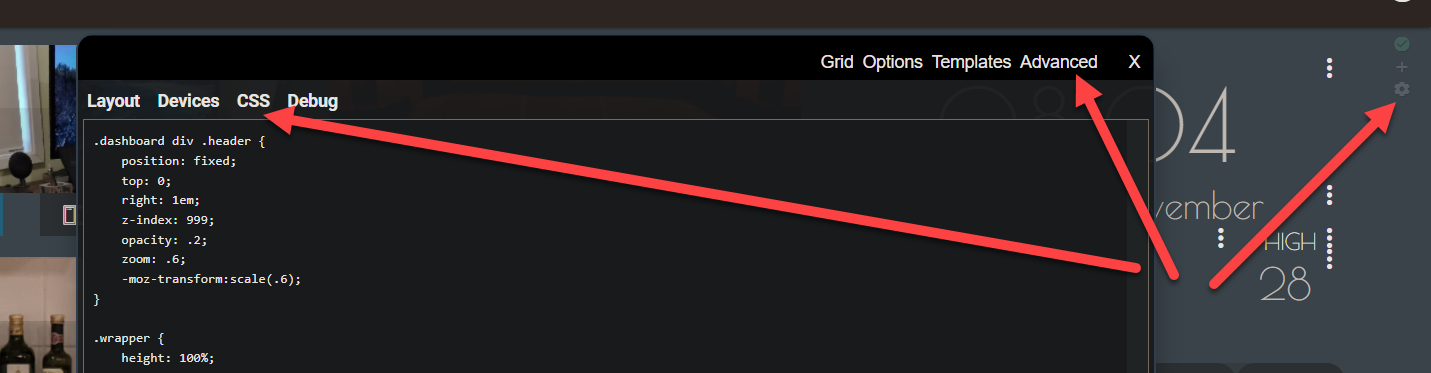
Add the following to the CSS section for the dashboard. To locate the CSS for the dashboard, click on the Cog icon, Advanced, CSS.
When including the CSS I have provided below, adjust the following to suit your dashboard:
-
Tile id's to those you just created
-
Remove any CSS for Tiles that were not created, e.g. if there is no Humidity reading for the room
-
Temperature scale
-
Shading Tile gradients to suit the background images being used
  /* Zone Title Font / Colour */
  #tile-36 div>div, #tile-41 div>div, #tile-43 div>div, #tile-45 div>div {
       font-size: 32px !important;
       color: rgb(230,230,230);
  }

  /* Zone Temperature - Add Scale */
  #tile-33 .tile-primary:after, #tile-73 .tile-primary:after, #tile-46 .tile-primary:after, #tile-75 .tile-primary:after {
  content: ' C';
  }

  /* Zone Temperature - Font and Size */
  #tile-33 .tile-primary, #tile-73 .tile-primary, #tile-46 .tile-primary, #tile-75 .tile-primary {
       font-size: 27px !important;
       color: rgb(230,230,230);
  }

  /* Zone Humidity - Add percent sign */
  #tile-34 .tile-primary:after, #tile-74 .tile-primary:after, #tile-47 .tile-primary:after, #tile-76 .tile-primary:after {
  content: ' %';
  }

  /* Zone Humidity - Font and Size */
  #tile-34 .tile-primary, #tile-74 .tile-primary, #tile-47 .tile-primary, #tile-76 .tile-primary {
       font-size: 19px !important;
       color: rgb(230,230,230);
  }

  /* Zone Background Image Tiles - Order */
  #tile-38, #tile-40, #tile-42, #tile-44 {z-index: 1; !important;}

  /* Zone Temperature / Humidity Tiles - Order */
  #tile-36, #tile-33, #tile-34, #tile-35, #tile-26, #tile-73, #tile-74, #tile-75, #tile-76 {z-index: 2; !important;}

  /* Zone Shading Tiles */
  #tile-87 { background:linear-gradient(0deg,black,white); opacity:0.1 }
  #tile-87 {z-index: 900; !important;}
  #tile-85 { background:linear-gradient(0deg,black,white); opacity:0.45 }
  #tile-85 {z-index: 900; !important;}
  #tile-86 { background:linear-gradient(0deg,black,white); opacity:0.15 }
  #tile-86 {z-index: 900; !important;}
  #tile-88 { background:linear-gradient(0deg,black,white); opacity:0.1 }
  #tile-88 {z-index: 900; !important;}
The temperature and humidity tiles will need to have their title hidden, use the example CSS below to achieve that, replacing the Tile Id's with your own and adding more to cover each tile created above (you won't need it for the text or image tiles, just those with a device referenced:
#tile-48 .tile-title, #tile-93 .tile-title {visibility: hidden; display: none;}
Zone Controls
Coming soon....
In short, some 2x2 sized tiles for shades, switches, window contact sensors, etc, with built-in icons selected in the tile setup. Some CSS is used to remove text and reposition the icons.
I'm not entirely happy with the dimensions I have chosen for the dashboard itself, the size of the Zone tiles means I end up with a gap at the bottom right if I try to fill a zone up with controls. I may even get rid of them at some point, not sure... I'll still capture notes sometime soon.
Date, Time and Weather
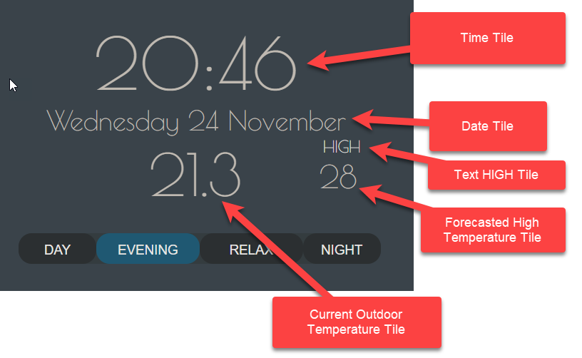
Add a New Tile (Time):
Column: 29, Row: 1
Height: 15, Width: 14
Device: Formatted Date/Time Virtual Device
Template: Attribute
Attribute: formattedTime
Update the CSS for the dashboard:
/* Time - Font and Size */
#tile-48 .tile-primary {
     font-size: 80px !important;
     font-family: 'Poiret One';
     color: rgb(190,190,190);
}

#tile-48 .tile-title {visibility: hidden; display: none;}
Add a New Tile (Date):
Column: 29, Row: 6
Height: 3, Width: 14
Device: Formatted Date/Time Virtual Device
Template: Attribute
Attribute: formattedDate
Update the CSS for the dashboard:
/* Day / Date - Font and Size */
#tile-49 .tile-primary {
     font-size: 30px !important;
     font-family: 'Poiret One';
     color: rgb(190,190,190);
}

#tile-49 .tile-title {visibility: hidden; display: none;}
Add a New Tile (Current Outdoor Temperature):
Column: 32, Row: 9
Height: 6, Width: 8
Device: Weather Station / Service
Template: Attribute
Attribute: temperature
Update the CSS for the dashboard:
/* Current Outdoor Temperature - Font and Size */
#tile-52 .tile-primary {
     font-size: 65px !important;
     font-family: 'Poiret One';
     color: rgb(190,190,190);
}

#tile-52 .tile-title {visibility: hidden; display: none;}
Add a New Tile (Text "HIGH"):
Column: 40, Row: 10
Height: 2, Width: 3
Device: None
Template: Text
Text: HIGH
Update the CSS for the dashboard:
/* Outdoor Temperature Forecast High - Font and Size */
#tile-51 div>div {
     font-size: 18px !important;
     font-family: 'Poiret One';
}
Add a New Tile (Forecast High Temperature):
Column: 40, Row: 10
Height: 5, Width: 3
Device: Weather Service
Template: Attribute
Attribute: Depends on the device / driver, mine was forecastHigh
Update the CSS for the dashboard:
/* Forecast High Temperature - Font and Size */
#tile-50 .tile-primary {
     font-size: 35px !important;
     font-family: 'Poiret One';
     color: rgb(190,190,190);
}

#tile-50 .tile-title {visibility: hidden; display: none;}
Add a minimum tile as well if you have that reading, I don't think I had that available when I set this up....
Mode Selection
This ended up more complicated than I would have liked, so I may re-visit it in the future, any suggestions are welcome....
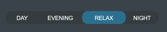
Mode Virtual Button
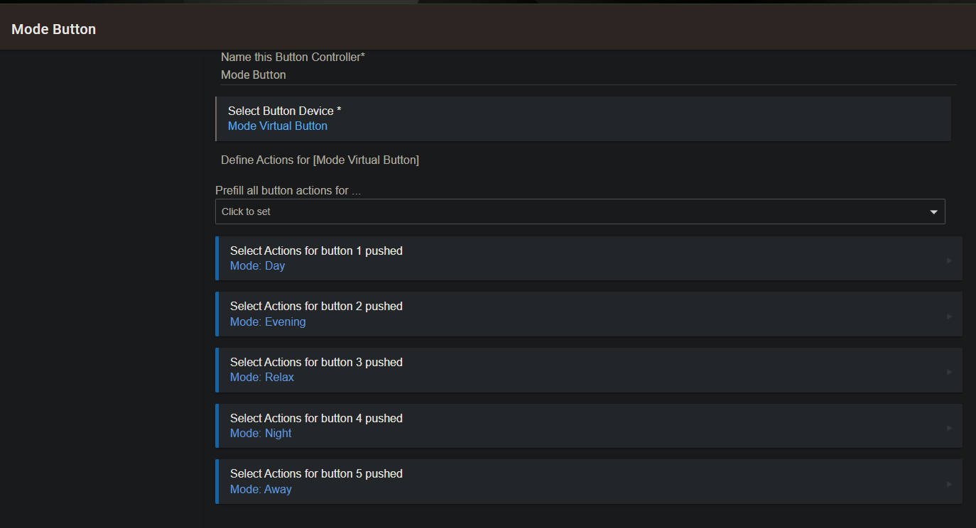
Create a Virtual Button device called Mode Virtual Button, with the same number of buttons as Modes configured on the HE hub. This is more than I eventually display on the dashboard, but it seemed like a good idea, in case I want to use it somewhere else.
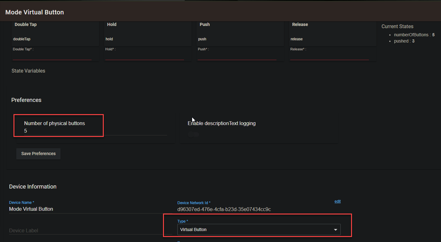
Use the Button Controller Built-In App to configure changes of the Mode setting in response to each button.
Mode Virtual Switches
Create Virtual Switch device for each Mode being presented on the dashboard, i.e. one for each button from the Mode Virtual Button. Prefix the name of each switch with "Mode VS - " followed by the Mode Name, e.g. Mode VS - Night.
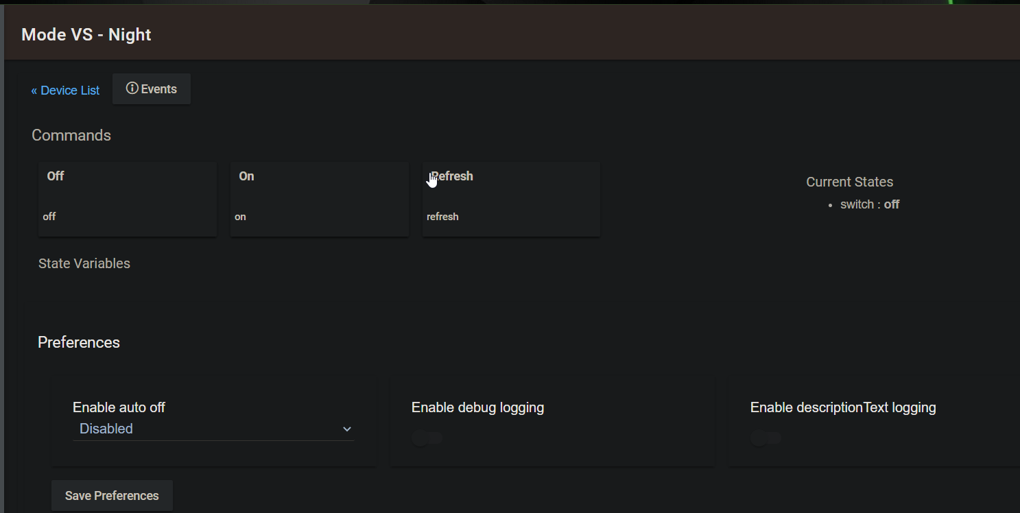
Setup Rules that keep the switches in sync with the Mode setting on the hub, either by adding them to existing rules (like I have) or setup new ones.

On the dashboard (in short):
-
Create tiles for each button for the modes being displayed
-
Create tiles for each switch for the modes being displayed
-
Create separate tiles with the name of each mode, using the Text template
-
Create a background accent tile that has the accent image as a background
-
Add CSS below to the custom CSS section to put the buttons on top, adjust the background colours, round the tiles slightly and remove icons
  /* ****** Mode Selection ******* */

  /* Button Tiles Ordering */
  #tile-58, #tile-59, #tile-60, #tile-61 {z-index: 999; !important;}
  /* Background Accent Tile Ordering */
  #tile-70 {z-index:   1; !important;}
  /* Switch Tiles Ordering */
  #tile-62, #tile-63, #tile-64, #tile-65 {z-index:   2; !important;}
  /* Mode Name Tile Ordering */
  #tile-66, #tile-67, #tile-68, #tile-69 {z-index:   3; !important;}
  /* Set a transparent Background for the Mode Name Text tiles */
  #tile-66, #tile-67, #tile-68, #tile-69 { background-color: rgba(0,0,0,0) !important; }
  /* Rounding of Switch Tiles and Background Accent Tile */
  #tile-62, #tile-63, #tile-64, #tile-65, #tile-70 { border-radius: 15px !important; }
  /* Removal of Icons from Switch and Button Tiles*/
  #tile-58 .material-icons, #tile-59 .material-icons, #tile-60 .material-icons, #tile-61 .material-icons, #tile-62 .material-icons, #tile-63 .material-icons, #tile-64 .material-icons, #tile-65 .material-icons { display: none; }
Key Status Indicators
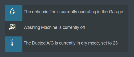
These are essentially switch tiles on the left and text tiles to the right, with an accent tile behind the text tiles. The switches use Custom icons chosen in the tile dialog, he-drop for the dehumidifiers, he-washing_machine_3 for the washing machine and he-thermometer_4 for the thermostat. I still need to move the icons around a bit to centre them on the tile
The switches are all Virtual Switches and the text tiles use Global Variables setup in Rule Machine 4 / 4.1. These are all maintained in separate RM rules. I assume the Global Variables would be setup as Hub Variables now, but haven't read up on that in enough detail to be sure...
I haven't done this yet, but I would place another transparent text tile over the switches so that they can't be turned on or off, not that it would cause anything bad to happen, just the display would not be accurate.
In terms for CSS, apart from removing the tile titles, the text tiles have some formatting applied:
/* ****** Key Status Tiles ******* */

/* Key Status Text Formatting */
#tile-54 .tile-primary, #tile-71 .tile-primary, #tile-72 .tile-primary {
                   text-align: left !important;
                   font-size: 14px !important;
                   color: rgb(190,190,190); }
Dashboard Links
Add a number of Dashboard Link tiles across the bottom of the dashboard with a height of 2 and as wide and spaced out as is needed, depending on how many you have. Add the CSS below for each dashboard apart from the one we are creating.
#tile-92, #tile-93, #tile-94, #tile-95, #tile-96, #tile-97 { border-bottom: 3px solid gray;
               background-color: rgba(0,0,0,0) !important;  }
For the link to the dashboard we are working on, adjust the bar at the bottom to be slightly brighter to indicate it is the one being viewed, rather than needing the Dashboard Header. This probably should be a text tile.
#tile-98 { border-bottom: 3px solid white;
           background-color: rgba(0,0,0,0) !important;  }
A/V Controls
Coming soon...
I haven't actually finished this myself yet, just made the shell of some static tiles on the dashboard, using similar techniques of overlaying tiles, etc. The image for the ABC was downloaded from the web and stored in the File Manager on the HE hub.
General Shortcut Buttons / Switches
Pretty basic virtual switches that are used in RM rules to do things like turn the TV on, close multiple blinds across the house, etc. Here's an example:
Add a New Tile (Close All Blinds Switch):
Column: 1, Row: 25
Height: 3, Width: 3
Device: Close All Blinds Switch
Template: Switch
Add other switches as required, I currently have 3 in total, shown in the CSS below
Update the CSS for the dashboard:
/* Switch Titles */
#tile-89 .tile-primary:after{ content: "NEWS TIME"; }
#tile-90 .tile-primary:after{ content: "CLOSE ALL BLINDS"; }
#tile-91 .tile-primary:after{ content: "SWAP TV's"; }
/* Switch Icons and Title Hiding */
#tile-89 .material-icons, #tile-90 .material-icons, #tile-91 .material-icons { display: none; !important; }
#tile-89 .tile-title, #tile-90 .tile-title, #tile-91 .tile-title { visibility: hidden; }
Dashboard Header and Buttons
If you want to remove the title for the dashboard, as well as move and make the buttons for refresh and configuration more transparent, you can use the CSS below. I took this from another post:
Assorted General Questions - #2 by TechMedX
/* ****** Dashboard Header ****** */

.dashboard div .header {
    position: fixed;
    top: 0;
    right: 1em;
    z-index: 999;
    opacity: .2;
    zoom: .6;
    -moz-transform:scale(.6);
}

.wrapper {
    height: 100%;
    margin-top: 0;
    padding-top: 1em;
}

.dashBack,
.dashName {
    display: none;
}

.dashboard div .header>.flex-auto.justify-end,
.dashboard div .header>.flex-auto.justify-end>.flex {
    display: block;
}

