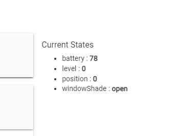
Thanks for that, definitely something amiss! It could be the driver not reporting states that the dashbord tiles need to see. It seems fine in the device page though. What states does yours report?
I am using the Smartwings community driver. Not sure if there is another that works with Smartwings. But even when I just put a new shade tile on my test dashboard I still can't change the tile, i.e no states just inherently in the off position, like when you add a new tile. Maybe I should reach out to support to see if indeed there is something broken with the tile and / or confirm what the HE Shade tile expects to see to make the colors change. @bobbyD
Hi, Looking for a way to change font size for the text of a variable string tile on the dashboard.
I could find in this thread the right code for hiding the tile name but not how to change the font size for the string value itself.
Any idea?
I thoroughly scoured this long topic for clues, but see no indication or mention of using @import as a means of importing CSS into Hubitat Dashboards. Is it possible?
I'm well versed in editing the CSS panel in HE DB, but lately have wondered whether that same (internal) block could be saved off into an (external, stored locally on the hub) .css stylesheet, leaving just the @import statement for reference.
Has anyone successfully done this? Is this madness to suggest??
Thanks, I need to give that a serious re-read. It had been six months or so. But I had since heard a suggestion that the @import wasn't working for some users when they attempted it. On the strength of your assurance, I'll give it another look.
You may need to consider alternatives if using cloud versions of your dashboard, I would not expect it to work there with the kind of url I provided, you would need a cloud accessible url in that case.
Seems likely that the underlying issue (post 746) is the one identified previously: While there is a Template named “Shade” that can be selected when editing a tile (and its associated colors can be modified using Template Color Editor), the Layout tab JSON refers to Template “Shades” - not “Shade”!!! The result is that you can edit colors for Template “Shade” as you wish, but the dashboard tiles follow some user-inaccessible Template “Shades”.
This was reported in Dashboard Templates - where are they? Can they be modified? References in Layout window - #5 by user2424.
Perhaps identifying Chad’s issue (post 746 above) will motivate corrective action? While I understand there are likely CSS-based means to overcome this, the obvious disconnect in the basic tools should be addressed. Thank you!
I have a standard button tile with the standard button icon. Tile ID is 7. The icon seems to be in "tile-primary". I want to remove the icon, replace it with the text "GO", with fond size 24 and centered in the tile.
Boy, this is from a long time go! @BrianP graciously helped me figure out how to vertically center text on a Link tile or a Text tile. Now I’m trying to do the same with a Hub Variable tile. Can’t get it to work.
Here’s the CSS @BrianP helped me with last time that I’m now trying to translate for Hub Variables. Any ideas? For bonus,I’m also trying to append unit-of-measure text to a hub variable. TIA!
Variable Boolean is similar, using .variable-bool, and Variable Date uses .variable-date, Variable Decimal uses .variable-decimal, and Variable Time uses .variable-time in the CSS selection.
It looks to be different for a Variable String tile. This won't work for that. Try right-clicking the tile and choosing "Examine" or "Inspect" on the element. Maybe then you can find the correct CSS selector to make this work. It might be something like .variable-string .items-center or .variable-string .justify-center instead of .variable-string .tile-contents.
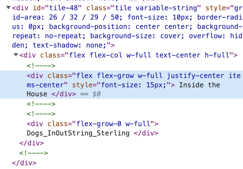
I always struggle finding the correct selector from inspect. Take this variable-string tile as an example. When I expect, I see this (below). Where do I look (and how far up the hierarchy do I look) to try to find the correct version of .variable-string, because .variable-string doesn't seem to work.
EDIT: I noticed in the Inspect view that was a little info note that said, "The display-table property prevents justify-content from having an effect. Try setting display to something other than table." What are the other options?
You might try adding an exclamation point to force display table... Maybe for the other styles also, removing the exclamation points one at a time if that works until it breaks again.
The CSS selector with .variable-string .text-center will select an element with the class .text-center that is also contained within an element with the class .variable-string. You could also use .text-center as the CSS selector, but that would also modify any element with that class regardless if it overlaps with a .variable-string element or not.
You're looking at the correct divs, starting with tile-48, including the next two divs. You want to pick a class in one of those divs to use in the CSS selector. I'd use text-center, justify-center, or items-center, since the other classes (i.e. flex, flex-col, etc) seem to be less specific.
Hi @mluck - Cannot promise you I can help you, but for us visual folks would you mind posting a picture of the tile you are speaking of and identifying the item you are trying to center?
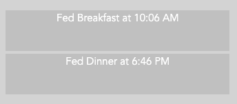
I appreciate the question. Here's one (er, two) of many examples where I'm using a tile on a dashboard to show a hub variable. This particular use-case is tracking whether the dogs have been fed by my oh-so-irresponsible teenagers ;). Note how I can't get the text to vertically center no matter what I try.