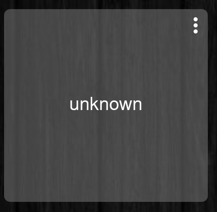
I figured out the mystery of vertically centering string variables. With @BrianP's awesome help, the CSS below works, but only if you use "display: none" rather than "visibility: hidden" when hiding the tile name text at the bottom of the cell. I have no idea why this is required, but I just tried everything I could think of and this was the combo that worked. Hope this helps the next person.
Curious if anyone has cracked the code on manipulating an inbox box like @markbellkosel84's example above? Like him, I'd like to change the size, but I'd also like to keep the input box horizontally centered in the tile when it's interacted with. Every time I try to change the value in an inbox (even a value with one or two characters), it scrolls off the left edge of the tile, rendering the input box useless.
I really appreciate your multiple attempts at helping me, but I just can't get this to work, and I don't want to impose further. My tile is a number variable, so when I used your CSS, I replaced variable-string with variable-number, but still no joy.
I noticed that this CSS works for a device that is a global variable (number), but doesn't work for a Hub Variable that's a number. If you know what I mean.
Guess that's my work around. I could add a connector to my hub variable and use that device in the dashboard, rather than using the variable itself. For some reason, CSS seems much more difficult when the tile comes from a variable rather than a device.
works exactly as you'd hope when viewed through the Hubitat android app - both of the "visibility" modifiers are applied.
But, when viewed through a browser (every one I've tried, PC and 'droid), neither modifier is applied - it's as though the line didn't exist. Splitting it into two, like
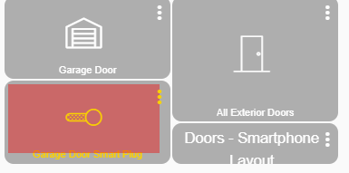
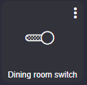
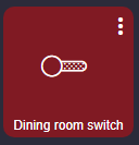
I'm trying to do something similar to this but I'd like a certain switch (tile# 10) to have a white icon and text whether it's on or off but when it's on have the background color rgba(255,0,0,0.4) and when it's off have the background coloring rgba(60,60,60,0.4).
How would I go about this? I've tried tweaking this CSS code but no luck...
Is it only the one tile where you want that to be the case and you have others using the same template where you don't want that colouring to be applied? Where I'm heading is, could you just use the template colours in the options rather than CSS?
There will be something here, I feel like I have been involved in working this through with someone else, using posts from others early on it this topic. I'll see what I can find over the weekend unless someone else comes up with a solution for you or you work it out yourself.
Thanks @wayne.pirtle, it's close but not quite. For some reason the red background is a smaller square but a larger dark grey square remains.
Also I see my initial post was backwards, I apologize. I'd actually like to have a white icon and text whether it's on or off but when it's off have the background color rgba(255,0,0,0.4) and when it's on have the background coloring rgba(60,60,60,0.4). Sorry for my mistake!
That's right. I believe what is happening there is that the DIV with the tile-primary class sits inside the larger tile DIV, so the change to the background-color is only being applied to the smaller / inner DIV, not the entire tile.
I found one of the earlier posts from @BrianP that I had in mind, which is very similar to what you started with.
One thing that is missing from this specific post, and I believe is what makes this work, is that you need to set the default colors in the template settings in order for the "style*=..." part to work. My interpretation of why and how this works is that the state of the switch is indicated on the inner DIV I was referring to earlier, through the use of a class on that DIV, but there is no equivalent class added to the tile DIV, so we cannot use that like we would normally. What is happening in @BrianP's solution is the template colors that are set on the outer tile DIV, help to indicate the state of the switch, and this is what is being used in the CSS when changing the tile background color.
For example, you set the "on" color for the template to be rgba(255,0,0,0.8), then in the CSS you use something like:
Ah, so the template color settings are likely a more generic approach, but for a typical switch, the background color is only set in the on state for a switch tile? And left out when in the off state?
lol, I was just as perplexed at first and I believe this is the only tile I have come across where this workaround is needed.
As you pointed out when you just set the background-color only the first div is touched.
[style*=] is basically looking for all attributes with a value of background-color and changing them rather than just the first div in that element set.
To answer your question, I never really looked into it but I believe there is a default color for both states that can be overwritten through the template feature, but I've never used it.
Now, I say this while drinking wine in 110-degree weather

