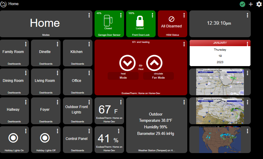
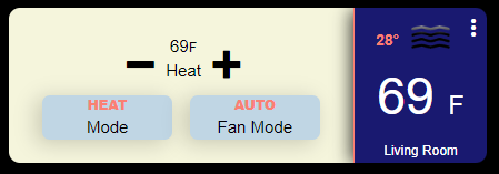
I have been looking but can't find a way to make the thermostat tile in Hubitat scale up. My wife said she can't read the text between the up and down touch points. I made the tile 2 x 3 and then started to poke around but nothing I have tried would increase the size of the font where the current set points are. Any suggestions on what CSS attributes could be used. Here is what I have on my dashboard below:
I'm pretty sure @ymerj and @chad.andrews (and others) have worked with thermostat tiles quite a bit, so they may be able to help.
1 Like
I'm far from an expert but I would use this:
#tile-0 .heating.pt-1.w-full>.inline-block {font-size: 3vh !important;}
But I'm not sure it would work on a different thermostat mode. Like @sburke781 says "Others may be able to help" better then I can.
edit: change tile-0 for your tile number and choose a vh size that suit you.
1 Like
Probably one thing to look at would be trying to identify the text without the reference to the operating state (heating). Not sure if it is possible....
1 Like
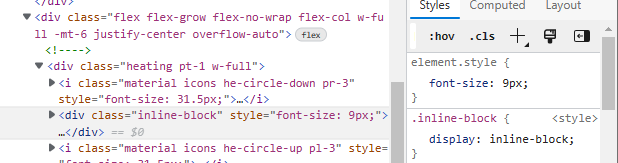
This is what I found so far with the debugger:
But right now the thermostat is calling for heat I will need to see change changes when idle and calling for cooling.
I totally agree, but have no idea if/how I could do that on a dashboard - are you aware of a way to do this?
Have you tried to attack the .inline-block on the tile like this?
#tile-XX .inline-block {
       font-size: 14px !important;
}
Not sure how that will affect the rest of the text, just a thought.
Hi, have you looked into installing an extension on safari that you can set the autorefresh on, like this one?
1 Like
I didn’t, but I checked it out - it requires iOS 15 and unfortunately, I don’t have it on my old iPad Mini… 
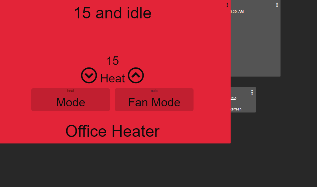
@ronv42 how big do you want it? lol. replace my px numbers to suit your needs.
/*All Thermostat Mode Buttons Adjust*/
.thermostat .inline-block {font-size: 40px !important;}

/*All Thermostat Button Resize*/
.thermostat .pl-3 {font-size: 55px !important;}
.thermostat .pr-3 {font-size: 55px !important;}

/*All Thermostat Top Description Resize*/
.thermostat .p-1 {font-size: 55px !important;}

/*All Thermostat Bottom Description Resize*/
.thermostat div.absolute.bottom-0.text-center.w-full {font-size: 55px !important;}
4 Likes
Thanks this works great. Now the wife will be able to see what the thermostat is set to on our tablets.
3 Likes
Handy bit of CSS. very useful, thank you!
3 Likes
This worked great for me. Thanks! 
Is there a way to remove or hide any elements/attributes on the media player tile?
I'm using it with Sonos but would like to remove the mute button and song title, artist name etc. To make it less cluttered.
Thanks in advance.
Mike.
1 Like
@Talos Sorry I don't have any media devices to test but you could certainly try this. Let me know if it actually works. 
/*Media Tile Song Remove*/
#tile-11 div.trackDescription {visibility: hidden; !important;}

/*Media Tile Mute Remove*/
#tile-11 div.muteControl {visibility: hidden; !important;}
3 Likes
Worked perfectly. Many thanks!
Much appreciated.
I've switched to Hubitat a week ago after being a long time ST user. Loving it so far.
Like many I got sick of ST breaking my hard work.
Been reading these threads for the past week and slowly rebuilding my system from scratch.
It's already better than it was before and with the help of you guys and good old CSS I've ditched ActionTiles also.
Totally localised now and anything that breaks is my fault alone. (Plenty of backups made.  )
)
Seems a great community and this was the first time I've had to ask a question. Everything else so far I've found on here already answered.
Really need to learn how to use logs and find attributes etc now so I can help find my own answers.
Thanks again.
7 Likes
A little tweak:
I found that although the track description was "hidden" it was still taken into acount in the layout/formatting so the other elements would shift up and down in position depending on the length of the track description.
Changed it to:
#tile-xx div.trackDescription {display: none; !important;}
That sorted it.
2 Likes
There ya go, even better! 
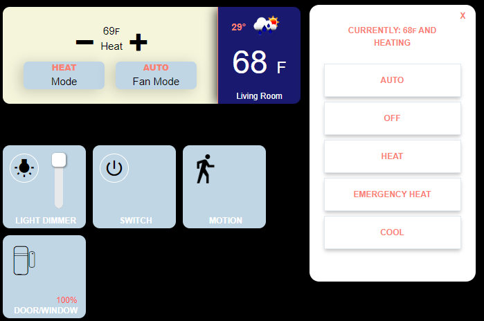
Texas is freezing and I'm having to work from home (I'm sticking to this story  ), so I decided to play around with the Hubitat dashboard and CSS in between business calls.
They say sharing is caring, this is what I came up with, use it as a template or build off of it. Don't let boredom stop you!  All of the CSS is located in the details of each tile below.
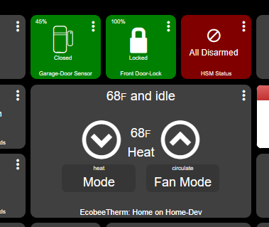
These are the tiles while idle.
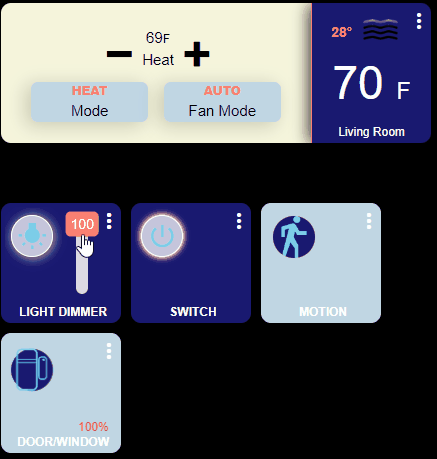
This is their on/active state.
How?
THERMOSTAT - The thermostat is made up of 3 tiles, the main thermostat tile, the temperature tile, and the OpenWeather tile. The pop-up has also been modified slightly, the dimensions have been reduced and the text is now upper case (this can be seen in the first picture).
<   /* ==== Thermostat ==== */

/* The main thermostat tile */

#tile-0 {
  width: 350px;
  height: 140px;
}

/* Change the standard background of the thermostat */

.thermostat {
  background-color: rgba(245,245,220,1) !important;
}

/* Change the color of the Mode & Fan Mode color then add a box shadow */

.thermostat .w-1\/3 {
  background-color: rgba(192,214,228,1) !important;
  color: rgba(0,0,0,1) !important;
  box-shadow: -5px 3px 18px 1px rgba(0,0,0,0.17);
}


/* Change the setting font color, make the text upper case and bold */

.thermostat .overflow-hidden {
  color: rgba(250,128,114,1)!important;
  text-transform: uppercase;
  font-weight: 900;
}

/* Change the down circle to a minus sign */
.he-circle-down:before {
  content: "\ea0b";
  color: rgba(0,0,0,1);
  font-size: 25px;
}

/* Change the up circle to a plus sign */

.he-circle-up:before {
  content: "\ea0a";
  color: rgba(0,0,0,1);
  font-size: 25px;
}

/* Change the font size around the buttons */

.thermostat .inline-block {
  font-size: 15px !important;
  color: rgba(0,0,0,1) !important;
}

/* Change the font size and color for the upper text */

.thermostat .p-1 {
  font-size: 15px !important;
  display: none !important;
  color: rgba(255,255,255,1);
  padding-top: 0.25rem;
  left: 20px;
  top: 30px;
}

/* Adjust the +/- buttons */

.thermostat .pt-1 {
  padding-top: 0.25rem;
  position: absolute;
  top: 20px;
  left: -18px;
}


/*  Change the font size and color for the lower text */

.thermostat .bottom-0 {
  visibility: hidden;

}

/* ==== Thermostat's popup ==== */

/* Adjust the popup size box */

.thermostat .popup-content {
  height: 400px;
  width: 240px;
}

/* Change the text color and make the text upper case in the popup box */

.text-lg {
  font-size: 12px;
  color: rgba(250,128,114,1) !important;
  text-transform: uppercase;
  font-weight: 600;
}


/* Move the mode and fan buttons */

.thermostat .my-1 {
  margin-top: 0.25rem;
  margin-bottom: 0.25rem;
  position: absolute;
  top: 75px;
  left: -20px;
}


/* ========== Show the temperature on one tile =================== */

/* Adjust the tile size, add a border to the left side and box-shadow */

#tile-1 {
  background-color: rgba(25,25,112,1) !important;
  height:140px;
  width:120px;
  left: 100px;
  border-radius: 0px 10px 10px 0px !important;
  box-shadow: -4px 1px 15px -1px rgba(0,0,0,0.73) !important;
  border-left: 1px solid rgba(250,128,114,1) !important;
}

/* Add just the temperature reading */

#tile-1 > div.tile-contents > div {
  font-size: 46px !important;
  left: 8px !important;
  top:46px;
  position: absolute;
}

/* ==== The weather is from OpenWeather integration ==== */

#tile-7 {
  background-color: transparent;
  height:60px;
  width:200px;
  top: -2px;
  left: 285px;
}


#tile-7 > div.tile-title {
  display: none;
}

#tile-7 > div.tile-contents > div > div.weatherCity {
  display: none;
}

#tile-7 .weatherDirection[data-v-5b4273a2], .weatherHumidity[data-v-5b4273a2], .weatherSpeed[data-v-5b4273a2] {
  display: none;
}


#tile-7 > div.tile-contents > div > div.weatherTemperature {
  margin-left: -11px;
  margin-top: -30px;
  display: block;
  position: relative;
  left: -35px;
  color: rgba(250,128,114,1) !important;
  font-weight: 600;
  display: inline-block;
  white-space: nowrap;
  overflow: hidden;
  text-overflow: ellipsis;
  max-width: 32px;
  max-height: 26px;
  top: -24px;
  font-size: 14px;
}
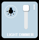
LIGHT DIMMER - The dimmer is actually two tiles, the dimmer of course, and the vertical level which has its background set to transparent so that it blends in and slight modifications to the slider tool-tip to give it a different look. In addition, I swapped out the HE icons for Material Icons.
To improve it, you could hide the tooltip and add another tile that keeps the dimmer percentage always visible.
/* ======================== Light switch configuration =================== */

/* Change the background color of the tile, resize, and move to the left */

#tile-2 {

  background-color: rgba(192,214,228,1) !important;

  height:120px;

  width:120px;

}

/* Hide the original icon */

#tile-2 .he-bulb_off:before {

  visibility: hidden;

}

/* Add a new icon format it and move it to the left and up */

#tile-2 .he-bulb_off:before {

  visibility: visible;

  font-family: 'Material Icons' !important;

  content: "wb_incandescent";

  font-size: 30px !important;

  color: rgba(0,0,0,1) !important;

  position: relative;

  top: -25px;

  left: -25px;

  border: 1px solid rgba(255,255,255,1);

  padding: 5px;

  border-radius: 25px;

}

/* Change the color of the button when turned on */

#tile-2[style*="background-color"] {

  width: 120px;

  height: 120px;

  background-color: rgba(25,25,112,1) !important;

}

/* Hide the original icon */

#tile-2 .he-bulb_on:before {

  visibility: hidden;

}

/* Add a new icon when the light is turned on, format it, and move it to the left and up */

#tile-2 .he-bulb_on:before {

  visibility: visible;

  font-family: 'Material Icons' !important;

  content: "wb_incandescent";

  font-size: 30px !important;

  color: rgba(125,209,233,1) !important;

  position: relative;

  top: -25px;

  left: -25px;

  background-color: rgba(255, 255, 255, .75);

  border: 1px solid rgba(255,255,255,1);

  padding: 5px;

  border-radius: 25px;

  box-shadow: 1px 1px 10px 1px rgba(255,255,225,.70);

  border-color: 1px solid rgba(250,128,114,1) !important;

}

/* Hide the slider/level */

#tile-2 div.dimmer {

  display: none;

}

/* Hide the tile title */

#tile-2 .tile-title {

  visibility: hidden;

}

/* Add a new title */

#tile-2 .tile-title:after {

  visibility: visible;

  content: "LIGHT DIMMER";

  position: absolute;

  text-align: center;

  left: inherit;

  right: 0;

  bottom: 0;

  white-space: pre-wrap;

  color: rgba(255,255,255,1) !important;

  font-weight: bold;

}

/* ==== Vertical Slider/level ==== */

/* Hide the tile title */

#tile-3 > div.tile-title {

  Visibility: hidden;

}

/* Adjust the slider/level size and move it over on top of the dimmer switch */

#tile-3 {

  width: 70px;

  height: 120px;

  left: -160px;

  background-color: transparent;

}

/* Adjust the height of the vertical slider/level */

#tile-3 > div.tile-contents > div > div > div {

  height: 70px !important;

}

/* Adjust the tool-tip circle */

#tile-3 .vue-slider-dot-handle {

  border-radius: 25%;

}

/* Center the tool-tip over the slider */

#tile-3 .vue-slider-dot-tooltip-left {

  left: 27px;

}

/* Change the tool-tip */

.vue-slider-dot-tooltip-inner {

  font-size: 14px;

  white-space: nowrap;

  padding: 2px 5px;

  min-width: 20px;

  text-align: center;

  color: rgba(255,255,255,1);

  border-radius: 5px;

  border-color: rgba(219,138,52,0);

  background-color: rgba(250,128,114,1)!important;

  box-sizing: content-box;

}
SWITCH - This one is pretty basic, besides the glowing around the button, it uses Material Icons like the dimmer.
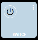
/* ==== Switch Configuration ==== */

#tile-4 {
  background-color: rgba(192,214,228,1) !important;
  height:120px;
  width:120px;
  left: -80px;

}

/* Hide the original icon */

#tile-4 .he-switch_2 {
  visibility: hidden;
}

/* Assign a new icon make it visible, move it to the left and up when the switch is off */

#tile-4 .he-switch_2:before {
  visibility: visible;
  font-family: 'Material Icons' !important;
  content: "power_settings_new";
  font-size: 30px !important;
  color: rgba(0,0,0,1) !important;
  position: relative;
  top: -25px;
  left: -25px;
  border: 1px solid white;
  padding: 5px;
  border-radius: 25px;
}


/* Change the background color when the light is turned on */

#tile-4[style*="background-color"] {
  width: 120px;
  height: 120px;
  background-color: rgba(25,25,112,1) !important;
}

/* Hide the original icon */

#tile-4 .he-switch_2_flipped {
  visibility: hidden;
}

/* Assign a new icon make it visible move it to the left and up when the switch is on */

#tile-4 .he-switch_2_flipped:before {
  visibility: visible;
  font-family: 'Material Icons' !important;
  content: "power_settings_new";
  font-size: 30px !important;
  color: rgba(125,209,233,1) !important;
  background-color: rgba(255,255,255,.75);
  position: relative;
  top: -25px;
  left: -25px;
  border: 1px solid white;
  padding: 5px;
  border-radius: 25px;
  box-shadow: 1px 1px 10px 1px rgba(255,255,225,.70);
  animation: glowing 1s ease-in-out infinite alternate;
}

@keyframes glowing {
  0% {
   box-shadow: 0 0 1px #fff, 0 0 2.5px #fff, 0 0 3.75px #f0f, 0 0 5px #0ff, 0 0 6.25px #fa8072d9, 0 0 6.5px #fa8072d9, 0 0 6.5px #fa8072d9;
 }
    100% {
     box-shadow: 0 0 3px #fff, 0 0 4.25px #fa8072d9, 0 0 7px #fa8072d9, 0 0 7.25px #fa8072d9, 0 0 8.5px #fa8072d9, 0 0 4.75px #fa8072d9, 0 0 6px #fa8072d9;
 }
}


#tile-4 .tile-title {
  visibility: hidden;

}
#tile-4 .tile-title:after {
  visibility: visible;
  content: "SWITCH";
  position: absolute;
  text-align: center;
  left: inherit;
  right: 0;
  bottom: 0;
  white-space: pre-wrap;
  color: rgba(255,255,255,1) !important;
  font-weight: bold;
}
MOTION - Here I decided to change things up. Rather than using Material Icons, I chose to use an image I loaded into HE's file manager. You may have noticed when it comes to icons you have options, standard HE ones, Material Icons, and icons loaded into the file manager, and somewhere in this thread are other options.
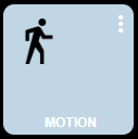
/* ==== Motion Sensor ==== */

#tile-5 {
  background-color: rgba(192,214,228,1) !important;
  height:120px;
  width:120px;
  left: -160px;
}

#tile-5 > div.tile-title {
  visibility: hidden;
}

#tile-5 > div.tile-title::after {
  visibility: visible;
  content: "MOTION";
  position: absolute;
  text-align: center;
  left: inherit;
  right: 0;
  bottom: 0;
  white-space: pre-wrap;
  color: rgba(255,255,255,1) !important;
  font-weight: bold;
}

/* Change the inactive sensor icon for one in file manager */

#tile-5 .he-motion-sensor:before {
  content: "";
  background-image:url("http://192.168.109.178/local/man-walking-to-right.png");
  background-size: 100% 100%;
  display: inline-block;
  position: relative;
  top: -20px;
  left: -23px;
  height: 42px;
  width: 42px;
}

/* Change the active sensor icon for one in file manager */

#tile-5 .tile-primary.active i.material-icons:before {
  content: "";
  background-image:url("http://192.168.109.178/local/man-walking-to-right_color.svg");
  background-size: 100% 100%;
  background-color: rgba(25,25,112,1) !important;
  display: inline-block;
  position: relative;
  top: -20px;
  left: -23px;
  height: 42px;
  width: 42px;
  border-radius: 50px;
  animation: pulse-animation 2s infinite;

}
@keyframes pulse-animation {
 0% {
   box-shadow: 0 0 0 0px rgba(250,128,114,1);
 }
    100% {
      box-shadow: 0 0 0 10px rgba(255,82,82,.10);;
 }
}
WINDOW/DOOR Contact Sensor - Nothing special here, moved a few things around and made the open sensor icon the same as the closed one, it also shakes for attention.
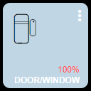
/* ==== Open/Close Sensor ==== */

#tile-6 {
  background-color: rgba(192,214,228,1) !important;
  height:120px;
  width:120px;
  top: -70px;

}

/* Color and move battery percentage */

#tile-6 .tile-tertiary {
  top: 95px !important;
  left: 102px !important;
  color: rgba(255, 82, 82, 1);
}


#tile-6 .tile-contents {
  font-size: 12px !important;
  top: -10px;
  left: -25px;
}


/* Closed */

#tile-6 > div.tile-contents > div.tile-primary.closed > i {
  color: rgba(0,0,0, 1) !important;
  position: relative;
  top: -8px;
  left: 0px;

}


/* Hide the original icon */

#tile-6 .he-contact_open {
  visibility: hidden;
}

/* The open door */

#tile-6 > div.tile-contents > div.tile-primary.open > i:before {
  visibility: visible;
  content: "\eb91";
  font-size: 42px !important;
  color: rgb(125,209,233) !important;
  background-color: RGBA(25,25,112,1);
  position: relative;
  top: -8px;
  left: 0px;
  border-radius: 25px;
}


#tile-6 .tile-title {
  visibility : hidden !important;
  bottom : 2px !important;
  font-weight: bold !important;
}

#tile-6 .tile-title:after {
  visibility: visible !important;
  content: 'DOOR/WINDOW' !important;
  position: absolute;
  text-align: center;
  left: inherit;
  right: 0;
  top: 10;
  white-space: pre-wrap;
}


#tile-6 > div.tile-contents > div.tile-primary.open {

animation: skewX-shaking 800ms ease-in-out infinite;
}

@keyframes skewX-shaking{
 0% { transform: skewX(-15deg); }
  5% { transform: skewX(15deg); }
   10% { transform: skewX(-15deg); }
    15% { transform: skewX(15deg); }
     20% { transform: skewX(0deg); }
      100% { transform: skewX(0deg); }
}
Hope you find this informative.
15 Likes
Could one of you kind folks run a test for me? The "Shade" Tile is not accepting colors for any of the states under the templates. Nothing custom just the regular Hubitat dashboard template color editor.
It's kind of weird.... And probably not working.... Maybe...
The colour settings seem to stick in that they are still (mostly) there when I go back into the Templates section. And when I changed the state colour in Templates for the state the shade was in, that took effect immediately on the dashboard behind the Settings dialog.
When I opened the Shade though, from the Dashboard, the tile reverted to the standard grey colour scheme. If I then refreshed the dashboard (while the shade was physically still opening), the colour went back to the previous states colour setting.
There could be something with the reporting of the status of the Shade, I'd confirm that is behaving as you expect, as as the Dashboard expects. I'm using the old Bond integration for mine.