I found a search discrepancy between List and Grid view.
List view will use your search qualifier looking at the "type" of device field while the Grid view doesn't search against "type"
I found a search discrepancy between List and Grid view.
List view will use your search qualifier looking at the "type" of device field while the Grid view doesn't search against "type"
Love the new UI - very clean.
One request, can the devices be controllable from the home tab? This looks like a perfect dashboard but you have to open each device to control it, would love to toggle by clicking on the icon.
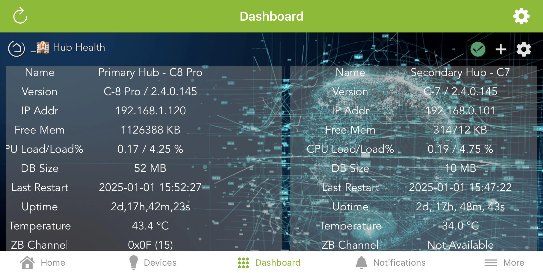
One thing nice I’ve just noticed with 2.4.0.145, is the average CPU utilisation seems to have dropped by about ~40% on both my C8 Pro and C7. ![]()
I'm blown away by the new UI. Great job y'all. It's everything I dreamed it could be. ![]()
Devices in room are not actionable if the room is selected from "Rooms." If the room is selected from Home the devices are available. I do see the add/remove function in "Rooms." The UI seems a bit confusing to me.
I just updated last night and overall I do really like the new UI. As others have noted, some things will take a short time to get used to but that's true for any large UI change. Yeah, I too want people to "get off my lawn". ![]()
I do have one "wish list" item however. I have a number of rules (Rule Machine app) and frequently add some details in the "Notes" field when building them. When I click on the "i" icon on the apps page I do get the fly-out showing all the details which is nice. The notes show in the "comments" setting but for some rules this requires a bit of scrolling to find. It would be nice if the comments could be displayed under the rule name at the top of the details fly-out.
Believe that is an intentional part of the design...
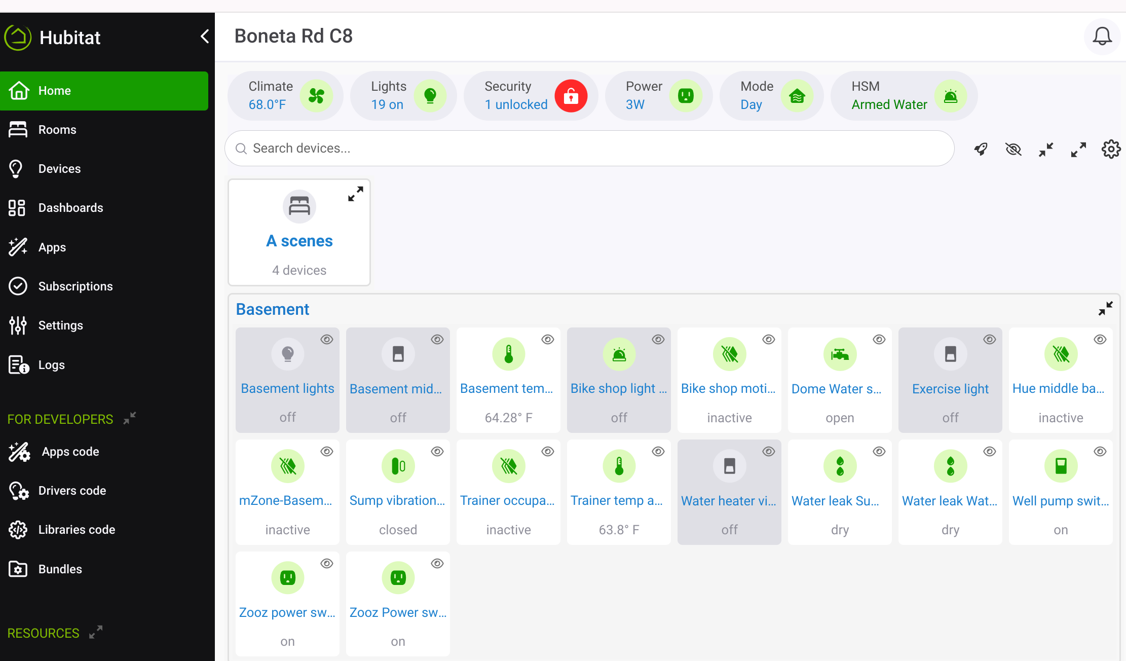
Selecting the room name allows you to see/edit what's in the room:

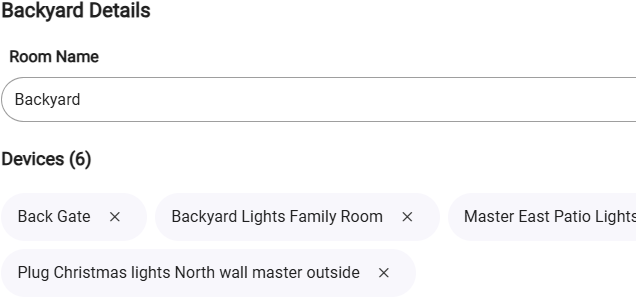
Selecting the room expand arrow, allows you to access/control the devices in the room.

Finally got sometime to update my 3 hubs to 2.4.0
Got to admit. The UI overhaul is a huge step forward.
Thank you Hubitat for this massive update!
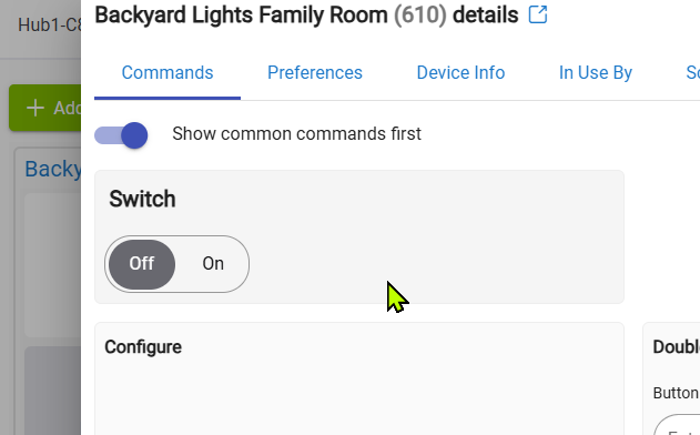
Ugh, the device tabs are a terrible idea. How utterly awful...
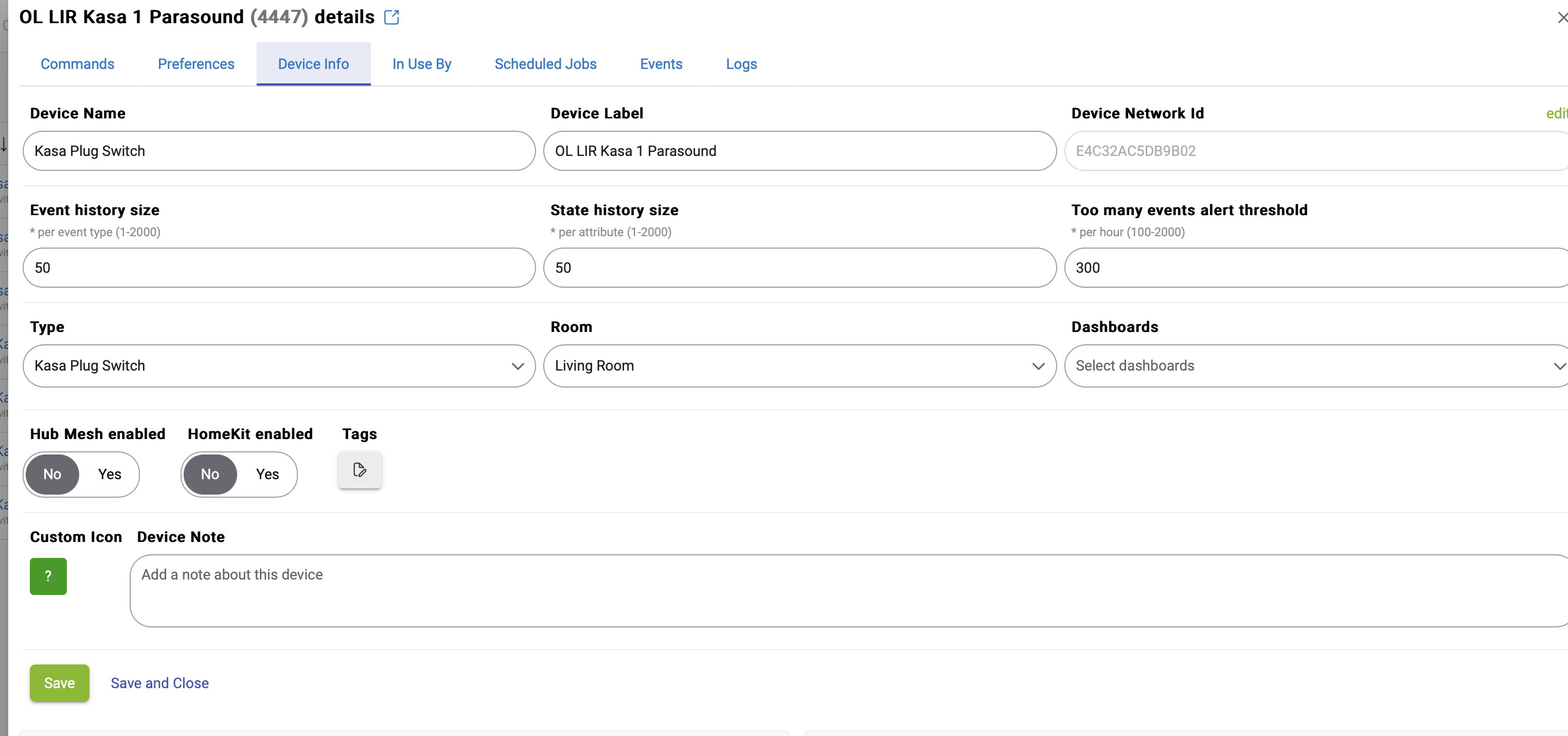
I now have to click 3 times where I used to not have to click anything at all. Could you please revert having Commands, preferences, device info and in use by on one page?
I assume you will get push back from folks who do now like this... Could you make it a switch, where I can determine in settings how I want to consume this?
You seem to be the only one who hates it.....
why do you like clicking more than you need to? Tabs make quickly configuring or changing devices much more cumbersome...
Especially on devices like Weather integrations, it allows me to jump directly to "Device Info" and "In Use by" etc, etc instead of scrolling half a dozen pages down. Even on devices without a lot of info, it lets me jump directly to the section of info I'm interested in.
So overall, the extra click makes it faster, not slower.
I am a bot. I get paid by the click.
That’s exactly the kind of mess I was expecting with a change like this.
Could we have a master switch” tabs on/off” please?
Just revert to the v2.3.9 UI until there's a need beyond the UI. Right now, that's the only big impact, unless you happened to have any of the devices added in v2.4
While I have only looked at the new UI briefly on my test/dev hubs, and I am mostly on-board with the new tabbed layout, I did wonder whether the tabs could potentially be displayed one after the other down the page, much like the old UI, perhaps with the logs and events still as separate tabs. I'm not saying I want it as such, just that it may suit some people to have the device detail laid out that way. I'm also not suggesting this to replace the new tabbed layout, only as an option for users to select, say in the hub settings, e.g. tabbed device details or single-view.
Sorry, but I now prefer the new UI over the previous as well...I can go directly to the content I need for the device w/a single click, rather than scrolling up/down a long page looking for stuff. Haven't done any timings of course so I don't know if the new UI is faster or not, but I've found that as my muscle memory relaxes from the old behaviors and gets used to the new ones, the new UI feels good/fast for me and I prefer a click to get to the area of the Device Details page that I want.
Of course this stuff is completely YMMV, and I expect most of us have felt your pain in other similar contexts, when a UI we use and are used to has been changed and we HATE IT!! ![]()
But in the end, HE is not going to go back on this change, and they aren't going to offer a old UI/new UI switch. They have shown they are willing to listen to suggestions, and have responded w/a lot of changes & improvements. If you can identify adjustments to the new UI that would help improve its usability for you and others, they could get adopted and you might be end up happier (or at least little less disappointed) about the new UI. ![]()
I just spent an hour putting all my 200+ devices into rooms - I'd never done that before, because the old UI made it too hard. The new UI made it much easier and less painful.
Are there things that could be improved, sure, but overall I'm also really happy with the improvements and direction of the new UI/UX.
![]()
You could add devices to a room in bulk before, from memory, it was never something you could only do just from the device detail page. That said, if it is now easier, happy days...![]()
Download the Hubitat app