Anyone able to update to 2.4.0.145? I keep on getting "Downloaded failed". I tried after rebooting the hub too
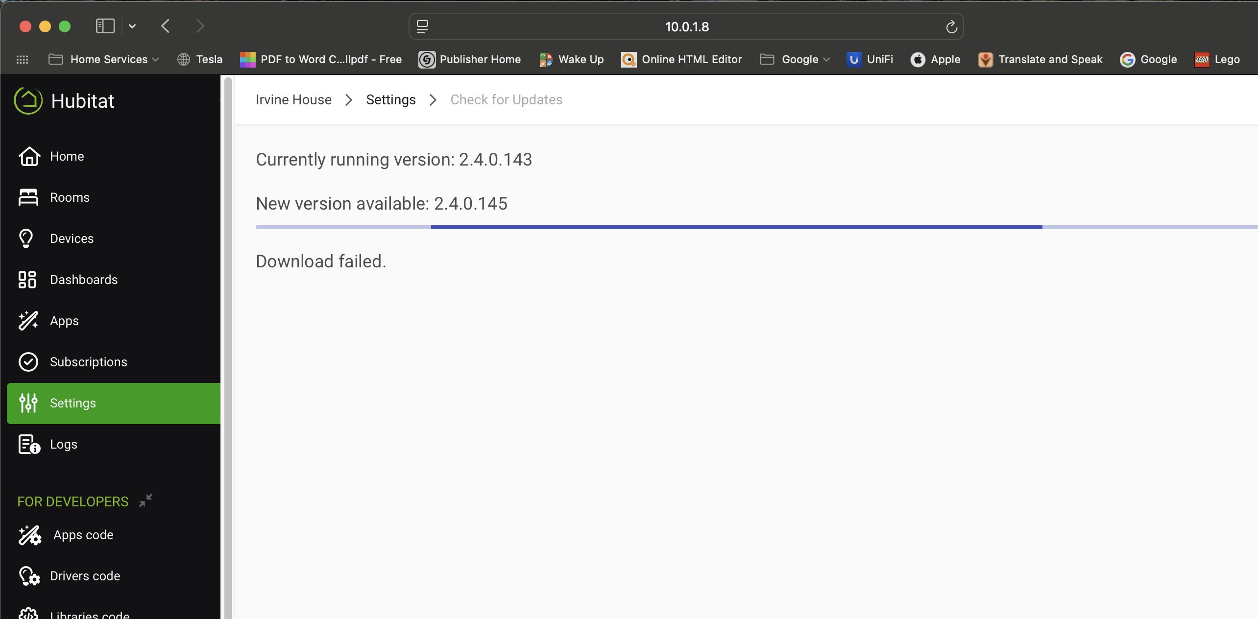
I updated about 5 hours ago without issue
Try changing your network speed settings to the opposite of what they are now.
2 Likes
I had the same problem, so I changed the ethernet setting from Fixed 100 to auto-negotiate, which worked as @dJOS mentioned.
2 Likes
@bobbyD One change that IMO would be nice on the Device pages (when on a landscape display), is to use 2 columns instead of 3 on Commands tab and have Current States and State Variables appear side by side under the commands list (or just 2 columns under the commands list and keep 3 columns for the commands).
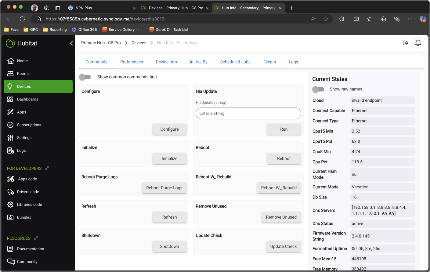
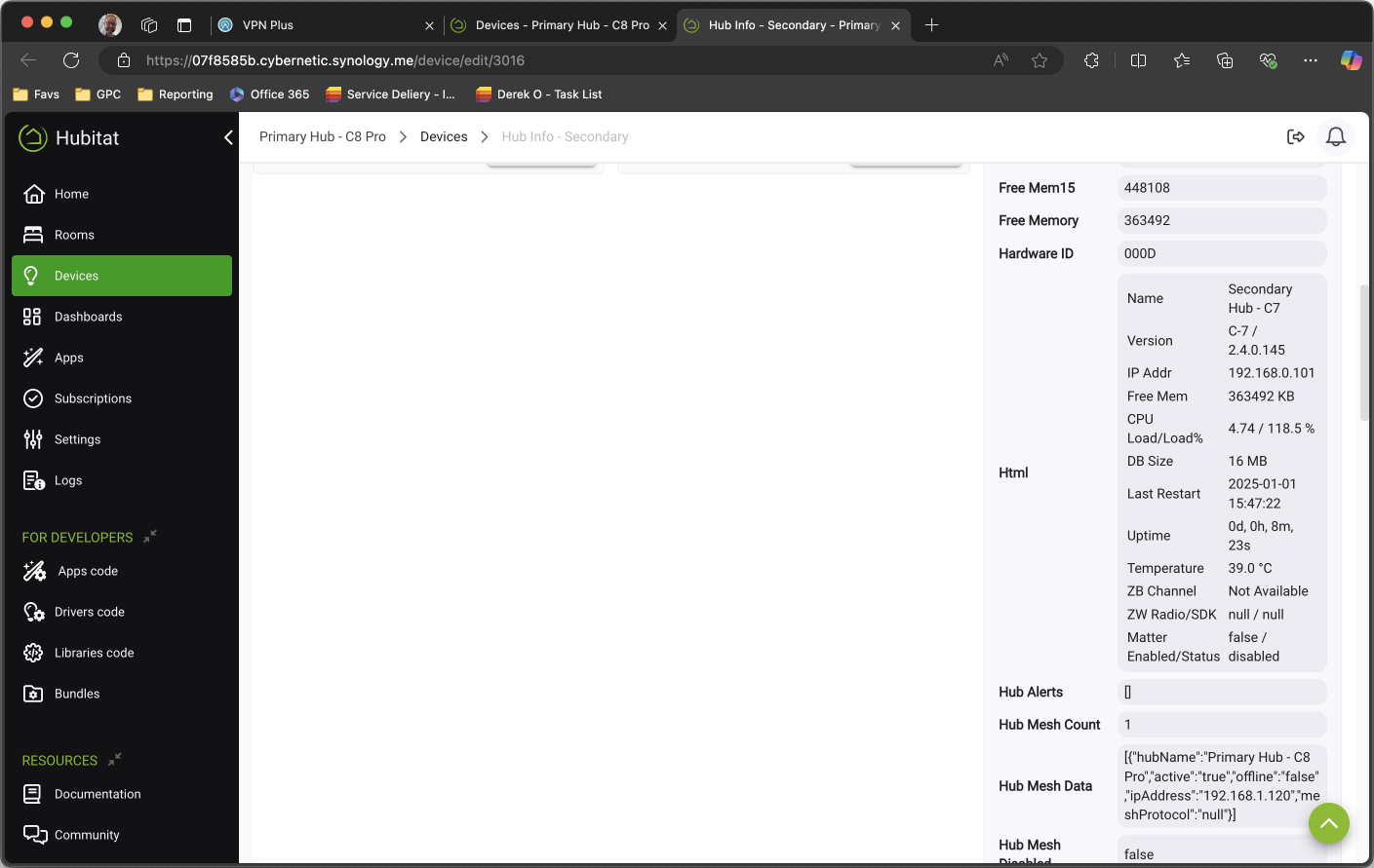
This would be really nice, particularly for many Custom devices, that contain a lot of data and HTML tiles - a good example is Hub Info and Weather Service integrations. Currently, there is still a lot of scrolling and wasted white space. Two wide columns would likely enable better information density and reduce scrolling.
/2.5c
1 Like
thanks. that fixed it.
1 Like
To be fixed in the next build.
I see a point... probably a toggle like Show common commands first.
Don't expect it to be per device, though ![]()
6 Likes
I was thinking this would be a global change to the devices page. Many of the community devices would be much more legible if the current state and state variables were down in two columns under the command section.
I prefer having the attributes/states at the top, as most of my visits to Device pages are to check the attribute and state values. I would vote for the commands under the attributes/states or split (commands left, attributes/state right). At least with a toggle, as you mentioned, attribute-loving folk don't have to scroll to find the device's current values.
1 Like
TBH, I think commands are in the grand scheme of things, more important, especially when setting up new devices.
1 Like
This is a good topic about user preferences, probably a fun thread by itself ![]() When joining devices, I first check for expected attributes to ensure that it joined properly ... before issuing any commands. I rarely run commands from the Device page, as my automations execute them. However, I check attributes often, taking in the full picture, especially if something doesn't seem right.
When joining devices, I first check for expected attributes to ensure that it joined properly ... before issuing any commands. I rarely run commands from the Device page, as my automations execute them. However, I check attributes often, taking in the full picture, especially if something doesn't seem right.
1 Like
![]()
![]() time!
time!
1 Like
I guess what I'm trying to say is that for newly installed devices, the first thing most ppl will do is test them to make sure they work by pressing the command buttons. Hence from a UX PoV, having the commands first is the most logical option, even if they dont get used a lot after that. eg test a light bulb to ensure it turns on/off and dims etc

I spent a few years as an IT Business Analyst/Project Manager working with internal customers to redevelop legacy internal applications in Oracle AppEx - it was an eye-opening experience that I'd like to think has given me a good appreciation for UI/UX and workflow design. There's rarely a perfect solution, mostly you settle on a "makes the most sense for most use cases" solution.
I think I found a UI bug. At the bottom of the tabs for a device are two options, one for devices and one for rooms. Either of the links take you to the appropriate page but you lose the navigation menu at the top.
Using latest non-beta release of Chrome on Android 11 & firmware 2.4.0.145 on a C5.
Same experience with latest production version of Firefox.
Latest version of Edge has more severe issues. The entire bottom of the page is covered and the links (and other buttons) are inaccessible.
2 Likes
Hmmm, I can only replicate this partially on my C7 and C8 Pro using .145, and only on my iPhone (Mac and iPad are fine).
For me, it only happens when I select "Rooms", Devices doesn't behave the same way which is odd - Im on iOS 18.2.
My wife is using her Apple devices so I can't check but it appears to be a mobile browser issue. Chrome is fine on the laptop using Linux lite.
Agreed, I was using Safari and could reproduce it - one thing I forgot to test on my phone was landscape mode.
EDIT: yep it still happens in landscape mode on my iPhone - interestingly, I had the issue happen on both the Rooms and Devices links in Landscape.
1 Like
Landscape is the same for both rooms and devices with the addition of the bottom row being almost entirely cutoff. I used stylus to click the links.
1 Like
It looks like this bug can occur when exiting out of Apps too. Eg this is after exiting from Hubitat Package Manager.
1 Like
I've seen this one too I just had not pinpointed what I did. I'm sure we are going to find latent bugs for quite some time.
1 Like

