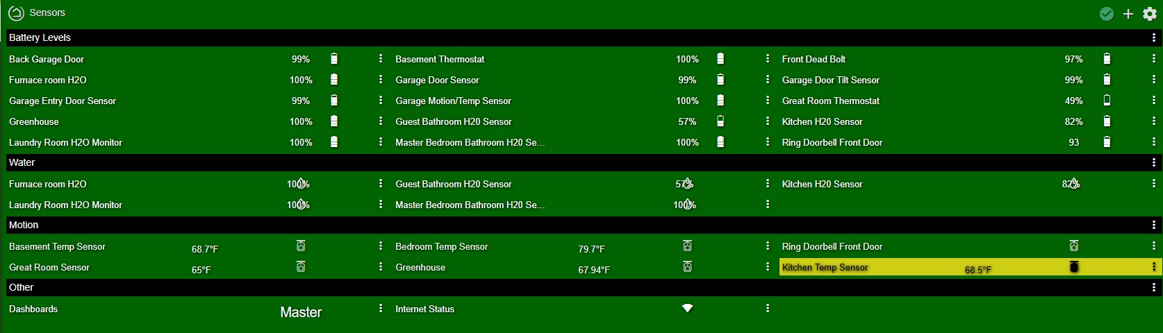
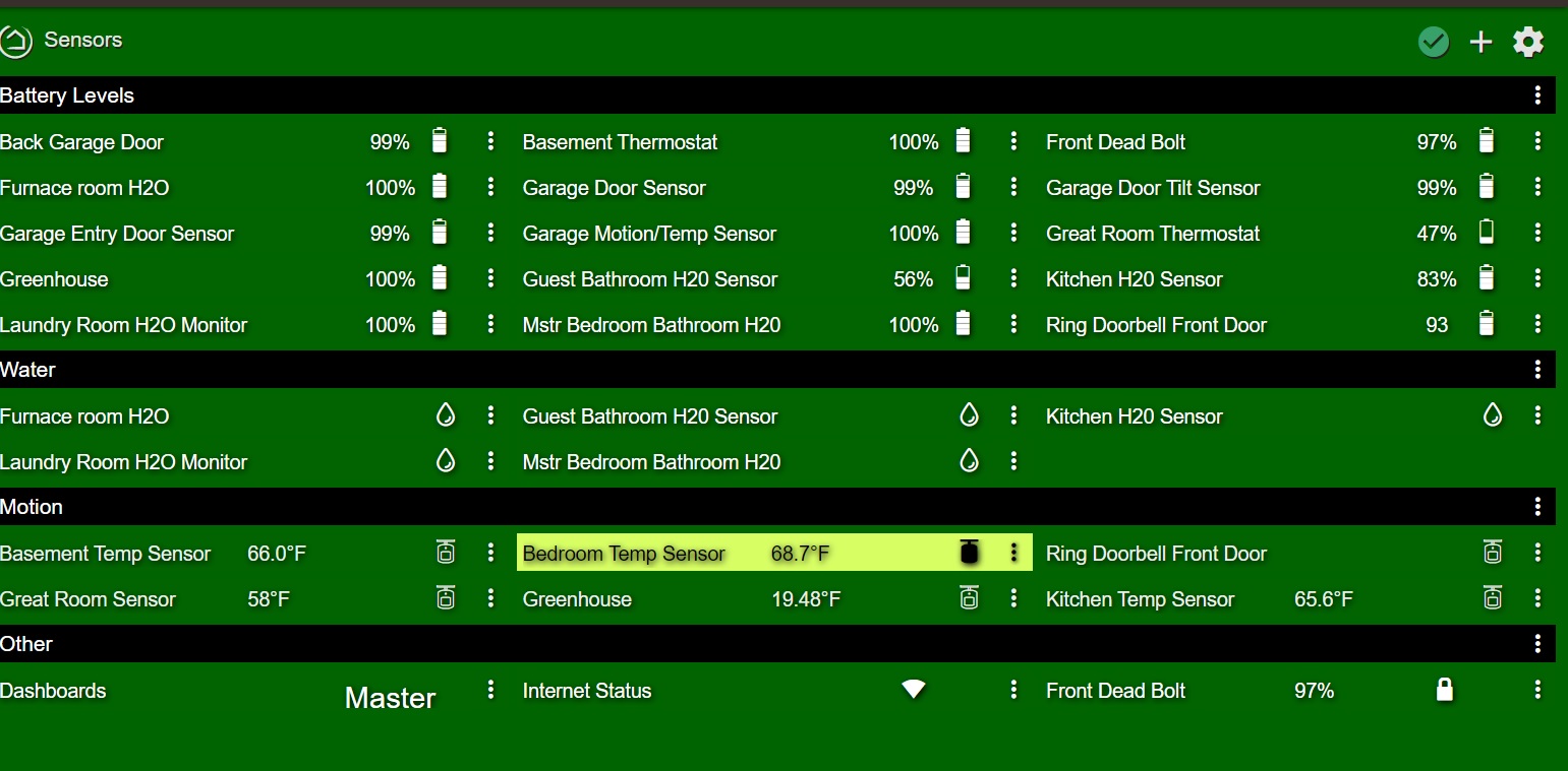
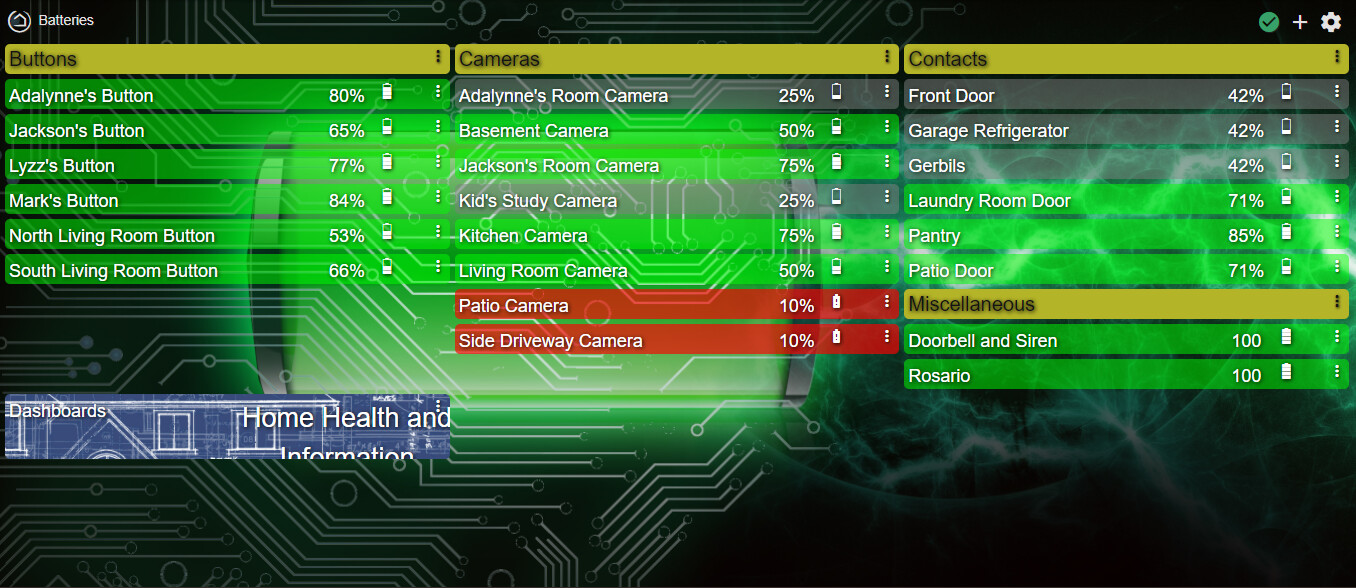
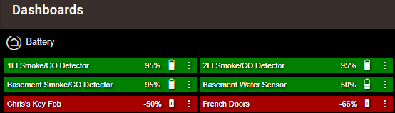
I recently had a few batteries die so I wanted to check out the status of my other devices. Since I bought a bunch more gadgets on ebay recently it was time to create a new Battery dashboard. I wanted the info to be more of a tabular layout so here was my solution. As an added bonus it looks pretty nice on the mobile browser too.
Disclaimer. This was the first time I've worked with CSS so this was a learning experience. Credit to @rocketwiz for the inspiration here: The Noob’s (in)complete guide to CSS for Hubitat
Here are the step by step instructions
- Start a new dashboard
a. Note: A narrow browser window before clicking Add will produce a 2 or 3 column dashboard which saves time re-arranging. Full screen gave me 4 columns.
- Press Dashboard Builder at the top-right of the dialog box
- De-select all of the boxes except for Battery
- Click Build My Dashboard
- Configure the dashboard.
a. Grid: icon size 16, grid gap 5.
b. Options: Column width 250, Row height 25, Hide tile template names.
c. Advanced, CSS: Copy/paste CSS code below. Save CSS.
I don't recommend mixing in other tile templates, only the battery icons/labels look right.
Personal preference, I left the 3-dot menus visible but if you get rid of them you can tweak some of the % values in the code to slide the icons and labels to where you like.
/* This should work for a dashboard of only battery tiles. 1 or 2 columns look best. */
/* Set tile Width of 250 to 300 and Height of 25. Hide tile template names. */

/* Move the device name up and to the left */
.tile-title {
  position: absolute;
  top: 4px;
  left: 4px;
  text-align: left;
}
/* Move the icon and icon label halfway across and at the top */
.tile-contents {
  top: 4px;
  left: 47%;    /* Change this to slide the icon and label left-right together */
  height: fit-content;
  width: 60%;   /* and/or change this to slide the icon and label left-right together */
  padding: unset;
}
/* Move the 3-dot menu up and shrink it down a little */
.tile-edit {
  top: 0px;
  font-size: 16px !important;
  transform: scale(0.75,0.75)
}
/* Modify the position of the battery icon. */
[class*=" battery-"] {
  position: unset;
  top: 0px;
}
/* Find the 'i' tag that is a child of the battery icon and re-align */
[class*=" battery-"] > i {
  position: absolute;
  left: 62%;   /* Change this to slide just the icon left-right */
}
15 Likes
This is really nice, a good clean concise way to see the battery data without having to run user code and risk a slow down.
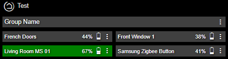
Thanks for CSS code. Looks great, but I am wondering if there is a way to also format some text boxes on the dashboard also? I am wanting to group devices by type and have a text box above the group for the description. The text tile is getting formatted with text being centered and I want it left aligned and also a slightly smaller font size.
Challenge accepted! 
This one affected the menus and the options window, so I had to get creative. The only new part is the text-tile part at the top. Everything below that remains the same.
/* This should work for a dashboard of only battery & text tiles. 1 or 2 columns look best. */
/* Set tile Width of 250 to 300 and Height of 25. Hide tile template names. */

/*TEXT TILE*/
/* This uses the * (grandchild) selector to isolate the justify-center class of the text-tile */
[class*=" text-tile "] * .justify-center {
  padding: 0px 0px 0px 4px !important;  /*top right bottom left*/
  justify-content: unset;
  font-size: 14px !important;
}
/*BATTERY TILE*/
/* Move the device name up and to the left */
.tile-title {
  position: absolute;
  top: 4px;
  left: 4px;
  text-align: left;
}
/* Move the icon and icon label halfway across and at the top */
.tile-contents {
  top: 4px;
  left: 47%;    /* Change this to slide the icon and label left-right together */
  height: fit-content;
  width: 60%;   /* and/or change this to slide the icon and label left-right together */
  padding: unset;
}
/* Move the 3-dot menu up and shrink it down a little */
.tile-edit {
  top: 0px;
  font-size: 16px !important;
  transform: scale(0.75,0.75)
}
/* Modify the position of the battery icon. */
[class*=" battery-"] {
  position: unset;
  top: 0px;
}
/* Find the 'i' tag that is a child of the battery icon and re-align */
[class*=" battery-"] > i {
  position: absolute;
  left: 62%;   /* Change this to slide just the icon left-right */
}
2 Likes
Thank you very much for your work. Everything looks great now!
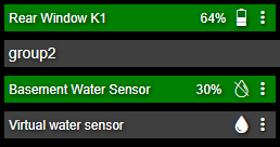
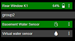
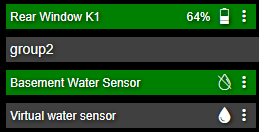
Is there a chance you could work on the water
The battery percentage is not really neccessary but it would be nice to line up the icons.
Hi, sure thing. Here's what I came up with. Hopefully this won't interfere with other device type layouts.
If you'd like the water icons in the same column as the battery icons, this should work.
/* Modify the position of the water sensor icon. */
.tile-primary.dry {
  position: absolute;
  left: 20%;
}
.tile-primary.wet {
  position: absolute;
  left: 20%;
}
If you'd like the battery % hidden since it's already showing up in the Battery Levels, then you might want to only add this. My guess is that other tiles having Secondary data will disappear too, without extra work or specifying this css by specific tile numbers.
/* Hide the tile secondary text. */
.tile-secondary {
  visibility: hidden;
}
And if you want just the icon and be lined up with the battery icons, add both of the above.
If you want to move your motion sensor icons, you can also add active/inactive.
/* Modify the position of the motion sensor icon. */
.tile-primary.inactive {
  position: absolute;
  left: 20%;
}
.tile-primary.active {
  position: absolute;
  left: 20%;
}
And those motion sensor temps are setting off the OCD. Bumping up the tertiary box should line them up.
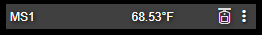
/* Move the tertiary text up a little bit to fix motion sensor. */
.tile-tertiary {
  top: 0px;
}
3 Likes
Wow, Thank you for your help.
2 Likes
I'm loving this set up!
Question: I have this dashboard accessed through a link in my main home info dashboard....
...once in the batteries dashboard I would like to have a "back" link which you can see here but I can't seem to apply my normal tricks of hidding the contents and changing the title from "Dashboards" to "Back".
Maybe stacking a transparent dashboard link over a text box that says Back? Check this thread:
Custom CSS to Remove Dashboard Link Name
2 Likes
The "Dashboard" text is accessible through the .tile-title class, and the name of the dashboard is under .tile-primary so one way of changing it to read "Back" (changing "20" to match the tile ID):
#tile-20 .tile-primary {
  display:none;
}
#tile-20 .tile-title {
  font-size:0px;
}
#tile-20 .tile-title::before {
  font-size:12px;
  content:"Back";
}
2 Likes
This is awesome!
Question: how do I get the color of the tile to reflect the battery level?
I notice that one of my tiles shows battery at 37%, and it is grey. Others are green.
Are the colors customizable? Could not find in the code.
There are 2 classes that can be used to do some customization, the more specific is at the the tile-primary level and is changed to match the actual level reported, ie battery-27 or battery-98...
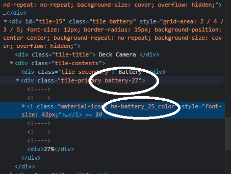
The other is interval based, i.e. he-battery_25_color, he-battery_50_color...
Thanks for the reply.
Ok, this is WAY above my skill set.
Where do I find the actual tile entries?
And how do I go about adding this?
If you click on the 3 vertical dots on the tile it will bring up the Tile Edit dialog, the tile ID is in the upper left of that. Clicking on the dashboard cog wheel and then Advanced | CSS will bring up the CSS entry screen.
I’d suggest creating a test dashboard where you can play a little, and try things first without impacting your “production” dashboards.
Other than that keep coming here and asking questions, it won’t be too long before you’ll be an expert.
3 Likes
Oh ok, see I was using "hidden" for the tile title and it looks like you are basically shrinking it till it's not visible. That seems to have worked for me. Thank you.
Thanks for replying.
I still don't get it.
Not sure where to start.
Is this being changed under CSS or JSON?
Well here's something unexpected. I have that back button formatted perfectly but it now no longer works as a link because apparently only the primary contents of the tile are the actual functioning link. Strange.