Show Off Your Dashboards!

wow what switch is this ?

I know this doesn't compare to other dashboards around here but this is my meager attempt at a house wide consolidated Alexa music control dash with the Smartly touch. Not super practical as I can tell Alexa to do the same thing, it was more of an enhanced dashboard creation exercise, passing variables between RM rules, etc. Right now it's setup to be able to select the music service and the Artist to search for then play on whatever Alexa is chosen. The album and song displays below the audio controls and it all actually works. :stuck_out_tongue:

4 Likes

Looking for some ideas to slim down my motion sensor tiles. Anyone have any slick looking tiles to show off?

I used float:left on the device image and was able to slim my contact sensors:

Here is my custom CSS:

.tile.window .tile-title {
font-size: 11px;
}

.tile.switch .tile-primary .material-icons, .tile.door .tile-primary .material-icons, .tile.contact .tile-primary .material-icons, .tile.motion .tile-primary .material-icons, .tile.window .tile-primary .material-icons {
float: left;
padding-top: 0px !important;
}

.tile.switch .tile-primary, .tile.door .tile-primary, .tile.contact .tile-primary, .tile.motion .tile-primary, .tile.window .tile-primary {
font-size: 20px;
}

.tile-primary>div {
margin-top: 0;
}

.tile.switch .tile-tertiary, .tile.door .tile-tertiary, .tile.window .tile-tertiary, .tile.contact .tile-tertiary, .tile.motion .tile-tertiary {
left: 40px;
}

5 Likes

Probably not what you want to hear, but you could use a 3rd party app that only displays the sensors that are actually active.

Here's an example of Homekit on iOS.

2 Likes

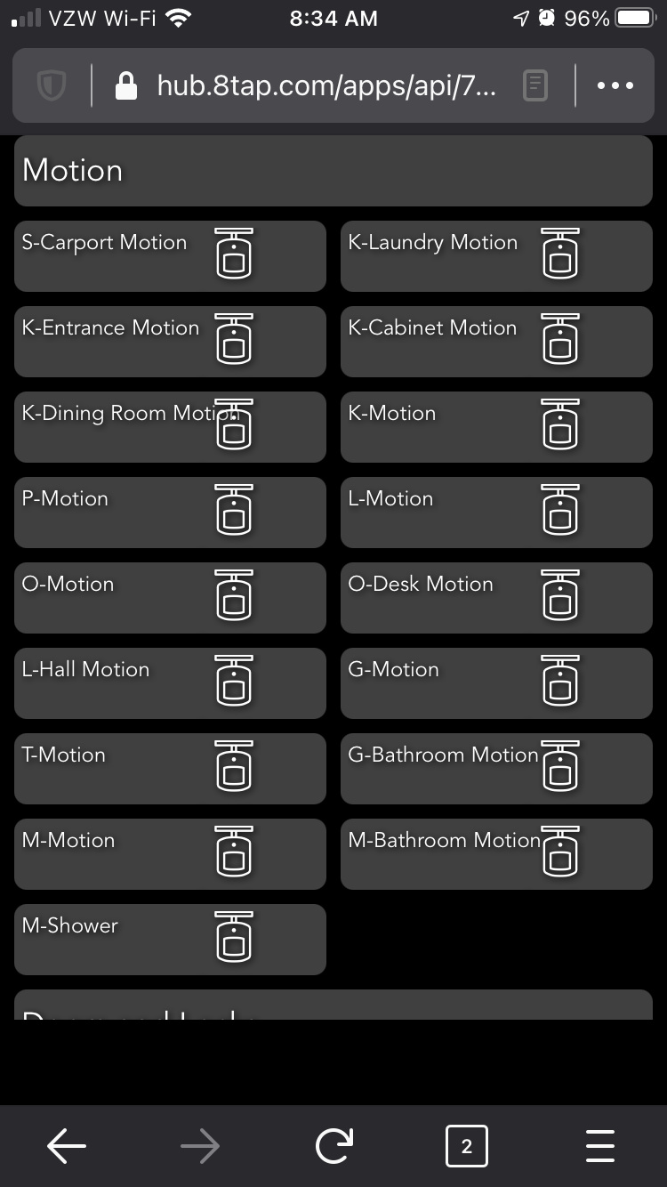
I used the battery hack listed here

1 Like

Mine are like this:

image

I have quite a bit of custom CSS but following is what I think is relevant. My dashboard changes sizes, so I can use the same one on my PC and my tablets, and everything scales. That's what attributes like font-size: 2.25vh; are for. I use color/icon to differentiate open/closed, so I got rid of the text. I just have location + icon + color, and battery % for battery-operated sensors.

.tile.dashboard > .tile-title {
  display: none;
}

.tile-contents {
  padding: 0;
  display: table;
  width: 100%;
  height: 100%;
}

.tile-title::after {
    visibility: visible;
    position: absolute;
    text-align: center;
    left: inherit;
    right: 0;
    bottom: 0;
    white-space: pre-wrap;
}

#tile-44 .tile-title, #tile-46 .tile-title, .tile.motion .tile-title, #tile-35 .tile-title, #tile-35 .tile-title, #tile-29 .tile-title, #tile-16 .tile-title, #tile-37 .tile-title, #tile-33 .tile-title, #tile-2 .tile-title, #tile-1 .tile-title, #tile-17 .tile-title, #tile-31 .tile-title, #tile-51 .tile-title {
    visibility: hidden;
    white-space: nowrap !important;
    overflow: unset;
}
#tile-1 .tile-title:after {
    content: 'Porch';
}
#tile-2 .tile-title:after {
    content: 'Kitchen';
}
#tile-16 .tile-title:after {
    content: 'Basemt';
}
#tile-17 .tile-title:after {
    content: 'Flood Lights';
}
#tile-29 .tile-title:after {
    content: 'Liv.Rm';
}
#tile-31 .tile-title:after {
    content: 'Basemt';
}
#tile-33 .tile-title:after {
    content: 'Fam.Rm';
}
#tile-35 .tile-title:after {
    content: 'Din/M.Ba';
}
#tile-37 .tile-title:after {
    content: 'Sunrm';
}
#tile-34 .tile-title:after {
    content: 'Motion';
}
#tile-47 .tile-title:after {
    content: 'Entry';
}
#tile-48 .tile-title:after {
    content: 'Mudroom';
}
#tile-49 .tile-title:after {
    content: 'Upstairs';
}

div {
    font-size: 2.25vh;
}
.material-icons {
    font-size: 5vh !important;
}
.material.icons {
    font-size: 4vh !important;
}
.tile-tertiary {
    font-size: 2vh;
}

.closed > div {
    display: none;
}
.open > div {
    display: none;
}
.motion .tile-primary > div:nth-child(2) {
    display: none !important;
}
.smoke .tile-primary > div:nth-child(2) {
    display: none;
}
1 Like

I'm glad that worked out well even though my concept was just for battery levels originally. You might be able to scale down the image if you really wanted to minimize the tile footprint.

Worked perfect for my use case. I have automated pretty much everything. Now with SSL support I am starting to put up some local dashboards. The CSS has made what I do use much better.

By any chance could you tell me how you set this up? Like the Tiles for searching and selecting provider and such?

Sure, I'll send something later tonight after work and my honey-do list is over :slight_smile:

Hi @derge,
I started off creating 3 global variables with connectors as 'variables' so they can be attached to a tile on the dashboard.

ArtistSearch - String for, well, the name of the artist to search for :slight_smile:
iMusicSource - Number(Integer) representing the Music provider selection (Amazon, Pandora, or iHeart), this is used on the dashboard as a variable number entry
sMusicSource - A string for the name of the music provider. Amazon, Pandora, iHeart, this is used as a display only tile.

I used the number as the selection to avoid issues of misspelling, capitalizing, etc, I used the string for display and in the conditional statements. This sets the sMusicSource based on the iMusicSource selection.

I select the provider (iMusicSource as a Variable number tile) and the artist (ArtistSearch as a Variable String tile) then press the button associated with the echo you want to play on.

I created a virtual button with as many buttons as amazon echoes, I have 6 echoes so I have a virtual button called pbSearchArtist with 6 buttons. Those are the 'Play on...' button tiles. The remaining tiles are a music player tile for each echo, and attribute tiles for the album cover, artist, and echo status.

Each button is the trigger for an RM rule like this one... (I default to Pandora if nothing else matches)

The searchAmazonMusic, searchIheart, and searchPandora (among others) are all available as custom commands. In the actions select 'Run Custom Action', select the echo you want then select which search... command you want to use. Then use the %ArtistSearch% global variable as the search string required by the action.

That's pretty much it. I spent almost as much time tweaking the tiles, also more for practice.

Hope that helps.

1 Like

Wow thank you for the write up. I'm going to set this up.

No problem, good luck. Be sure to run the dashboard thru Smartly to make it look sleeker. :grinning:

1 Like

Any way to use a slider to adjust thermostat set points?

If you created a virtual dimmer, then created a rule on change of that dimmer that does some math translating 0-100 on dimmer to range of temperature you want for thermostat. I use a virtual dimmer to control color temperature bulbs using node red to preform logic but I don't see any reason Rule Manager can't perform same logic.

EDIT: OR something like this but use thermostat setpoint:

2 Likes

I used a rule for that back before Alexa supported thermostats.

In Pseudo:
If Dimmer Changed > Change Set point to Dimmer Level


I’m about to tinker with Homebridge. Meanwhile, happy with the dashboard styling so far. I’ve added custom css to:

  • change tile backgrounds to use webkit’s background blur and saturate (and picked my own tile colors)
  • soften the drop shadows on text significantly
  • reduce opacity on the "more" icon, customized the weather widget to put more focus on temperature
  • tweak header styling in small ways and use a background image from Unsplash

Anyone ran into an issue where any tiles added after the Mode tile was added show atop the mode selection modal? I seems like background filters are interacting with the layout in a bad way.

I wish the tiles on the far right weren’t cut off before the edge of the screen, creating a weird margin at the edge when the dashboard needs scrolling.

3 Likes

This sounds like a grid settings issue. I documented the process in my Guide to HE Dashboard write up. I have reposed the applicable section below. Make sure your grid has been adjusted to allow for enough space to add additional tiles where needed, and not on top.


Grid Columns and Rows

The amount of columns and rows available on the gird is set in the Options (gear icon). This comes in mostly when adding new tiles. The system will automatically chose the next tile location given the settings below.

When adding a new tile, be sure you are placing it's location on a green tile. If you see a blue tile, that means you will be overlaying an existing tile (shown below). If no more green tiles are available you will need to adjust the grid settings above.

The system will allow you to place tiles outside the grid setting, so this is not a limitation. It's just very helpful when placing new tiles to make sure they do not overlap, making it harder to adjust afterwards.


Using smartly you can add your mobile devices (both portrait, and landscape) to the calibration section and it will size your dashboard correctly. smartly will create a custom CSS entry for each of your device. My iPad calibration (I only use landscape since it is mounted) looks like this....

@media screen and (max-width: 1024px) and (min-width:1020px){.dashboard{zoom:0.94;}}

With that code in the CSS my screen is perfectly sized with no tiles bleeding over the edge. Since smartly makes lots of other changes to your dashboard, I do NOT recommend you run this dash thru it (not without a good backup first). Instead I suggest you create a new dash (copy the current JSON if you want) and run that "test dash" through smartly. Pick all your devices for calibration. Apply the smartly changes to your "test dash" and see how it looks. If you like the format, but not the other smartly changes copy the @media screen lines to all your new dashes for the calibration to remain.

All and all a very good start!

Recently converted from ST to HE, this is on my Samsung :woozy_face: smart fridge, I modeled it after my ActionTiles layout I previously used.

18 Likes