Will the UI ever get better?

,

I'm going to try and stay positive with feedback but it's going to a difficult. I've been using Hubitat since late 2019. I think the hardware is really solid and everything I was hoping for: Zigbee and Z-Wave, local first, etc.

But the web UI back in 2019 felt very alpha and had the sort of weird UI bugs you'd expect from a barely used OSS project from the early 00s or maybe a quick initial version while developers focused elsewhere.

It was bad enough that I immediately connected it to a different smart home device with a professionally designed interface that others in my house could use. I only ever used the web UI and its native app wrappers if I absolutely needed local access.

Now, I admit I might be biased as a professional software engineer who does work specifically in web UIs but I came back today to see if things had improved only to find it was as bad as ever.

Some of the issues are just basic CSS layout woes that could be solved with judicious use of flexbox or grids. Some are issues that would be greatly helped by a designer. And some are basic web app development techniques you'd learn doing an intro to Next, vue, Ember, etc.

I'm confused about why these issues are still present in a commercial product.

Some examples:
CleanShot 2023-09-24 at 15.57.44

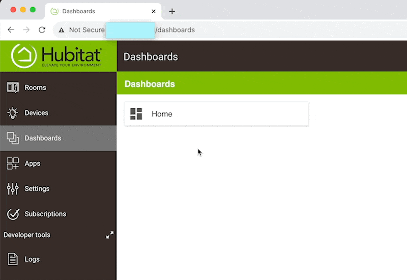
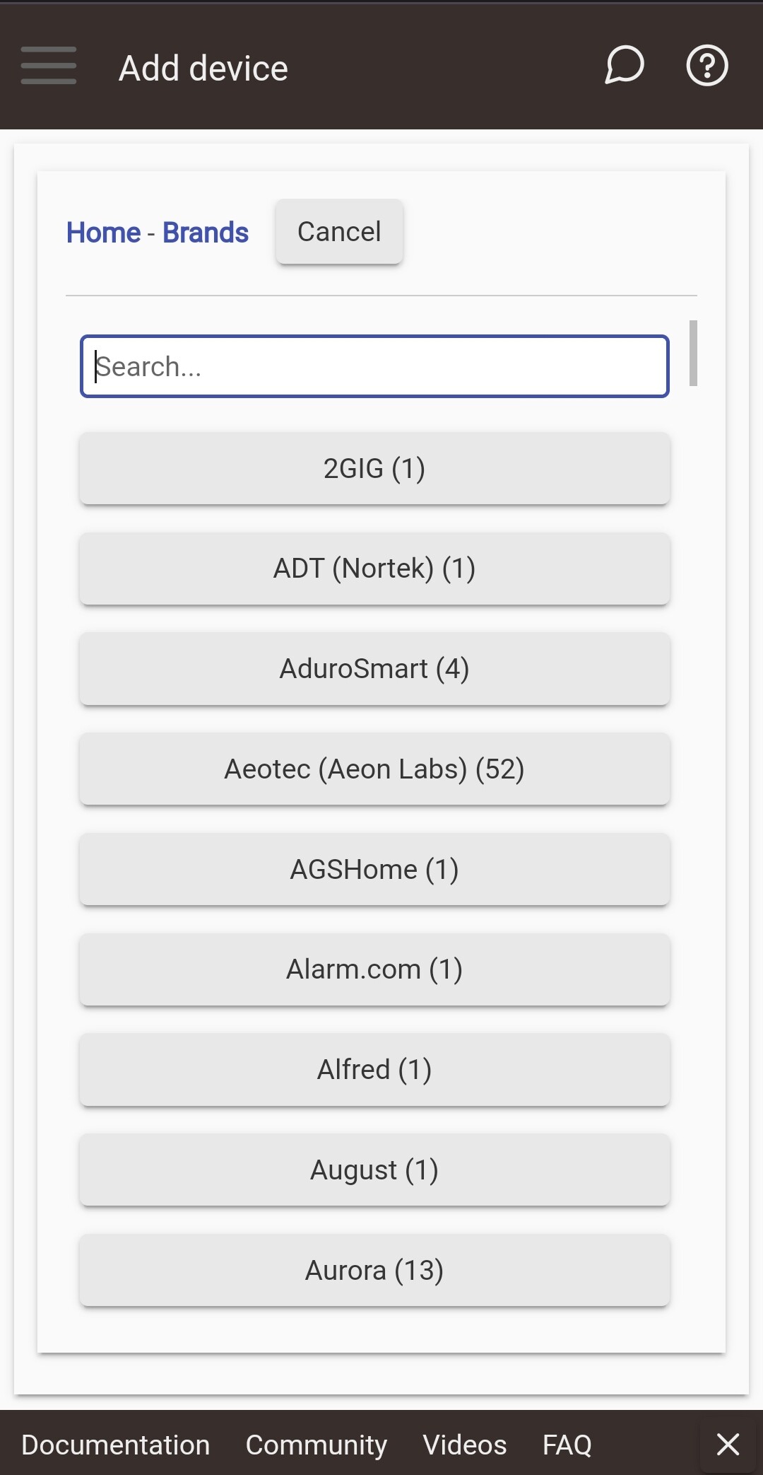
The dashboards screen is using iFrames. Unsure about what technical decisions went into this but the effect is that viewing a dashboard lacks a fixed URL and a reloading while viewing a dashboard takes you back to the list of dashboards. If you're clever enough to view source you can get access to each dashboard's unique url, but you shouldn't need to enter cheat mode to get basic web functionality.

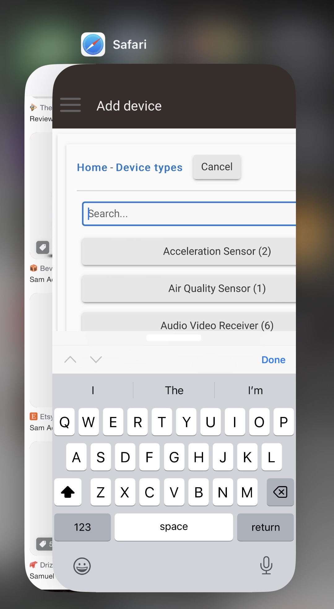
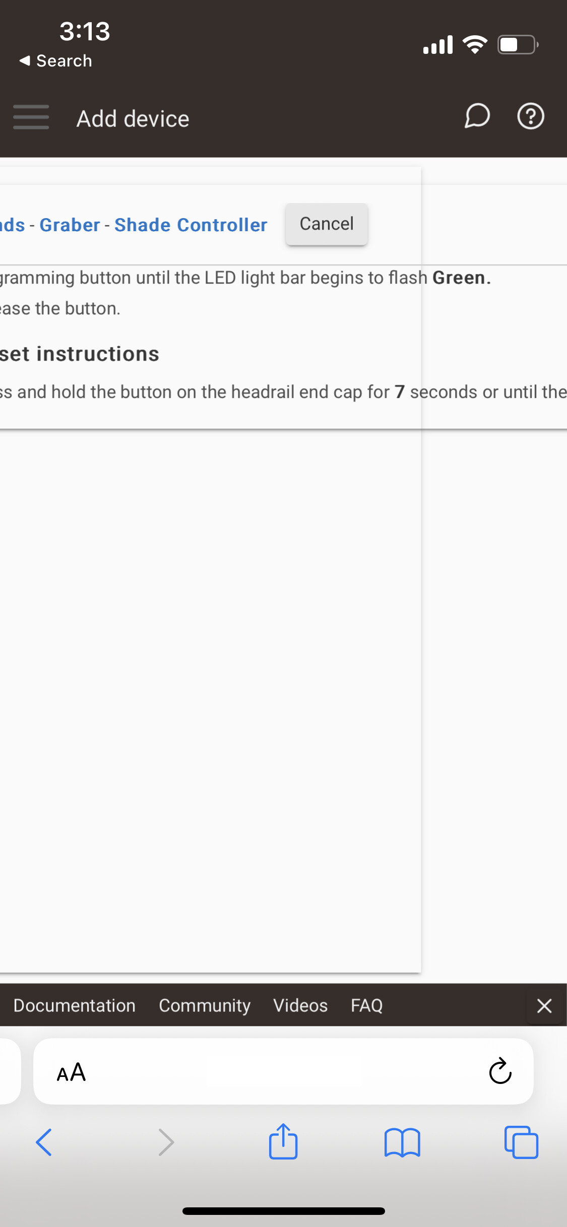
Within a dashboard, it doesn't get much better especially using the a mobile browser where the layout just doesn't work and adding devices is a chore of manually zooming the page around


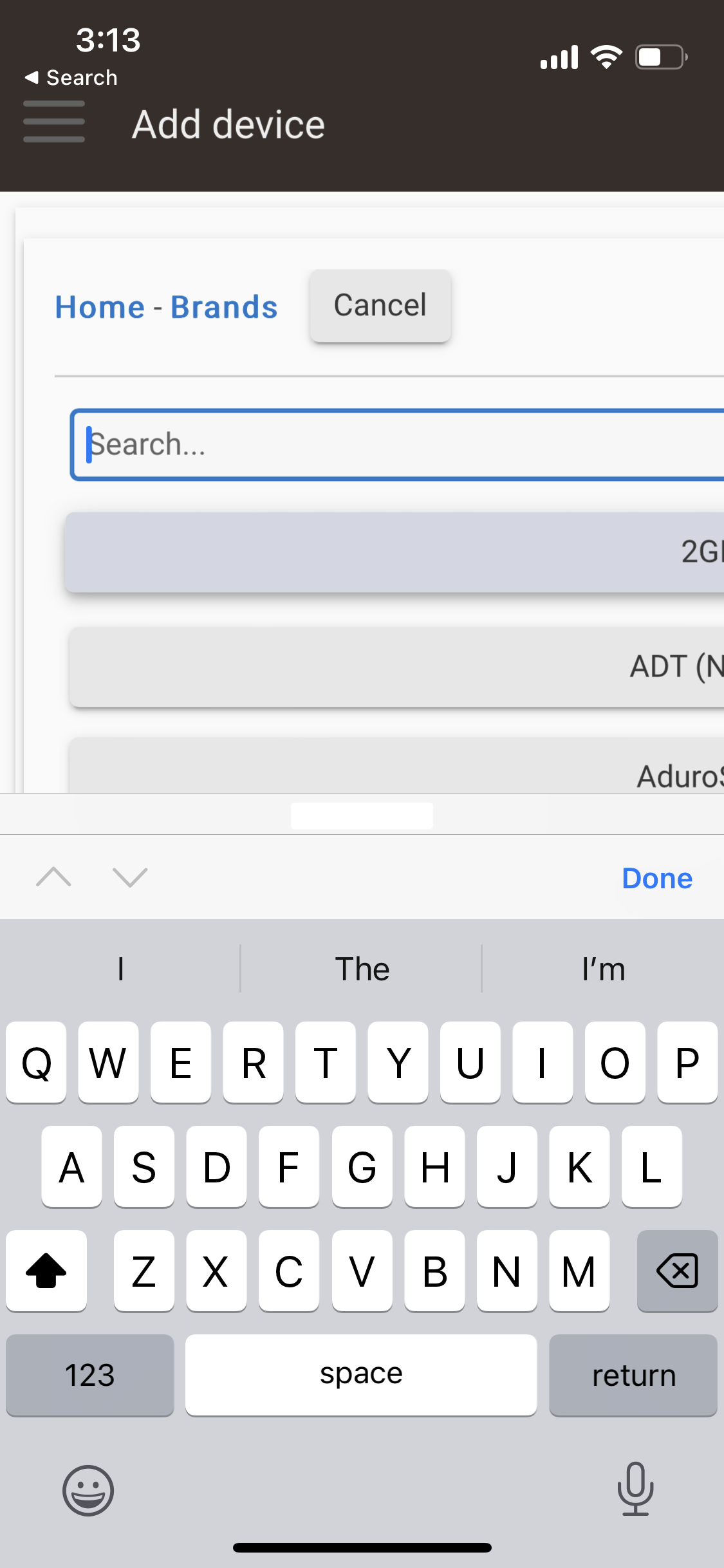
These are not complicated issues to resolve. It's just simple HTML meta tags. I'm perplexed how this is still a bug!

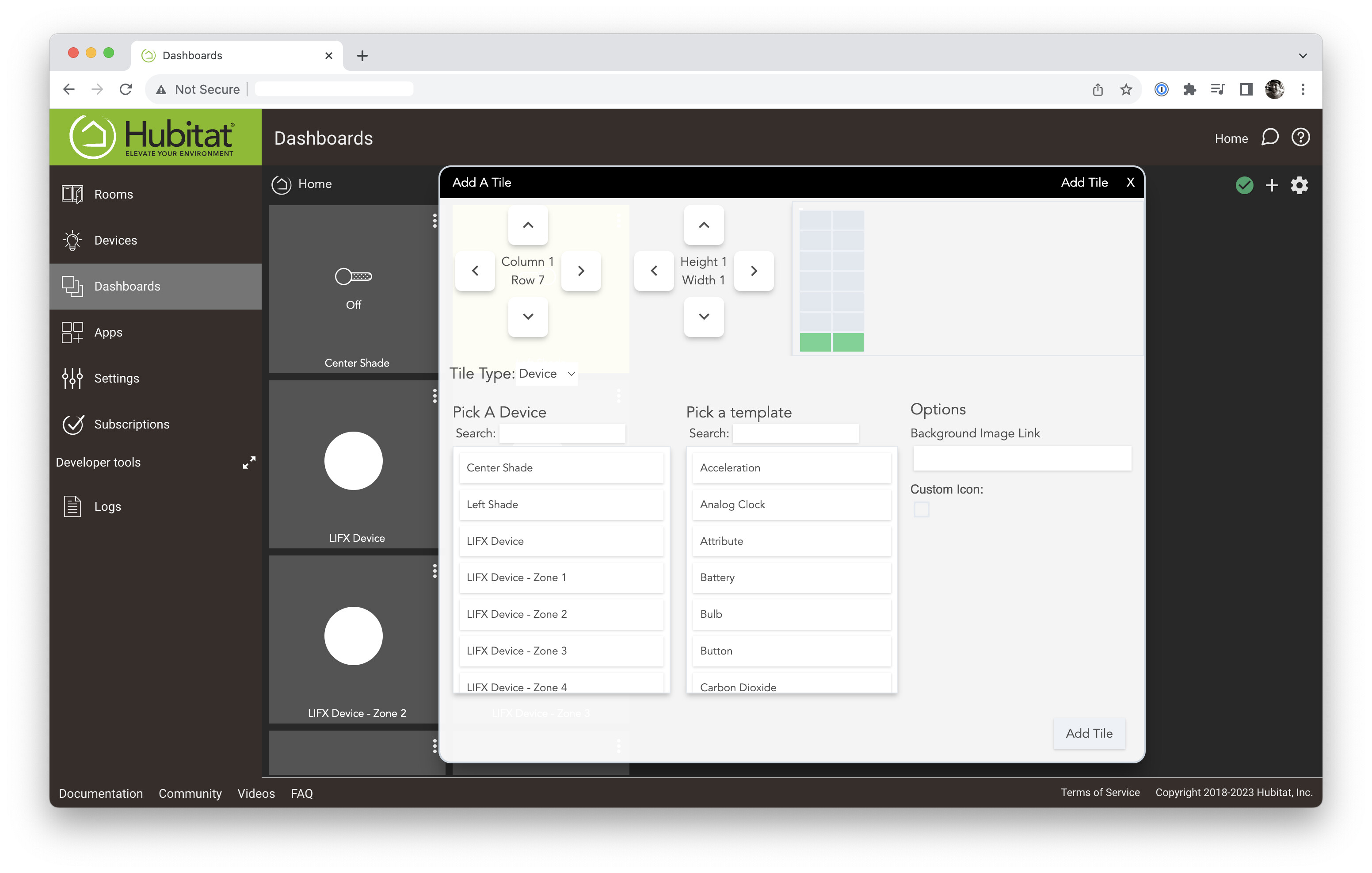
And, then there is the overall design. I admit this can be a matter of taste but this feels very "whipped together a demo with jQuery UI in 2009" and could really benefit from a few rounds with a design professional.

I feel awful knowing that the developers and designers who worked on this will probably end up reading this negative feedback, but I've found hubitat to be good hardware and there's a whole crop of nice hardware with polished UIs cropping up (e.g. Homey Pro) coming.

I don't especially want to shift over to a new platform or buy new hardware just to get a better user experience but... dang.

15 Likes

Some of us have automated our homes and never use dashboards.

9 Likes

I know Hubitat has said in the past they'd welcome constructive advice regarding the UI, etc. I've seen messages suggesting "things could be better" but I've never seen them turn into discussions... now it's entirely likely that those discussions would not occur here on the Forum and I'd know nothing about their acceptability. :slight_smile:

I'd suggest you explore a mockup or two to explain your advice. :ok_hand:

4 Likes

Thanks for your feedback. I am glad to hear that you feel the platform and the hardware are everything that you had hoped for. That has been the #1 goal since Hubitat Elevation launched- to deliver a rock solid local platform. We know that the UI is not matching the platform's reputation, but eventually, it will. There are so many things to do and not enough hours in a day to complete them all with our limited resources :wink:

11 Likes

I'm one :smiley:

I do have Dashboards and I keep them up-to-date but then rarely use them. Once a month or so I open a Dashboard on an iPad and wander the house confirming all the sensors trip. I have a dashboard of battery devices but it's not as reliable as walking a circle around the house. :slight_smile:

6 Likes

Same. All automation. I do export a subset of devices to HomeKit. But rarely use the Home app.

1 Like

Same, however on those rare occasions it would be nice for it to look nicer and as others have said more inline with such a great product with a great reputation.

It's the biggest / only grip I get from customers.

5 Likes

Now, more specific to your feedback, I am also perplexed why your browser is rendering the way it does. It shouldn't, the @ media tags are there and the page you're showing, should look like this:

UPDATE: I know why, you're accessing the hub's web interface via mobile app. Try to open the web interface by using the browser directly to see the difference.

You don't need to do this: just go to Apps, find Hubitat Dashboard, then locate your specific dashboard "child app" in that list (the same place you'd go to authorize new devices, etc.). There will be local and cloud URLs listed, depending on which options you have enabled for the dashboard. As a history lesson, this was once basically the ony way to view Dashboards, pre-dating both the easy acdess from the mobile app and (I think) the link in the sidebar.

This is not to say this couldn't work differently, just pointing out how it does now.

It seems like your screenshot is of the regular UI, not anything insde Hubitat Dashboard (though I also don't recall seeing that and they'd likely be curious what browser/OS).

This screenshot, on the other hand, is back inside Hubitat Dashboard.

I'm noting this difference in part because anything outside the Hubitat Dashboard child app, including everything in the Dashboard itself, exists outside the regular hub UI framework (any app on the hub can serve whatever content it wants from an endpoint, Dashboard being a complicated example--and what you joked about is not out of the question for how one might do so :slight_smile: ... and also something anyone could write a verison of they like better if they want).

I can't comment on any specifics, other than that posts from staff in the past have indicated that they are aware of areas where the UI can use some work, and there have been at least small changes in recent releases. As an end user, I don't mind (I'd rather have the power than something that just looks pretty, and there's often a trade-off in design) -- but I'm one of those who doesn't use Dashboards, which seem to be the main issue for people who do. I'm also used to the quirks that exist elsewhere by now, I guess. :slight_smile:

2 Likes

Since everything is near 100% automated things like Dashboards, Switches, Buttons
are rarely used (but they do exist). My preference is to have very solid and stable
hardware/platform and HE definitely delivers this. Good and nice looking GUI is nice to
have but not very important.
From the other side all these cloud-based toys are ASOLUTELY no go regardless how
nice their GUI and/or apps.

1 Like

Were this an open source project, I certainly would! But in this case I am a customer, not a contributor.

1 Like

The screenshots are all directly taken in Safari mobile. The embedded browser was even worse.

Odd, I am an Android user with only iPads for testing, so I cannot replicate it, but we will get that fixed. Do you mind sharing your iPhone model, current operating system version and update version that your hub is running?

Hub is on 2.3.5.125
iPhone 13 mini on iOS 16.6.1

Nothing on latest and greatest, but nothing terribly dated.

Great, thanks, do you mind updating to 2.3.6 and see if the issue persists?

Totally agree for myself. But I'd like to have something I could recommend to friends and family who are less technical.

3 Likes

There is so single solution that will meet all needs. And there is a place in the Home Automation world for those who are best served with cloud-connected offerings designed to work with HomeKit, Google Home, and Alexa.

I love HE too, but @trek has some good points and I know that the developers here are aware that the UI is the weak spot. Hopefully it's near the top of the TBD pile to get some love and attention.

I too rarely look at dashboards and have endeavored to make my home "smart" with rules making intelligent decisions automagically. But, there are plenty of users whose idea of a smart home is more about pushbutton control on phones and tablets and such. For these folks the UI is more important. I'm sure that in the future, HE will polish these things up.

1 Like

Ouch! I hope they don't grip too hard!! :wink:

As Bobby notes, always a question of resources available across prioritized tasks. I know that if the HE team asked me whether to throw money at nicer dashboards vs. almost any other product enhancement, dashboards lose, badly. I'm about automation, rather than display/management.

10 Likes

I have found that if I use Homekit with the Home app on my devices, I have a very nice dashboard.
If the HE staff wasn't using it's resources to add all this Apple stuff them maybe they could update the UI to your specs. Resources are not limitless unless you are one of the big 3.