Why don't you post your dashboard with CSS so other can look at it and maybe provide alternative means of reaching your goal.
Just a thought.
Why don't you post your dashboard with CSS so other can look at it and maybe provide alternative means of reaching your goal.
Just a thought.
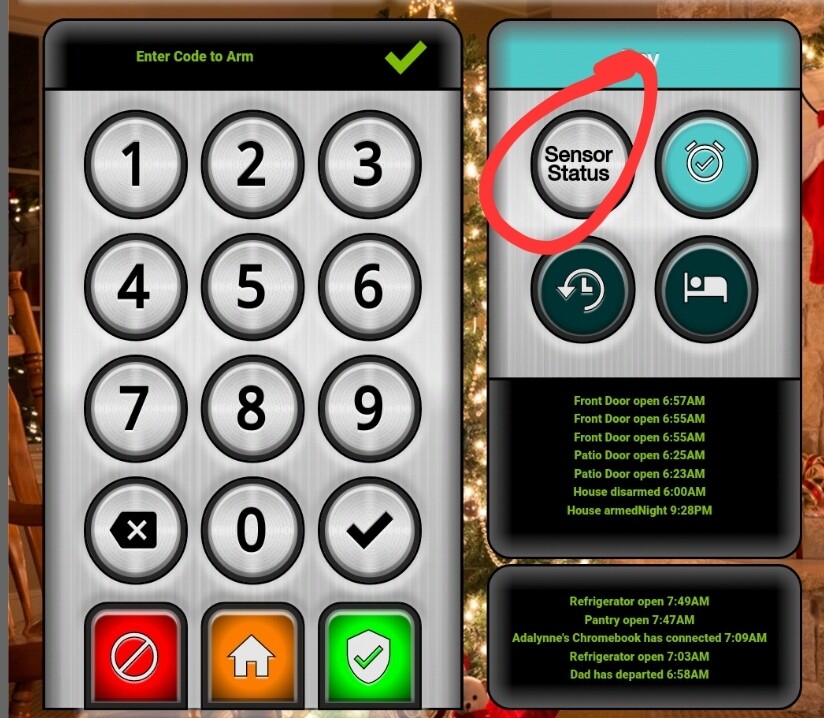
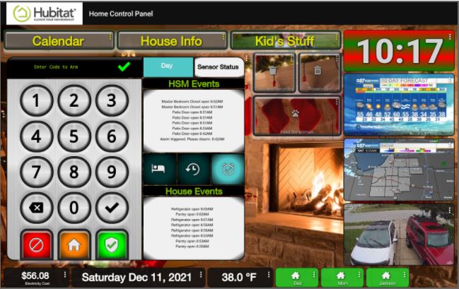
Here's the main one. I'm working on the idea of rarely having to switch to another one (unless it's kid related, calendar, or technical info that nobody but me gives a crap about) so it's getting ALL the css love I can muster. Yet, I want it to be for an actual appearance improvement and not just because I can.
I really want to add some flare to the bottom row which is purely information.
I also want to sort out a much more polished look for the clock (it's big to be seen from across the room)
I LOVE how the keypad itself has evolved and I'm really feeling like that is it's final form aside from minor tweaks if I learn new things. the stuff on the side of it isn't quite there though.
I may have found a similar Stack Overflow post to what you used for the tap highlight color... But have you tried using rgba(0, 0, 0, 0) instead of 255's like you had in your sample CSS?
And what are you applying the CSS to, the tile, a particular element of the tile?
Also, not sure if you mentioned this, but what browser / version and platform are you accessing this on? i.e. Chrome vXX on an Android tablet, Windows, etc?
Interestingly, I saw someone comment that it is actually an accessibility feature for those with vision impairment....
I think that may actually be my issue.
Fully Kiosk Browser 1.44.1 on a 7th gen Fire10. Those both are not typical platforms.
Yeah, I thought I may have had something similar, but I can't say it is that noticeable, in Chrome on Windows. Maybe try loading the dashboard on another setup and see what happens....
Actually, what it may be is one of those trying to apply some styling over the top of what you define. While still not that noticeable, when I turn on a "dark reader" chrome plugin, I do get a very short flash on a switch tile. The plugin I am using injects some styling into the page to achieve changes to colours and brightness being used. Maybe Fully Kiosk is doing something similar? Are there settings around appearance you can tweak?
This may be deviating a little outside of CSS now.... Perhaps another thread and post back here when we have a solution?
getting back to css related directly....
I swear it was already addressed but I can't find this specific example.
Replacing text in a tile with a HE native icon. The tile is an attribute template.
#tile-71 .tile-primary {visibility:hidden;}
#tile-71 .material-icons {content: "he-info_3";}
I thought that was it but it's not working
I am pretty sure the material-icons class would only be available on tiles that include an icon normally, so switches, etc, probably not for the attribute template.
I'm thinking with a bit of creative thinking this may be something like what you need, without being a copy-paste solution...
The use of the fonts and the hex value may need to be adjusted to suit the content of an attribute tile and you may then want to look at alternatives for the icons used.
Will need some experimentation....
I had seen that. I was thinking that the local icons could be referenced the same way. Only thing is I have no idea where the get the \e2ea or whatever in the content section.
To give you a visual of what and why I want this...
I was wanting to use one if the info icons instead. Goes more with the feel of the rest of it.
Are you wanting a single "icon" image, or a different one depending on the value of the attribute? A single one should be simple enough (I think....), but a different one depending on the attribute value is not something I have seen, apart from smarts in drivers or iFrame / HTML files....
Just a single one
Hmmm.. now I need to deliver..... silly me for offering the prospect of a solution.... 
Seems a little harder than I thought, might need some more work....
Yeah, I've been trying multiple things that seem logical and nothing works
Is it possible to add your own custom icons by putting them on the Hubitat via the file manager?
Is there any way to store the icons locally so I don't need an internet connection?
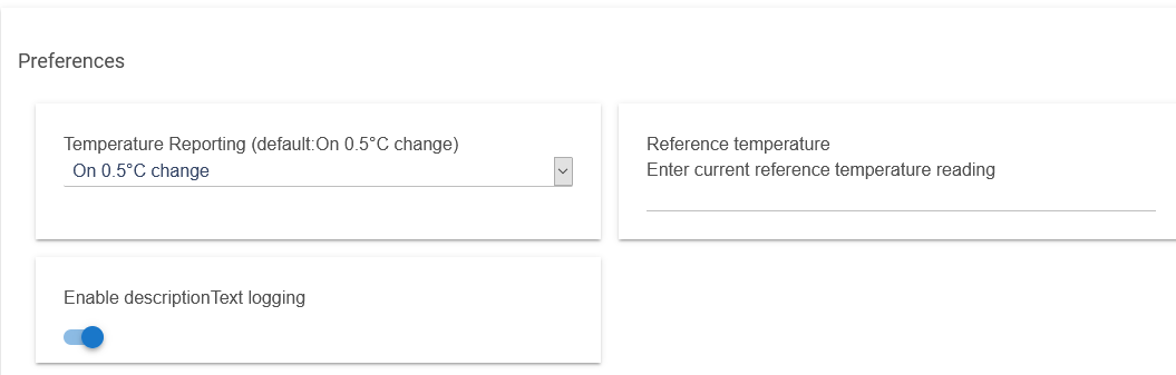
I have a temperature sensor wich is off by 7 degrees. Is there a way to correct the value displayed on a dashboard tile?
Most temp sensor drivers will allow a variance to be put into the driver.
This one (Generic Component Temperature Sensor) does not have an offset setting option and neither the parent device. For accuracy, it is pretty accurate in the sense that it is constantly exactly 6,7 degrees off. You are right stating that many factors probably contribute to the offset but the point is I just would like to correct the temperature displayed and not looking for the cause.
Markus is no longer participating on these forums, so it is very unlikely he will answer you.
I don't think icons can be done this way. But someone will probably tell me I am wrong so you will get a correct answer. ![]()
You can store backgrounds locally with the built in file manager. This works pretty good, I have done that for a few of my items.
Download the Hubitat app