Well I didn't get an answer to my question, but that sure is cool, Chad!
Hi @Krishna, Thanks! Sorry I didn't see a question, was it for me?
It was the question posed by @sburke781. Never mind though, some else answered it elsewhere, any really I just wanted to say that your CSS code was just cool looking and I think I might want to try that eventually.
1 Like
launcher = launcher + " style='height:${height}%;width:${width}%;border:none;left:0;position:absolute;top:25%;left:25%;'></iframe></div>"
@sburke781
this did it perfectly
2 Likes
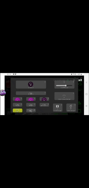
Is there a way to enable the HE default icons to be available to select for attribute tiles?
at the moment it only allows background image
@mark.cockcroft I've fiddled with that, can't get it to work. I assume there is no spot for an Icon in the first place, so nothing there to replace. I did have a square show up when used the content: "/ea37" for example, but it was like it didn't know how to display the icon from the font-family. Maybe look at another tile with the info you need and CSS it to make what you want, if that makes sense.
I thought there must be something in the the base templates the made the icon option unavailable
@markbellkosel84 - not sure if you ever got you bound on 
here is one that has a slow and steady bounce to it. If you want to make is slower or faster change the .8s to your liking.
#tile-4 .on
{
  animation: smooth_bounce .8s; animation-direction: alternate; animation-iteration-count: infinite;
}

       @keyframes smooth_bounce {
          0% { transform: translateY(0); }
          100% { transform: translateY(-50px); }
}
1 Like
I'll have to give that a try!
In the meantime, do you think this is doable:
Basically I would like to increase grid gap in only a section of my dashboard. I've played with margin and it only ends up shrinking the elements.
I want these buttons spaced out more.
Play around with
.wrapper.z-0 {
   gap: 20px !important;
}
Wait, are you saying there are other items on the dashboard besides those button? If so, this won't work since it will increase the gap for all items on the dashboard not a specific set of buttons.
I believe someone with more skills than I would have to chime in for something like that. But I'll test it out on play around dashboard and if I come up with a solution, I'll send it your way.
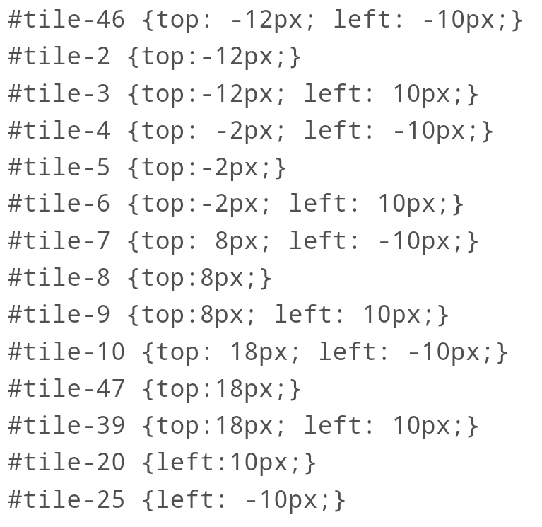
This is an option if you don't mind moving each button.
Top: -15px will move the button up 15px and left: 20px moves the button right 20px, both will take negative and positive values.
#tile-1 {
top: -15px;
left: 20px;
{
Actually, you can group several buttons together and move them at the same time.
1 Like
Works great! Was playing really hard with gradient. Think I got it really nice. Couple more tweaks to make them look like real buttons.
2 Likes
That does look pretty nice, what did you end up using for the spacing?
1 Like
I do still REALLY wish could remove the blip you see from a mobile device (or tablet). When tapping, you get a faint blue highlight flash of the entire grid area. So in my case since I have rounded my buttons and added active effects it really muddys it up and looks bad.
Edit: oh! I think I might have it. I'll try it shortly when I go to lunch.

The -webkit-tap-highlight-color doesn't work on every browser and .noSelect, I believe is for preventing text highlighting, but I may have that wrong.
Maybe some other member could help with this request, not sure it is possible, but I could be wrong.
@chad.andrews, @thebearmay, @sburke781 and thoughts on this?
Sorry, not sure how you might do that ...
Well I sorta got it working. Oddly enough it causes the highlight to now disappear if I have a :active set up. If I don't, the highlight is still present. I'm ok with that.
Oops scratch that. I just checked again and it's still there.

