You should inspect the OpenWeather div to find out how to adjust its size. I included .material-icons { } to change the size of some icons, but I'm sure there is some class you'll need to find to adjust the size of the OpenWeather images.
I don't use the D&D Floor Plan Dashboard Editor, I just leave width/height blank for the dashboard, so the tile sizes scale. Getting this to work on different screen sizes will require a lot of inspection (Ctrl+Shift+I in Chrome) and CSS editing. I don't think D&D Floor Plan Dashboard Editor was designed to adapt to different screen sizes.
Also, I liked mbarone's comment about using
body {
transform: scale(1.1);
transform-origin: 0 0;
}
Calculating that based on media queries. Maybe you should try that instead of using % or vh/vw.
The Hubitat dashboard is not designed to be responsive. You are supposed to make different dashboards for different devices. I'm happy with my landscape version that scales, but I don't use it on my phone. I created a separate dashboard for that.
There's a good chance this won't work for your situation, you do seem to have a dashboard with many tiles on it.... But two things come to mind...
Have you tried setting the Row Height or Column Width to zero. This enables the "auto-fit" option and it should adjust the size of the tiles to suit the device. I don't believe the fonts are adjusted, but I could be wrong... The Row Height and Column Width settings are available under the Options tab in the Dashboard settings, i.e. the "cog" icon.
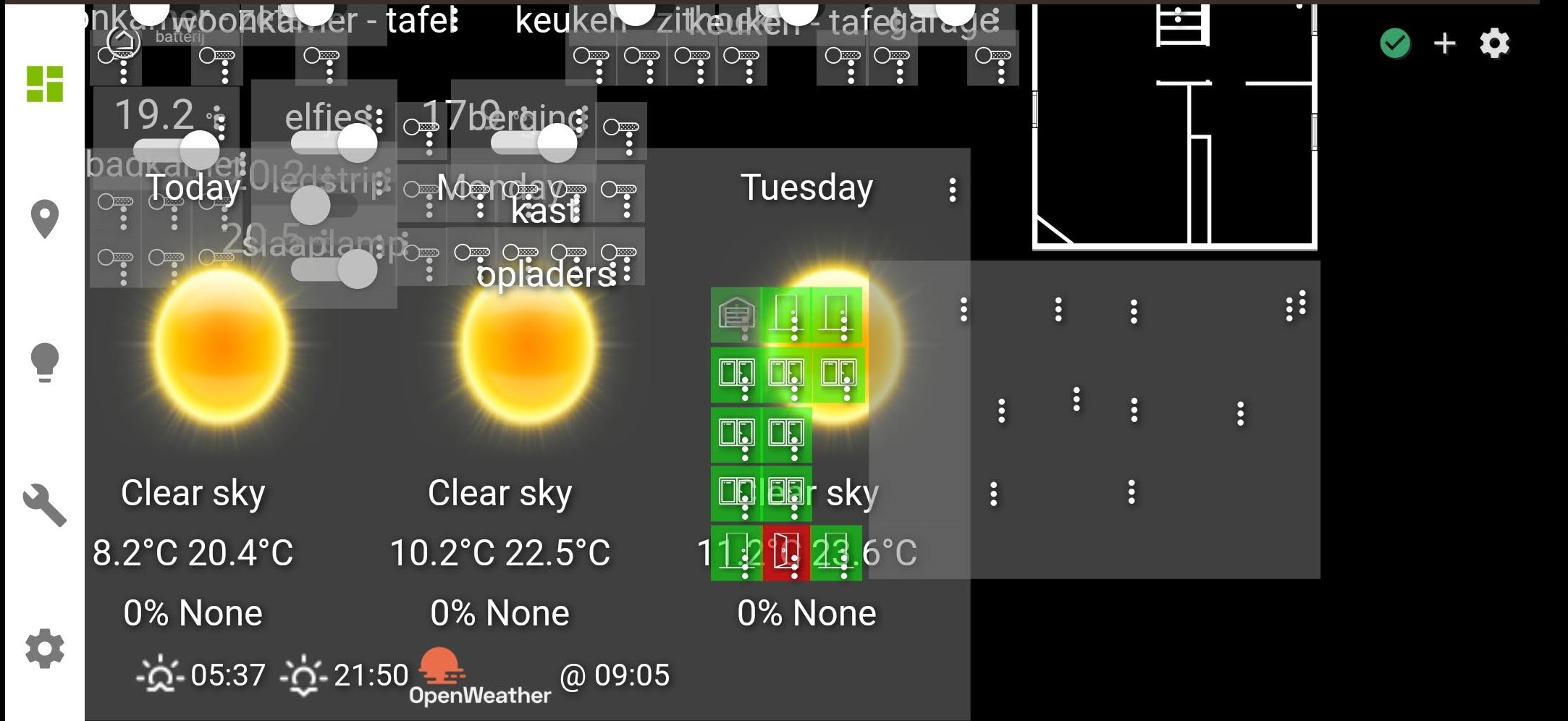
Alternatively, one trick I have used is to setup my dashboards so that when displayed on typically landscape device like a PC monitor or tablet held in that orientation, the tiles are arranged into 2-3 sections horizontally, so that when they are displayed in portrait, you can scroll left and right to see the 2-3 sets of tiles. I'm probably not describing this very well, so here's an example.
I have added the three red boxes to the screenshot to illustrate my point, these parts of the dashboard fit neatly onto my phone, so I can scroll left or right and see a consistent and meaningful set of tiles.
i'm sure... Just learned it from TV/games and since a few years 'smart home'
Sorry
thx, i'm not home but wil take a look and play around with it.
think I understand what to do but with me you never know
to bad, I tried Smartly but that doesn't really allowed me to stack items
on the dashboard (i have image and on top 'square' that light up when there is motion)
It didn't worked on it's own but maybe in combination with your tip(s)
Hi guys, is it possible to have an attribute tile full screen when click on just like the image tile?
Second question. How do you clear the background and the border/frame of one attribute tile?
HELP!
I want a specific tile to change its background by its current state and it has to be totally clean (no icons/text/Sliders). So i've finally got the current state and background working! But when I put the (.tile-primary and .tile-secondary) data, it doesn't show the background. Even if I put it the data in the Tile ID itself (#tile-2 .tile-primary.off).
With data I mean the properties: Opacity, Visibility, Display.
I'm doing something wrong and its probably quit simple but I cant seem to think straight anymore..
I tried this approach to replace the title on some of my dashboard tiles but because visibility: hidden; removed the containing element (tile-title in my case) it seemed to lose the "text-align: center" attribute for the replacement text. For me the following CSS (based on a Stack Overflow Post) seems to work and keep the alignment:
.tile-title:after { /* Default style for replacement text */
	text-indent: 0;
	display: block;
	line-height: initial;
}

#tile-4 .tile-title { /* Collapse the original line and move the text off screen */
  text-indent: -9999px;
  line-height: 0;
}
#tile-4 .tile-title:after { /* Add the replacement text */
	content: 'Current Mode';
}
Hi noob here, I'm trying to figure out how to change the icons for HSM (armedHome, armedAway, disarmed, armingAway) as these statuses change. I setup a button that I'm testing with and so far I have been able to change the border color, transform the words to uppercase, and remove the title, but I haven't been able change the icons specifically to something local within HE. like directions_walk. Thanks in advance for any help.
Pretty much have it like I want it. It is in 24 hour format, how can I change that? I set the template as attribute/formattedTime I used a little CSS to change the font size and the title. Now it is off center from top to bottom


 So i've finally got the current state and background working!
 But when I put the (.tile-primary and .tile-secondary) data, it doesn't show the background.
