ok, better I think
1 Like
Looks good! One other change I see, shrink the text a little on the life 360 location tiles so you can fit two lines of text for location.
yeah, that is supposed to pick up the location name 'work' but, while it shows 'work' on the web interface, here it is showing a street location, which is what the device state reads. somehow it is not picking up the location name (tho it shows it for "previous address"). another L365 oddity
1 Like
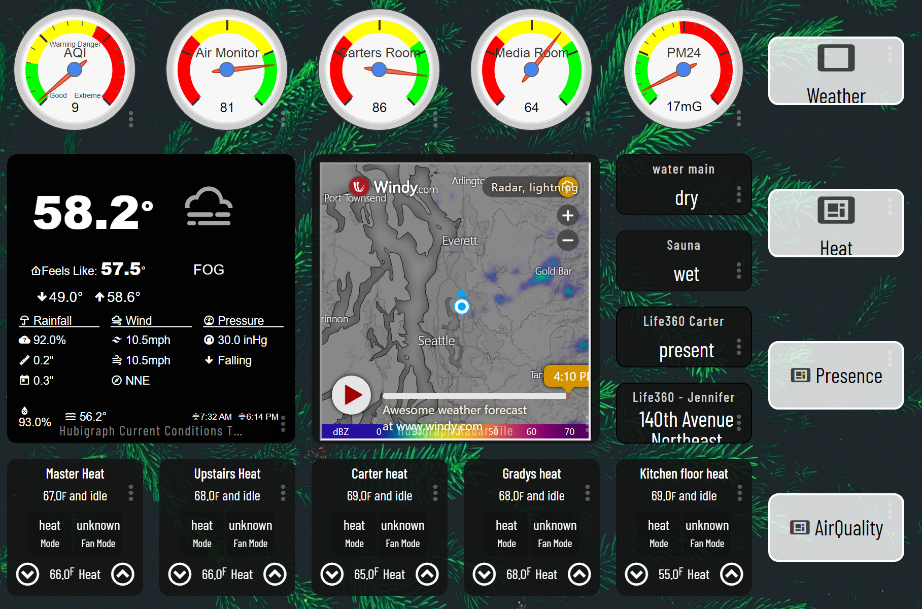
Seems weird that two of the gauges go green/yellow/red from left to right and the other three do it right to left. I’m used to seeing the gauge go from green/yellow/red and “rise” from left to right but maybe it’s just the way those items report.
yes, the Awair scores are better as they rise--higher score, better air qual...I agree on the dissonance--it was part of the reason I went for gauges as simply reporting the numbers didn't give the g/y/r context
Just a note; the gauge colors are configurable...
You can get rid of the dashboard tile icons if you want a cleaner look...
2 Likes
You put that under advanced right? But where in the json code does it go?
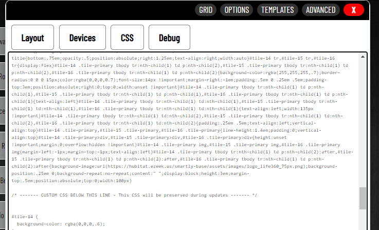
Using he_blank icon will allow you to remove icon per tile instead of per template. You have to type it into the CSS JSON (layout) window. It's not a choice in the normal template editor.
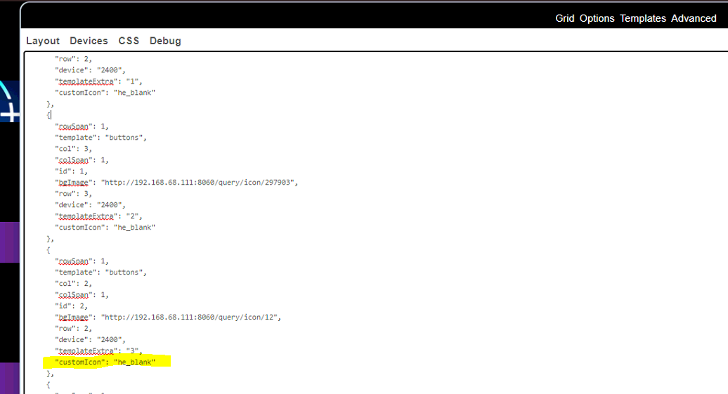
EDIT: Corrected with @TechMedX's help. Thank you.
1 Like
I think @stephen_nutt meant to say the JSON (Layout) tab not CSS. Template changes go in the Layout page while tile edits go in the CSS "tab"
1 Like
Ooops, sorry. I edited my original post but I don't know how others have done the strikethru font to show edit corrections.
1 Like
I gotcha
sample = ~~ sample ~~ (remove spacing)
2 Likes
I'm trying to do something similar but struggling with getting the picture size correct to sit under the 3 columns of tiles visible on my Iphone. what dimensions did you end up with? I have it going through Google photos as well. https://photos.app.goo.gl/r7GSuGjjTmGxPgop7 (my attempts here)
Go to whatismyscreenresolution.net and it will give you what you are after. For example, for my phone, it told me it was 414x896, so in my layout I made a rectangle of that size and then just scale it to fit my layout. I then exported a photo using the rectangle as "frame".
thanks, that does help, but the image does a weird sizing thing when i look at it on phone vs desktop, looks completely different so it makes an overlay of devices difficult. Anyone figure this out?
This sounds like a grid settings issue. I documented the process in my Guide to HE Dashboard write up.
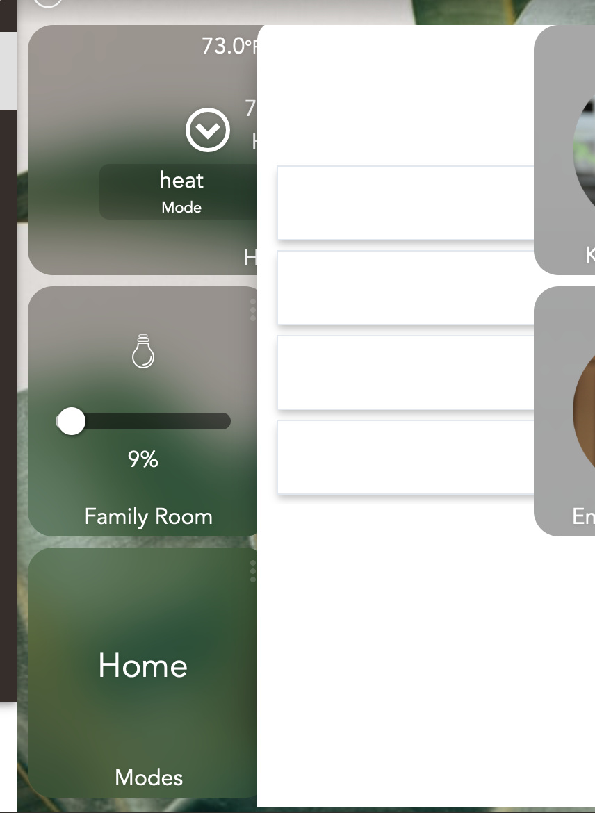
Thanks for the link! Useful into there. I did not have the grid set up properly (now I do) but the issue of some tiles overlapping the modal seems to be brought about by a line of css I added:
.tile { -webkit-backdrop-filter: saturate(3) blur(20px); }
when I remove it, everything is fine. When it’s there, the "Change mode to:" modal for example is overlapped by any tile added to the dash after the "Mode" tile, which brings about the modal.  Grid setup seems not to affect it.
Talking about the grid setup, the coloring of cells in the mini-map confused me briefly initially, I expected the filled (green) cells to indicate placed tiles / occupied cells and empty (light gray) cells to indicate the available grid slots rather then green indicating availability. Hope we can boost Hubitat’s business enough for an investment in some kind of drag-and-drop solution in the future ;).
Using smartly you can add your mobile devices (both portrait, and landscape) to the calibration section and it will size your dashboard correctly. smartly will create a custom CSS entry for each of your device.
I had no idea about Smartly. Thank you - just duplicated my dashboard to run off of Smartly! Lots of the aesthetic choices I’m going for are squarely shared with Smartly for both the overall dash look and esp. the layout inside specific tiles. The few things I prefer about the default dash styling are easy enough to tweak (larger & full-size tiles, font). Smartly does remove the awkward margin from the right which is great (I do prefer to see a sliver of any off-screen tiles as an indication that it’s not the end the dashboard).
I think I understand. You would need to create “device specific” dashboards: one set for your phone and a different set for your desktop; more work but possible. You would then need a landing dashboard different on your phone and on your desktop.
I don’t run into that problem as I only use my phone for dashboards.
1 Like
Have you seen....
Anything you want to do over and above smartly's default can be done with simple CSS. smartly 1.8 (2.0 pre-release) exposes tile attributes in such a way that makes CSS targeting easier and more effective. Even something gimmicky like making the tile rotate 360 degrees when turned on.
.tile.switch.on {
  transform: rotate(360deg);
}
have you tried targeting selective tiles instead of all of them? Maybe try them one by one until you find the one creating the issue, and them we can target it with something else. Try
.tile.dimmer { -webkit-backdrop-filter: saturate(3) blur(20px);
.tile.switch { -webkit-backdrop-filter: saturate(3) blur(20px);
and so on.
Have you seen....
Woah. I missed that. Need to read through that thread more. Installed through HPM; need to figure out adding a virtual device part... There should be drag-n-drop out of the box really...
have you tried targeting selective tiles instead of all of them?
Just tried more specific selectors like .title.dimmer {…} and the behavior seems to be the same. Not a huge deal though - "Mode" is the only tile I have that spawns a modal.
Thanks for suggestions.

