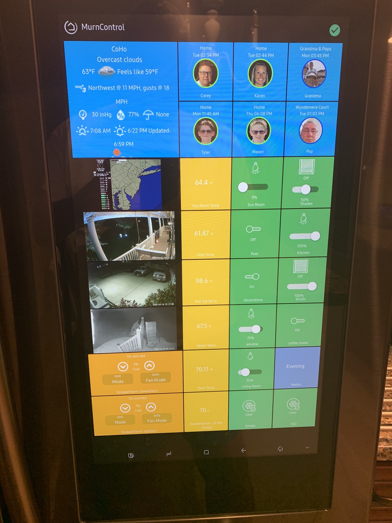
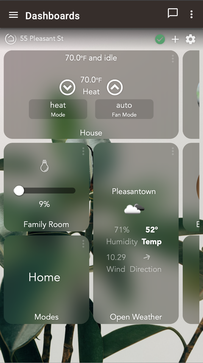
I’m about to tinker with Homebridge. Meanwhile, happy with the dashboard styling so far. I’ve added custom css to:
change tile backgrounds to use webkit’s background blur and saturate (and picked my own tile colors)
soften the drop shadows on text significantly
reduce opacity on the "more" icon, customized the weather widget to put more focus on temperature
tweak header styling in small ways and use a background image from Unsplash
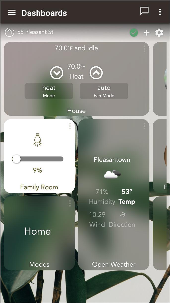
Anyone ran into an issue where any tiles added after the Mode tile was added show atop the mode selection modal? I seems like background filters are interacting with the layout in a bad way.
I wish the tiles on the far right weren’t cut off before the edge of the screen, creating a weird margin at the edge when the dashboard needs scrolling.
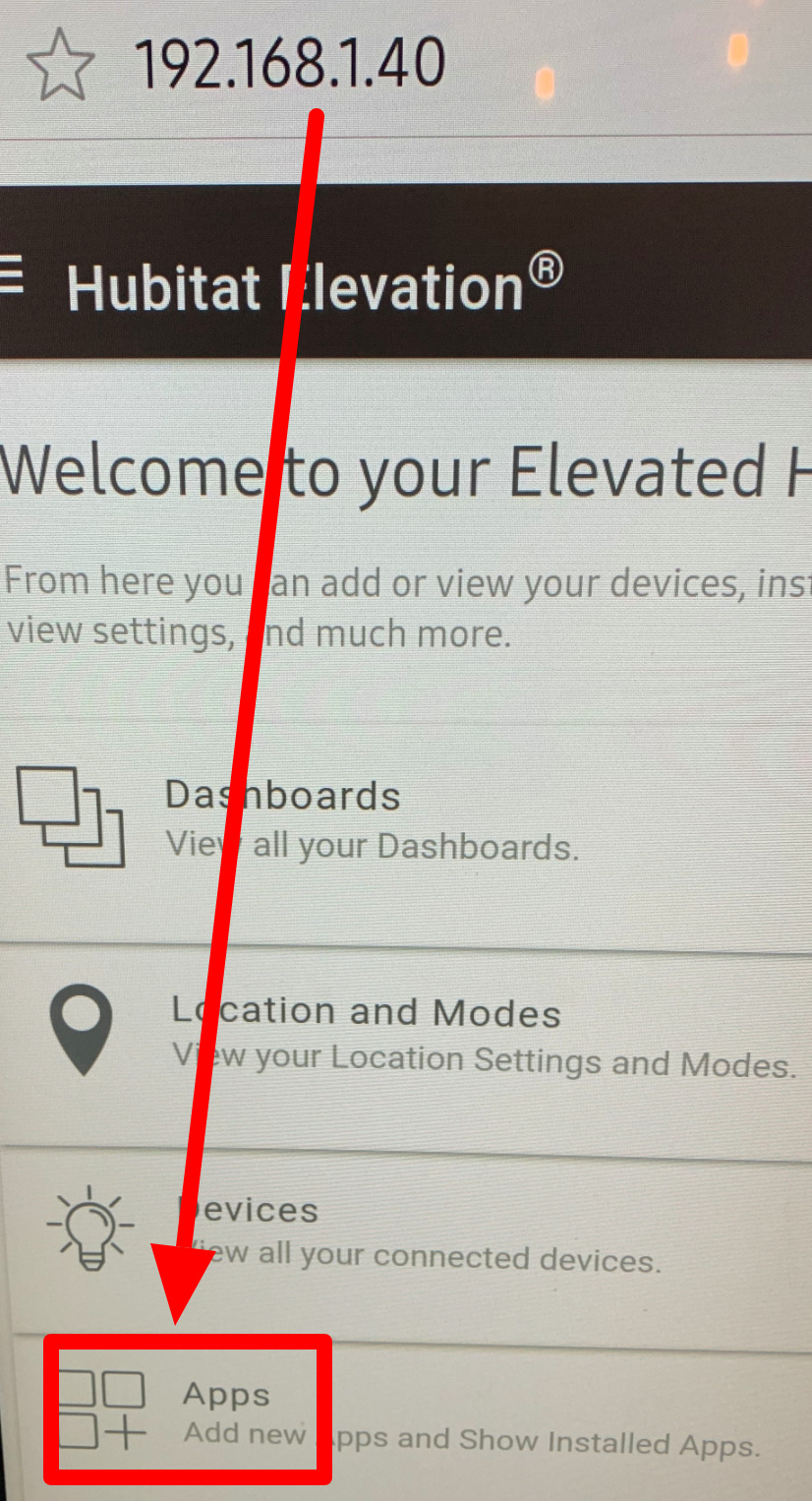
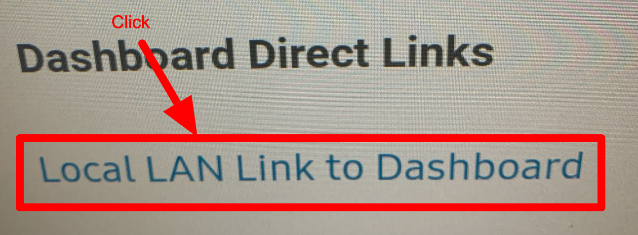
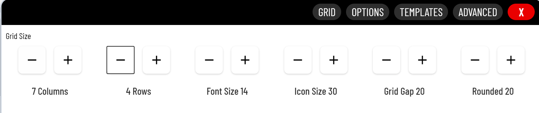
This sounds like a grid settings issue. I documented the process in my Guide to HE Dashboard write up. I have reposed the applicable section below. Make sure your grid has been adjusted to allow for enough space to add additional tiles where needed, and not on top.
Grid Columns and Rows
The amount of columns and rows available on the gird is set in the Options (gear icon). This comes in mostly when adding new tiles. The system will automatically chose the next tile location given the settings below.
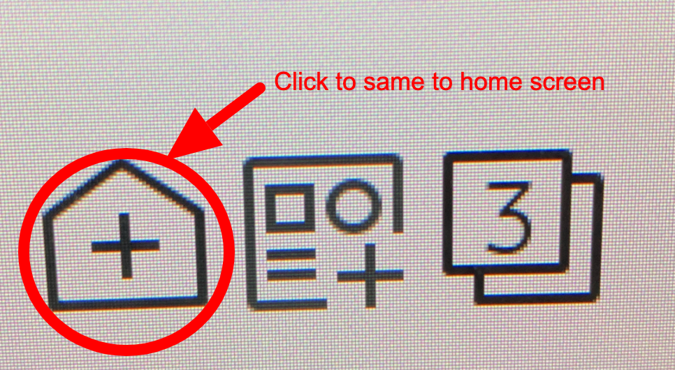
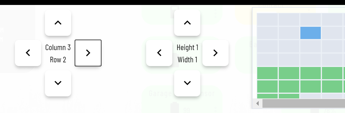
When adding a new tile, be sure you are placing it's location on a green tile. If you see a blue tile, that means you will be overlaying an existing tile (shown below). If no more green tiles are available you will need to adjust the grid settings above.
The system will allow you to place tiles outside the grid setting, so this is not a limitation. It's just very helpful when placing new tiles to make sure they do not overlap, making it harder to adjust afterwards.
Using smartly you can add your mobile devices (both portrait, and landscape) to the calibration section and it will size your dashboard correctly. smartly will create a custom CSS entry for each of your device. My iPad calibration (I only use landscape since it is mounted) looks like this....
@media screen and (max-width: 1024px) and (min-width:1020px){.dashboard{zoom:0.94;}}
With that code in the CSS my screen is perfectly sized with no tiles bleeding over the edge. Since smartly makes lots of other changes to your dashboard, I do NOT recommend you run this dash thru it (not without a good backup first). Instead I suggest you create a new dash (copy the current JSON if you want) and run that "test dash" through smartly. Pick all your devices for calibration. Apply the smartly changes to your "test dash" and see how it looks. If you like the format, but not the other smartly changes copy the @media screen lines to all your new dashes for the calibration to remain.
DUDE how do i use the weather tiles like you have? i been trying in the native hubitat dashboard but haven't figured it out. Tried sharptools and i was doing well with that but the monthly charge took me away from it and back to the native dashboard.
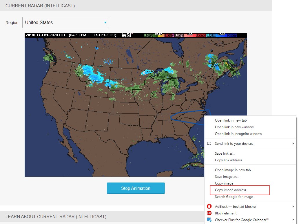
This example is from the weather underground maps page. For this one I clicked on animation and then right click and copy image address. Then pasted that into an tile using the image template with a refresh
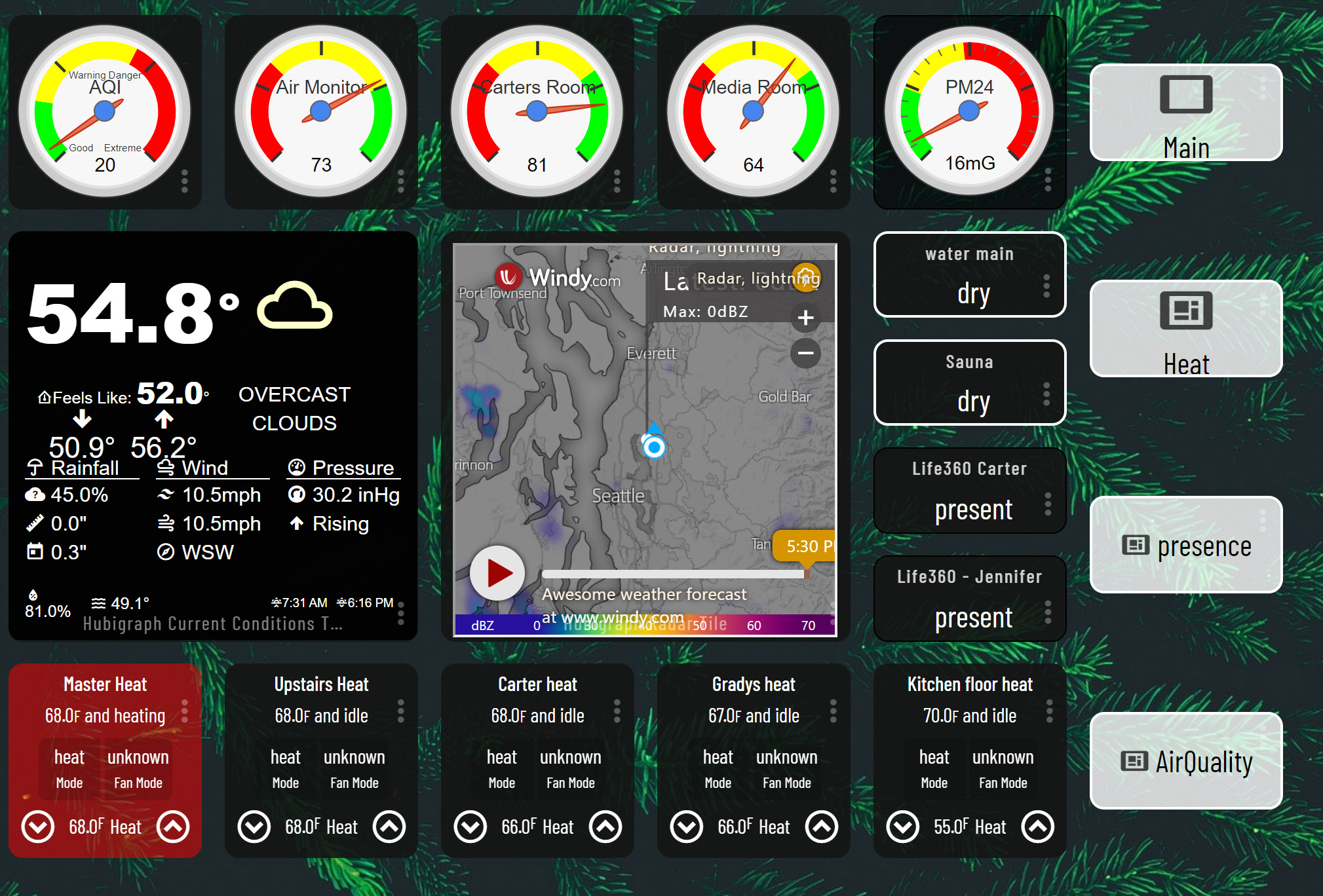
main screen just finished, using Hubigraph and smartly. top row is all air quality. worklng on the sub-pages now. hosted on my android tablet using kiosk browser.
You should make the tile background transparent on those top dial tiles. Your presence dashboard is not capitalized but the others are. Also would be nice to have the presence tiles change color depending on status. And drop the Main dashboard link on the Main dashboard to free up some space for something else. Maybe HSM or something like that in it's place.
What conditions are your targeting, and what formatting do you want tot apply? With smartly 2.0 (which it looks like your using) CSS conditional targeting is much easier.
Here's a couple temp and humidity BG color changes as examples
was thinking that the water sensors should turn red if wet. presence icons change based on state. Easy to do in android hubitat dashboard app, but not HE. I don't see it in smartly--will need to learn some CSS it apears.
 smart fridge, I modeled it after my ActionTiles layout I previously used.