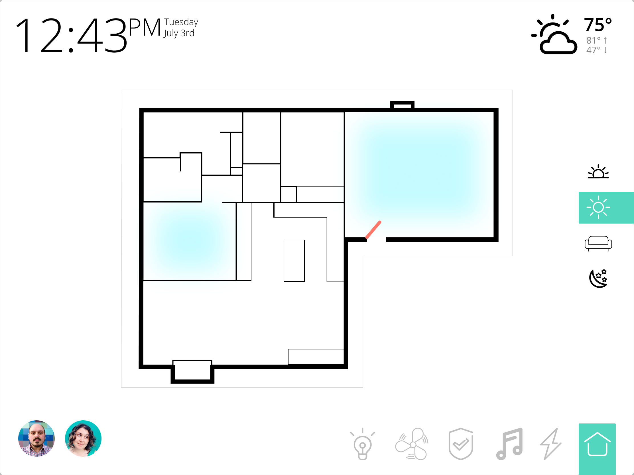
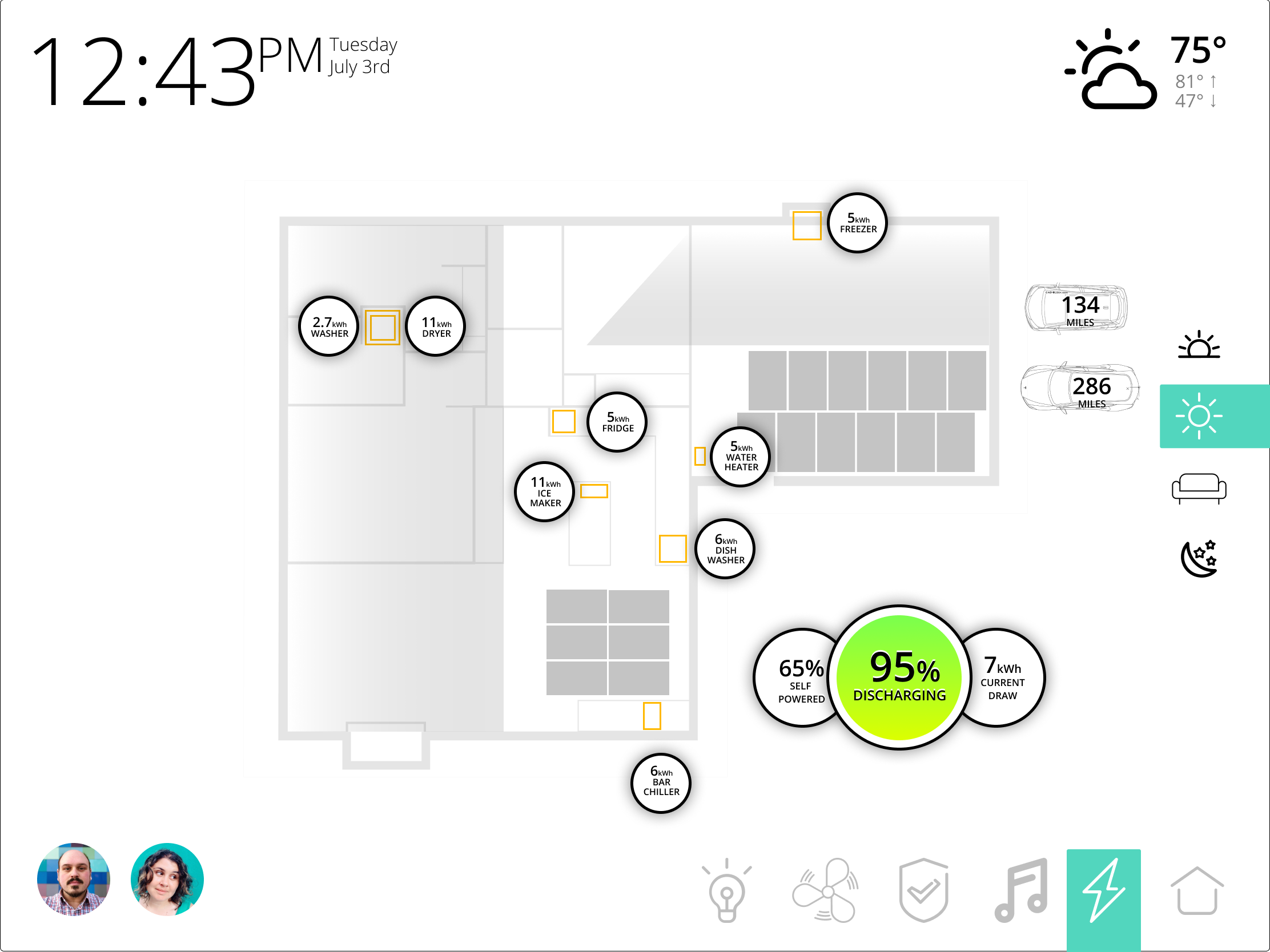
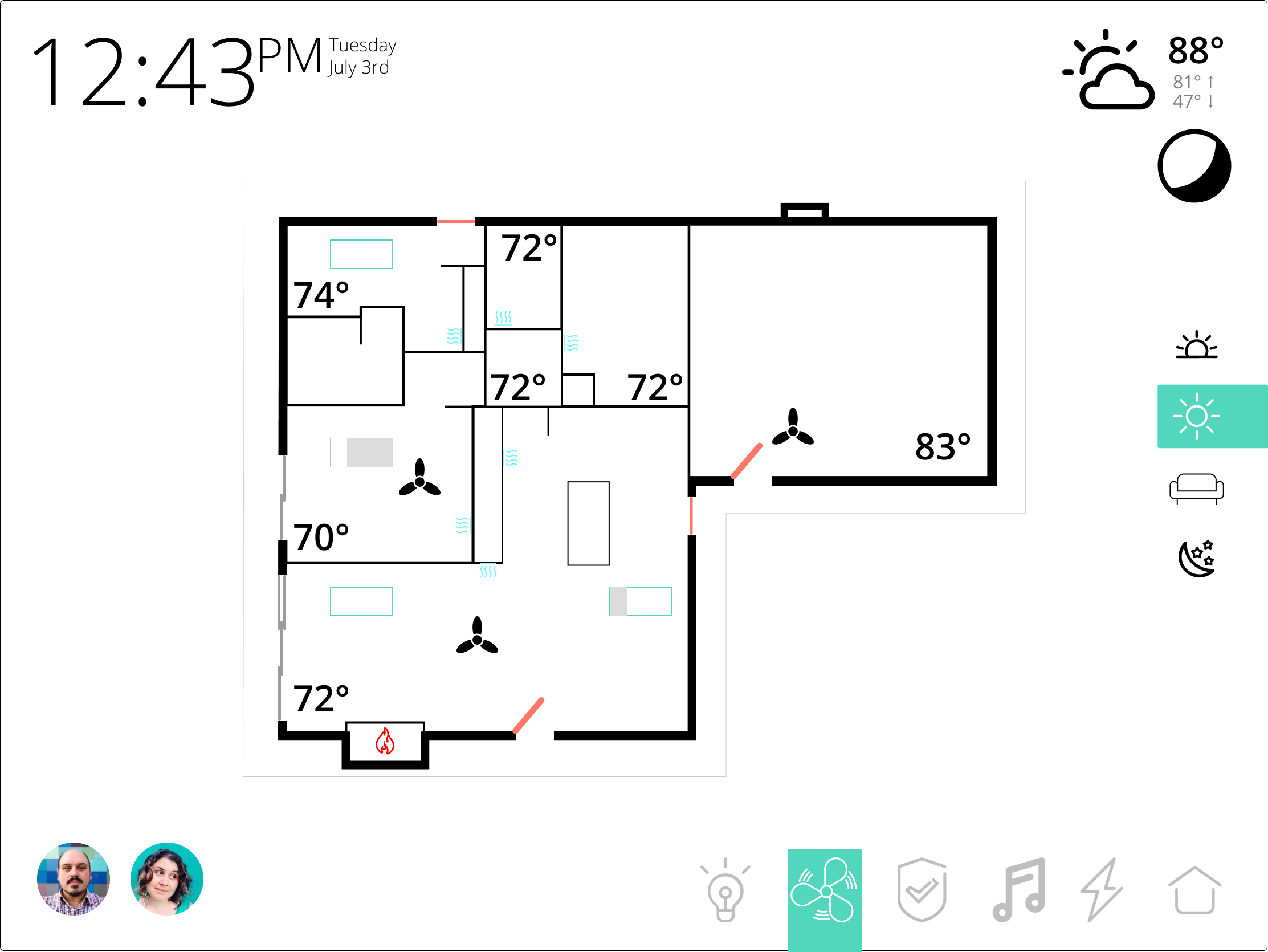
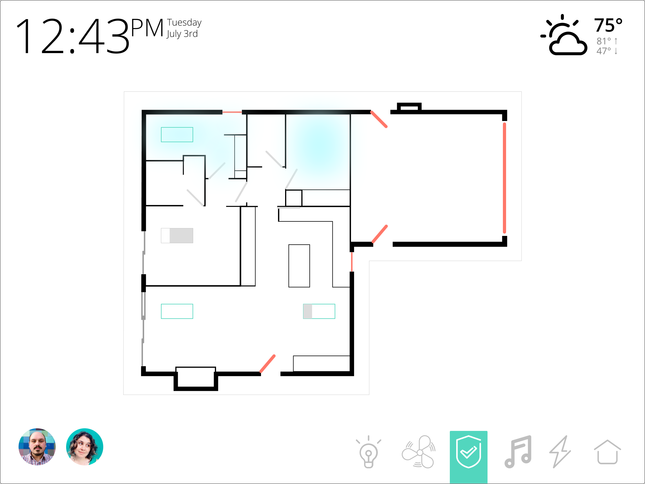
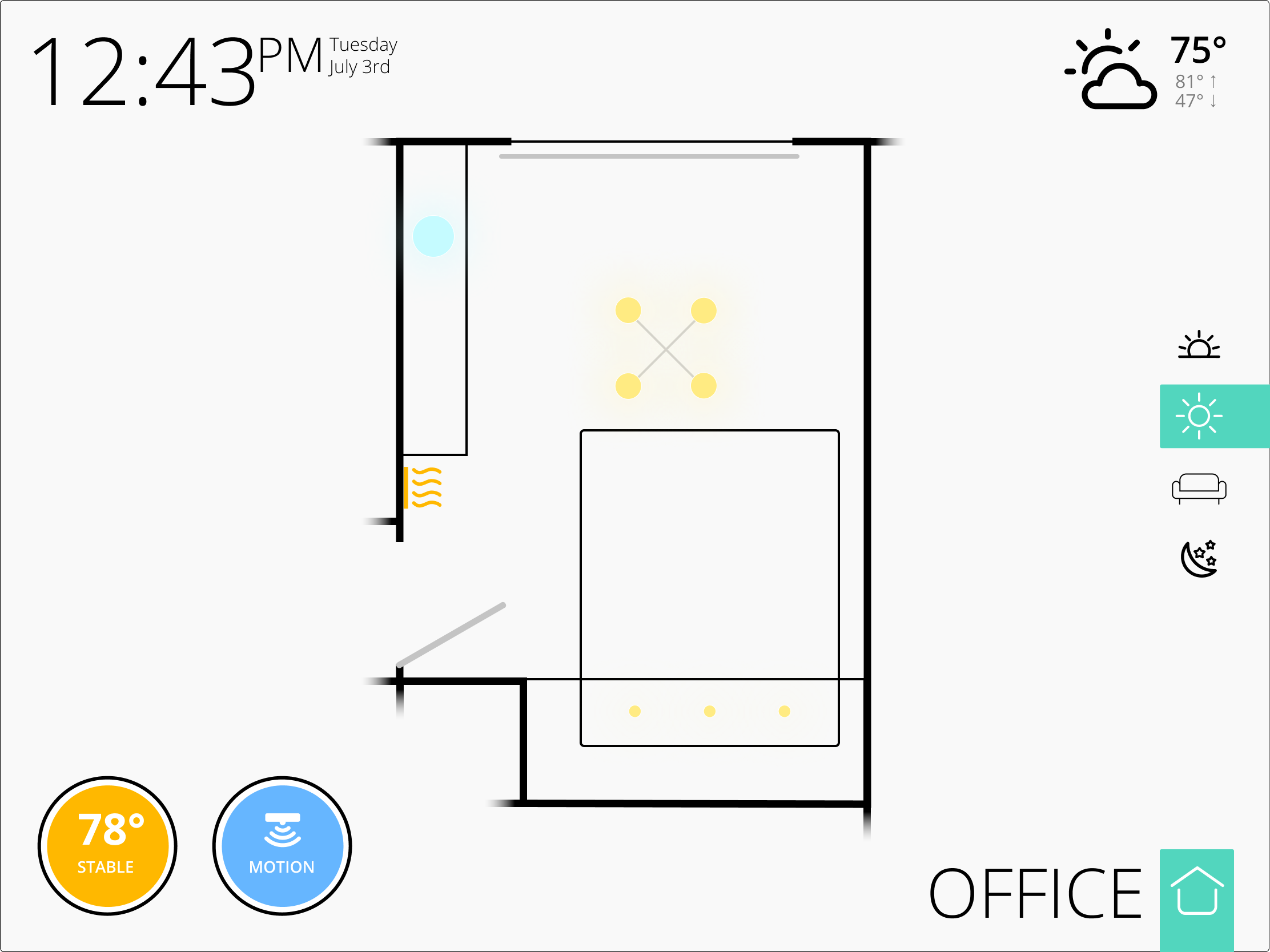
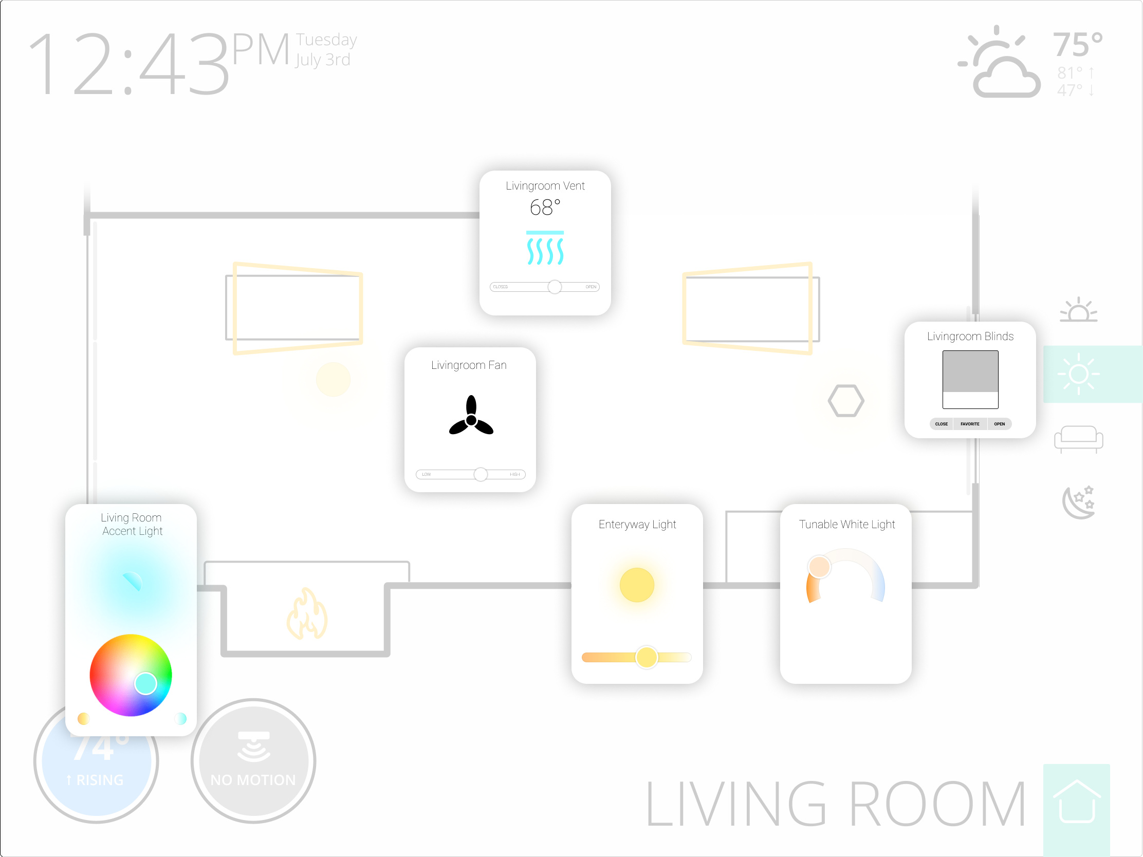
I freaking love these dashboards that overlay the controls onto a floor plan of the actual house and use transparent controls overlaid in the positions they exist in the rooms.
3 Likes
I created a sub-panel for controlling my pool light colors:
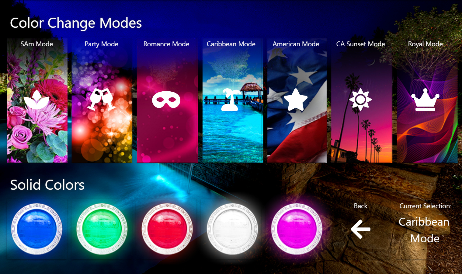
This is on SharpTools, but it's custom designed with mostly transparent buttons.
Here's the writeup of exactly what's going on with this dashboard and how it controls my pool lights exactly.
8 Likes
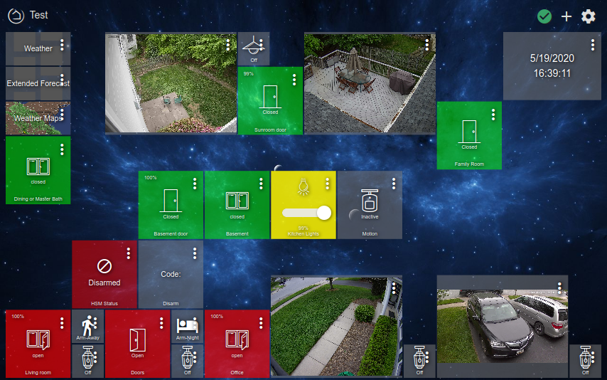
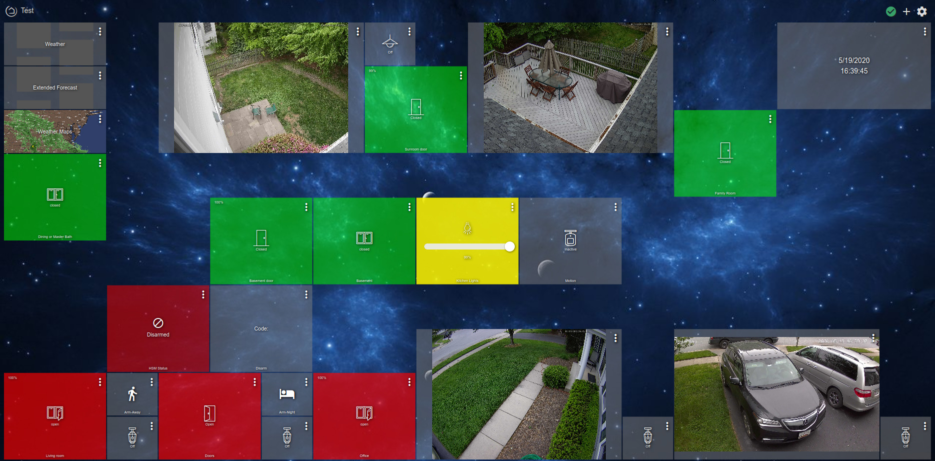
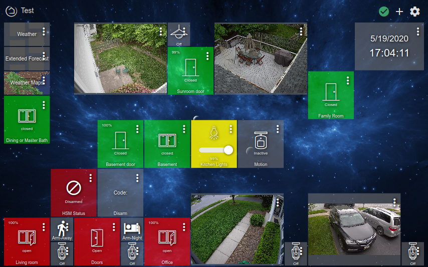
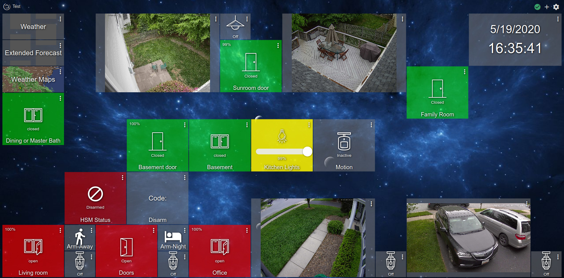
Here is my dashboard, running only off the Hubitat hub (i.e. only Hubitat [custom] apps and dashboard).
I have also posted this under the HubiGraph page. Which is where the graphs came from.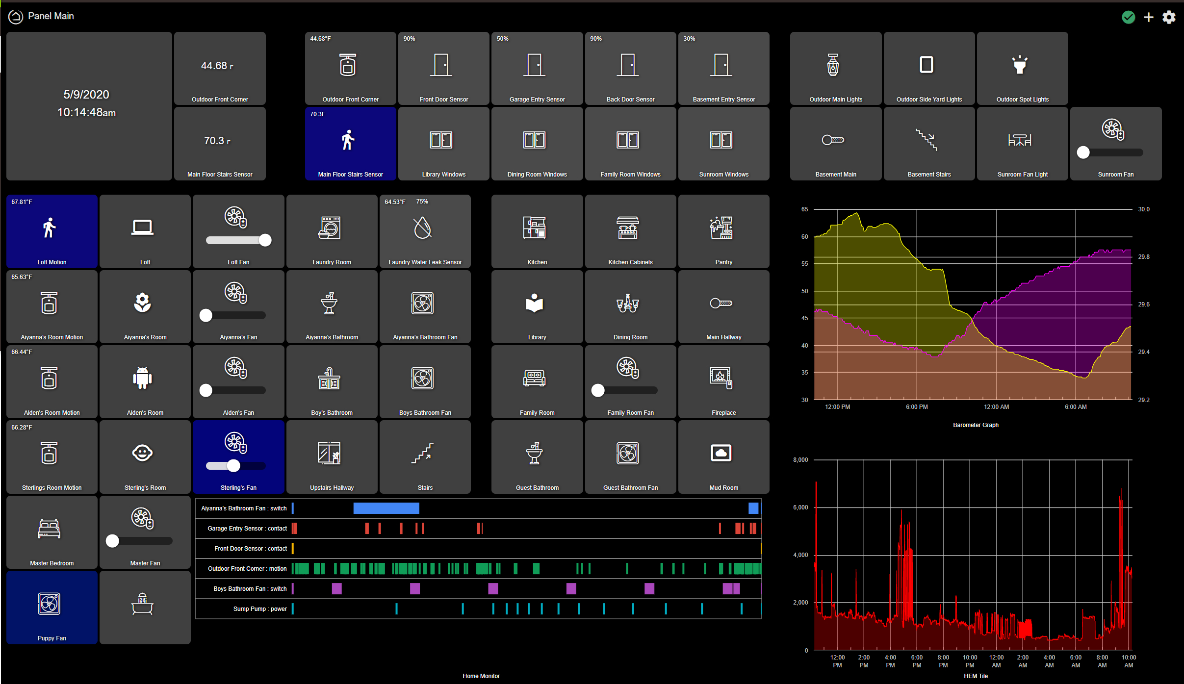
11 Likes
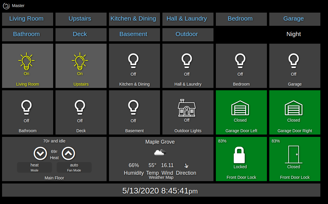
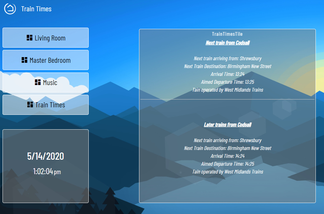
I'm new to Hubitat and just started playing with dashboards. I decided to create a master dashboard with a tile for each room and a link to a dashboard specific to that room.
One thing that would be awesome is if the Tile name could have a standard option to make it a link or dashboard link. Until then, I started playing around with overlaying the dashboard links on the tiles and using css to make everything look right.
7 Likes
I'm starting to love my dash more these days. I'm always tinkering. This is using Smartly 
The empty tiles are waiting on my re-pairing things.
Still work in progress, and tinker further as I get the time 

4 Likes
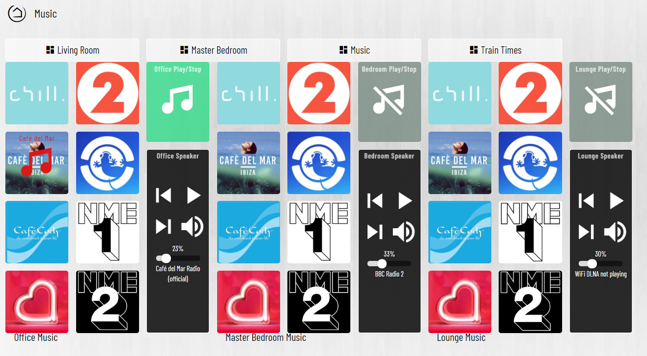
@Royski Loving the layout! Dig the music tile begin portrait, nice approach.
Why is one curtain icon partially open, and one icon full open, when both look like they should be full open?
That bold train text needs some love to, unless it is just blurry in the pic.
I see @spelcheck didn't included the nicer LED strip icon I found for us. Gonna need to give him a talking too. We want better icons!!
@kjh Not sure what you mean there. You can use "Link" and "Dashboard Link" tiles to link between dashboards. I use "Link" with the direct dash URL for a "Refresh" button, and dashboard links to all other dashes.
Much like @Royski has on the left side of this dashes above.
1 Like
Thank you Sir ![]()
This will be the Mrs working from home, and closing them slightly. ![]() She works at the dining room table.
She works at the dining room table.
A few still do, work in progress ![]()
Yeah, agree on that one!
Yeah I wanted it to resemble more like a remote control lol.
2 Likes
I think that's because we're not including the italic version of the font in the base skin. Browser might be trying its best to emulate italics.
![]() I think I've pretty much caved in at this point.
I think I've pretty much caved in at this point.
| https://community.hubitat.com/t/smartly-custom-icon-requests/39540
3 Likes
Nice one here 
2 Likes
What I mean is I would title in the tile to function as link instead of having to create a separate dashboard link tile. It will save space and improve UX.
If you are trying to get multiple Dashboard links on one tile it looks like you can do it via @bptworld Tile Master 2. I am still figuring it out and getting "Null" instead of the link, but it is possible.
Feel free to jump on over the TM thread so we can get that figured out for you!
1 Like
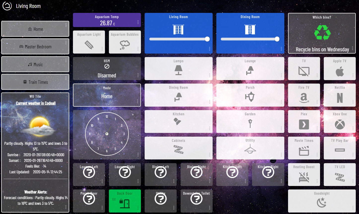
Not a full dashboard to show off, yet, but a neat 'trick' I learned and want to share. Some of you may know this, but for those that don't here goes.
Tile stacking - using multiple overlapping tiles to give the impression of a single more useful tile.
The tile on the left is somewhat obvious it is 7 tiles stacked 1 lock 1 contact for each door plus an oversized background tile with a group title.
The right side has 2 sets tiles each having a switch and a color bulb tile. This is great for easy on/of plus color control from "one tile"

How To - Tiles are stacked by HE depending on the order they appear in the JSON. Tiles on top are created 1st and tiles that come after are placed on top. If you want a tile to be on top c/p it's JSON tile entry below that of the way you want to be "on top" of. Notice below I put tile 55 below 56. That change will make 55 be displayed second, and sit "on top" of 56.

This can also by achieved by removing the tiles that are "behind" other tiles and then adding then back into your dash. This will create a new tile at the bottom of the list and bringing it "to the front"
Thanks to @spelcheck for smartly to build on, and helping me figure this stacking thing out.
5 Likes
Updated 2 of my dashes using the smartly "quarter height/half width" modified settings. The link has details, plus before/after of these dashes
Main Dash

Lighting Dash

Last 2 are still in progress in not worthy of posting, yet.
Please know that this 'mod' of smartly is not 'officially supported'. See this post for details.
PS. @Angus_M be gentle, some of the spelling mistakes are intentional due to space limitations (you can still poke fun). Any that aren't I'll just say are. I still say HE needs to allow browser spell check!
3 Likes
Finished wireframes, next step visual design, hopefully more to show soon. When I started the project I had a lot of devices outstanding that I didn't think I'd be able to get into Hubitat, that number is quickly dwindling. With some of those remaining likely to start working soon too!
Still outstanding:
- Ryobi Garage Door Opener
- Getting Homekit device statuses into Hubitat (Velux, Nest, Apple TV)
- myChevrolet
- Tesla Powerwall
- 220v monitor for Dryer & Water heater (Just need to get an electrician to do this)
- Valor Fireplace (there's Bond, but I really want something bi-directional)

18 Likes
Looking good!
1 Like
Nice work. I love the layout and nice clean look. Well done indeed! I'm making steady progress with mine too. Now I'm adding pages for music control, photos (for slideshow), etc. I'm still waiting for the 3D views from the architect then I will integrate all the devices I've set up (lights, AC, leak, contacts, motion etc). I'm loving the flexibility of using good old html/css/javascript instead of being locked down to a formal grid dashboard approach.
1 Like
This is really cool.
1 Like
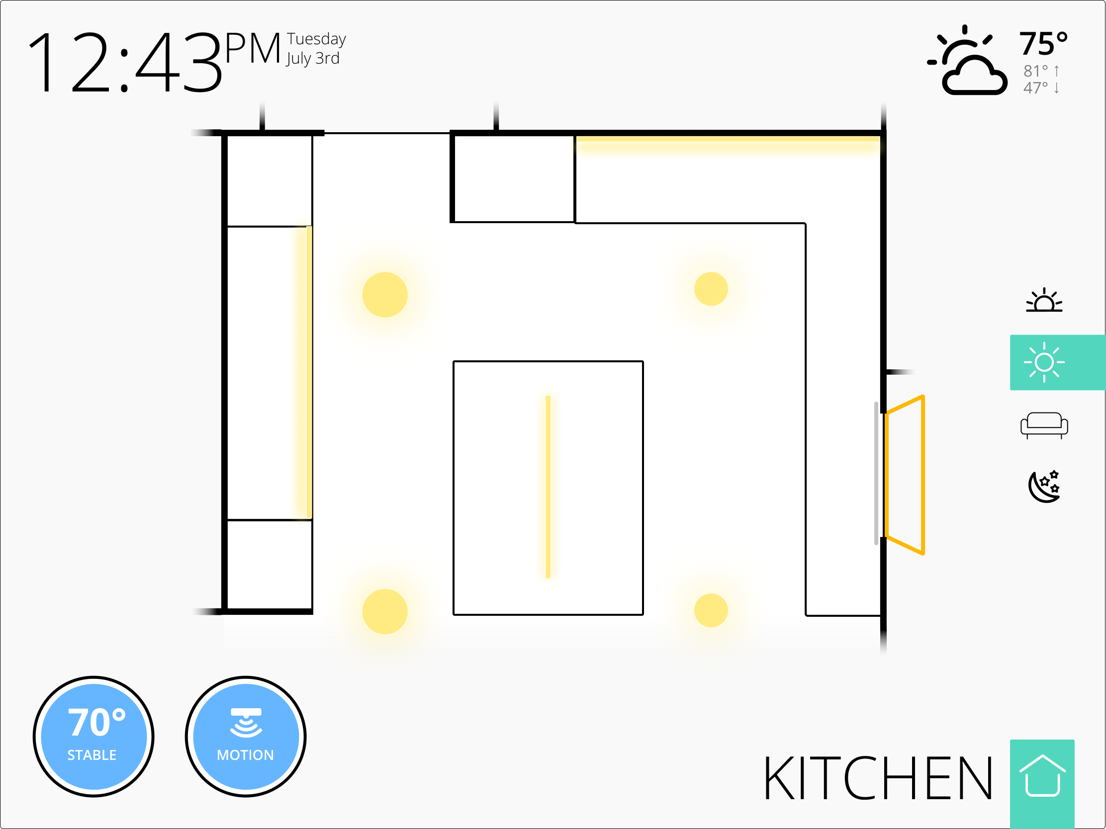
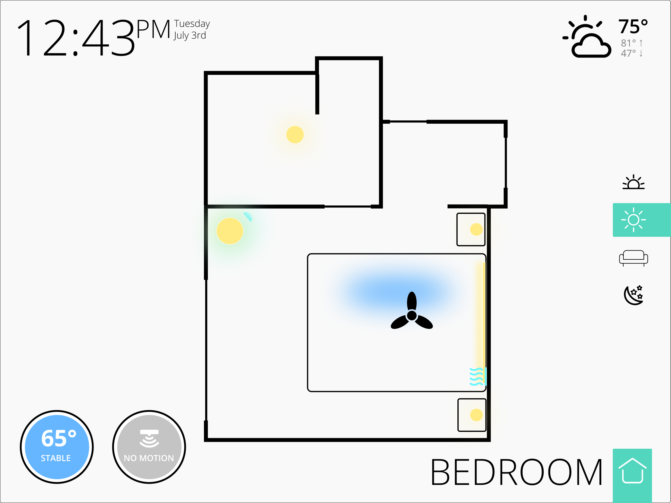
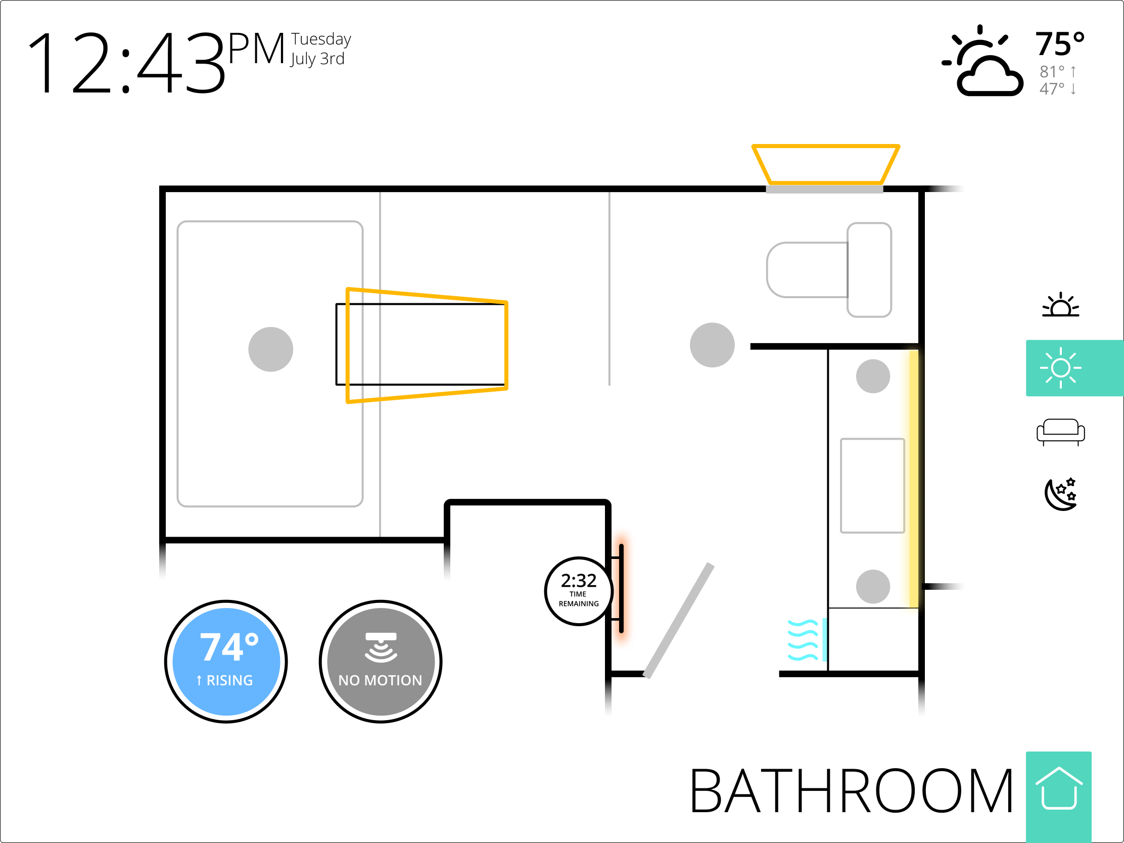
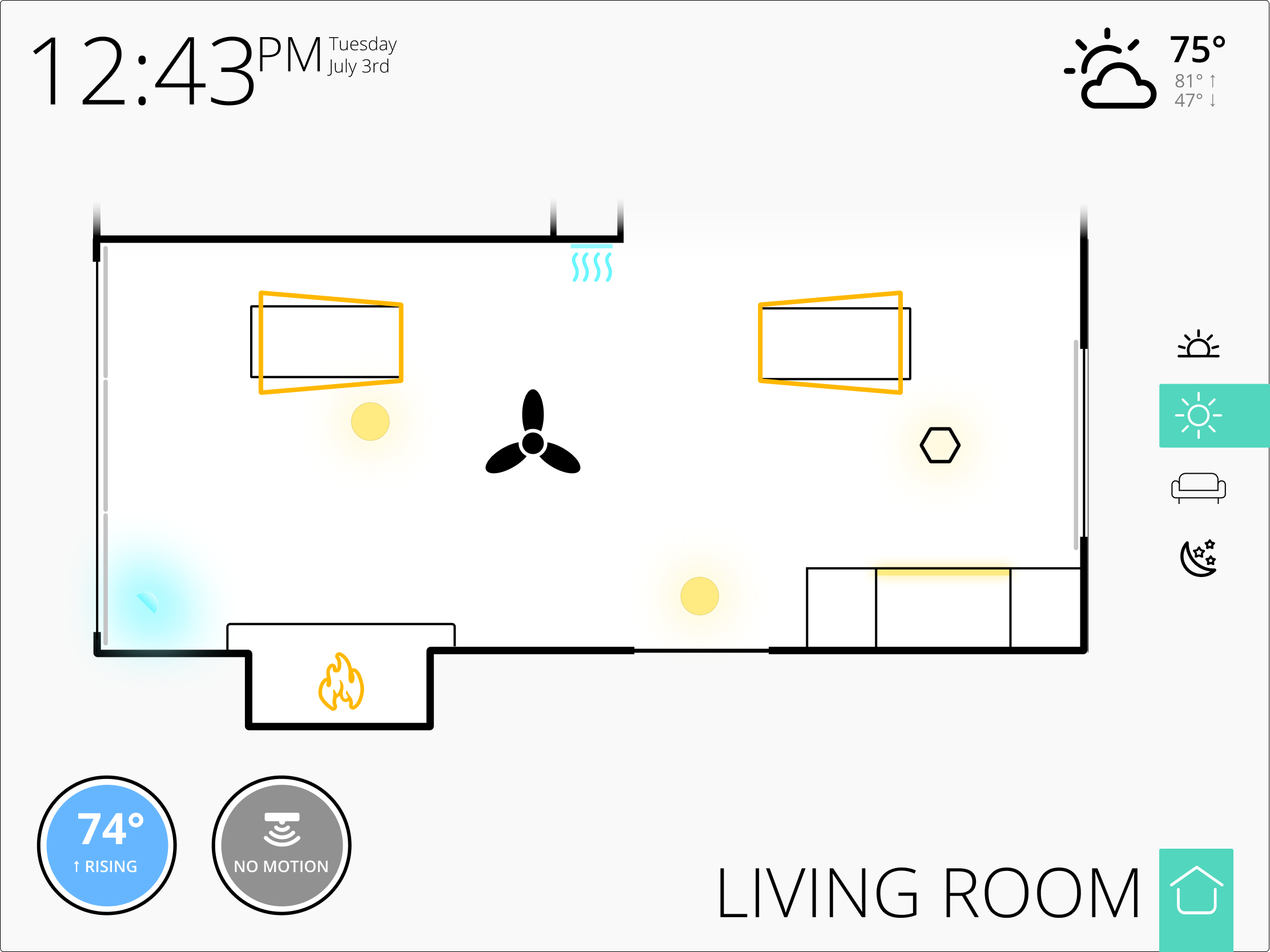
What did you use to make the floorplans?
I'm working on making the built-in Dashboard app re-size well. I went ahead an left the tile width and height blank so they resize.
Here's what it looks like going from my tablet viewport (using Web Developer tools in Firefox):
compared to my native desktop viewport:
The icons and fonts don't scale, and I think it looks terrible on a big screen.
Here's what happens after some CSS sizing things based on vh and vw--first the tablet:
and now the desktop monitor:
Much better, I think!
Here's the custom CSS I added to get that:
.vue-slider {
  height: 2vh !important;
  margin-top: -0.75vh !important;
  margin-bottom: -0.75vh !important;
}

.vue-slider-dot {
  width: 3.5vh !important;
  height: 3.5vh !important;
}

.tile-title {
  font-size: 1vw !important;
  bottom: 0px;
  left: 0px;
  right: 0px;
}

.tile-contents > .tile-primary {
  font-size: 1.2vw !important;
}

.tile-contents > .tile-primary > .material-icons {
  font-size: 6.5vh !important;
}

.tile-contents > .tile-primary > div {
  font-size: 1.5vh !important;
}

.tile-contents > .tile-primary > div > .material-icons {
  font-size: 6.5vh !important;
}

.date-clock > .tile-contents .tile-primary {
  font-size: 2vw !important;
}

.date-clock > .tile-contents .tile-primary > div {
  font-size: 2.5vw !important;
}

.tile-contents > .tile-tertiary {
  font-size: 1.5vh !important;
}
I used percentage of viewport height (vh) for fonts I wanted to be a specific height, typically short labels. Some I wanted to not break into 2 lines, like the tile titles, so I based it on viewport width (vw).
In general, the tiles are approximately square for a 16:9 display. It would still be ugly moving from landscape to portrait, because I haven't yet figured out how to make tiles have a width/height dependent on the same viewport dimension (e.g. width = 10vw; height = 10vw;). That should be possible, though, just need to spend more time inspecting the elements.

