The difficulty is changing the same type of tile based on it's content. Using CSS only, it's not possible to look at say the name of the device in the label. I have however, been able to use a convention rather than a logic. IOW, I know the tile is in a particular location on the dashboard I can find it through it's data tag and apply styles to it or it's parent, by walking up the ancestry.
Some of these dashboards seem to show tiles controlling a light bulb, but with no horizontal slider at the bottom for brightness. I have a number of bulbs that don’t dim, but when I use the Bulb template ( I think that’s it, I’m away) it shows a redundant slider. What am I missing?
Use the switch template instead 
1 Like
Aha! And then use a custom icon to make it look like a bulb.
1 Like
I installed pyarlo on my raspberry but I have no idea what to do next? How to access it
What did you use to make the dashboard, I really like it and am looking for something similar.
All done with the built in hubitat dashboard designer...
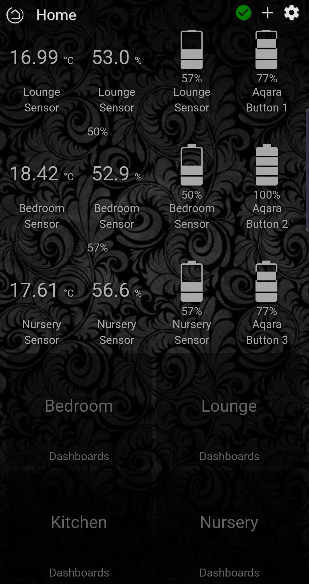
For the tablet I have just used an image I liked for the background. The life360 app for location info. For forecast I used theweather.com to build a widget and then used the link as a background image on a tile. The rest is mostly switches, dimmers and temp sensors. I have increased transparency on all tiles and used white/grey colours for off states or info only tiles and orange for on states. The two colour bulbs (bottom left and right) vary depending on white colour I have the bulb set to.
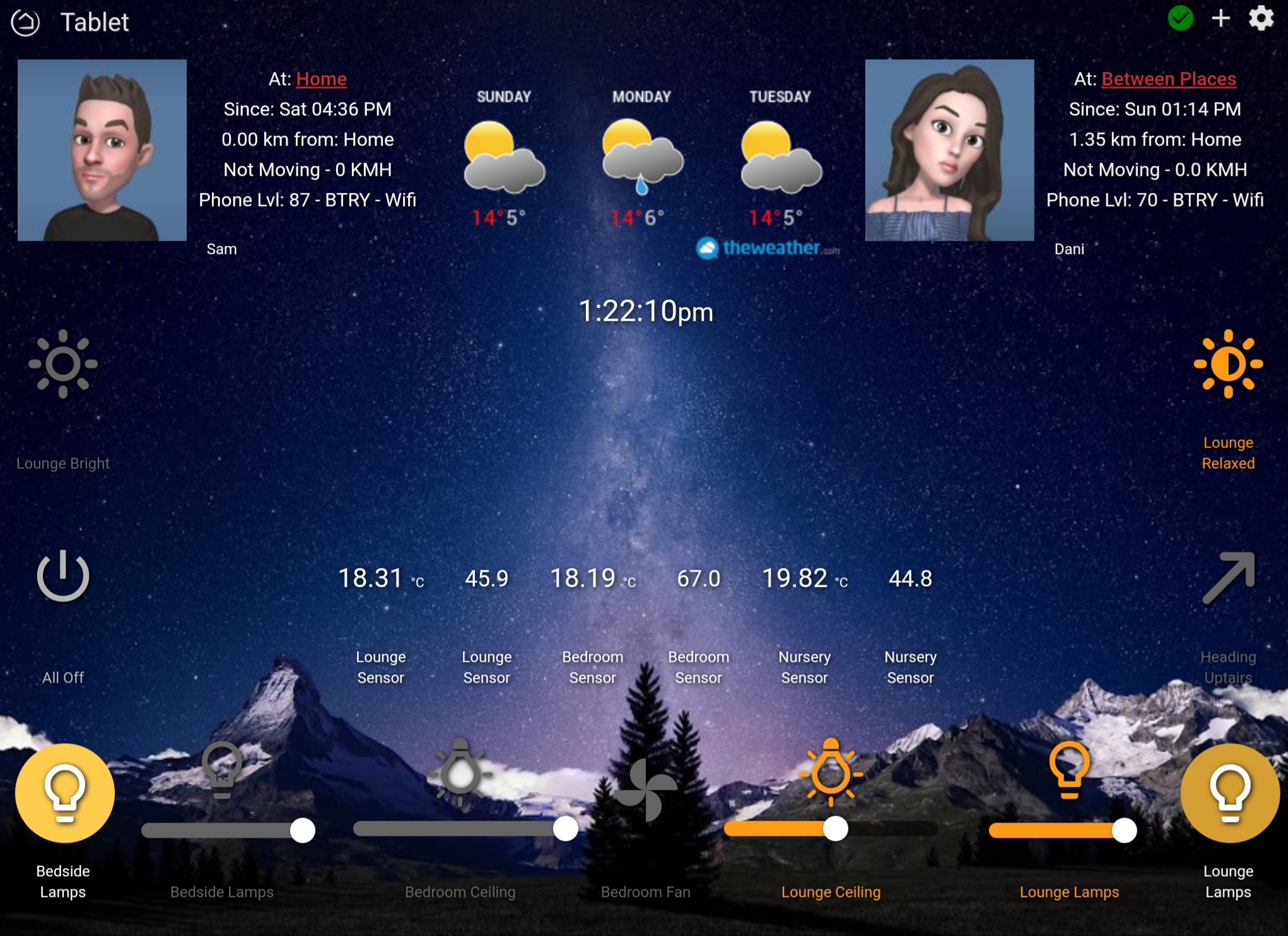
For phone dashboards I have created a few. One home page with most used functions and then dashboard links to each separate room. Each room then has all functions and a link back home.
Again, just used an image for the background, high transparency on the tiles and white/grey for off states and info and orange for on.
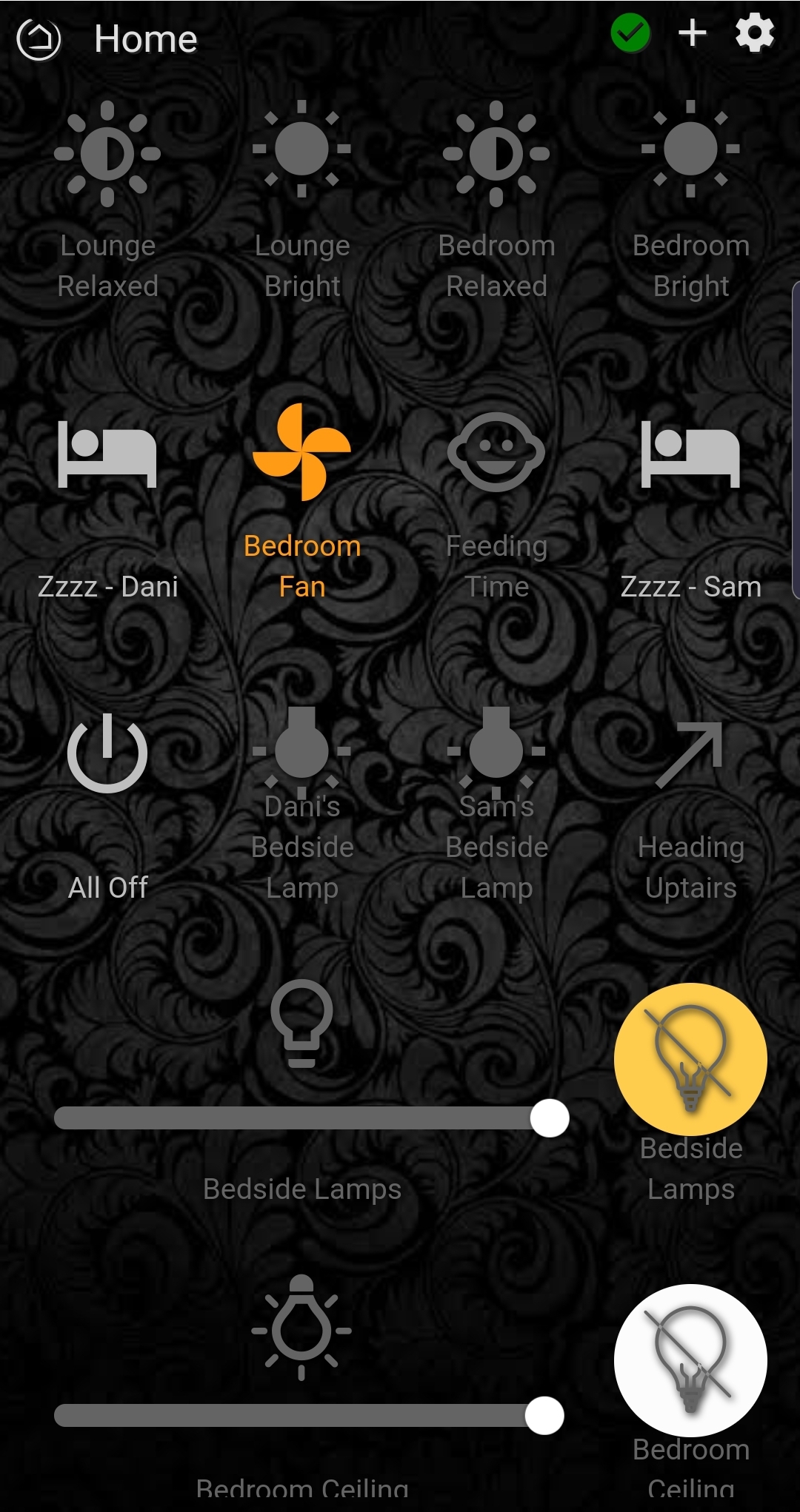
Some of the switches are routines, like the 'zzzz' are sleep routines which turn off all lights, tv, play rain sounds etc.
This covers most things i think. Let me know if you would like any further info.
13 Likes
very clean, I like it!
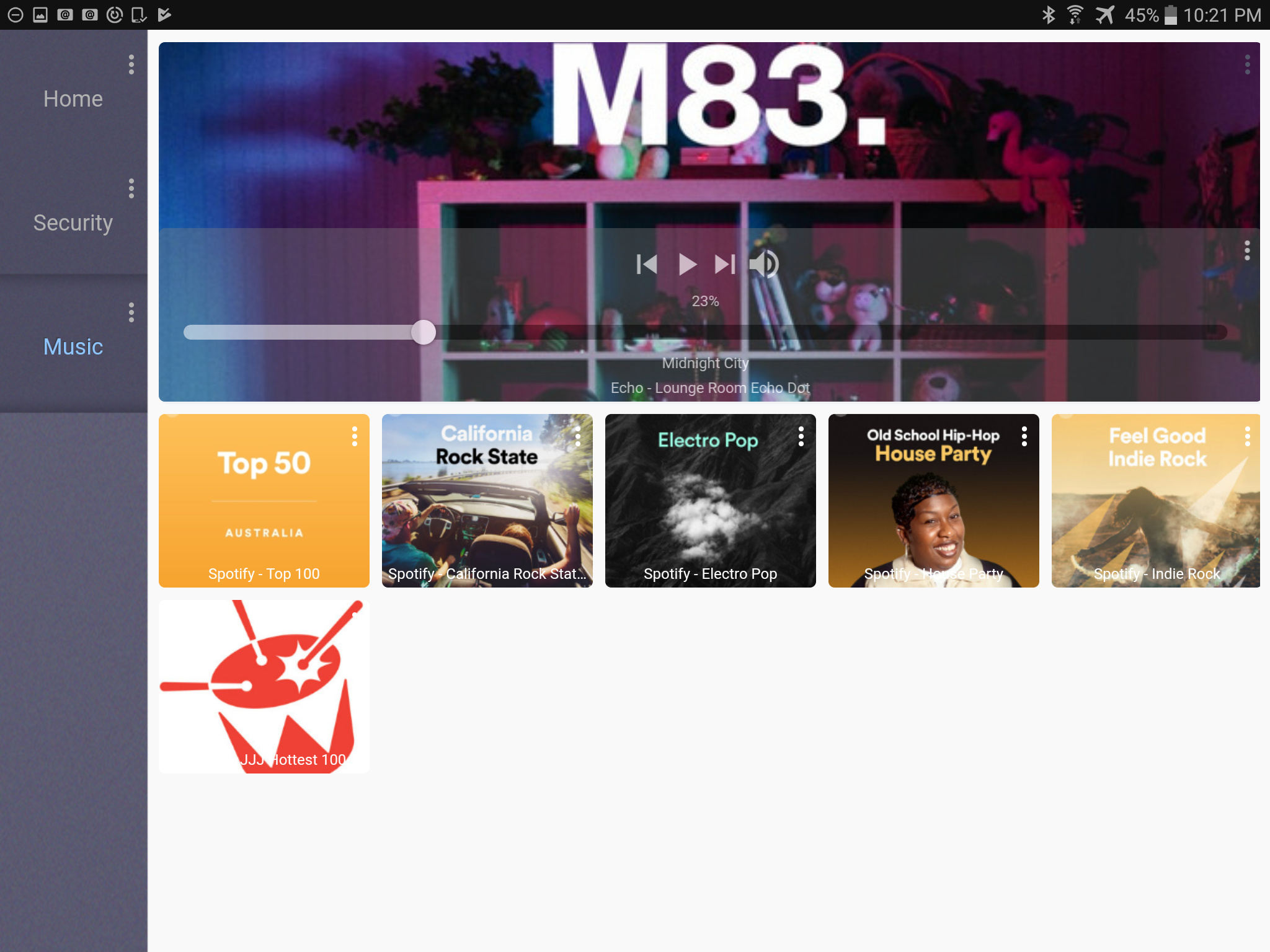
Here is mine so far, took me quite a while with these and pretty much just messing around with the CSS files but I am quite happy with way it is coming along, still few things to add and add more spotify links.
Got quite a lot of help of various people with different apps, so really appreciate their work!
9 Likes
Loving it 
How did you get the colour column on the left like that? Liking that
It's just a background image with CSS changed to line up top left. Took a bit to line it up correct and as I am only using this on one tablet just had to match it to that screen size.
1 Like
That's a creative approach.
That is a great looking dashboard, but also so very confusing.
- it looks the fuzz is onto you so you better run..
- you've got some aussie radio lined up to play - but the 5-0 there look very american..
Ps nice cameras, what are they ?
1 Like
Ha yeah they are just images atm while I try to work out how to set this python script for my Arlo cameras. I have never used python before so taking longer then I thought and just used these as fillers so I can space things out.
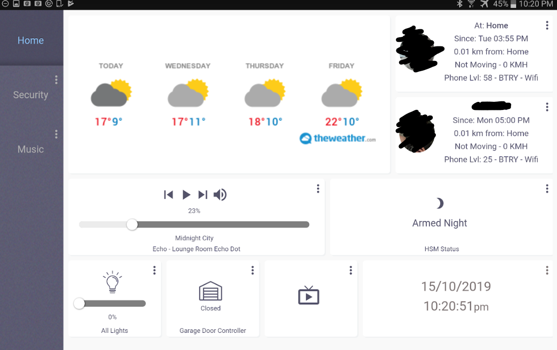
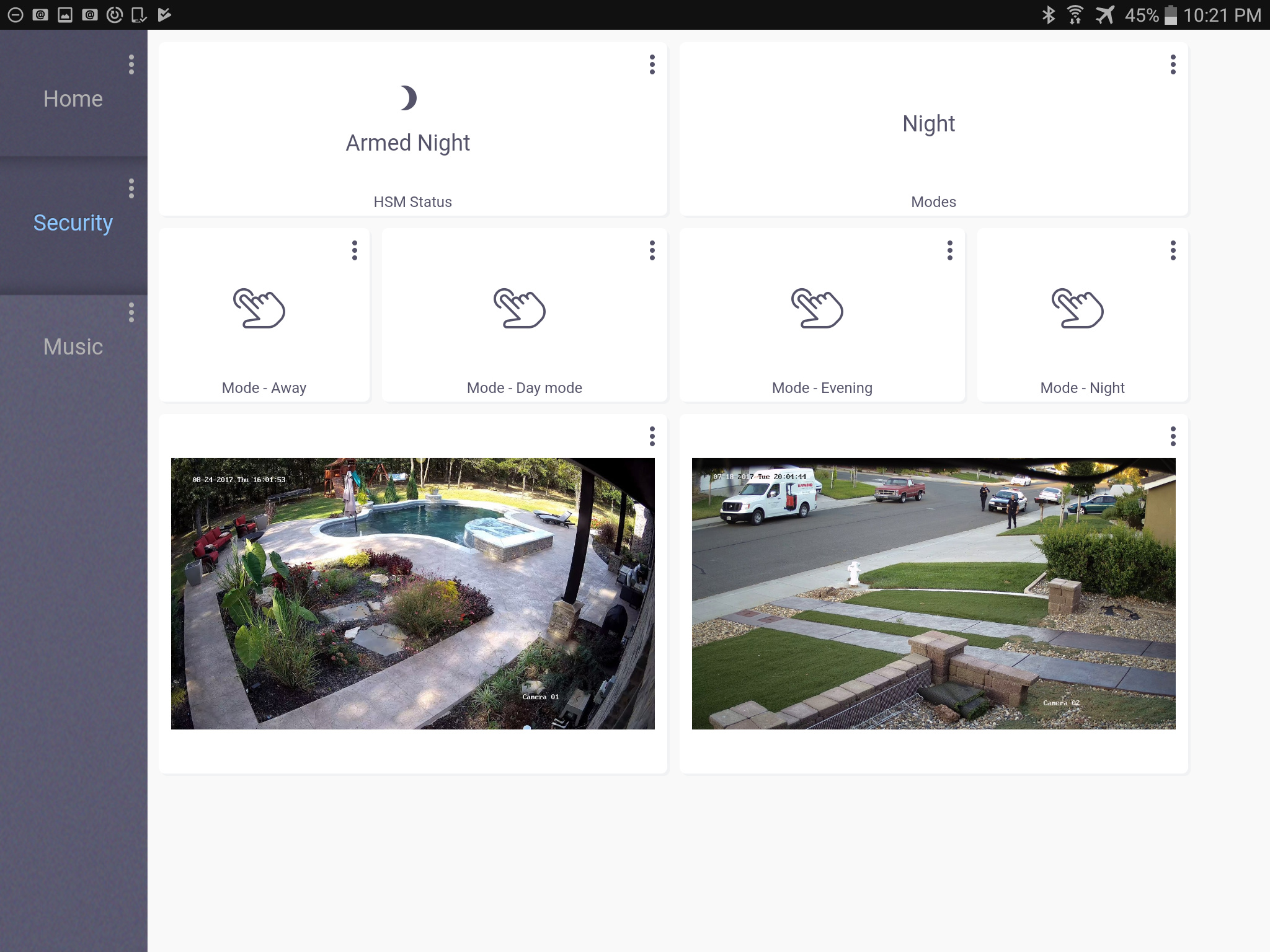
Here's my dashboard. I have Hubitat connected to Apple's Home app via Homebridge and am using Blue Iris for my cameras. This is two apps running on an iPad using a split screen. The camera tiles are actually live feeds.

9 Likes
After a week of tinkering and several versions (best way to learn)
All the dashboards are tab driven so its easy for kids to use, personally I don't need to see everything on one page. Missus is okay with the style, does not look like an eyesore.
8 Likes
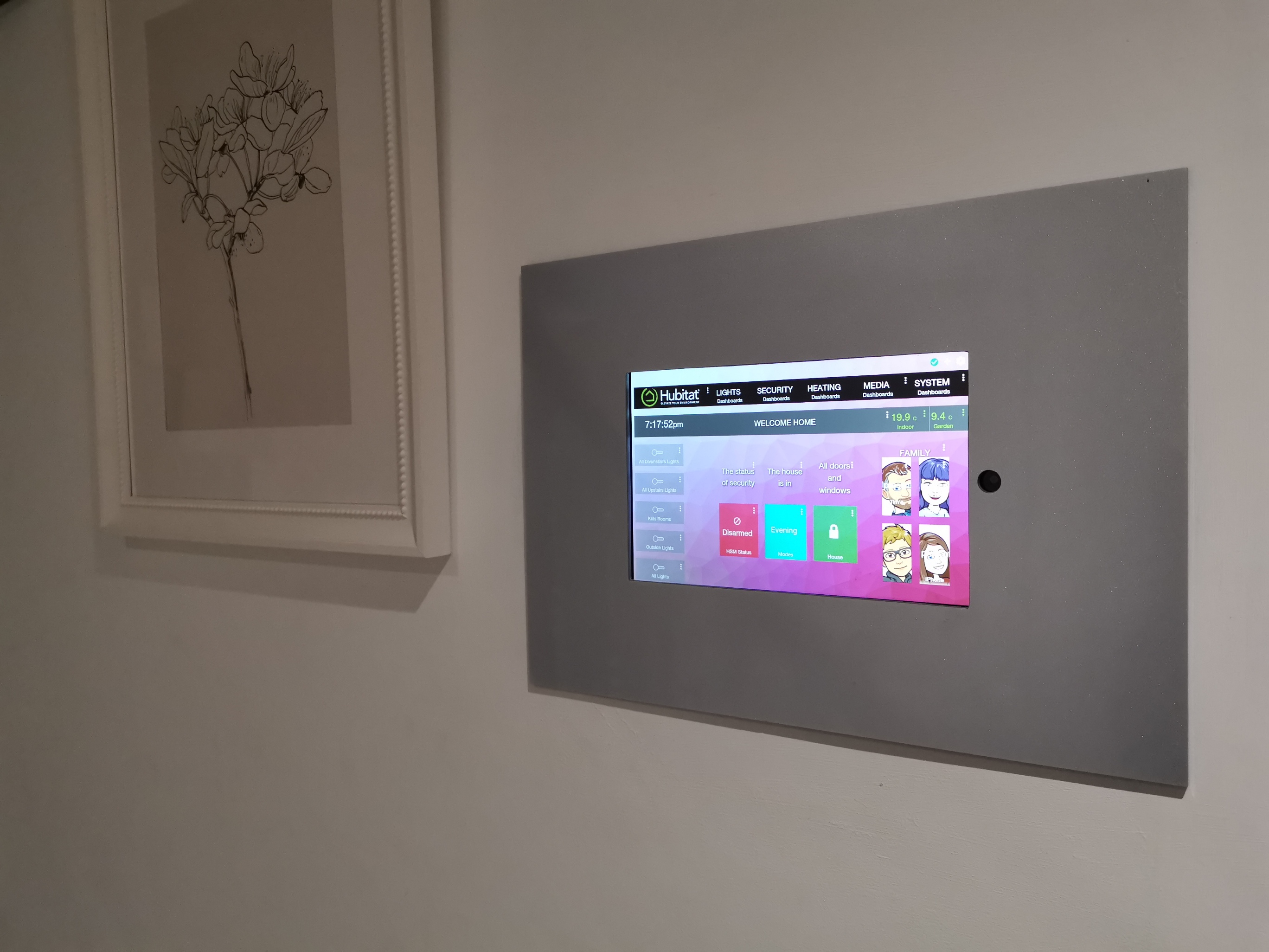
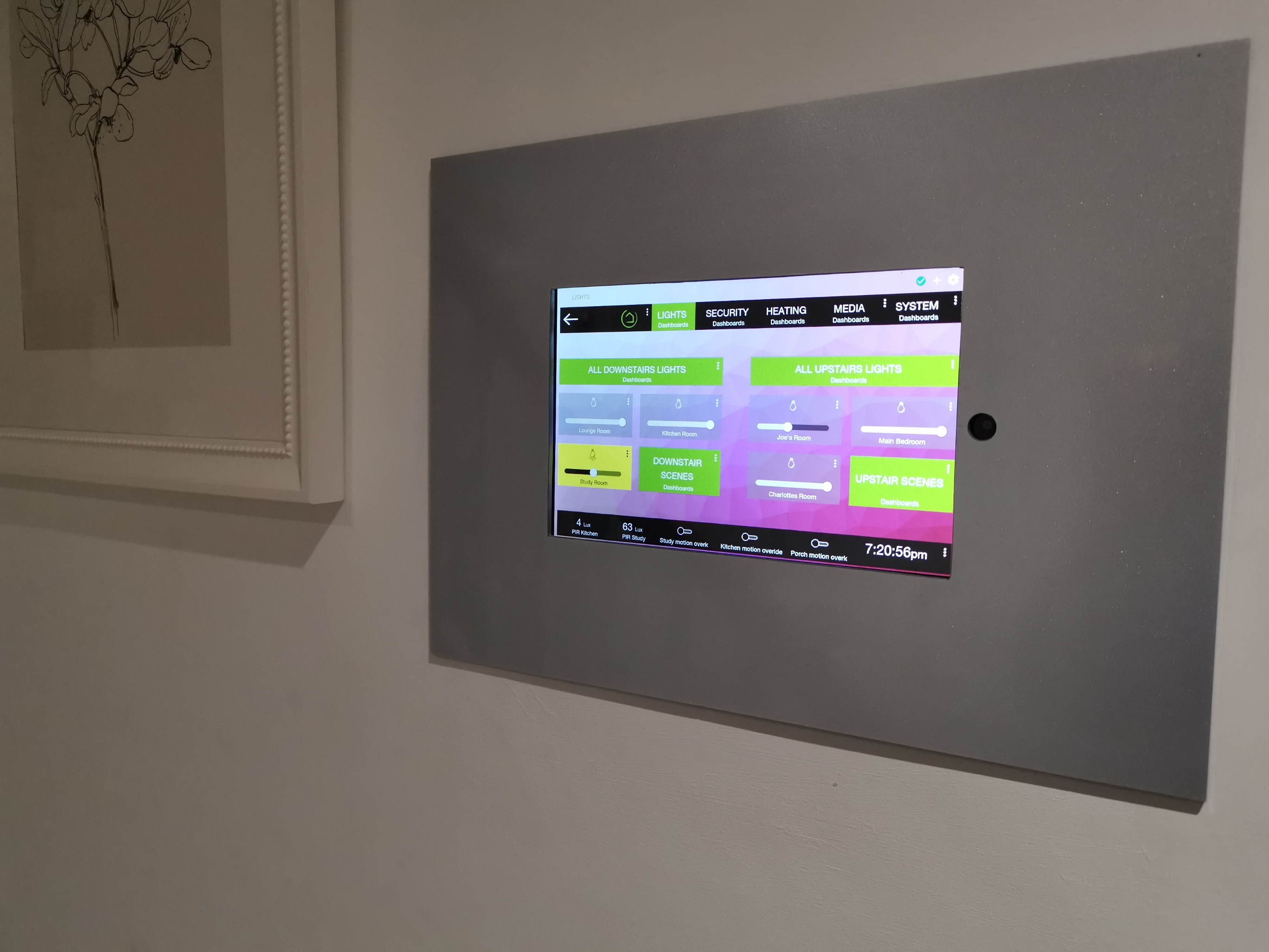
May I ask how you created the "lights" " media" "heating" tabs at the top?
Thy are all simple dashboard links across the top that have a black back ground and white writing, when you are on the page you want, I add a background image to that tile
3 Likes
Nice design
1 Like
Thanks! Can’t wait to try this out.
2 Likes

