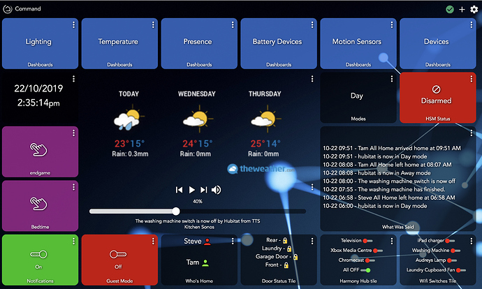
My OCD is killing me if you forward me your PayPal details I’ll pay for your license mate. Apart from that I’m loving the dashboard


 just one of those list of things I need to get around to hahaha. Cheers mate
Always tweaking and mostly had the dashboard as a testing board - but after testing Ive had a chance to slowly move somethings into place to look more presentable.
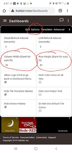
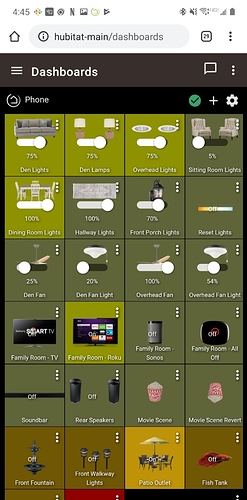
How did you get four across on mobile? I can't get mine to do that
Are those spotify square buttons to start casting music? How did you do that?
Oh wow...that was an old dashboard. That was done with a much older version of the Dashboard app but the process is essentially the same.
Click the Cog icon on the dashboard and select Options. You can then set the column width and row height to what ever you need for your phone.
This is my new dashboard. I honestly rarely use it. In fact taking the screenshot was the first time I've opened it in months.
Thanks for a quick reply! I don't seem to have those options on mine. I wonder if I clicked something when I initially made it.
What do you see when you click on the Cog in the upper right corner?
A screenshot would be helpful if possible.
I was just on the wrong tab, now I feel like an idiot. Thanks for your help!
I like your Movie scene revert icon!
Lol...I really put a lot if thought into that one.
I just got the image from Spotify and set it to background for the button
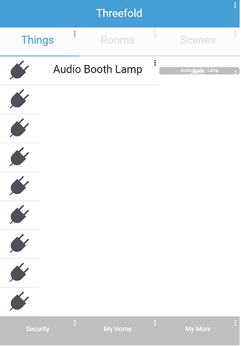
Look Familiar? 
I started this to see if I could make the SmartThings classic app as a dashboard. Mostly as a joke. I intend to finish it, but it has no real purpose aside from being a goofy tech demo of sorts.
There really aren't a ton of limitations of what you can do with a dashboard, turns out...
Edit: Just want to throw it out there that this is actually a rebuild. I had an older version with a device page built out, but lost it to some DB corruption. Always keep backups!
What those spotify buttons actually do? Where is it playing from and how did you do that? 
Also could you give hints how to actually add camera feeds on dashboard? What is easiest approach?
I've been lurking on this thread and I'm just now getting around to putting any real effort into a dashboard. I've been focused on automation for the most part, but now I've got the itch to build a dashboard for a wall-mounted tablet.
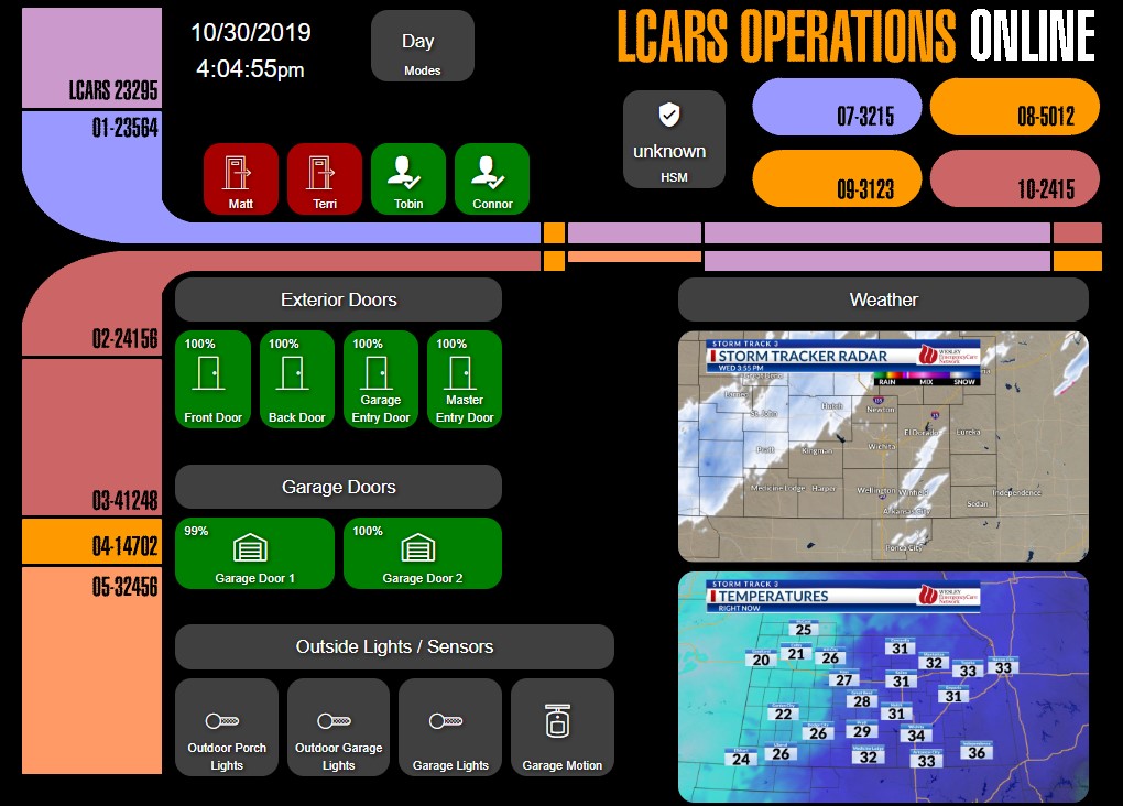
This is just the first attempt at getting a few things on there (playing with layouts, colors, etc.). I'm thinking I want a "monitoring" dashboard to be visible all the time and then a "control" dashboard a click away. I'd love to get everything on one dashboard, but limited screen real estate will likely crush that dream. I dunno. My wife just rolled her eyes at the LCARS background.
Please ignore the "unknown" HSM status. Putting together an active dashboard has me re-thinking a bit of my HSM approach as well.
That's great work. Will look forward when you get some of the Lcars buttons working. Should be possible
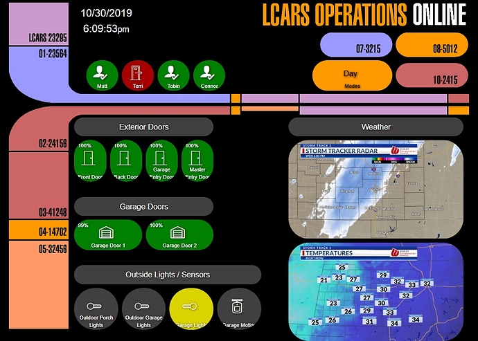
Yeah, I've been thinking about the best way to do that. The problem is that you can't control most tile attributes on a tile-by-tile basis. It's either global (font size, icon size, rounded corners, etc.) or template-based (all Door tiles are green). Below is an updated screenshot where I changed the size of the Modes tile, changed rounding (which changes all tiles  ), and changed the color (which changes ALL Modes tiles... but I only have one, so not a problem in this case)... you should be able to pick it out easily, the odd sized LCARS button in the top right.
A few things I'd like to see in dashboard development (low priority, but nice to have):
-
Absolute sizing - let me choose the size of the dashboard, regardless of the size of the browser tab you have it open in. For example, the LCARS interface I'm using is a background image that's 1024x768 (size of my Galaxy Tab's screen). If I open it on my PC in a 1080 window, all of the alignment is off.
-
Tile by tile attributes (tile size, color, rounded corners, font, icon, etc.)
-
Flashing tile option - it would be cool to flash a tile for 5 seconds on status change (for example, when a door opens) or flash constantly while in a certain state (motion detected, water detected, temp out of bounds, etc.)
BTW, I don't know if anyone else struggles with creating attractive dashboards for different sized screens, but I found www.howbigismybrowser.com is a great help to resize your browser window to specific resolutions to see how it will look on various devices.
I also started creating dashboards with the resolution in the title. I have an "LCARS-1024x768" for my Galaxy Tab and an "LCARS-1920x1080" for one of my PC monitors.
Are dashboards supposed to or is there a way for them to automatically resize based on the screen resolution? For example, I have a full grid of all devices that are in the platform and looks good on a larger table or laptop, but this dashboard does not resize when looking at from the App on iOS. From quick review, it seems like I would instead need to use the SharpTools dashboard instead?
Well I have set tile width to automatic, so it kinda does resize based on current browser. But it looks bit shit either way  My main layout is created for mobile, so PC version looks stretched.
