You could have the background tile black natively. Then apply a specific colour background image url image.
I do something similar to show my tab options change colour when you are on that dashboard.
The issues are different resolutions as nentioned
I agree having more control would be great, the dashboard appearance made a good proportion of the reason why I moved to HE
So that was my other idea, fixed height/width tiles with background images. So... take a full dashboard and carve it up into equal sized chunks then re-assemble tile by tile. I think that would look amazing, but would be a royal pain in the ass to do. I might try a very simple layout to prove the concept.
The background always auto sizes to fit the current resolution. But it maintains the aspect ratio of the background image, so if you go from 4:3 to 16:9 you lose the top and bottom of your image.
As for tiles, you can set them to a fixed height/width or have them auto-scale. Both have their pros and cons.
Again, if you want a very specific look, you can only accomplish it in a single resolution.
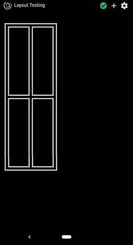
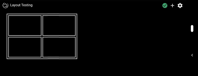
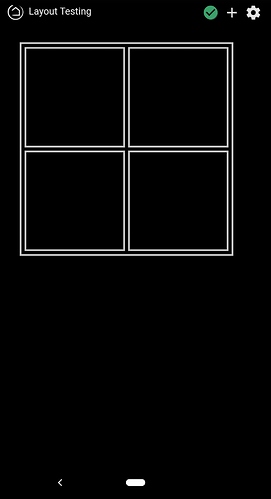
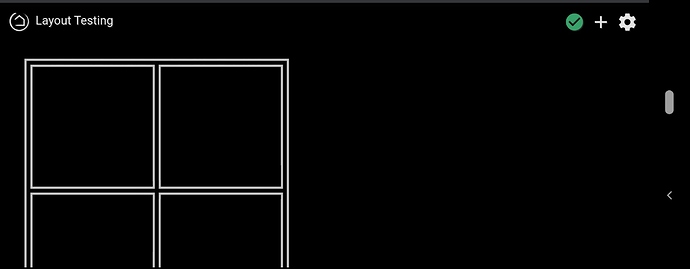
Ok, I created a few simple, reusable images that can be applied as tile backgrounds to create dashboard structure. I put together a simple 2x2 frame to show how it works (no sensors on the dashboard yet).
In the first two images, the tiles are set to adaptive. You see the aspect ratio still messes thing up but the structure stays intact.
In the second two images, the tiles are set to a fixed size. You can see the aspect ratio isn't effected, but then we get a scrolling issue.
Yeah your not getting away from this.
I use the same tablets with the same screen resolution. As far as phone goes I have a separate dashboard for these
I think it is possible. But i'm not 100% sure. Though it does involve CSS. As far as I know the HTML for all tiles are blocks and CSS makes them display in a grid. But in CSS you can set the width of the tiles based on the VW(view width) and you can set the height also based on the VW (maybe use calc here to make it work). I can try this for you if you want but I'm only able to next week. In CSS grid it's also possible to mess with positions of all grid items and if the auto-wrap to a new line when the display gets too narrow.
I also suspected this could be more elegantly handled with CSS. However, it's been a LONG time since I've done any real web development and my skills are 1) way out of date and 2) extremely rusty. Or, said in GIFs...


For mobile screens, I think just vanilla dashboards work very well. It also has a high WAF.
Dashboards designed for wall-mounted tablets can be designed to specific resolutions relatively easy and you don't have to care about other resolutions, screen rotation, etc.
That's where my head's at for now.
Now I'm just looking for some good Black Friday deals on some Kindle Fires.
Oh, also, has anyone used a Lux Mount? Decent price, drop dead-simple, and fits the cheapest tablet on the market. I think I might pick a couple up.
@MBHoag, you are thinking small. I bought 3 Dell P2314T monitors for $75.00 apiece on ebay! These are real glass 23" touch screens with a raspberry pi running them. My wife loves these. I just switched from Smartthings to Hubitat this week, I pulled the plug on the smartthings for the last time this morning with routines that work better and a dashboard that looks better then actiontiles. 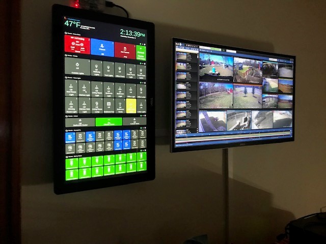
Wow! It's more like Houston Mission Control!
How did you get multiple dashboards to display like this on the left hand screen?
Used a Raspberry Pi as a local web server, instructions on google, and iframes. Pretty basic stuff really. Everything on that screen is running locally except the top bar which is pulled from my public web site.
Ah, got it. Nice idea. I will copy that I think. I guess mounting a screen like that into a cavity in the wall would be problematic due to heat dissapation right? But it looks cool. Nice job.
Shouldn't be any problem with cooling a monitor, go for it! Hard part is finding good ones cheap on e-bay. I got lucky and bought three.
Here is my HTML, it really is that simple, just edit to fit your needs.
         <!-- Add <!DOCTYPE html> to the top, Head line, delete the following four lines if you don't know how to make one -->

<body style="background-color: black">
	<div  >
		<iframe src="http://xxxxxxxxxxx.com/hubHeader.php" frameborder="0" style="height: 160px; width:100%;" style="border:0"></iframe>
	</div>

<!-- Monitor - House Status -->

	<div >
		<iframe src="http://192.168.xxx.xxx/apps/api/3/dashboard/193?access_token=accesstoken&local=true" frameborder="0" style="height: 250px; width:100%;" style="border:0"></iframe>
	</div>

<!-- Monitor - Outside -->

	<div >
		<iframe src="http://192.168.xxx.xxx/apps/api/3/dashboard/194?access_token=accesstoken&local=true" frameborder="0" style="height: 250px; width:100%;" style="border:0"></iframe>
	</div>

<!-- Monitor - House Lights -->

	<div >
		<iframe src="http://192.168.xxx.xxx/apps/api/3/dashboard/195?access_token=accesstoken&local=true" frameborder="0" style="height: 440px; width:100%;" style="border:0"></iframe>
	</div>

<!-- Monitor - Critical -->

	<div class="dAllup_pix" >
		<span>
			<iframe src="http://192.168.xxx.xxx/apps/api/3/dashboard/264?access_token=accesstoken&local=true" frameborder="0" style="height: 160px; width:100%;" style="border:0"></iframe>
		</span>
	</div>

<!-- Monitor - Motion/Fire -->

	<div >
		<iframe src="http://192.168.xxx.xxx/apps/api/3/dashboard/161?access_token=accesstoken&local=true" frameborder="0" style="height: 300px; width:100%;" style="border:0"></iframe>
	</div>

<!-- Monitor - Battery Status -->

	<div >
		<iframe src="http://192.168.xxx.xxx/apps/api/3/dashboard/82?access_token=accesstoken&local=true" frameborder="0" style="height: 300px; width:100%;" style="border:0"></iframe>
	</div>

</body>
Thank you! That's awesome.
Cheers.
You'll need to edit "height: xxxpx" to match the height of each dashboard. Then just paste the local link after "src=" between quotation marks.
Yeah understood. I've used iFrames before so I'm kinda familiar with it. Cheers.
I thought you had, was just adding that for anyone else that came along. It really is simple.
Welcome to HE and thanks for sharing @bill5. That looks so cool. You inspired me to look for a larger display!
Many thanks for this. I have a HP Touchsmart which isn’t in use since my boy complained it was too slow, but this will be perfect!! Now to convince the Mrs I want it in the Lounge 
