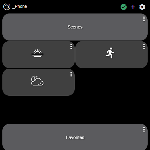
My humble entry after just few days owning the awesome HE addiction hub 
All right, I'll get in on this...
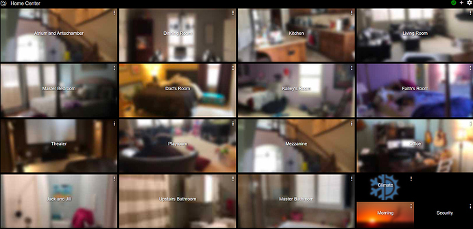
Home Center
Each dashboard link opens the dashboard for the particular Area.
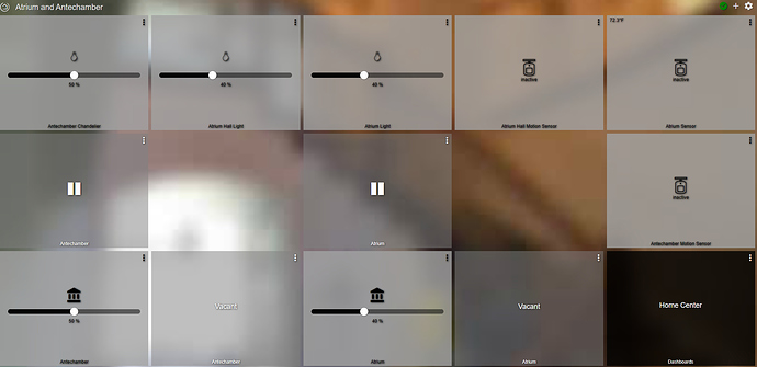
Example Area
Pause buttons allow me to pause automation in that area. I use a custom application to track occupancy of a room or area and the automation for that level of occupancy.
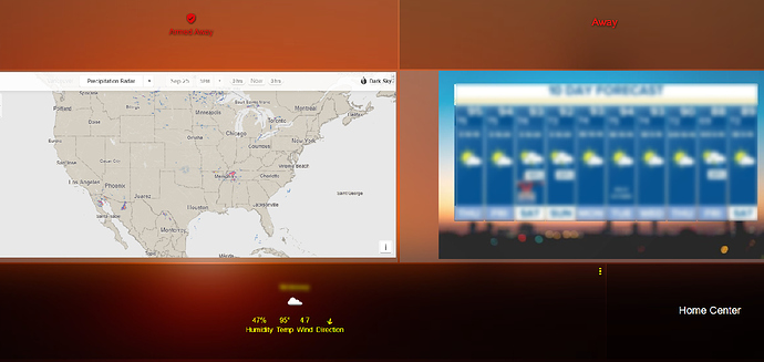
Api Driven Dashboards
I use FullyKiosk Api to manipulate dashboards based on events. Here's an example of the morning dashboard in the kitchen, which automatically shows up on the mounted tablet when the Mode becomes Morning. Details blurred to protect the guilty. Using the handy MyFrame to place iFrames on the dashboard, means that map is fully interactive.
Just snagged another Fire HD 8 to run my dashboards on Fully Kiosk. QVC has them for $49.98, with $10 off at checkout for new customers. Comes with a 32GB card, too, I think.
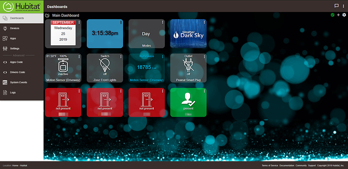
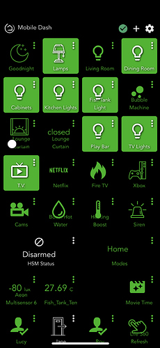
I tried to make my Dashboard look kinda like a mobile app for phones, since my wife's main way of turning things off is an app for some reason.
love your background. It's blending so well with the dark sky and lux tiles.
How do you make the month/date tile?
Thank You 
For the Date and Time, I simply added a new tile using the Date template.
Anyone have issues adjusting columns/rows on an existing dashboard? I was rearranging some dashboards and when I reduce the columns from 4 to 3 nothing happens. Same issue with rows I cannot reduce the number of rows. I can however increase the grid without issues. I currently have auto resize on for the grid. I had an empty column and it still did not resize the tiles when on auto resize.
Which firmware release are you on?
2.1.5.124
So maybe this is intended, but if I create a dashboard and choose "auto fill grid" or even manually add the tiles, the grid will only auto arrange tiles up to a limit. The limit seems to be determined by the location of the tiles when it was added to the grid. So if I have 4 tiles 2 in each row and I enable auto-fit for the row height and column width and then reduce the row count to 1, this would not work unless I change the placement of the tiles in row 2 to row 1. This does make sense, I guess I was just expecting the grid to re-arrange the tiles automatically as I shrunk the rows/columns if auto-fit was enabled.
Love this, I dunno why mine never looks this good
More than happy to share the layout and css if you’d like it mate?
That would be excellent. I want to setup a dashboard. Do you have separate ones for mobile and tablet
Oooo can you share the tablet code and the new mobile code when you’re done?
Also what do the fireTv and Netflix buttons do. Looks like you have a lot of similar gadgets to me
I'll send you a PM with what I have. In the CSS I've written comments which I hope may help.
The TV, Netflix ETC are Harmony activities.
Looks awesome. I’m curious...what are you using for your fish tank lights and temp. I have 3 tanks and have been looking for the beat ways to integrate.
Thanks in advance!
The light is just a SmartThings plug for the LEDs above the tank.
The Temp is a flashed Sonoff TH16 with a DS18B20 probe attached. I check the temp every 15 minutes, and warned if too high, or low 
Looking over the posts here about using CSS. I was able to duplicate changing the tile title ok. What I am wondering now is how to change the tile color for both on and off states? I can change the template ok, but If i want the same template on different tiles but different colors how would I do that with CSS?
Thanks.
If I am not mistaken than I don't think that this is possible without having something like jQuery access or so.
The background color is applied to the very top element (css tag tile), however, the state of the switch is a subelement (css tag tile-primary). CSS does not give you an ability to select a top element based on it's child classes and it doesn't give you a way to select a parent of a found element.
Applying to background color to the tile-primary element will make it look funky (I tried to make the background green):
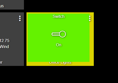
Of course, I would be very happy if someone can prove me wrong!
