It's easier and with fewer click to change rooms from the main "Devices" page where in the Room column there is a pencil that you click to edit the room assignment.
2 Likes
That is true, but I find it easier to see the devices in their room grouping when im deciding to rearrange things. eg I have a bunch of virtual devices etc that were scattered across various rooms and I moved them into their own "room" called "Home Automation" to declutter real "rooms".
PS, you cant create new rooms from the Device list, but that is certainly a quick update method for devices that arent assigned to an existing room.
1 Like
@djh_wolf perhaps give this a go - there's a noticeable speed-up from HE .146 on my ancient 2013 MacBook Pro and 4 year-old base spec iPad. Both feel quite responsive now, nice work Hubitat Team. ![]()
3 Likes
Same experience here.
1 Like
Do you mean .145?

OK
Really speedy on my S21! ![]() Nice.
Nice.
3 Likes
You’re assuming he meant “from one to the other”. A plausible alternative is “from the use of,” or “from the upgrade to.”
But seriously why does it even matter?
2 Likes
I see your confusion, isnt the English language fun - my wording was meant to convey that the .146 FW delivers a noticeable speed-up, as in the speed-up is "from .146".
This is why Lawyers have jobs. ![]()
2 Likes
Perhaps it's because we're in different hemispheres, lol.
2 Likes
Nah, the english language is just such a mish mash of other languages and cultures, that seemingly concise descriptions can be interpreted in multiple ways by ppl with different backgrounds.
2 Likes
I didn't have to search far:
https://www.fionalake.com.au/info/translations/australian-american-words
1 Like
Ask anyone who leared English as a second language...it's an incredibly annoying language to learn.
4 Likes
She goes on and on about Australian Iced Coffee....it really sounds great.
Lol, yeah there are a few little differences here and there ...
According to the Oxford Dictionary, the word "from" has 11 different meanings! ![]()
Farmers Union Iced Coffee is so good it outsells Coke in South Australia.
4 Likes
@gopher.ny I found something today that is less than ideal, the feature is awesome, but it screws with the device list UI when you use it. eg
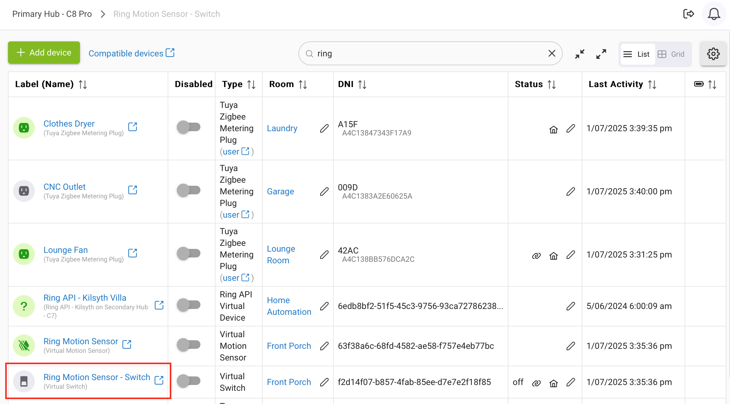
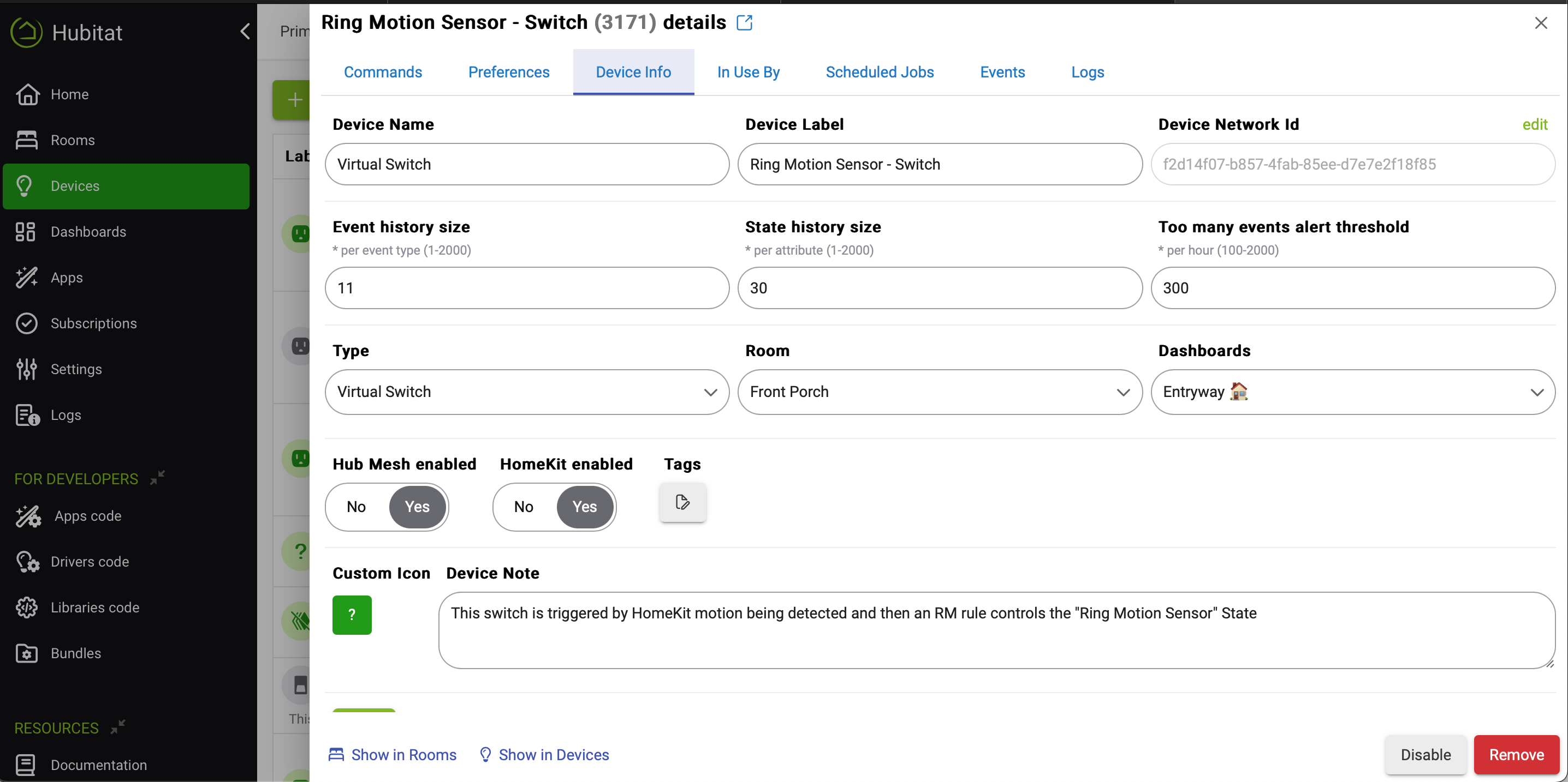
and after I use the excellent new notes feature, due to a lack of text wrapping, my Column is now silly wide:
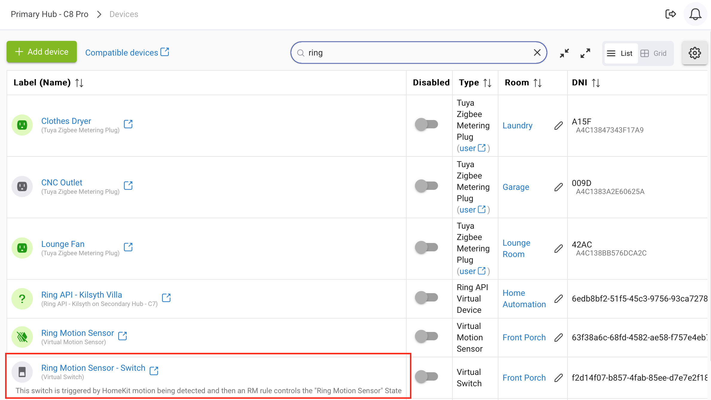
I even tried inserting manual carriage returns into the text to simulate wrapping, and I still got the above result.
3 Likes
I think you'll like this one ![]()
4 Likes
Thanks for the reasoned replies. I can appreciate that people such as yourself do try to provide assistance. I tend to lurk a little. It's common. Thank you.
Moving on, I'll leave it at:
-
I'm sick and tired of the standard responses. It's all been said. I could bring many examples to the table, where users report an issue and some of the forum-regulars jump to defend, claim fringe case only, etc etc, but this really isn't the time or the place. It's frigging obvious. Happens all the time. I'm not the only one to have noticed. It's very, very off-putting. But, moving on....
-
The performance is far better. Yay. Thanks for updates.
-
A bit of transparency would have helped, if the release had advised initially that performance may lacking on older devices, but this is known and would be rectified. Then I wouldn't have reported it, i wouldn't have been encouraged to troubleshoot (which would have been a total waste of time), and people wouldn't have got all pissy and defensive. Reeks of the old fanboyism from the days of Apple v android online grumbles.

-
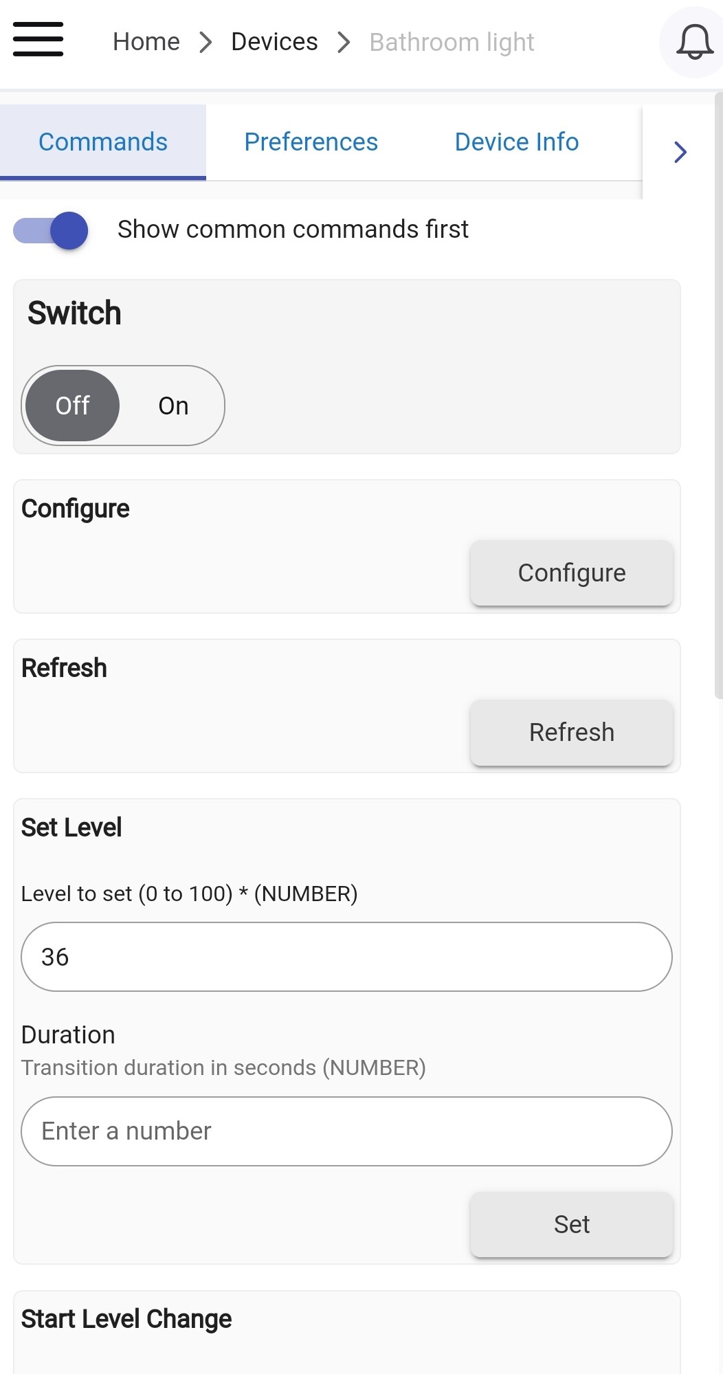
Searching for a new device shows this.
I need to click directly on the link to show the device itself. Might be more finger-friendly to either allow you to flick the switch by pressing the icon in the circle, or to allow anywhere in the rectangle to navigate to the device page instead of needing to hit the tiny target.
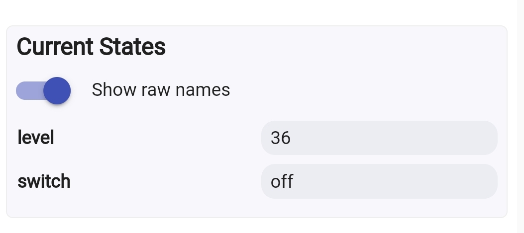
- It would be handy to be able to see the current states without needing to scroll half way down the page. This would allow me to hit on/off and quickly see it's actually worked. Useful.
Cheers!
3 Likes
Excellent ![]()
TBH, I doubt that the Hubitat team or beta testers keep ancient hardware around like my MacBook Pro from 2013 for testing (perhaps they should tho).
There are also so many phones around running a million versions of Android and iOS that it would make regression testing really difficult.
I think under the circumstances, resolving the performance issues in under 2 weeks over the Xmas / New Year period is a pretty stellar effort.
That said, there are definitely some general UX issues that have been reported by a few of us in this topic. Hopefully they get resolved rapidly too.
7 Likes

