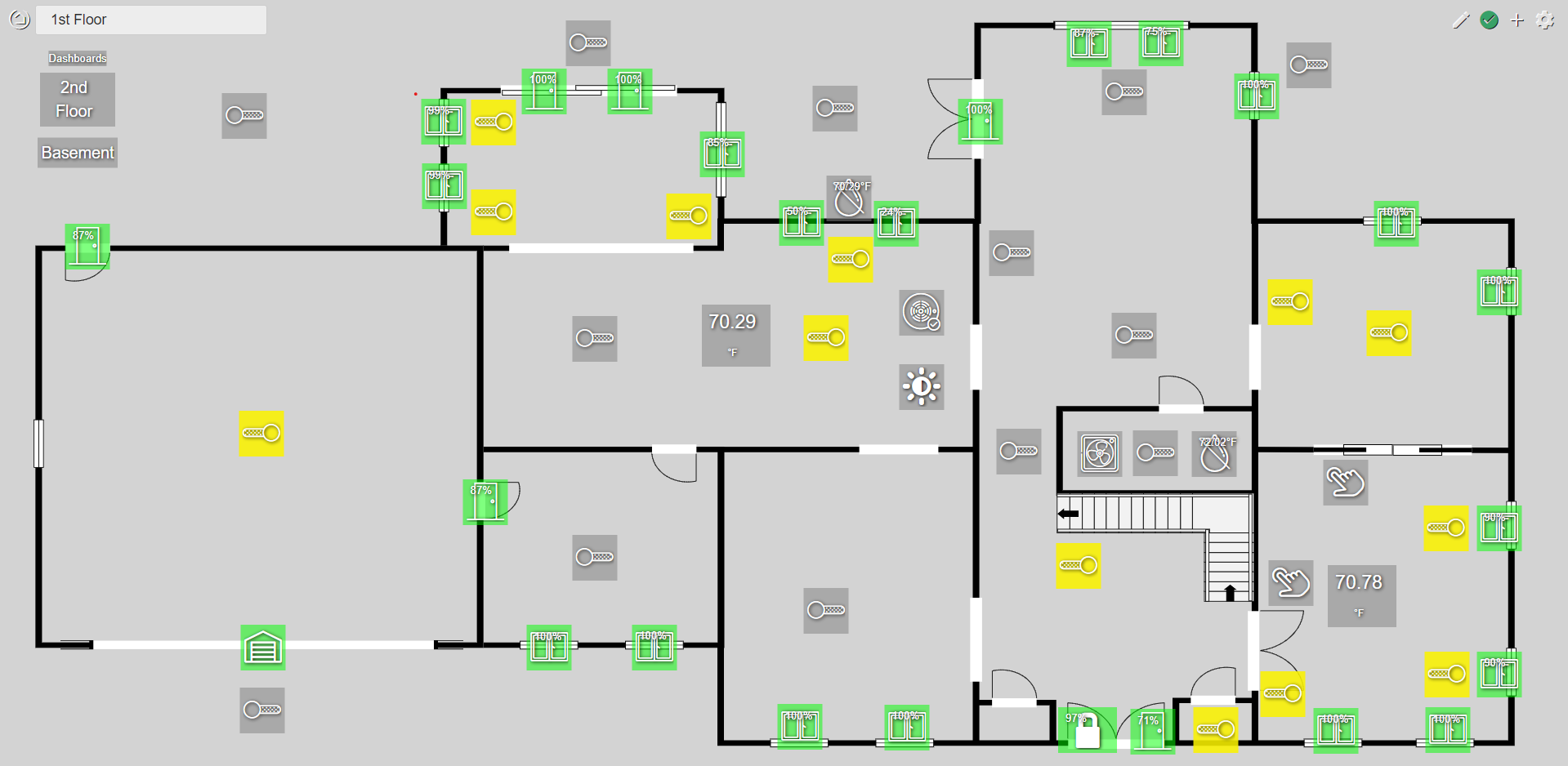
A drag and drop editor for creating floor plan based dashboards. This eliminates the grid layout and positions tiles via CSS. It will overwrite any custom CSS.
A drag and drop editor for creating floor plan based dashboards. This eliminates the grid layout and positions tiles via CSS. It will overwrite any custom CSS.
That looks sweet!
Very nice! What do people use to create a floorplan image?
I used SmartDraw. Then I edited the exported SVG to make it scale well.
https://www.smartdraw.com/floor-plan/architectural-drawing-software.htm
I just started playing with this. Here are some notes:
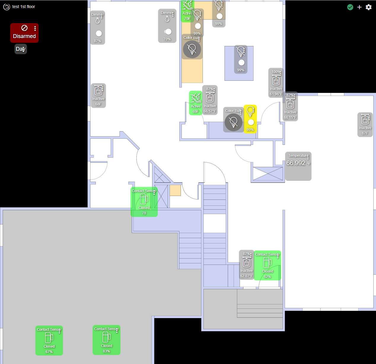
I created my SVG floorplan images uses SketchUp (since I already had the house drawn in that), exporting to PDF and then using Inkscape to convert to SVG. I manually edited it to height="auto" and width="auto". Having a small margin around the SVG seems needed (I didn't do this yet).
Once I uploaded my floorplan to my hub, I could add it as a background image using the path (e.g.,) /local/1st-floor.svg.
The instructions are written assuming you did not do an autofill on the traditional dashboard. On my first one, I did the autofill, and then when I went to hupIP/local/DashEd.html, all the existing tiles were stuck in the upper left. Selecting them and moving them was tedious. I recommend not doing autofill and adding tiles one at a time as per the instructions.
I definitely need to do more work.
I'm relatively new to HE so please bare with me  . Does "installing" this D&D floor plan dashboard editor "mess" all the existing dashboards or just selected one? Can new dashboards be created and edited with default HE dashboard editor?
With best regards!
This only affects the specific dashboards you edit & save with this editor. I have a mix of dashboards, some using a floorplan and some with the normal view. You can always revert a dashboard by wiping out the custom CSS it saves.
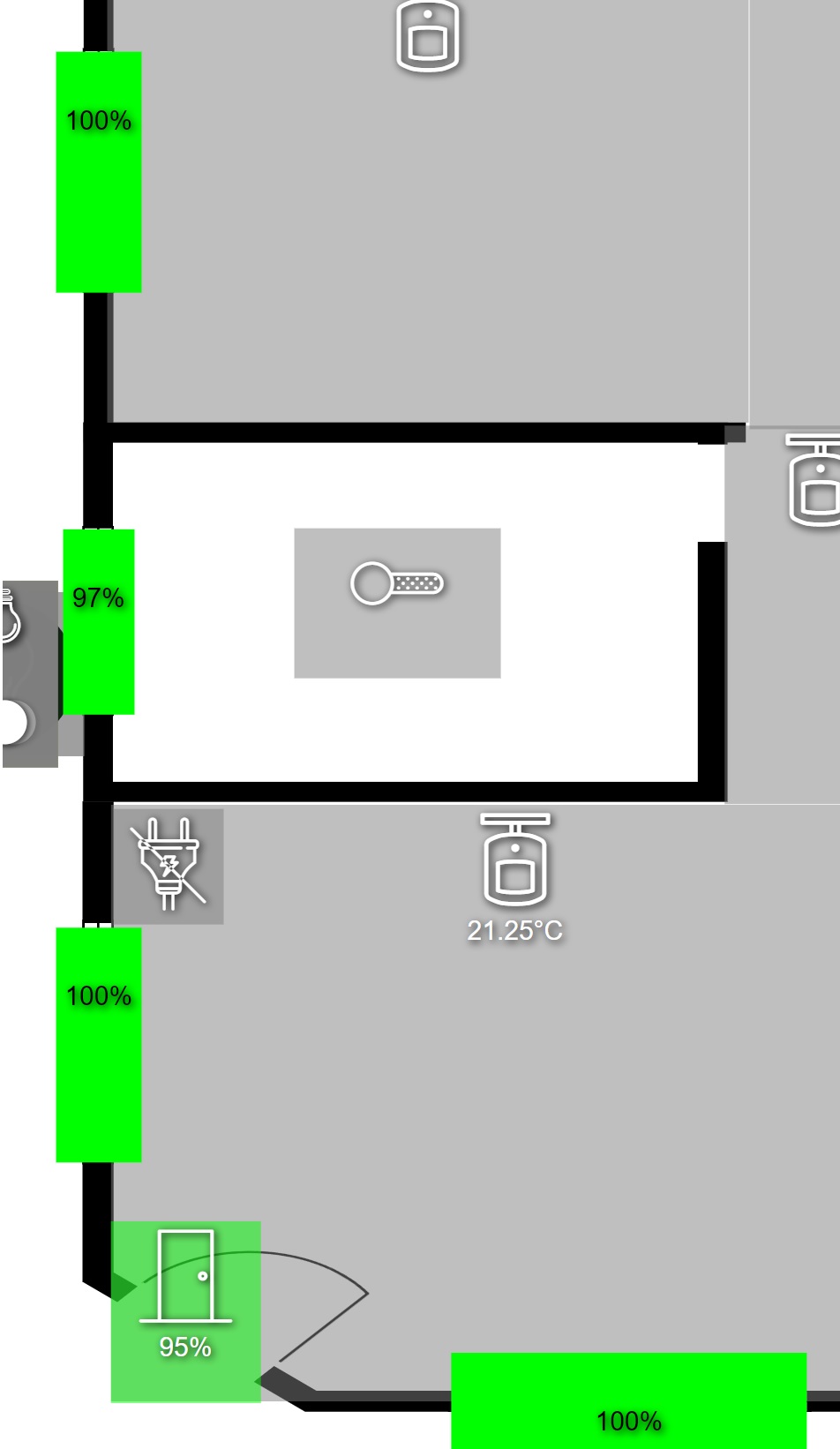
I liked the drag and drop editor... just a small problem... at least for me.
I would like to make the green boxes verry small but it will not allow me to do it...
Yeah I can adjust it etc but wen I hit the safe and the page reload... i'm back with this.
I think it's the battery status forcing it to be bigger.
But even adding a '.tile-tertiary display: none' seems to work, only as long as i don't refresh the page 
I don't need anything else but just a green or a red box, depending if the contact sensor is open or closed...
anybody got a clue to help?
got the door/windows down a lot but the last part doesn't seem possible.
Also text and numbers don't scale and icons. (on phone it looks huge
Is it possible to scale text and icons? If yes, how.
Is anybody stil reading this?
There is probably a way to customize the JSON to do this… but the dashboard tool only allows one (customizable) size.
A proportional sizing for icons and text would be a very nice feature to add though! @bobbyD, who would such a request need to be directed to?
It's possible for the tiles etc working with %
Now I will make a new dashboard of my 'downstair', 'downstairs phone' and 'downstairs tablet'... 
It's a pain and clutters everything on the hub. just to get the same layout on phones, pc and kids tablets.
AND NO i'm not even thinking of redoing it for my/her phone (one is bit bigger)  but what els can I do...
It sure make Hubitat a lot less accessible for the non-tech house-creatures (wife, kids, cat, godzilla,...)
But there is more... I need 2 versions of those dashboards (6 in total)...
why...
because i love making the same dashboard...
Got ya...
No, because the standard icons are not 'cool' and we wanted more custom icons for different rooms, floorplan etc. But hubitat doesn't show local stored icons/pictures/backgroud so...
version for local use and version for on the road...


Looks like these can be adjusted using CSS. So someone here in the community might be able to help resize them to fit better when used on smaller screens.
It looks like we can scale the whole dashboard page by applying this to the body css:
body {
transform: scale(1.1);
transform-origin: 0 0;
}
the scale(1.1) will make it 110% of normal size. the origin will keep upper left in the 0,0 position.
this combined with maybe some media queries for screen size might be able to help us scale for different screens.
I will be playing with the floor plan editor more when I have time, and will post back with updates.
Maybe somebody of Hubitat itself could take a look at it? I would think a company would like happy user-expierence. And scaling things to phone/tablet and/or PC seems verry basic function. but who and how?
On the other hand... user-expierence doesn't bring in any cash. Ok, in time it would if ppl are talking about how easy it is... but that's long term.
Any luck? i tried your body-transform but had no succes. It just scaled a bit on the pc but on phone it was still a messy thing
@rgraves maybe you can help with your creation?
Forgive me if I’m missing the obvious, but are you seriously asking the HE staff to modify a community developed application and/or teach you CSS? 
I'm asking for something not related to this app but for every app. It just happend to be here on this app but I could post it almost any app.
Should be usefull even if you don't any app.
So again... Basic
Since this is a user written and contributed app, the Hubitat people have nothing to do with it.
Any changes or tweeks to it would be made by the developer of this app, if they felt it was worth it.
The Hubitat staff have plenty to do for the platform, so it's not likely to be on their radar.
1 and 1 
Not only for scaling but also for custom icons/backgroud/image/...
Local, yes but nothing more.
I know of student houses refusing my idea of hubitat just because it.
I think @gertjan.deprez comment about Hubitat staff looking at this was more a request for a responsive design dashboard implementation, not that they should provide support or feedback for css based changes or support any user generated mods/etc. Having built several responsive single page applications/websites, I know how much of a pain it is for it to be close to perfect (especially considering different browser implementations of web "standards"). There will always be tradeoffs when viewing from multiple devices.
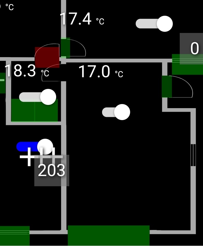
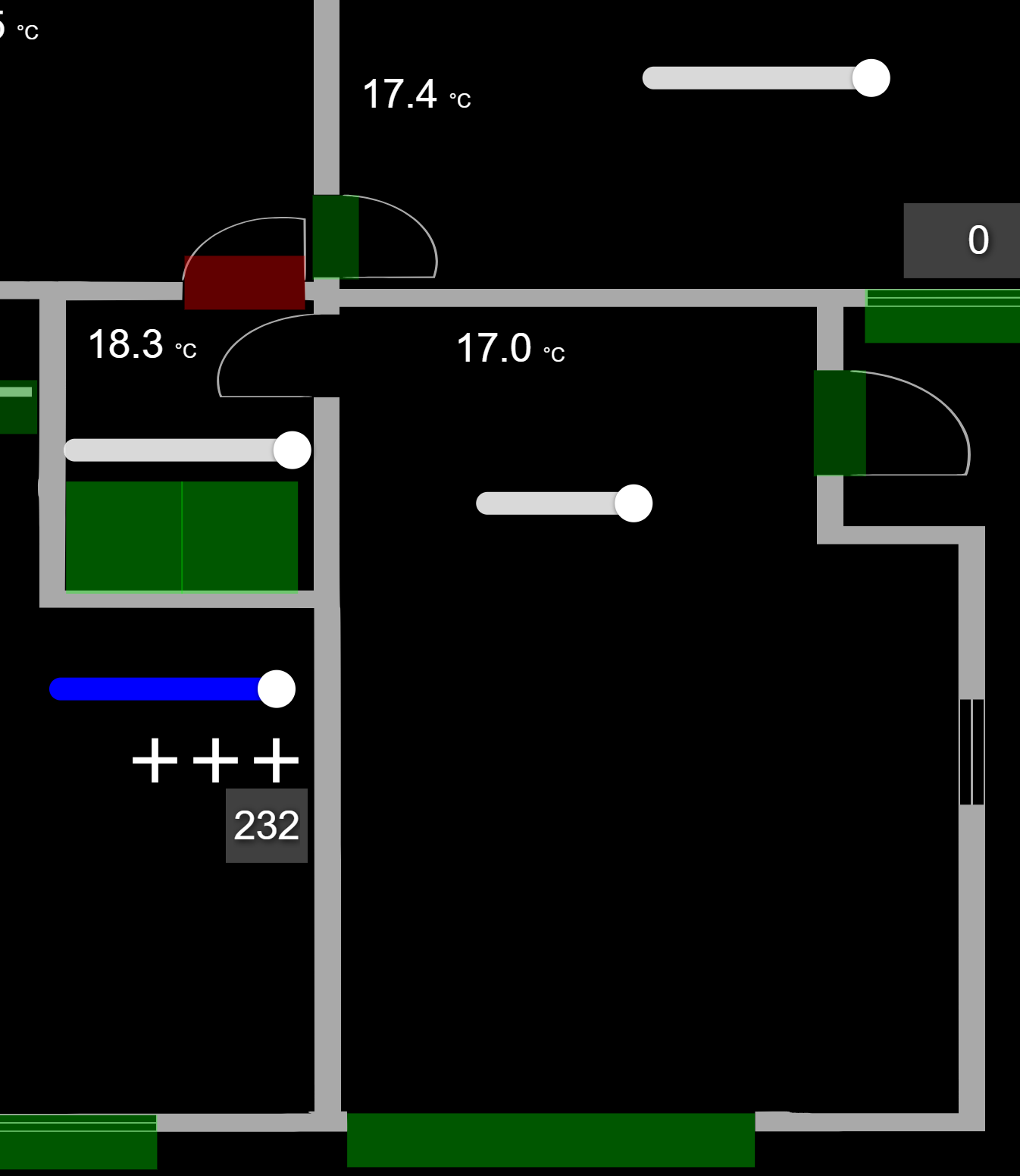
I have played around with this a little bit, and will post my findings below. they are not fully hashed out and it looks like any use of this will require some playing around for each screen resolution AND aspect ratio you want to have these displayed on. It may be easier to just copy the dashboard and have 1 dashboard for each screen resolution you want to use it on, but that will obviously make future changes more complex. Also, this will only work if all displays are the same orientation, in my case horizontal displays.
What I found was that the tiles will scale differently than the background image on the dashboard when moving to different screen resolutions/aspect ratios. So, with this in mind, I first had to choose my default/standard screen resolution and aspect ratio to build this dashboard. since I have FireHD8 tablets, the primary resolution is 1280x800 with an aspect ratio of 16:10.
I also had some issues getting the D&D floorplan editor to work how I imagined it would, so for the proof of concept, I just manually moved the tiles around and sized them appropriately for my need using the default dashboard editor. If you are happy with how the D&D floor plan editor works, then use that, but I would use an image tile for the floorplan svg sized to fill the whole display size and use the css i show below.
To do this, I created a new dashboard, and set the columns and rows to a higher multiple of my aspect ratio (16:10), so i chose 80 columns and 50 rows. (16x5 = 80 and 10x5 = 50). I then removed the width and height values for the columns and rows so they would auto fill the space. this will allow you to fine tune the spacing and location of tiles over the floorplan image.
**note, since the column and row values are large, when adding tiles, make sure to set them at least 5 columns x 5 rows (you can change later) otherwise it will be almost impossible to move them as 1x1 are super tiny.
For the floor plan image (.svg), like i mentioned, I had scaling issues when it was set to the dashboard background, so what I did was the first tile you add to the dashboard will be an image tile, and set the image to your floorplan svg. Make this tile full screen on your dashboard, in my case, 80 columns x 50 rows. I then set this custom css to remove click events from that tile and make the tile background invisible/etc:
#tile-0{
	pointer-events: none;  /*  removes click events from the tile preventing the image from going full screen when clicked */
	background-color: rgba(0,0,0,0);  /* whatever you want here, i wanted full transparent  */
    border: none !important;   /*  I didnt want a border on this tile */
}
#tile-0 .tile-edit{
	pointer-events: initial;   /* this will allow you to click the 3 dots to edit this tile if needed */
}
Now you can start adding your other tiles (make sure they are 5 columns x 5 rows when initially adding them) and move them to where they need to be over the top of the first image tile, then you can change their columns/row value to whatever you need to make it look correct.
This gets you pretty close to the D&D floor plan editor (at least it works for my needs) and this will be set for your main resolution screen.
Now you need to look at scaling for other screen resolutions and/or aspect ratios.
This will require the use of CSS mediaqueries to apply specific CSS depending on screen size. there are plenty of write ups on how to use mediaqueries, so google for more info, but this should help get you started:
/* apply to screens wider than 1900px */
@media only screen and (min-width: 1900px) {
  body {
    transform: scale(1,.9);  /* scale( x-axis, y-axis) */
    transform-origin: 0 0; /* keep upper left in the top left position */
    aspect-ratio: 14.8/9; /* this is useful if you need to adjust the aspect ratio, in my case, my main display is 16:10, but if i want this on a 16:9 screen, then I would need to adjust this ratio to make it look better and keep the tiles aligned */
  }
}

/* apply to screens wider than 1300px and less than 1900px */
@media only screen and (min-width: 1300px) and (max-width: 1899px) {
  body {
    transform: scale(1,.9);  /* scale( x-axis, y-axis) */
    transform-origin: 0 0; /* keep upper left in the top left position */
    aspect-ratio: 14.85/9; /* this is useful if you need to adjust the aspect ratio, in my case, my main display is 16:10, but if i want this on a 16:9 screen, then I would need to adjust this ratio to make it look better and keep the tiles aligned */
  }
}
** note, when using the aspect-ratio to go between different aspect ratio monitors, this needs to be relative to your main screen. In my case, 16:10. If I wanted it on a 16:9 monitor, then adding 16:9 here will not work, it needs to be the difference from my initial 16:10 screen, in my case 14.85/9 got close, but could use some more fine tuned adjustments. I know this sounds complicated, but play around with the numbers in the web admin tools/inspector and you will see what I mean.
Again, because the current dashboard framework is grid based AND the fact that the floorplan needs to have overlapping tiles in correct positions, any scaling between different sized screens will need some adjustments and will take time to look good for you.
Hope this helps.
Download the Hubitat app