The Noob's (in)complete guide to CSS for Hubitat

Is there a way to move a tile title to the centre of the tile, can't seem to find a way...

horizontal or vertical???

Both, I am kind of achieving what I need with some text tiles, but it is an ugly way to do it...

If you use

display:block;
top: ypx;
left: ypx;

it may give you the control you need

Thanks, I'll get something going with the text tiles, then see if I can change it over to this method, will be much neater if it works.

It's to much for me...

I'm trying to scale the words on my dashboard and icons.
I try to explain more since my english isn't that good.
I make dashboard on pc with icons, text, weather app etc
Just perfect... even used This Thing here

but when i want to open the dash on my phone/tablet everything is different... Icons and text are huge making the dashboard useless.


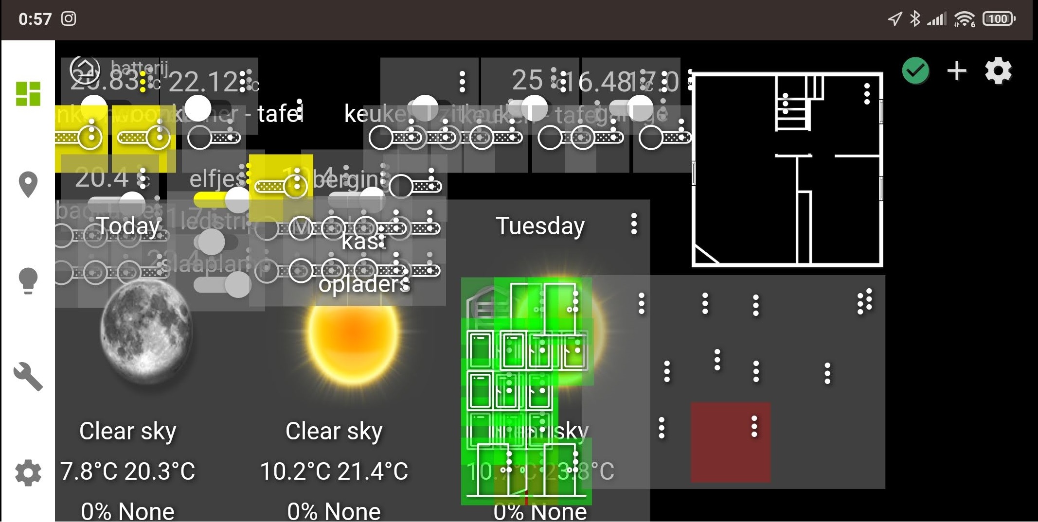
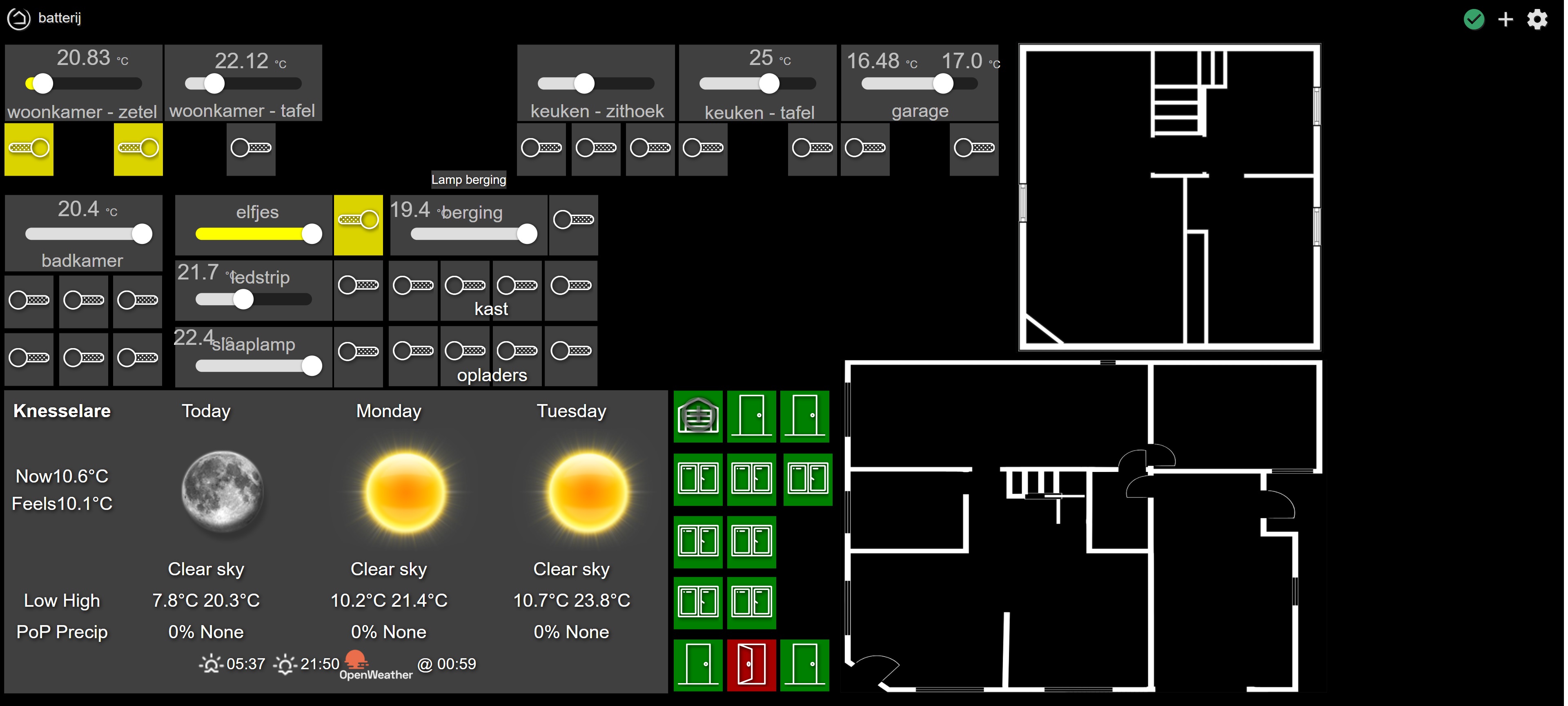
think you see the difference...
I tried some tips that I found but it's not working for me and "bobbD" couldn't help... or won't.

Can somebody PLS help?
I want to make a dashboard on the pc and make it scale down for tablet/phone... and not making 3 dashboards (pc, tablet, phone)

Take a look at this:

You can use vh or vw to set font sizes, and they will respond to your viewport size.

I did. I tried but I don't even know some words...

.header { position: absolute; width: 100%; }
.header span:last-child span { z-index: 5; }
.dashBack { z-index: 5; cursor: pointer; }
.wrapper { height: 100vh; width: 100vw; margin: 0px !important; }
.tile { grid-area: unset !important; position: absolute !important; transform: translate(-50%, -50%); overflow: unset !important; }
.tile-title { position:absolute; background: inherit; transform: translate(-50%, 0%); left: 50% !important; bottom: unset !important; right: unset !important; top: -2em; width: max-content; visibility: hidden }
.tile-contents { height: 100%; width: 100%; }
.tile-primary { height: 100%; display: overflow: unset; }
.tile-secondary { position: unset; display: none; table-row; }
.tile-tertiary { position: unset; text-align: unset; display: none; table-row; }
.tile:hover .tile-title { visibility: visible; }
.vue-slider:hover { width: 10em !important; },

That is the the start of my css code followed by some tiles and positioning of them like this...

/*  lamp 1  */
#tile-2 { top: 20.49760601915185%; left: 2.117106132209301%; min-height: 7.060533515731874%; min-width: 3.125%; }
/*  lamp 2  */
#tile-3 { top: 20.49760601915185%; left: 16.26709004243215%; min-height: 7.060533515731874%; min-width: 3.125%; }

It's hard for me to figure it out. I've seen px, vh, vw, %, body, translate, transform,... :exploding_head:
What, where, how... :man_shrugging:

Try adding something like this:

div {
    font-size: 2.25vh;
}

.material-icons {
    font-size: 5vh !important;
}
.material.icons {
    font-size: 4vh !important;
}
.tile-tertiary {
    font-size: 2vh;
}
.tile.dashboard .tile-primary {
    font-size: 3.5vh !important;
}

Change the font-size numbers to get the right size. The font-size values that end with !important need that or they will be overwritten by Hubitat.

thx @BrianP it kinda works...

switches, button, window and garage status do scale now.

no luck on sliders, open weather icons and text

and I did play around with it but more then a flat sun in a big box... nothing happend

I think you have a big language problem... I hope you can understand us well enough to fix your problem.

For the sliders, try something like this:

.vue-slider {
  margin-top: 1vh !important;
  margin-bottom: 0vh !important;
  height: 2vh !important;
  margin-right: 2vw !important;
  margin-left: 2vw !important;
  padding: 0.75vh 0vh !important;
}
.vue-slider-rail {
  border-radius: 1.5vh !important;
}
.vue-slider-dot {
  width: 3vh !important;
  height: 3vh !important;
}

You should inspect the OpenWeather div to find out how to adjust its size. I included .material-icons { } to change the size of some icons, but I'm sure there is some class you'll need to find to adjust the size of the OpenWeather images.

I don't use the D&D Floor Plan Dashboard Editor, I just leave width/height blank for the dashboard, so the tile sizes scale. Getting this to work on different screen sizes will require a lot of inspection (Ctrl+Shift+I in Chrome) and CSS editing. I don't think D&D Floor Plan Dashboard Editor was designed to adapt to different screen sizes.

Also, I liked mbarone's comment about using

body {
transform: scale(1.1);
transform-origin: 0 0;
}

Calculating that based on media queries. Maybe you should try that instead of using % or vh/vw.

The Hubitat dashboard is not designed to be responsive. You are supposed to make different dashboards for different devices. I'm happy with my landscape version that scales, but I don't use it on my phone. I created a separate dashboard for that.

There's a good chance this won't work for your situation, you do seem to have a dashboard with many tiles on it.... But two things come to mind...

Have you tried setting the Row Height or Column Width to zero. This enables the "auto-fit" option and it should adjust the size of the tiles to suit the device. I don't believe the fonts are adjusted, but I could be wrong... The Row Height and Column Width settings are available under the Options tab in the Dashboard settings, i.e. the "cog" icon.

Alternatively, one trick I have used is to setup my dashboards so that when displayed on typically landscape device like a PC monitor or tablet held in that orientation, the tiles are arranged into 2-3 sections horizontally, so that when they are displayed in portrait, you can scroll left and right to see the 2-3 sets of tiles. I'm probably not describing this very well, so here's an example.

I have added the three red boxes to the screenshot to illustrate my point, these parts of the dashboard fit neatly onto my phone, so I can scroll left or right and see a consistent and meaningful set of tiles.

Simon

Yeah it's '0' or better left blank. even so with that D&D floorplan app that doesn't really matter.

The idea with scrolling is possible if nothing else comes up.

1 Like

i'm sure... Just learned it from TV/games and since a few years 'smart home' :stuck_out_tongue:
Sorry

thx, i'm not home but wil take a look and play around with it.

think I understand what to do but with me you never know :smiley:

to bad, I tried Smartly but that doesn't really allowed me to stack items
on the dashboard (i have image and on top 'square' that light up when there is motion)

It didn't worked on it's own but maybe in combination with your tip(s)

Don't be sorry!

I'm sure it's difficult, and hopefully we can help.

Sounds like a web designer to me.

1 Like

Lol not sure if you were insulting me or web designers :rofl:

I‘m a web devloper of over 20 years and I still do this. Its better that book learning.

2 Likes

Hi guys, is it possible to have an attribute tile full screen when click on just like the image tile?
Second question. How do you clear the background and the border/frame of one attribute tile?

HELP!
I want a specific tile to change its background by its current state and it has to be totally clean (no icons/text/Sliders).
:white_check_mark:So i've finally got the current state and background working!
:x: But when I put the (.tile-primary and .tile-secondary) data, it doesn't show the background.
:x: Even if I put it the data in the Tile ID itself (#tile-2 .tile-primary.off).
With data I mean the properties: Opacity, Visibility, Display.

I'm doing something wrong and its probably quit simple but I cant seem to think straight anymore..

Here's my code:

Summary

.tile {
background-color: rgba(0,0,0,0);
}
.tile-title {
display: none;
}
.tile-contents {
display: none;
padding: 0;
display: table;
width: 100%;
height: 100%;
}
.tile-primary {
opacity: 0.0;
}
.tile-secondary {
background-color: rgba(0,0,0,0);
visibility: hidden;
}
.dashboard div .header {
position: fixed;
bottom: -0.5em;
right: 0.0em;
z-index: 999;
opacity: 1.0;
zoom: 1.0;
-moz-transform:scale(1.0);
}

#tile-2 .tile-primary.on {
background-image: url('http://XXX.XXX.XXX//local/Schilderij.png') !important;
}
#tile-2 .tile-primary.off {
background-image: url('http://XXX.XXX.XXX/local/SchilderijOFF.png') !important;
}