That would be nice for temperature/humidity devices as well.
4 Likes
On the device page... I would like to have a "user note" field. That becomes very useful particularly with user-created virtual devices that were created to link to other devices like Alexa. Over time, you forget why you have the virtual device to begin with. A note field would be useful to forgetful people like myself.
6 Likes
In the meantime, have you seen this?
4 Likes
Thanks, I'll give that app a try, but if I understand, that app allows you to create fields for data not necessarily a couple of lines of notes. What I would like is the ability to make notes on a device similar to how you can add notes to a rule in RM.
1 Like
It's a keyed note, but you can put quite a bit of text in it....
5 Likes
I, and others, have found it very hard to edit Rule machine rules to add or change an if or Else or ElseIf. I find that very confusing and usually end up having to start from scratch.
Another big change I’d like to see is apps that let us start with a condition (or conditions) instead of a device. For example, I think it is much more intuitive to say when the sun goes down turn on switches X, Y, and Z instead of the way Hubitat does it as start with switches X, Y, and Z. I want them on if the condition the sun has set is true.
As a big fan of Hubitat I try to watch all they review YouTubes I can find and the one thing that is universal is everyone knocks the UI.
I have been able to get my house set up to do some great things, thanks to Hubitat really getting the power/usability right between SmartThings being the simple but not powerful enough one, and Home Assistant being more powerful, but having a steeper learning cure and requiring much more on-going maintenance. So I don’t want to come off as Hubitat bashing, but a major overhaul to the UI could help bring in a much bigger audience and make it possible to do even more complex automations.
So keep up the great work.
2 Likes
The "conditions" are really "events," but that's exactly how Rule Machine already works:
Trigger event: Time is sunset
Actions to run:
Turn on X, Y, Z
(This is not to say there are not some things that are awkward. ![]() )
)
However, if that is the automation you are trying to create, have you checked out Basic Rule instead? Being newer than other "rule"-type apps, including Rule Machine, it was written knowing they have learned since then about the way most users think of automations. Part of this includes the flow you've described. It would be something like:
When time is sunset...
Turn on X, Y, Z
Despite the name, you can still do some complex automations with it (just not some things like variables or conditional expressions).
There are also some changes currently in beta that may also be along the lines of what you are thinking, but I'll let Bobby or someone spill more on that if they want to (assuming you aren't a tester).
3 Likes
That confused me a bit, it's not that obvious. I think possibly clicking the app or device ID in the logs should do the same as @TomG mentions but is broken. I notice that when you mouse over the device ID the cursor changes as if it is a link and generates the tooltip as shown below as if it should work but doesn't:
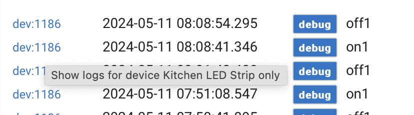
Perhaps @gopher.ny can confirm?
This works as expected for me. It filters the log display to just the device or app ID in question. (This is different from navigating to the device detail page, which clicking the info, debug, error, etc. box does, as mentioned above.) Is that not what you're seeing? If so, what browser and OS?
3 Likes

4 Likes
I just popped into Basic rules and saw I can do that (pick when Sunsets first). Fantastic!
The one I did notice with that is something else I failed to mention before: and that it is often necessary to click off of where you are to make the next step appear. Using the above example I started a Basic rule to run X minutes before sunset:
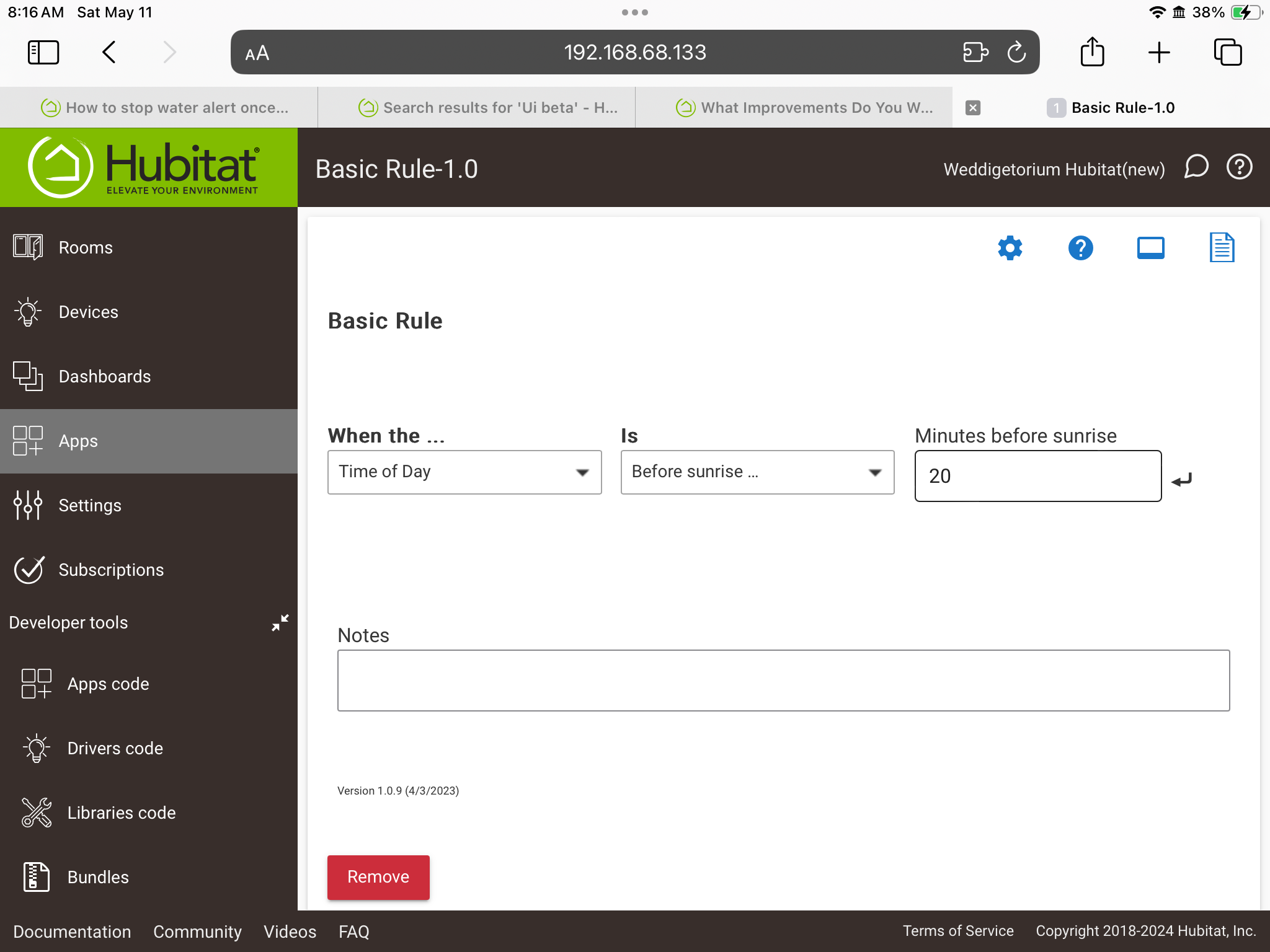
But, as you see from the above I have no idea what to do next. That is, until I clicked someplace on the screen and then the “Do this action” box appeared:
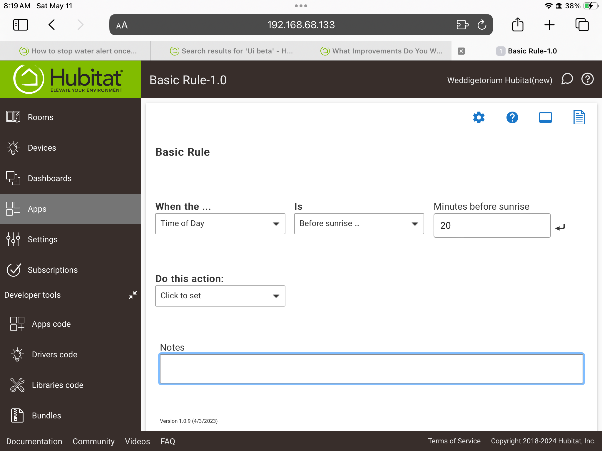
Eithe the Do this action should have been there but grayed out until I had filled in the time, or appeared when I filled in a time or there was a prompt to click off on to the page or something. Considering the “Is” box appeared when I picked Time of Day and then the “Minutes before sunrise” box appreared when I picked before sunrise I don’t understand why I then have to click off to make the next box appear, but much worse, since the other boxes appeared on their own, there is no reason for me to think I needed to click off to make the next box (The “Do this action” box) appear and there is nothing on screen giving me any guidance at all.
Well, let me correct that. I went back and touched the “enter” symbol next to the time and that made the next box appear. So I guess my real suggestion is perhaps to replace that with maybe words like “Click for next”, or I think better still, is to have the next box on screen, just grayed out until a time was filled in.
3 Likes
Ah yes - I missed that it was filtering to the specific device, my bad.
This is a very nice feature, and very useful, but also very hard to discover on your own. Wasn't obvious to me that the log type is a clickable object, I would not have known if not for release notes (and we know how many people read those! ![]() ) and a few conversations here. Would be nice if ease of discovery of this feature could be enhanced.
) and a few conversations here. Would be nice if ease of discovery of this feature could be enhanced.
3 Likes
yep. not very intuitive. Especially since (I think) Basic Rule was aimed more at the newer users with less experience. I could be wrong, but I thought I read that somewhere.
It was only a few years ago Bruce pointed out to me I could open the app / device from the log type after I requested having some convenient way to open it. I was thinking recently it might be more obvious to have two icons next to the app or device, one a filter icon and the other like a cast icon or similar.
It would be great to more easily group Rule Machine rules into functional groups so that they can be better organised and found and have these functional groups appear more across the other parts of the platform. I know their is a community app for this but it would be great to build this in and enhance it further.
I also find editing exiting rules difficult and find I often have to write conditional statements from scratch as I can't change a certain criteria within one.
I also find advanced button controller painfully slow (when adding functions) compared to RM. Is there a reason for this and hopefully a way to speed it up?
If you ask me, device and apps pages are also part of the UI and they are ugly has heck must be a nicer way (but don't ask me, I'm not a UI developer)...
Also would like to have the possibility to rearrange the order within the driver code of all the command buttons at the top of driver pages. It could default to the alphabetical way when not stated in the code. Having buttons of same nature not being grouped is really non intuitive. But then again, how many actually really go there except for debugging.
As for the settings section in drivers, that could also use a face lift.
I must have missed that, any idea what its called?
Rule Machine Manager available in Hubitat Package Manager HPM
It is.

