There has been much discussion over time about what people want to see improved in the Hubitat's UI.... I thought it was a good time to try and capture people's must-have's.... And let's keep it constructive... As always... ![]()
1 Like
Hasn't this been done like 5 or 6 times already?
I mean it is "the lounge" so crack on, of course, but I'm not sure the dead horse needs flogged any further?
15 Likes
Shhh... I was trying to lead the horse...... Hmmm.....Maybe I have revealed too much..
Needless to say.... Good stuff is coming....
4 Likes
I always thought the device page could use some attention, but then again when you are making drivers you notice every little thing. Most people are in that page a couple of times to set a device up and never go back there again. I wish there was a way to make hidden state variables.
While the UI is not amazing, it is functional, and it has come a long way since I started using it not too long ago. Personally I would rather see apps and drivers get updated/refreshed than the UI.
5 Likes
Seems my attempt to drum up support leading up to a new releese may have fell on deaf ears... Meh... My bad... I can accept my own failings....
Personally, no changes.
My use of Hubitat is for automation. And my automations are not UI-limited. I would rather see development time be spent on increasing reliability and support for additional devices.
17 Likes
But to be fair, that has not been the entire focus, that has not been the entire focus in the beta....
1 Like
I'll admit this got a little more focus than I expected... but hey, welcome alll and comment on.... ![]()
1 Like
For those commenting so far..... let's be honest, beta is not a "silent" think..... So if you carry any sway exercise it there....
As my 10 yo would say, "we don't talk about Bruno, oh no, he is hiding in the attic" ![]()
6 Likes
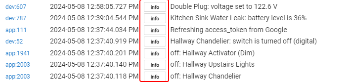
When I am in the logs, it would great to be able to click on the device or device ID and be taken to that device’s page.
3 Likes
6 Likes
That was one of my favorite changes. ![]()
1 Like
My general feedback is to make the proper procedures more discoverable.
Specific examples are adding tooltips, in-page help text, and help article links to many places in the GUI.
1 Like
VR support for rule visualization and dashboards, or it is trash.
2 Likes
Boy that was fast! You updated my app. ![]()
So much I don’t know.. I know READ THE DOCS
Thanks for pointing that out.
1 Like
This, yep.
3 Likes
Remove the "return to top" green button from the app entirely. That damn thing is always in my way. It is not one bit phone screen friendly.
2 Likes
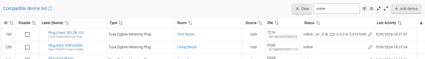
On the device list page, allow multiple attributes to be shown instead of just one. For example, for a dimmer switch, it would be nice to display the switch status (on/off) and the level (0/100).
8 Likes