Color me not excited.
As one who doesn't use rooms, modes, hsm, as well as easy dashboard, I don't see anything in it for me.
I just hope it doesn't screw with the way things are now, and that these new 'features' can be chosen, or not.
It was bad enough when choosing 'Dashboards' got rid of the left menu panel.
Thanks.
You don't know what you're missing out, but hey, everyone has something in it. Here is one you'll probably use...a lot:
Why?
Because the existing one will gone poof?
If you want zero changes to the hub’s admin UI, you’re probably among a minority of users.
UI redesign is probably one of the most common feature requests they’ve received over the years. And it’s one the staff have acknowledged was necessary, but not a small undertaking.
Congrats to the Hubitat team for following through on commitments to improve the user experience.
Well, you replied directly to me so I suppose I'll respond.
edit: Thought better of it.
That’s correct, I was responding to you directly.
I welcome further responses, assuming you want to have a conversation about this topic.
Last time, it didn't end well, did it?
Depends whether you want to discuss Hubitat or denigrate other users for no particular reason.
@bobbyd please consider moving this digression to a thread of its own.
@velvetfoot ; what are your specific concerns here?
It took me about 5 seconds to understand what you meant about the dashboards; and another two seconds to find the button to switch back to "classic?" view.
I think it's great the team is giving the UI some much needed attention.
At worst, it's just a matter of re-learning the muscle memory of where things are located.
I'm genuinely trying to understand why the resistance.
So, where's this "classic" button?
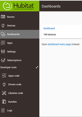
All I see is this:
If "Dashboard" or "dashboard menu page" is clicked, you lose the left navigation panel.
Now, I've gotten around it by favoriting http://my ip/dashboards , but still, why the change?
There you go again.
I think this is what you are asking about:
Yes, you lose the navigation panel... but that thing is hideous if you are using a panel for people who are not hubitat techie users. Like a front-end "kiosk" panel.
But, just clicking that one button I highlighted, takes you back to the area with the navigation on the left menu.
Is this on a beta version?
No. I actually just a few minutes ago enrolled in the beta group.
This is from my live hub, most recent version.
Actually, that was a lie. I'm so sorry.
I'm on version 2.3.9.193.
Hmm. I don't get that button, and I'm on the latest production firmware, 2.3.9.201.
See my edit above.
So, let me update and see if the button was removed.
EDIT: Yes, it's there on my backup hub... most recent version (2.3.9.201).
I found it, below.
It still doesn't load the navigation panel.
It's not a super big deal, but I had to figure out a workaround, because I like the panel.

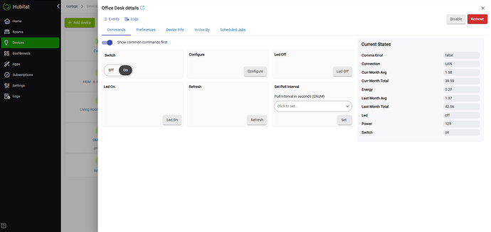
I really hope is that all the added excess white space gets removed from the system administration portions of the UI. It's less efficient. For example, in your image above, left aligned text with a right aligned button means one's eyes have to scan left to right. Those cells are all way wider than necessary. If you are going to have tabs, which is OK, then use the freed up space to make individual sections flow better. Maybe consider 1 function per row. The panel also isn't using all the screen space up to the black navigation column.
It should load back to the "classic?" dashboards page; which does have the navigation panel when I click it... unless we are talking about two different navigation panels.
Regardless, you were still able to find a way to get what you wanted, right? Maybe not the most elegant in your eyes.. but still shows the power of hubitat as being quite versatile, imho.
But it doesn't...for me.
Generally, if they'd keep a way to switch back to legacy versions, it would be nice.


