Oh, yes, I forgot to mention, from some of the examples I have posted, I did tweak the driver to centre it at the top of the screen, with very similar styling to what @thebearmay posted. I want to play with this some more and will post back what I end up using.
When tiles overlap, as in some of your well-planned examples above, is there a straightforward way to control the order (a/k/a the Z-index numbering) of overlapping layers? After all, you want to be certain that any tap or click on the "ESPN" logo will activate that small tile, not the container it is positioned "over".
I don't recall seeing such a control in basic Dashboard, which left me wondering. Thanks.
Yes, you can control in one of two ways. The order you create the tiles in can mean that the later tile will appear on top and be tapped instead of the background tile. But to force it (which I prefer) by adjusting the z-index via CSS:
#tile-33, #tile-34, #tile-36 {z-index: 999; !important;}
You can also change the id of the tiles to achieve the first option, but I would need to find the post where that was explained.
2 Likes
In case anyone is interested and looking for feedback when you click a button, you can use the following to, for example create a box shadow when you click the button
#tile-12:active {
  box-shadow: 1px -1px 38px 2px rgba(207, 0, 15, .8);
}
or have a box shadow when you move the mouse over the button
#tile-10:hover {
  box-shadow: 1px -1px 38px 2px rgba(207, 0, 15, .8);
}
5 Likes
One more before I go.
If you want to make the button wobble add the following and adjust until you are content 
#tile-13:hover

{
            animation: effect 0.4s ;
        }


@keyframes shake {
  10%, 90% {
    transform: translate3d(-1px, 0, 0);
  }

  20%, 80% {
    transform: translate3d(2px, 0, 0);
  }

  30%, 50%, 70% {
    transform: translate3d(-4px, 0, 0);
  }

  40%, 60% {
    transform: translate3d(4px, 0, 0);
  }
}
4 Likes
Can this be translated to switches?
They should work, the standard switch seems to be a button that changes the icon when you press on it, as far as I can tell.
Well, I'm curious if it would work to have a switch that is on shake for example
What would your implementation look like? would it shake when you move your mouse over it, when you click on it to switch it to on, or would it shake the whole time?
It would shake when it's on. That is the one thing that I still really miss about ActionTiles.
1 Like
Going a bit crazier than usual. 
Trying to rename a tile as they all a bit wordy with the device ID.
Tried all the examples here and tertiary as well. Nothing changes except if I operate on "primary". Tried most of the post examples and variations like
#tile-63 .tile-secondary {
visibility: hidden;
}
#tile-63 .tile-secondary:after {
content: 'My Front Door';
}
or
Any other suggestions? Using Chrome and I have other CSS stuff that works fine to fix up the Dashboard look.
Cheers!
It should be .tile-title instead of .tile-secondary. Everything else is correct though. It may need a !important tag.
You're like a CSS God. 
Glad I stopped learning new languages 25 years ago. My head would explode with Groovy and CSS.
1 Like
That should be directed at @thebearmay and @william2 I've learned everything from this thread thanks to their knowledge contributions.
1 Like
Edit 2: Human error. Can't have a apostrophe in "Lily's", Duh!
Edit: Tried various combinations and it seems that first operation on tile 2 craps all the rest out. I don't see any typo but it must be this human
Still a black art. Got one line working with your input for tile 2 so I thought I would try a block but obviously I'm violating some rule. All this does is remove the text from tile 2 and do nothing to the rest of the tiles. I have all my braces matching. Does CSS get upset if you put the command on one line?
I have other CSS one liners but I do note they have a > after the tile # but before .tile-title
I did reload/refresh.
#tile-2 .tile-title { font-size:0px; }
#tile-2 .tile-title:after { content: 'Lily's Room'; font-size:8px; }
#tile-6 .tile-title { font-size:0px; }
#tile-6 .tile-title:after { content: 'Dining Room'; font-size:8px; }
#tile-9 .tile-title { font-size:0px; }
#tile-9 .tile-title:after { content: 'Ensuite'; font-size:8px; }
#tile-47 .tile-title { font-size:0px; }
#tile-47 .tile-title:after { content: 'Master Bedroom'; font-size:8px; }
#tile-54 .tile-title { font-size:0px; }
#tile-54 .tile-title:after { content: 'Office'; font-size:8px; }
#tile-103 .tile-title { font-size:0px; }
#tile-103 .tile-title:after { content: 'Dave'; font-size:8px; }
#tile-114 .tile-title { font-size:0px; }
#tile-114 .tile-title:after { content: 'Master Bedside'; font-size:8px; }
Each template is a little different so while tile-title works for some, others require tile-secondary or some other variation. Easiest way to find out is to do a right-click inspect on the item you want to adjust and see what class or id can be used to affect the div you’re interested in.
4 Likes
Loving this thread — CSS has always fascinated me to no end — though clearly intended for very brave souls with strong ability to focus. Kinda makes you dizzy when you stop to think, "I'm editing CSS for items on a web page, laid out on a template, arranged on a dashboard, using devices assigned by a hub, using firmware running on a little black box, connected to the internet, which I access through a browser, running on my computer, which all of this stuff is being programmed to turn on when I enter the room, triggering the CSS on the element I'm editing here."
So meta!
Sorry for the delay in responding, but I have the flu and thing are a bit foggy right now.
I don't have the button wobbling when it is on, but I have something a little more elegant.
I added brief comments to explain what each snip does. Although can group all of this together, for my sanity I separate them especially when I'm trying new thing. Hope this helps.
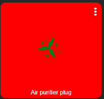
/* when the switch is turned on change the background color to red */

#tile-0[style*="background-color"] {
    background-color: rgba(255, 0, 0, 1)!important;
}


/* when the switch is turned on change the color of the icon to green */
#tile-0 .on {
    color: green !important;
}


/* when the switch is turned on make the icon spin indefinitely or until the switch is turned off.
If you want the icon to spin faster change the animation-duration: 500ms */

#tile-0 .on
{
  animation-name: spin;
  animation-duration: 5000ms;
  animation-iteration-count: infinite;
  animation-timing-function: linear;
}

@keyframes spin {
    from {
        transform:rotate(0deg);
    }
    to {
        transform:rotate(360deg);
    }
}
This is what it should look like without the stutter of course.
5 Likes
I love this! Animations bring a whole new level to things in my opinion. LOVE IT!
Hope you feel better soon!
I believe you could also make your 'spin' animation rotate counterclockwise if you place a minus sign '-' in front of the '360deg'. At least that's my understanding of how CSS3 functions.
1 Like