Texas is freezing and I'm having to work from home (I'm sticking to this story  ), so I decided to play around with the Hubitat dashboard and CSS in between business calls.
They say sharing is caring, this is what I came up with, use it as a template or build off of it. Don't let boredom stop you!  All of the CSS is located in the details of each tile below.
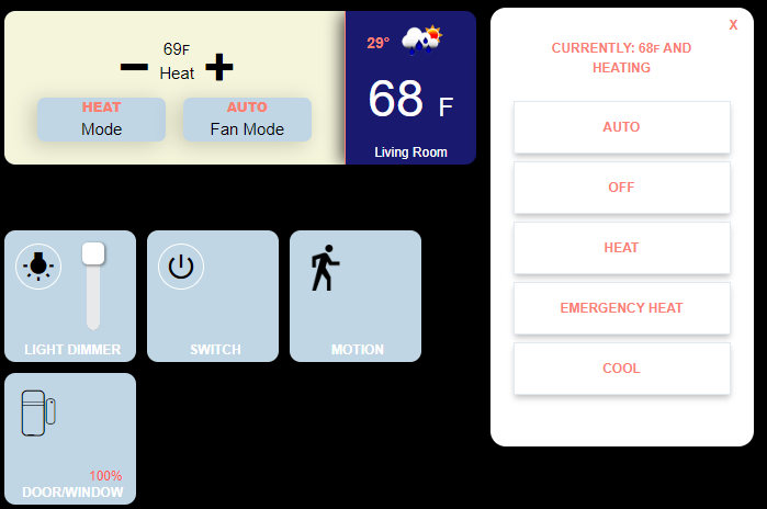
These are the tiles while idle.
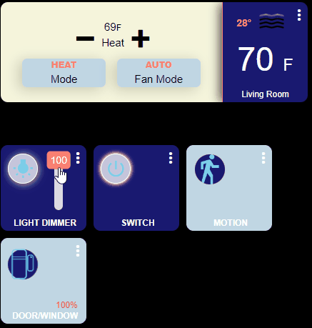
This is their on/active state.
How?
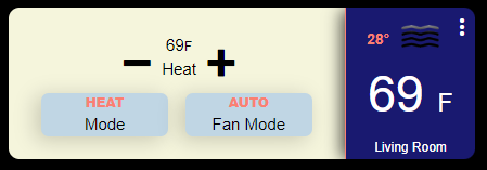
THERMOSTAT - The thermostat is made up of 3 tiles, the main thermostat tile, the temperature tile, and the OpenWeather tile. The pop-up has also been modified slightly, the dimensions have been reduced and the text is now upper case (this can be seen in the first picture).
<   /* ==== Thermostat ==== */

/* The main thermostat tile */

#tile-0 {
  width: 350px;
  height: 140px;
}

/* Change the standard background of the thermostat */

.thermostat {
  background-color: rgba(245,245,220,1) !important;
}

/* Change the color of the Mode & Fan Mode color then add a box shadow */

.thermostat .w-1\/3 {
  background-color: rgba(192,214,228,1) !important;
  color: rgba(0,0,0,1) !important;
  box-shadow: -5px 3px 18px 1px rgba(0,0,0,0.17);
}


/* Change the setting font color, make the text upper case and bold */

.thermostat .overflow-hidden {
  color: rgba(250,128,114,1)!important;
  text-transform: uppercase;
  font-weight: 900;
}

/* Change the down circle to a minus sign */
.he-circle-down:before {
  content: "\ea0b";
  color: rgba(0,0,0,1);
  font-size: 25px;
}

/* Change the up circle to a plus sign */

.he-circle-up:before {
  content: "\ea0a";
  color: rgba(0,0,0,1);
  font-size: 25px;
}

/* Change the font size around the buttons */

.thermostat .inline-block {
  font-size: 15px !important;
  color: rgba(0,0,0,1) !important;
}

/* Change the font size and color for the upper text */

.thermostat .p-1 {
  font-size: 15px !important;
  display: none !important;
  color: rgba(255,255,255,1);
  padding-top: 0.25rem;
  left: 20px;
  top: 30px;
}

/* Adjust the +/- buttons */

.thermostat .pt-1 {
  padding-top: 0.25rem;
  position: absolute;
  top: 20px;
  left: -18px;
}


/*  Change the font size and color for the lower text */

.thermostat .bottom-0 {
  visibility: hidden;

}

/* ==== Thermostat's popup ==== */

/* Adjust the popup size box */

.thermostat .popup-content {
  height: 400px;
  width: 240px;
}

/* Change the text color and make the text upper case in the popup box */

.text-lg {
  font-size: 12px;
  color: rgba(250,128,114,1) !important;
  text-transform: uppercase;
  font-weight: 600;
}


/* Move the mode and fan buttons */

.thermostat .my-1 {
  margin-top: 0.25rem;
  margin-bottom: 0.25rem;
  position: absolute;
  top: 75px;
  left: -20px;
}


/* ========== Show the temperature on one tile =================== */

/* Adjust the tile size, add a border to the left side and box-shadow */

#tile-1 {
  background-color: rgba(25,25,112,1) !important;
  height:140px;
  width:120px;
  left: 100px;
  border-radius: 0px 10px 10px 0px !important;
  box-shadow: -4px 1px 15px -1px rgba(0,0,0,0.73) !important;
  border-left: 1px solid rgba(250,128,114,1) !important;
}

/* Add just the temperature reading */

#tile-1 > div.tile-contents > div {
  font-size: 46px !important;
  left: 8px !important;
  top:46px;
  position: absolute;
}

/* ==== The weather is from OpenWeather integration ==== */

#tile-7 {
  background-color: transparent;
  height:60px;
  width:200px;
  top: -2px;
  left: 285px;
}


#tile-7 > div.tile-title {
  display: none;
}

#tile-7 > div.tile-contents > div > div.weatherCity {
  display: none;
}

#tile-7 .weatherDirection[data-v-5b4273a2], .weatherHumidity[data-v-5b4273a2], .weatherSpeed[data-v-5b4273a2] {
  display: none;
}


#tile-7 > div.tile-contents > div > div.weatherTemperature {
  margin-left: -11px;
  margin-top: -30px;
  display: block;
  position: relative;
  left: -35px;
  color: rgba(250,128,114,1) !important;
  font-weight: 600;
  display: inline-block;
  white-space: nowrap;
  overflow: hidden;
  text-overflow: ellipsis;
  max-width: 32px;
  max-height: 26px;
  top: -24px;
  font-size: 14px;
}
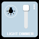
LIGHT DIMMER - The dimmer is actually two tiles, the dimmer of course, and the vertical level which has its background set to transparent so that it blends in and slight modifications to the slider tool-tip to give it a different look. In addition, I swapped out the HE icons for Material Icons.
To improve it, you could hide the tooltip and add another tile that keeps the dimmer percentage always visible.
/* ======================== Light switch configuration =================== */

/* Change the background color of the tile, resize, and move to the left */

#tile-2 {

  background-color: rgba(192,214,228,1) !important;

  height:120px;

  width:120px;

}

/* Hide the original icon */

#tile-2 .he-bulb_off:before {

  visibility: hidden;

}

/* Add a new icon format it and move it to the left and up */

#tile-2 .he-bulb_off:before {

  visibility: visible;

  font-family: 'Material Icons' !important;

  content: "wb_incandescent";

  font-size: 30px !important;

  color: rgba(0,0,0,1) !important;

  position: relative;

  top: -25px;

  left: -25px;

  border: 1px solid rgba(255,255,255,1);

  padding: 5px;

  border-radius: 25px;

}

/* Change the color of the button when turned on */

#tile-2[style*="background-color"] {

  width: 120px;

  height: 120px;

  background-color: rgba(25,25,112,1) !important;

}

/* Hide the original icon */

#tile-2 .he-bulb_on:before {

  visibility: hidden;

}

/* Add a new icon when the light is turned on, format it, and move it to the left and up */

#tile-2 .he-bulb_on:before {

  visibility: visible;

  font-family: 'Material Icons' !important;

  content: "wb_incandescent";

  font-size: 30px !important;

  color: rgba(125,209,233,1) !important;

  position: relative;

  top: -25px;

  left: -25px;

  background-color: rgba(255, 255, 255, .75);

  border: 1px solid rgba(255,255,255,1);

  padding: 5px;

  border-radius: 25px;

  box-shadow: 1px 1px 10px 1px rgba(255,255,225,.70);

  border-color: 1px solid rgba(250,128,114,1) !important;

}

/* Hide the slider/level */

#tile-2 div.dimmer {

  display: none;

}

/* Hide the tile title */

#tile-2 .tile-title {

  visibility: hidden;

}

/* Add a new title */

#tile-2 .tile-title:after {

  visibility: visible;

  content: "LIGHT DIMMER";

  position: absolute;

  text-align: center;

  left: inherit;

  right: 0;

  bottom: 0;

  white-space: pre-wrap;

  color: rgba(255,255,255,1) !important;

  font-weight: bold;

}

/* ==== Vertical Slider/level ==== */

/* Hide the tile title */

#tile-3 > div.tile-title {

  Visibility: hidden;

}

/* Adjust the slider/level size and move it over on top of the dimmer switch */

#tile-3 {

  width: 70px;

  height: 120px;

  left: -160px;

  background-color: transparent;

}

/* Adjust the height of the vertical slider/level */

#tile-3 > div.tile-contents > div > div > div {

  height: 70px !important;

}

/* Adjust the tool-tip circle */

#tile-3 .vue-slider-dot-handle {

  border-radius: 25%;

}

/* Center the tool-tip over the slider */

#tile-3 .vue-slider-dot-tooltip-left {

  left: 27px;

}

/* Change the tool-tip */

.vue-slider-dot-tooltip-inner {

  font-size: 14px;

  white-space: nowrap;

  padding: 2px 5px;

  min-width: 20px;

  text-align: center;

  color: rgba(255,255,255,1);

  border-radius: 5px;

  border-color: rgba(219,138,52,0);

  background-color: rgba(250,128,114,1)!important;

  box-sizing: content-box;

}
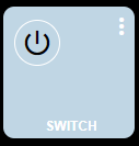
SWITCH - This one is pretty basic, besides the glowing around the button, it uses Material Icons like the dimmer.
/* ==== Switch Configuration ==== */

#tile-4 {
  background-color: rgba(192,214,228,1) !important;
  height:120px;
  width:120px;
  left: -80px;

}

/* Hide the original icon */

#tile-4 .he-switch_2 {
  visibility: hidden;
}

/* Assign a new icon make it visible, move it to the left and up when the switch is off */

#tile-4 .he-switch_2:before {
  visibility: visible;
  font-family: 'Material Icons' !important;
  content: "power_settings_new";
  font-size: 30px !important;
  color: rgba(0,0,0,1) !important;
  position: relative;
  top: -25px;
  left: -25px;
  border: 1px solid white;
  padding: 5px;
  border-radius: 25px;
}


/* Change the background color when the light is turned on */

#tile-4[style*="background-color"] {
  width: 120px;
  height: 120px;
  background-color: rgba(25,25,112,1) !important;
}

/* Hide the original icon */

#tile-4 .he-switch_2_flipped {
  visibility: hidden;
}

/* Assign a new icon make it visible move it to the left and up when the switch is on */

#tile-4 .he-switch_2_flipped:before {
  visibility: visible;
  font-family: 'Material Icons' !important;
  content: "power_settings_new";
  font-size: 30px !important;
  color: rgba(125,209,233,1) !important;
  background-color: rgba(255,255,255,.75);
  position: relative;
  top: -25px;
  left: -25px;
  border: 1px solid white;
  padding: 5px;
  border-radius: 25px;
  box-shadow: 1px 1px 10px 1px rgba(255,255,225,.70);
  animation: glowing 1s ease-in-out infinite alternate;
}

@keyframes glowing {
  0% {
   box-shadow: 0 0 1px #fff, 0 0 2.5px #fff, 0 0 3.75px #f0f, 0 0 5px #0ff, 0 0 6.25px #fa8072d9, 0 0 6.5px #fa8072d9, 0 0 6.5px #fa8072d9;
 }
    100% {
     box-shadow: 0 0 3px #fff, 0 0 4.25px #fa8072d9, 0 0 7px #fa8072d9, 0 0 7.25px #fa8072d9, 0 0 8.5px #fa8072d9, 0 0 4.75px #fa8072d9, 0 0 6px #fa8072d9;
 }
}


#tile-4 .tile-title {
  visibility: hidden;

}
#tile-4 .tile-title:after {
  visibility: visible;
  content: "SWITCH";
  position: absolute;
  text-align: center;
  left: inherit;
  right: 0;
  bottom: 0;
  white-space: pre-wrap;
  color: rgba(255,255,255,1) !important;
  font-weight: bold;
}
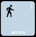
MOTION - Here I decided to change things up. Rather than using Material Icons, I chose to use an image I loaded into HE's file manager. You may have noticed when it comes to icons you have options, standard HE ones, Material Icons, and icons loaded into the file manager, and somewhere in this thread are other options.
/* ==== Motion Sensor ==== */

#tile-5 {
  background-color: rgba(192,214,228,1) !important;
  height:120px;
  width:120px;
  left: -160px;
}

#tile-5 > div.tile-title {
  visibility: hidden;
}

#tile-5 > div.tile-title::after {
  visibility: visible;
  content: "MOTION";
  position: absolute;
  text-align: center;
  left: inherit;
  right: 0;
  bottom: 0;
  white-space: pre-wrap;
  color: rgba(255,255,255,1) !important;
  font-weight: bold;
}

/* Change the inactive sensor icon for one in file manager */

#tile-5 .he-motion-sensor:before {
  content: "";
  background-image:url("http://192.168.109.178/local/man-walking-to-right.png");
  background-size: 100% 100%;
  display: inline-block;
  position: relative;
  top: -20px;
  left: -23px;
  height: 42px;
  width: 42px;
}

/* Change the active sensor icon for one in file manager */

#tile-5 .tile-primary.active i.material-icons:before {
  content: "";
  background-image:url("http://192.168.109.178/local/man-walking-to-right_color.svg");
  background-size: 100% 100%;
  background-color: rgba(25,25,112,1) !important;
  display: inline-block;
  position: relative;
  top: -20px;
  left: -23px;
  height: 42px;
  width: 42px;
  border-radius: 50px;
  animation: pulse-animation 2s infinite;

}
@keyframes pulse-animation {
 0% {
   box-shadow: 0 0 0 0px rgba(250,128,114,1);
 }
    100% {
      box-shadow: 0 0 0 10px rgba(255,82,82,.10);;
 }
}
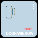
WINDOW/DOOR Contact Sensor - Nothing special here, moved a few things around and made the open sensor icon the same as the closed one, it also shakes for attention.
/* ==== Open/Close Sensor ==== */

#tile-6 {
  background-color: rgba(192,214,228,1) !important;
  height:120px;
  width:120px;
  top: -70px;

}

/* Color and move battery percentage */

#tile-6 .tile-tertiary {
  top: 95px !important;
  left: 102px !important;
  color: rgba(255, 82, 82, 1);
}


#tile-6 .tile-contents {
  font-size: 12px !important;
  top: -10px;
  left: -25px;
}


/* Closed */

#tile-6 > div.tile-contents > div.tile-primary.closed > i {
  color: rgba(0,0,0, 1) !important;
  position: relative;
  top: -8px;
  left: 0px;

}


/* Hide the original icon */

#tile-6 .he-contact_open {
  visibility: hidden;
}

/* The open door */

#tile-6 > div.tile-contents > div.tile-primary.open > i:before {
  visibility: visible;
  content: "\eb91";
  font-size: 42px !important;
  color: rgb(125,209,233) !important;
  background-color: RGBA(25,25,112,1);
  position: relative;
  top: -8px;
  left: 0px;
  border-radius: 25px;
}


#tile-6 .tile-title {
  visibility : hidden !important;
  bottom : 2px !important;
  font-weight: bold !important;
}

#tile-6 .tile-title:after {
  visibility: visible !important;
  content: 'DOOR/WINDOW' !important;
  position: absolute;
  text-align: center;
  left: inherit;
  right: 0;
  top: 10;
  white-space: pre-wrap;
}


#tile-6 > div.tile-contents > div.tile-primary.open {

animation: skewX-shaking 800ms ease-in-out infinite;
}

@keyframes skewX-shaking{
 0% { transform: skewX(-15deg); }
  5% { transform: skewX(15deg); }
   10% { transform: skewX(-15deg); }
    15% { transform: skewX(15deg); }
     20% { transform: skewX(0deg); }
      100% { transform: skewX(0deg); }
}
Hope you find this informative.

