The Noob's (in)complete guide to CSS for Hubitat

Border-radius is what you are after. I'll get an example later after work if you can't find one. It won't do oval though...

1 Like

Even if it’s some other non-square shape, it should work for my purposes.

I’m not using Android and just to clarify, I want to change the size of only some buttons in a given dashboard and not all.

By the way, I’m just “typing out loud” here, but it would be my ultimate dream to make my dashboards look like one of those computer screens from Star Trek The Next Generation complete with beeps whenever a button is pressed.

Just saying….

1 Like

Yeah, sorry, I glazed right over specific tile. Sadly, this will provide no help, but it does seem possible. I created scene tiles with the top corners rounded but the bottom were not. I scanned over my CSS and I have no idea how I did that. It was definitely from community help but it looks like this.
Tile
So, it would seem it's possible. If you round the bottom corners as well, that would look somewhat like an oval to me. No doubt sburke781 will come back with a solution.

Someone has created a Star Trek themed board. I cannot remember where I've seen it but I believe it's in this thread Show Off Your Dashboards!

1 Like

Well, through sheer dumb luck, I figured it out...

Before:

Added the following to CSS (3, 4, 5, and 7 corresponding to the rows I wanted to hide):
#tile-163 .flex div:nth-of-type(3), #tile-163 .flex div:nth-of-type(4), #tile-163 .flex div:nth-of-type(5), #tile-163 .flex div:nth-of-type(7), #tile-163 .flex div:nth-of-type(8) {display: none ; !important;)
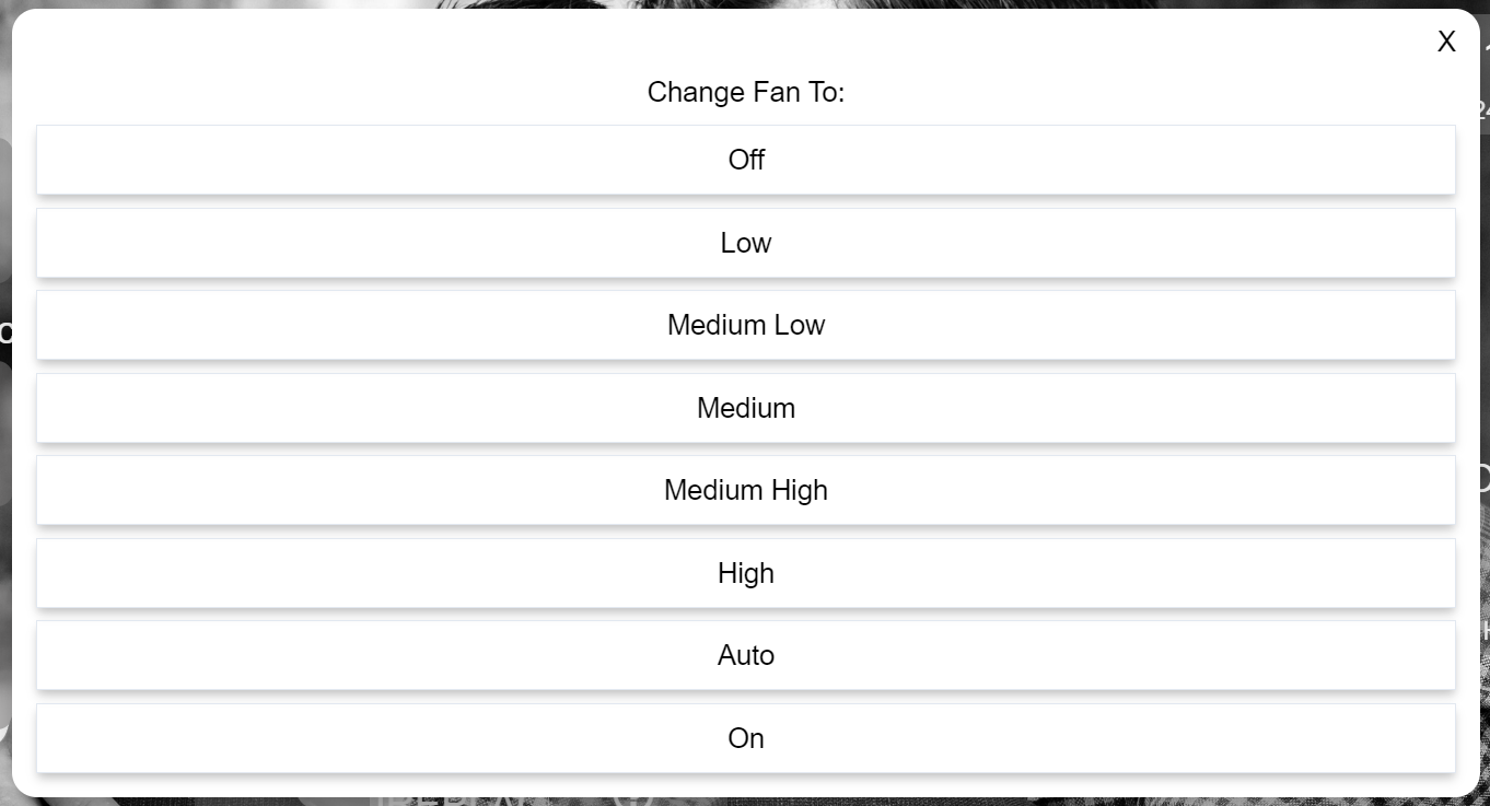
Result:

3 Likes

Try this

#tile-5 {
   border-radius: 25% !important;
}

Change the tile number to the one you want to modify and change the border-radius percentage to define the way you want the button to change, 50% will get you a circle, from there you can taper back whatever percentage you like.

by the way if you want oval you will need to change the height and width like so

#tile-5 {
   border-radius: 50% !important;
   height:90px;
   width:200px;
}

image

2 Likes

Thanks, this might be what I want, but I'm not sure exactly where to insert it. In my first try it created some weird results. Here is a sample CSS code for just one of my buttons. Where exactly would I put the lines above?

#tile-135 .tile-title::after {
visibility: visible;
position: absolute;
text-align: center;
left: inherit;
right: 0;
bottom: 0;
white-space: pre-wrap;
}

#tile-135 .tile-title {
visibility: hidden;
white-space: nowrap !important;
overflow: unset;
}
#tile-135 .tile-title:after {
content: 'Formula Scandinavian';
}

Click the settings cog on the dashboard, select the advanced tab, then CSS. You can add the custom css there.

What I mean was, where in the tile code (given above) in the CSS screen do I put the new lines?

Oh never mind, it looks like I can just put it wherever I want. Thanks!

1 Like

Ok this is working, but I have a question: if the standard button sizes are being auto-determined rather than specified, is there a way to have ovals whose size is also auto-determined and proportional to that of the standard square buttons?

If I'm understanding your request one approach is to change "rowHeight": 30, in the layout template (settings--> Advance --> Layout), at the lower half of the screen you will see this.

"goBack": true,
  "modePin": "",
  "bgColor": "#282828",
  "lanRefresh": 2,
  "iconSize": 42,
  "cols": 6,
  "rowHeight": 30,  <------
  "hideEvents": false,
  "tempScale": "F",
  "noColors": false,
  "readOnly": null,
  "rows": 5,
  "hideIconText": true,
  "hideTextShadow": true,
  "name": "test",
  "fontSize": 12

then each time you place a button you would get that oval shape, like this
image

Another option is CSS by grouping tile numbers like this

#tile-0, #tile-1, #tile-2, #tile-3 {
   background-color: rgb(57,57,76) !important;
   height:90px;
   width:90px;
   box-shadow: 1px 1px 5px 0px rgb(12, 12, 14);
}

All 4 of those buttons are exactly the same on the dashboard.

Does this help?

By the way if you choose to go the layout path make sure to click the Save Layout button or else it won't work.
image

3 Likes

For your exact question re using a variable, or possibly even a device attribute, I am going to say (without too much authority or confidence) no. My understanding is that CSS cannot use the value of a node (could be the wrong terminology...) to drive the formatting.

That said, one way, which requires some extra config, is to include a switch or something similar, and overlay tiles, where the switch tile provides the colour change. These get a different class assigned when they change state, which you can respond to using CSS. By the sounds of it, you could potentially use a switch instead of a variable you describe in question 1.

I have also seen people adjust settings for tiles using temperature and humidity readings, so there may be something there you could use.

1 Like

Should clarify my last statement, not respond with CSS, background colour settings in the templates

1 Like

If you look at how HE generates some of the tiles, often times you’ll see a class attached to the tile with the value embedded (I know temperature does this, and believe I’ve seen others). Those classes can be defined in the CSS tab to have background-color, etc.

2 Likes

For my own edification, I went ahead and created a Variable Connector for a Boolean variable I had been wanting shown (circled in black) on my test Dashboard, and am happy to report that it behaves as intended when I designate "Switch" for its Template.
Touch On, touch Off – colors and custom icons as chosen – with all state changes instantly reflecting back in the underlying Hub var.

This concludes my testing for the day, I believe, although I will naturally go muck around with the other Templates just to "see what happens" (but I won't mention any of that here) and to explore the accompanying CSS styling.

I've got some exciting ideas brewing on how to manage multi-state text and numeric Tiles (think: weather or thermostats) a bit more efficiently than has been presented thus far, which is why I'm even doing this. Stay tuned...

1 Like

Nice work :slight_smile:

SPECIAL HANDLING OF NUMERIC CSS CLASSES

I wasn't sure whether the topic of numeric CSS selectors (e.g. class="3") had been discussed here previously, so I thought I'd share some notes on the subject. It's hard enough to identify, much less isolate, the precise UI element you're targeting!

What I have here is a Dashboard with just one Tile, linked to a Hub Variable of type Number, through its Variable Connector of type Illuminance, and accordingly using the "Illuminance" template as shown. Its sole job is to display the number that corresponds with the value that I (or some rule) might set for "Lux" on the Connector device.

My goal was to have CSS formatting affect only specific number values (in this case, "3"), achievable since Hubitat Dashboards treat "Illuminance" Tiles in a special way, namely assigning a CSS class to the innermost text element (the variable value, e.g. 3). That class happens to be named the same as the value (hence class=3).

BUT NOT SO FAST... The problem, of course, is that technically – according to W3C specifications – "In CSS, identifiers (including element names, classes, and IDs in selectors) should be at least two characters in length; may contain only [a-zA-Z0-9] and ISO 10646 characters U+00A0 and higher, plus the hyphen (-) and the underscore (_); they cannot start with a digit, two hyphens, or a hyphen followed by a digit." In other words, class=3 is (doubly) verboten, thus must be handled in a special way for parsing in Dashboard's custom CSS.

As these screenshots demonstrate, one must escape these numeric Class names with a \3 prefix to make them recognizable and thus allow your special formatting to take effect. This works because the numerals [0-9] represent Unicodes U+0030 through U+0039:

Value = 3 ► font changes to big and red

Value = 4, etc. ► font unchanged from Default

I hope this tidbit is of value to someone out there.

  • Libra

NOTES

  • There is no prescribed way to select parent nodes located "higher up" in the DOM model than the element your CSS targets; in other words, altering text may work in this example, but it would be impossible to assign, say, a different background color to the Tile containing that text at the same time. For that, you'd need to include another selector statement.

Thanks for your help. It looks like simply deleting those height/length lines gives me the auto-adjusting button that I want.

Also, when I use border-radius 25%, it gives me one kind of oval, and when I use border-radius 50%, it gives me an oval with more tapered ends. I’m not sure what the border-radius refers to exactly, but I’m assuming I can pick numbers in between for different oval shapes?