Some honest feedback: Room Lighting UI is genuinely awful

Sorry for the negative topic, but I feel this is worth discussing - and surprised that it isn't discussed more. I don't doubt that this app is incredibly capable, I can tell it is. But the UI is dreadful. It's easy to understand why there's such a barrier for entry into these more advanced home automation platforms, when something as simple as setting up lights can be so complicated. It's taken me days (DAYS!) just to figure out how to set up a simple light schedule, when any other lighting OEM app could do this in a matter of seconds.

The issue isn't just the complexity - that can be worked around. The UI is almost purposely illogical. Almost every single object on the screen is vague on what it does, and in major of the cases, completely impossible to guess the function without consulting the documentation. Even resorting to the documentation often leads to more questions than answers.

I love the concept of an "all in one app", but the UI is about a couple decades in the past. I don't want to be too critical - I like my hubitat and I don't exactly think there's a better alternative at the moment. But this UI is just... yikes. :face_with_peeking_eye:

6 Likes

It would be more useful if you could point to certain aspects of the UI that caused you the most issues, if we want to see improvements to avoid this for other users.

Were there certain phrasing or layout of different elements that made it difficult to understand? Were there parts of the documentation that did not make sense when trying to understand how the app works? Did you post any questions on the Community when trying to work through your issues?

I'm not trying to be difficult or argumentative, just trying to help those who can address this understand where the gaps or issues may lie.

7 Likes

It is , but its usually been buried in another post looking for help, not just put out there as its own topic. I actually agree. The CONCEPT sounds amazing, I REALLY want to like it. The reality has ben despite ton of help from many of the regular super helpful people (no sarcasm intended, we all know who is out there all the time helping people figure out what they are trying to do), for the most part I just can't get it to work. Too complicated, and I swear half the options and capabilities are reverse of what you think they should be . For example I have 10 room lighting instances, 5 are paused ort disabled because I cant get them to work correctly, and just opted to re do them in Rule Machine or Simple automation. I have one room that has 8 separate Rule Machine Rules to make it about 85% functional the way we want it, i would really like to be able to boil that down into 1 room lighting instance, but I have actually had someone tell its not the ideal scenario from room lighting highly variable schedules and room usage).

AS for UI, honestly, that horse has been beat to death and then some. The truth of the matter is pretty much any discussion that broches on UI ends up devolving into something completely different and mostly non productive. Based on some of what I'm seeing in Beta, I think they are starting to work on that, but I also think its going to take a while for it to get where many would like it to be. In the end we are just going to have to be patient and wait for it to develop (realizing a percentage of people still wont be happy with it).

I'm sure others with more experience and insight will offer their input at well. I don't claim to be an advanced user or overly skilled in any of this , I pretty much know enough to know when I did something I can't fix and come here to look for help.

2 Likes

I really wish I could comment but I can not.
I have been here for five years and use RM for everything. Yes I know, overkill. But it works for me.

I tried the motion app when it first came out and quickly went back to RM.

That said, I understand that starter apps are required to compete. I know Wink and SmartThings have the IFTTT type of UI and it’s a requirement for wide spread adoption. And that wide spread adoption promotes the longevity of Hubitat. I hope they work it out.

6 Likes

To be honest I assumed this was known and accepted but simply not enough resources to improve. The point of my post was just to highlight the UI and discuss that, rather than ask for help. I already have other help posts open, some discussing Room Lighting. If I had just resorted to asking for help, it would basically have to have been just asking someone to do everything for me. After a few days of reading the documentation a few times, watching the YouTube videos, searching all the questions on the forum, I understood at least enough to experiment and try to figure out the open questions myself.

The UI is just not intuitive. I feel like that shouldn't be controversial. It's certainly not reminiscent of any mass market apps.

When I get back to my computer I'd be happy to document every questionable part about the UI, if that's helpful.

1 Like

Definitely. I wasn't trying to come across all defensive or wanting to shout you down, so to speak. I was mostly just wanting to get some more details so that those who could make any improvements had something tangible to work on.

The UI more generally has and still does get discussed here on the Community, including with Hubitat staff input, and the developers are working on different aspects of the UI and built-in apps to make improvements in usability.

It's good that you are happy to engage in the Community when seeking help. Some will make comments such as yours without having asked for help, which is not ideal, so it's good to see that you made that effort. It's also nice to see you have attempted to make use of the various resources such as the documentation and videos, again something people may not always take advantage of.

So my main point for asking those questions was to make sure you were aware of the different options for seeking support and that you had made use of them. If you are still finding the UI confusing then that's where I was heading with my suggestion to offer some examples as feedback for where you think improvements could be made. If you have topics you have created to cover most of your issues, then links to them would be enough, no need to repeat yourself here unnecessarily.

4 Likes

Room Lighting is not really designed for simple on/off light schedules. Many people who try to do that in RL get frustrated with the time periods setup because that is not what it was really made for. In fact I do those types of automations in Rule Machine, using RL to just to group devices together if needed.

Also generally curious what other apps are you talking about? I have used the Kasa app before and yes it could do a simple on/off schedule but that was about the extent of its abilities.

3 Likes

Completely subjective. I actually think the EXACT OPPOSITE. This is why people need to give specific recommendations, or even drawn sketches/mock-ups of what they view as "better".

I'm not trying to argue. I believe you when you say it is not intuitive for you. But I disagree that it is a given that it is non-intuitive for "all". Because it isn't viewed as universally bad/non-intuitive, you really have to give some very specific feedback on what you think would be better.

Examples, running through a new room lighting install -

image
Seems obvious what that does.

image
What else would it do other than what it says?

image
Again, what else would it do other than what it says?

Sure there are a few of the other lesser used options that are more vague - I'll agree with that. But they are typically optional, and if you don't know what they do, you likely don't need them.

Example:
image

5 Likes

Thanks for your feedback. I am glad to hear that you enjoy elevating your environment with Hubitat. While we have been making improvements to the user interface in the past months, and will continue to do so in the future, I'd like to point out that Hubitat offers a multitude of built-in apps that are more suitable depending on the use case.

As you pointed out, other companies offer simple light scheduling that can be setup in seconds, but often their automation power stops there. Hubitat too offers easy to use rule builders that can set a light schedule in seconds. Look no further than Basic Rules app. As for Room Lighting, it is a highly comprehensive lighting app that very few home automation platforms can match its versatility. It may seem intimidating at first, but that's because it covers more complex scenarios. For this reason we recommend users to begin their home automation journey with Basic Rules app, which can accommodate 99% of common use cases.

You could think about the variety of built-in apps that Hubitat offers, like power tools. To most users, a compact drill would be able to get the job done, but sometimes you may want to use a specialized drill for a specific job, and can you really turn a magnetic drill press into a compact drill?

image
source: dewalt.com

9 Likes

This sort of reminds me of another recent thread. Probably my favorite response of the nearly 200 posts in that one, which could apply here, was:

As @JasonJoel has already pointed out,

9 Likes

Hubitat is what it is and I have accepted that it's going to be, well, obtuse at times.

But what would help a lot would be adding more text to the UI, explaining what the vaguely named options do, and linking to the exact relevant portions of the help documents.

Even the very important Configure button on a device page has no hint about its function attached. There are countless similar examples.

5 Likes

I'm surprised to see the pushback, but then again, this is a hubitat community lol. Outside of here, the opinion is a little less controversial. If discussing HA systems elsewhere, the only system typically mentioned as higher barrier to entry than hubitat is Home Assistant. It is at least interesting to see though that HA is pushing a huge initiative to redesign for more user friendly design. going to be tough to compete if suddenly HA gets more user friendly.

In any case, sure, I'll provide my detailed feedback.

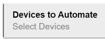
Let's discuss the main "table" for settings things up. If anyone says this is intuitive, then they're in way too deep.

Device Control/Activation settings - not awful but a little weird. Split into two distinct sections but they are both controls, kinda confusing already.

State - how would anyone know that "state" is a means to manually test turning a device on and off? It's a test button but within the same table as the individual lighting period settings. At least this one is clear in the documentation.

Act/Off - equally and crazy confusing. You would maybe assume this is where you set the device on/off state for each table, but then there's a separate column for "switch" which is also on/off. And the default is to have them both checked? I still don't understand these columns even with all my research. Can't figure out what these accomplish that the "switch" selection doesn't. And in my testing, checking "OFF" certainly doesn't function the same as selecting "ACT" and then "off" in the switch column. It's hard to understand how selecting a checkbox that says off doesn't actually mean to turn the device off.
The documentation gives a vague example of the use case but I still can't understand the difference or proper use of these.

Switch - well, this made sense once I realized the text could be clicked to change between On/Off. I had to find another forum post with someone having the same confusion before I figured that out. Normally one would recommend a drop-down or some other clear indication that this text is meant to be changed. Good example here of easy design but bad UI. It doesn't follow standard conventions.

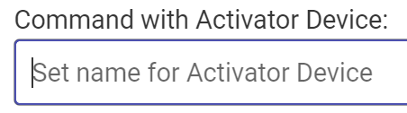
The rest of the device settings are pretty clear, but only if you have previous knowledge that X(X) denotes Command(Current). It would be nice to accurate have that labeled. It would also be nice if the pop-up dialog for changing the command popped up where clicked, instead of a new table under the current table. Just makes it really time intensive to set a bunch of these.

I think for this table being the very foundation of Room Lighting, it could use some updates.

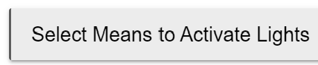
Let's get to Activation settings. These are mostly obvious except one, to me. "Create Transition". This is illogical. The means to Activate the rule is to create a Transition? Huh? Or is this a way to create a transition, but it's lumped in with the activation options? But then you need to go back to the periods page to set it up. Is it an activation or not? I can't tell.

But now we're taking transitions. We have "create transition" under means to activate. We also have device transition time under "activation options", and then in "other options" within options, we have "use transition for activation" which brings up yet another input box for transition time. Oh, and we also can Import a transition from Groups and Scenes. Truly, how many different places can we have a selection for Transition with none of them explaining what they are. And in this case, documentation doesn't answer these questions at all. And also if we select to create a transition, we get a table in the periods page which I have no idea what it does. You can only seem to select one setting instead of a "from/to". Also since it's on the periods page, you would think there would be a transition table for each period you have, but in fact there's just the one unlabeled table. I don't know how it could possibly be more confusing to just set up a transition or fade from one period to another. I also can't seem to figure out why there's a selection box for "adjust lights from one period to another" - isn't that the whole point of having settings for each period?

There's a lot more questions - but you can see how many questions there are from simply trying to set up changing your lights at various times.

4 Likes

Activate is a weird term. I think they chose that because there really isn't another word that quite describes this function. Activate could be many things. It could be off, on, dim, change color, change color temp, and probably a few more things I can't recall.

There just isn't a good short word to describe all that. Activate is the closest you probably can get to cover a bunch of functions like this. Trust me, when this first came out in Beta I went through the thesaurus to see if there was a better term, and I couldn't find one.

I do think complexity is a problem. But it isn't unique to Hubitat. I personally think that many people dive right in, and get over their heads too quickly by using apps that aren't necessary. Many people can, and should, use Basic Rules to do a majority of the automations, at least at first.

As you build your system and need more complexity, and are more familiar with the system, that is when you start exploring the more complex apps.

There used to be a similar but worse phenomenon before Room Lighting and Basic Rules. There were fewer options, and people would come here screaming about how awful Rule Machine was to use. Their first experience was that, instead of Simple Automations and Motion Lighting.

Basic Rule was born to help get people up and running, and help them to learn how Hubitat works. Similarly I think Room Lighting was created by staff to bridge the gap between the simpler Motion Lighting and Simple Automations apps, and the most complex of them all, Rule Machine.

There is an app for most every skill level now, (albeit maybe there are slight gaps) and for most every automation need. If Room Lighting is too confusing, try a different app. Motion Lighting is good for those with a motion sensor or door sensor. Maybe Rule Machine is more up your alley where you can pick and choose more so than you can with Room Lighting?

8 Likes

Also I do want to reiterate that I'm not upset with Hubitat in general. I like it, and this community is fantastic. Quite frankly I don't think this system would survive without the helpful community, but really that's not unique for something complex like this.

But it is things like this, while I personally can enjoy tinkering around with, stop me from being able to recommend the system to friends and family. The general public would never be about to wrap their heads around this stuff, which sucks, because there really is so much cool stuff you can do. There are a lot of really simple changes that could be made to the UI to make Hubitat way more user friendly - more clear labels, pop-up tool tips where there's no room, and following more standard conventions on selectable items - drop downs, popups, and other clear indicators.

6 Likes

To me I think this is the crux of many of the issues that people can face, particularly having information easily accessible from within the UI itself, such as the inclusion of tooltips and other short pieces of information that can explain the meaning behind the naming of a field or what you are meant to do with it. I am trying to introduce this into an app I am building, including a short description for a setting with a link to further documentation about the setting.

It can seem / read like it is an us and them mentality in some of these threads, and some do end up in that territory, more out of frustration at times. But it is more a combination of enthusiasm and people wanting to help that you can get half a dozen or more responses in topics like this. And the type of people many of us are crave detail and a more targetted conversation, hence my recommendation to provide examples. Talking about things like this in very general terms often does not lend itself to a productive conversation. So thanks for providing the examples you did.

4 Likes

I'd agree the "Act" (Activation) thing is not intuitive at first glance, but as @neonturbo explained it does have a logical history once you understand the more complex nature of what you can capture as part of the activation of the Room Lighting automation. From my last comment, I think this is a good candidate for a tooltip and / or a link off to the explanation of what it means. The way I like to think about it, which kind of lines up with the other two main sections in the App, is that the RL automation is active or off, so when it becomes active (activated) what do you want to have happen to each device, if anything. Equally you can also define what to do when the RL automation is deactivated (off), which may not always be to turn devices off.

The Command(Current) still gets me as well, even now. I would like that either split out or more accurately labelled, which could take the place of Switch, IMO. Looking at it again now, there is actually a tooltip for the X(X) text, so including a short "Currtent(Target)" description would lbe a good change I think.

Removing the Switch text from the column heading may improve things slightly as well.

3 Likes

I'm still kinda tripped up on act/off. I don't mind the term activate at all, because yes I do understand there's more than just switches. But there is "Off", and "Act->Off". What's the difference? And why couldn't you just select the chosen action in the "switch column" and have that labeled activate instead? I feel like "activate" and the chosen action, and "ignore" if nothing is desired would make more sense, but I'm assuming I'm still misunderstanding their function.

I did realise after my last comment that the title of the X(X) column does in fact reference what the X(X) are, Activation Settings (Current).

Re Act/Off, I also noticed as I was typing my comment that the use of Off kind of goes against the description I was typing out for the reason behind Activate as the term to use instead of On. Can't offer an alternative at the moment....

1 Like

Re the reason for having the checkboxes for Act and Off, that is to allow you to control whether the device should be included in activation of the RL instance and whether to include it when the RL instance is turned off. There can be times where you only want a device to be activated, or where you only want to make sure it is turned off. So those checkboxes provide that control, then the Activation Settings is where you can define "what" to do when Activated. Somewhat less obvious is that you can then get more advanced and control what to do when the RL instance is "turned off" and also different options for time periods or modes.

1 Like

i tend to agree and dont use room lighting.. (but that is just me) all stuff can be done in other apps that to me are clearer and easier to use..

simple automation/basic automatation for the majority and a few complex cases in rule machine itself.

i think i have one in event engine which is probably the one that would be a good candidate for room lighting... it turns on light in the basement based on the door opening OR on multiple motion sensors in the basement to stay on and turns off after 20 minutes of no motion...

that is the beauty of the system there are multiple ways to do things and to each his/her own.

i wouldnt say as in the title it is genuinely awful... but it is very complex and tricky to use/understand all the options but can do some really really complex automations.

6 Likes