Been having a play with smartly and really helped create some tidy dashboards quickly - great work. I have some existing dashboards themed in a specific way. Not sure if it would be too complex to allow user to provide existing JSON but not override existing styling but allow limited set of features e.g. changing titles of tiles and header bar config
2 Likes
I'm curious what your current dashes look like that you'd like to leave mostly untouched, because significant thought has been put into these skins, including multi-device calibration. We've added settings for the most common modifications and now have a framework to add more easily.
And if all else fails, there are workarounds. If you're up for it, let's pick this up in the support thread 
Thanks for the reply; mostly just a matter of personal preference / taste ...
Not perfect; but I find this sort of colour scheme makes it very easy to glance at and see if something is open/close that shouldn’t be. The themes in smartly are very colourful and whilst that is nicer to look at it can be difficult to quickly see what’s on/off or trying to grab your attention.
I had recently gone through and carried out a tidy up of some labels in HE to adopt a naming convention which then impacted the dashboard so I was looking for a quick way to tidy up the labels on the dashboard itself ..
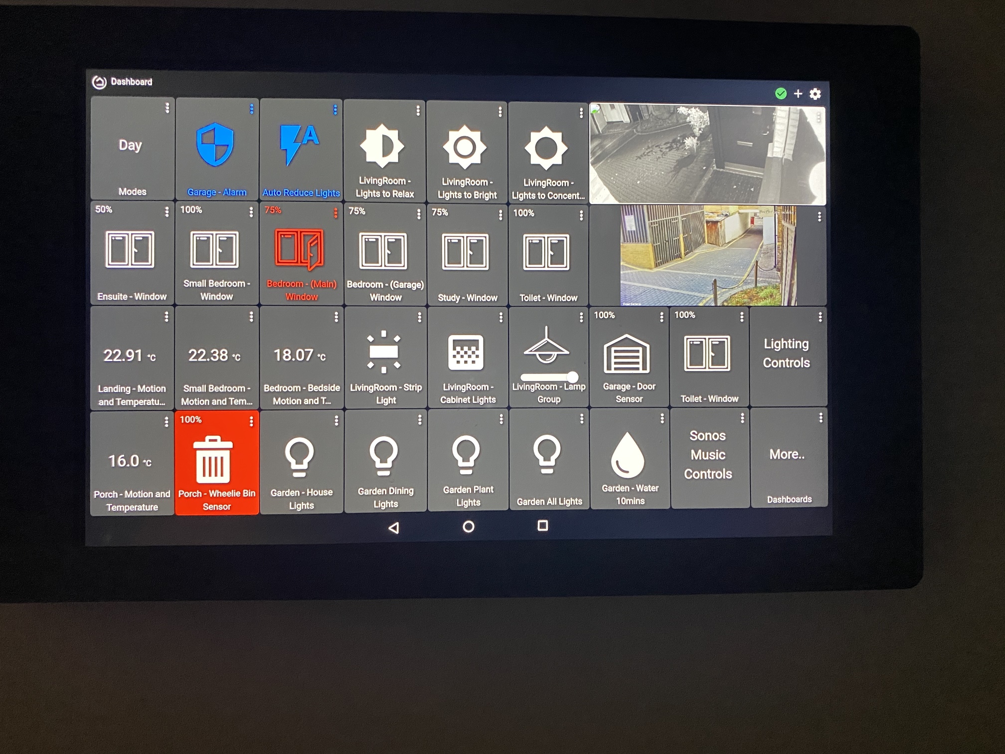
Here’s my wall dash ..
2 Likes
Would you be up for working with me on a high-visibility smartly skin? I can see the need for something like the 'slate pro' theme in AT, where there isn't much if any space between the tiles.
What are the most important things about this design that you like? I noticed some tiles are using background color for status, while some use text color. Is this specific to you, or could we only do background tile color change for status?
I think the ActionTiles slate was actually my inspiration for this, I wanted to recreate almost exactly what I had under ActionTiles a couple of years ago.. I find the design informative and the colours have a clear meaning: blue representing two frequently used actions, the gray just sort of blends in to the background and makes anything that is in an 'exception' state pop out from a cursory glance. I find themes with a lot of different colours going on to be confusing even if they look nicer. This particular dashboard has a very practical application for me, tell me if something is wrong when passing by.. I'd be happy to help
The blue colored tiles are two frequently used buttons, they turn red if pressed, showing the garage alarm has been disarmed and the other is a switch that temporarily disables my lighting automation - again turns red when pressed. The blue is just to highlight their location on the dashboard. Most of the other buttons are really informational 99% of the time.
The inconsistency on the bin tile is just an oversight for an in progress automation I was setting up.
1 Like
I agree. the colors are nice for small dash's but bigger ones are a little hard. I also reverted to to default colors for a lot.
I would like a smaller thinner top bar too including the logo. but i am loving that this runs local. my life is somewhat complete now.
1 Like
Text that is colored is often harder to read, partiularly on some backgrounds - the grey above is not necessarily a friend to the colorful text.
I would either keep text a constant, high-visibility color if tiles are fixed background color, or develop a set of high visibility font/background combinations.
In both cases either the icon colors or the background can vary to communicate status. To avoid "eye fatigue" and make it easier to zero in on/understand key status quickly, I would choose one or the other.
1 Like
should we just start it as a clone of slate pro and then modify from there? it shouldn't take me long to get that built.
@daniel.john.edge what is the difference between tiles that have the background change on status and the ones where the icon changes?
1 Like
It started out as an ‘accident’ in my setup. But I like the idea of having a ‘warn’ and a ‘critical’ status.
Windows open - I want to know about but probably intentional 99.9% of the time vs something I want to be more concerned about e.g. my garage alarm is switched off. You don’t want it to become the case that lots of red on the dashboard becomes ‘Normal’ and you stop noticing. A more generic solution that lets you change the icons, background colour and icon colour dependent on whether the state indicates a warn or a critical alert could be a neat way to do this..
I sent across the JSON for in PM
1 Like
Agree 100%...if everything is red, nothing is important. 
I "manually" make an adjustment when looking at my dashboards depending on time of day. Open at noon is 99% of the time a non-issue, at 10:00 PM it may be important.
Having an option to set time or mode controls for when "open" or "unlocked" are red vs. yellow or whatever, would be a convenience.
1 Like

