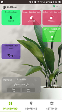
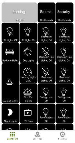
Simple cell phone Dashboard with spelcheck's code and assistance. Make the wife happy, so I love it!
This is fantastic, thank you.
This will be my new "Home" default for my better half.
Thank you!
I'll eventually create a separate thread for the "skins", but wanted to give a shout-out to @TechMedX for helping iron things out over the past few days. Many updates have been committed to github and many more to come. Biggest TODO is browser width based zoom (CSS media queries), so the layout will naturally scale to the device you're viewing with. Please PM if you have requests or questions between now and when I get a thread started.
http://192.168.0.24/video2.mjpg but its intermitantly working on dash but dosnt work when you open it up (click on it)
Only way to diagnose that issue is by using Developer Tools in Chrome or Firefox (right click and "Inspect") on the image itself when it's tiled and when it's clicked on. This isn't the right thread for troubleshooting this issue though. I'll see if I can find a better one and we can help out there. 
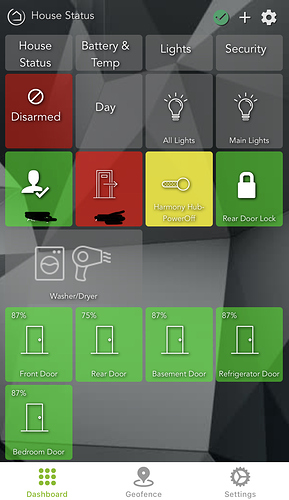
Finally got around to updating my dashboards with custom CSS to tailor to my liking. This one is a status overview (really wish I could define a default dashboard in the app!)
I should probably toss this into this thread, as well as its original...
You can do a LOT with CSS in the dashboards. Their layout is pretty easy to work with. 
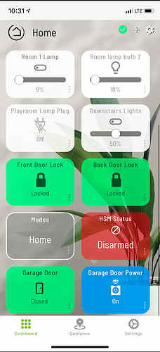
Here's what mine looks like - or atleast my family friendly "home" dashboard (special thanks to @spelcheck for the skin):
I also have dashboards for;
- All my lights.
- Security (alarms, door status, motion status)
- Sensors - Mostly Temperature, Humidity and water
- Presence - Dashboard for me to understand what's happening if our Presence is messed up, or to turn on Guest mode
- Batteries - Dashboard to see what all my devices are reporting.
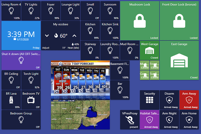
my dash. currently working on an old (and slow as heck) Amazon 3rd gen fire. upgrading to a 10" soon.. just need to pick something.
I used the smallest icons that I could get (50px) for the door sensors. I need to fix the text still but the idea was to be able to make them so small that anything else that was a 2x2 looked like a real 1x1
this is just a concept right now. I am still working on how I want it to look..
Sharptools.io looks super pretty , and i love it, with the old tablet nothing is responsive, so that will be on me to get something better.
What in the world is smell?
Lol.. it's an electronic candle burning thing.. it was a joke that I never got to changing. :). You out this small wax block on the top and it melts it making a pleasent smell..
Thanks to @spelcheck for the templates... I'd been putting off jazzing up the dashboard and you inspired me to get to it. Much better looking now. Greatly improved the WAF. I'm very happy Hubitat built this into the product but it really could use some polish now. Still, this is great.
Yes I did the same with my wife's Yankee candle melter. I got rid of the inline switch and then use a peanut plug to turn it off and on. I didn't call it "Smell" instead I called it "Aroma"
Can you share what you are doing to get the various sized icons?
I love the idea of Doors being large and others small.
I'm pretty sure @eaton.blumenstein is using sharptools. But you can have button span more than one column or row with the built-in dashboard. Just pop into the layout settings and you can adjust things in there manually. rowSpan or colSpan.
just make the size of the icons small.. both Sharptools and the regular dashboard, I set the Pixel size to 50 something. that is super small. so then what you do, is every NEW tile that you want to look normal , just set to 2x the size, or 100pix for example.
pretty much every new tile I make i just go into the setting and double the size. its an illusion,
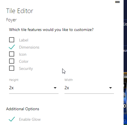
an example of one of the icons is 2x by 2x
and in Hubitat dash
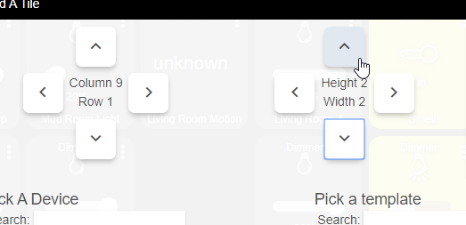
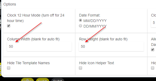
i hope that makes sence.. its just a visual trick.. since you cant make tiles smaller then the standar 1x1, you just make 1x1 super small, and make everything you want 2x2
How did you get the presence info to be so detailed, like in between places?
That's from the Life360 with States app. ![]()
