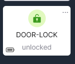
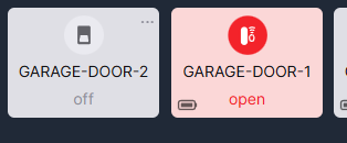
Hey @gopher.ny can you make this red when open ? and green when locked ?
My OCD is going crazy LOL Thanks !

and the garage door icons too ! Green closed / red open ?

Hey @gopher.ny can you make this red when open ? and green when locked ?
My OCD is going crazy LOL Thanks !

and the garage door icons too ! Green closed / red open ?

@gopher.ny please take a look at the lock icon. Black for locked is a no go. Red, unlocked -attention may be required- and green for locked. /searching didn't find a solution or reason for the current choice.
I would vote for the too. i.e. that green = good = locked/closed and red = bad = unlocked/open
Noted.
Agreed as well.
Red Unlocked, Green Locked
Red Open, Green Closed
GREAT response from Hubitat team! I just went into my Easy Dashboard where my door lock is and noticed it was green as it was locked. I touched the icon and when it opened (very quickly I might add) the icon turned red.
Thank you Hubitat!! It's great to see that when there was such a strong consensus to have it this way Hubitat quickly implemented it. Yea!
well they kinda fixed it ..
think they fixed the door one ..
But the lock is still gray .. should be green < when locked.
lock red when < unlocked.


One more? ![]()
Green = locked, closed, inactive (motion).
Red = unlocked, open, active (motion).
Next update, likely.
As I posted elsewhere, looked like is was in .158 but reverted to gray = locked and green = open in .162
If you are talking about locks, I don't see that in the latest, it is consistent with contact, motion, etc:
Locked...
Unlocked...
Can we please get the garage door tile to match the lock tile, in terms of the icon direction and color?
Yes, it's on the list. I noticed the difference right after I posted the lock pictures above. ![]()
So it's really weird, but when I just went into the app on my iPhone just now to take a screenshot I saw that the icon was green when it was locked. However, touching the main icon did nothing. I had to touch the 3 dots to get to the inside screen and I could unlock it from there. And, like your screenshot, the icon was then red. Back out at the main screen, touching the main icon likewise did not lock it. The only thing I can think of is that an update got pushed to my iPhone overnight.
So I'm glad we do have the colors "right" now. But can they go back to how it was that touching the icon from the main screen will lock/unlock it?
Still waiting on this.
EZ locks appear different on the local network vs a remote connection. Local appearance is preferred.
Local
5G
In .290, the lock tile is white with a grey icon. Never goes to red. When locking from the dashboard, it momentarily has a green icon, then goes back to gray.
Edit:
Take that back, kinda. In unlocked state it’s green and grey when locked.
The above must all be from the Ios app.
I totally agree the icon should be
=green when locked/closed/inactive
=red when unlocked/open/active
However in my Android app (even today's new one), the lock is black when locked on both the devices section and the new dashboards.
Both mobile apps for Android and iOS display the same dashboards in embedded mobile app browser. The dashboards are not native to the mobile app.
The standard colors in the latest hub version are as follows:
Green: garage door (closed), contact sensor (closed), lock (locked), motion sensor (inactive), leak sensor (dry)*
Red: garage door (open), contact sensor (open), lock (unlocked), motion sensor (active), leak sensor (wet)
*dry leak sensor is currently gray instead of green
This is what I see on my dashboard, and what is currently expected to be displayed for everyone:
Green:
Red:
Please post the image from your phone on a mobile non-local connection.
Hey, I said what is currently "expected" ![]() . I saw the differences between local and cloud that you've reported and confirmed to be an issue. You can expect to be resolved in the next update
. I saw the differences between local and cloud that you've reported and confirmed to be an issue. You can expect to be resolved in the next update ![]()