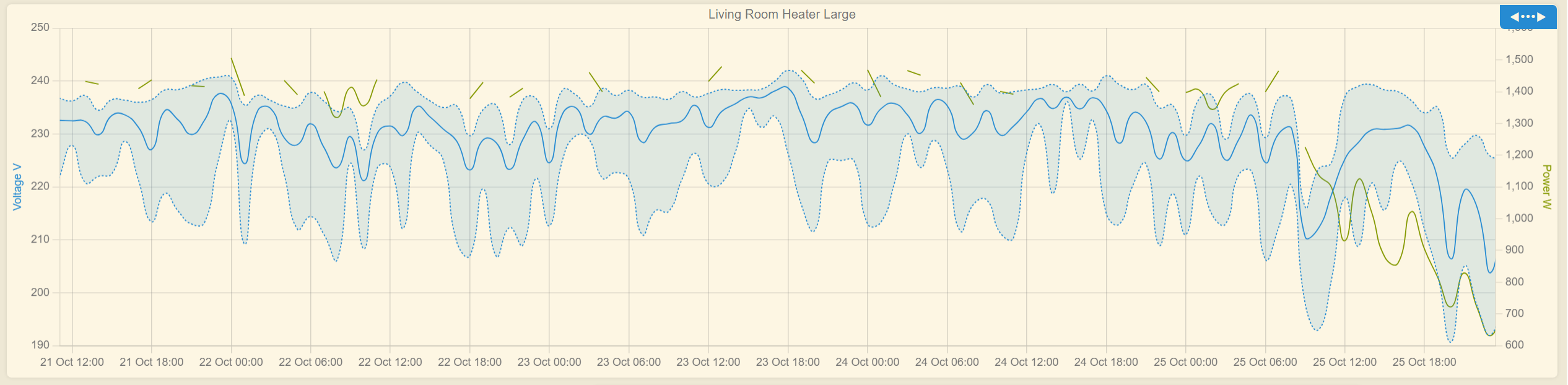
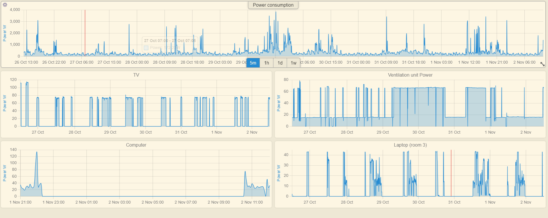
It is safe to ignore the extremely wild Voltage fluctuations, this is the primary reason I am logging this, so that I can send this to my utility company and complain.
Ah, that makes sense, but indeed, that does make the graph look a bit weird
Now I wonder, as we are now logging information from devices via this tool, would it be possible to create a text tile that can inform about total on/off time or accumulated data (total x) from the available data? I am aware that the outlets already accumulate energy, days on etc, but it is not as easy to view.
I really need to play around with this and get some sort of display worked out.
Something to pull the hourly voltage value from a graph and display it on a Dashboard tile.
Sure wish programming stuff didn't make my head hurt.
Coming back after a month or so of playing, I think for me a dealbreaker is not being able to get more specific with what shows up on a graph. My example I gave above is still one of my best, but I need to pick different attributes from each device and plot them on the same graph to be useful in my usecases today. Right now, I either have to pick broadly across "all temperatures" (for an example) or "multiple things in one device" - and I really need more specificity, ideally with dual axis capability too.
Are you thinking about any of this as you progress with the app? Thank you so much!!!
This is kind of a big change. Not saying that I won't do it sometime, cause I see its value, but I need the find a big chunk of time to tackle it. Thank you for the request.
Change tooltip title to display the datapoint time interval
This release contains only UI / dashboard changes, with just a very small fix on the Groovy / data collection part. Hope I did not break anything, it was a bit of a rush job
Thanks for another great update!
Unfortunately, something did break...
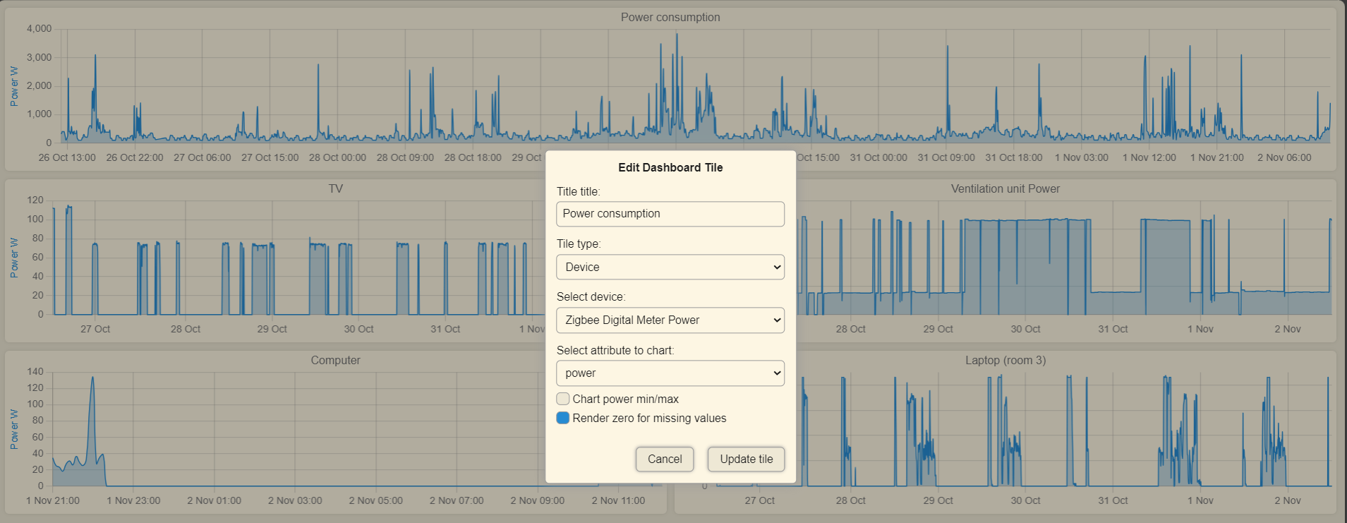
A device can be added to a new or existing dashboard.
However, adding a second device in the same session replaces the device that was just added.
Saving and closing after adding a single device allows for another device to be added.
Since you enrolled me to the beta testers team...
I would like to report some minor issues for you to review when you have some time, no rush or not very important
1. Chart zoom selection when mouse gets out of bounds
If you get the mouse of the tile widget bounds, the zoom resets. The first chart has a scale on the right side (RAM MB Size), so your mouse does not get out of the tile bounds. Cannot fix this, sorry.
Edit: You can start the zoom from the right side and move to the left, maybe this will help a bit.
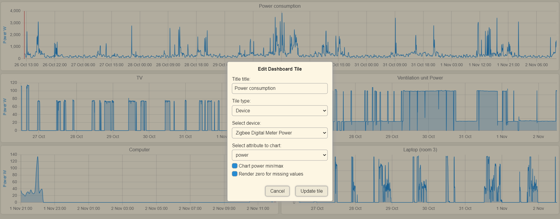
When the graph has more than 2 datasets, it changes from area-type chart to line-type chart, otherwise the multiple area overlapping (color mixing) will look bad. By adding the min/max, you are adding 2 more datasets.
Both bugs were fixed in 2.2.0. Thank you very much for taking the time to report this. You rock!
Mr. Dandanache .. Nice work as always
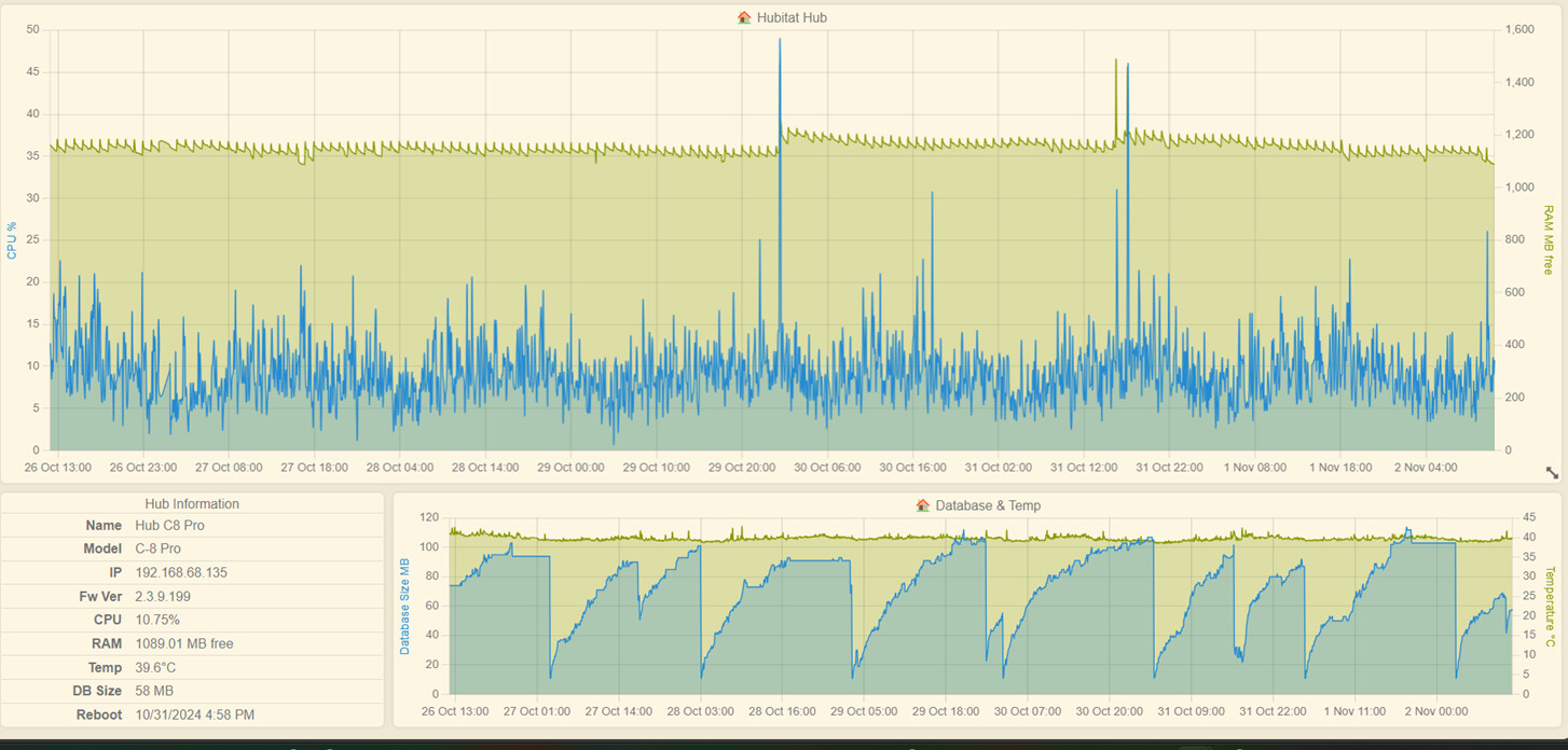
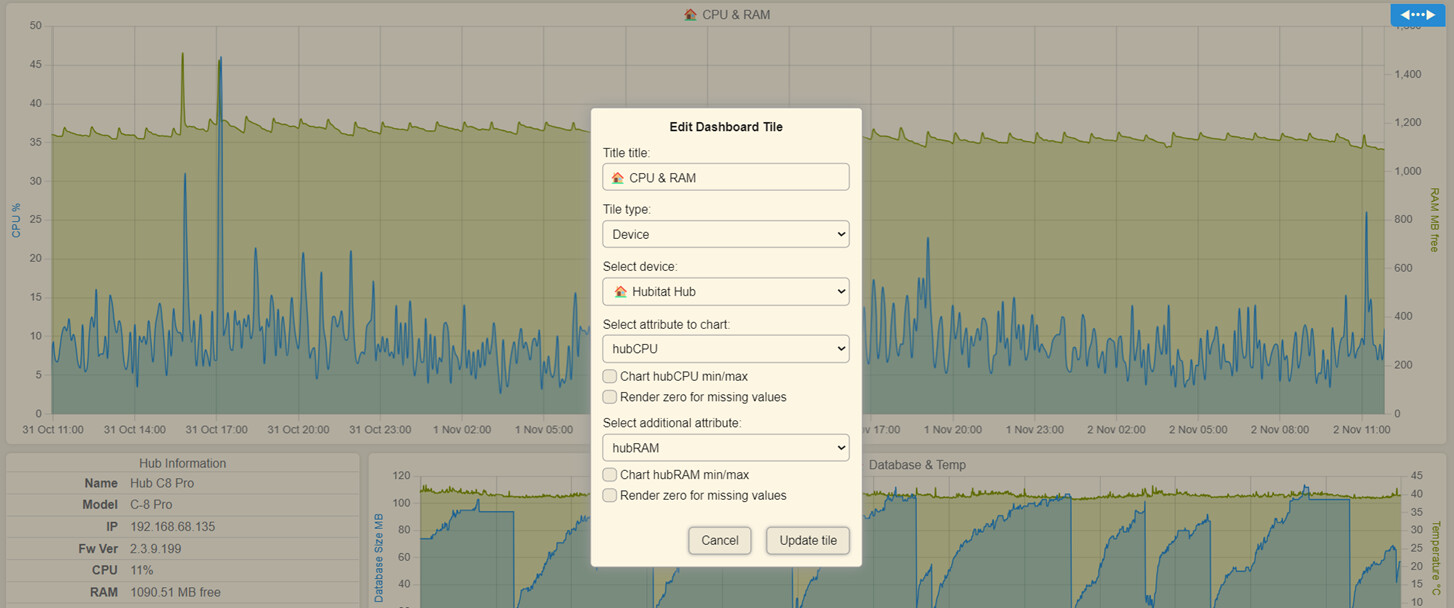
Was wondering if you could add the hub ram and temp to watchtower ?
Kinda like with the [Hub-a-Dashery] or is there a way to do it ?
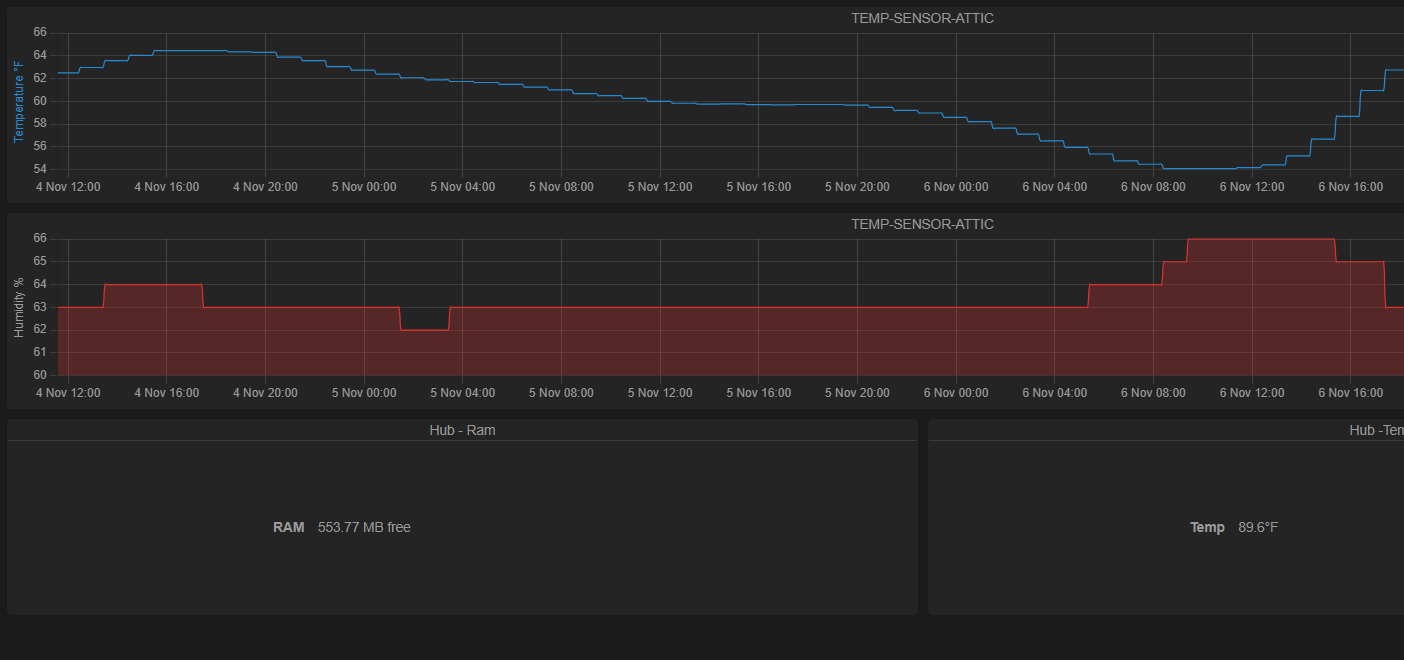
On My Charts it only shows current. ( see Pic ) Thaks !
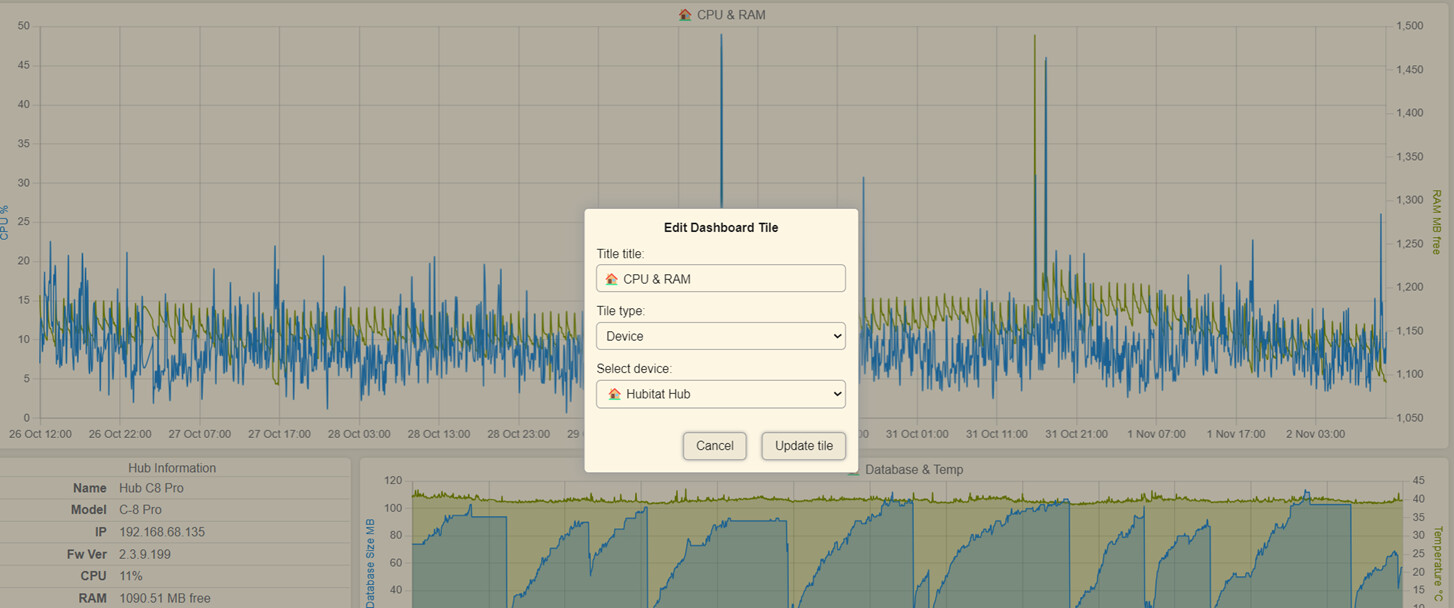
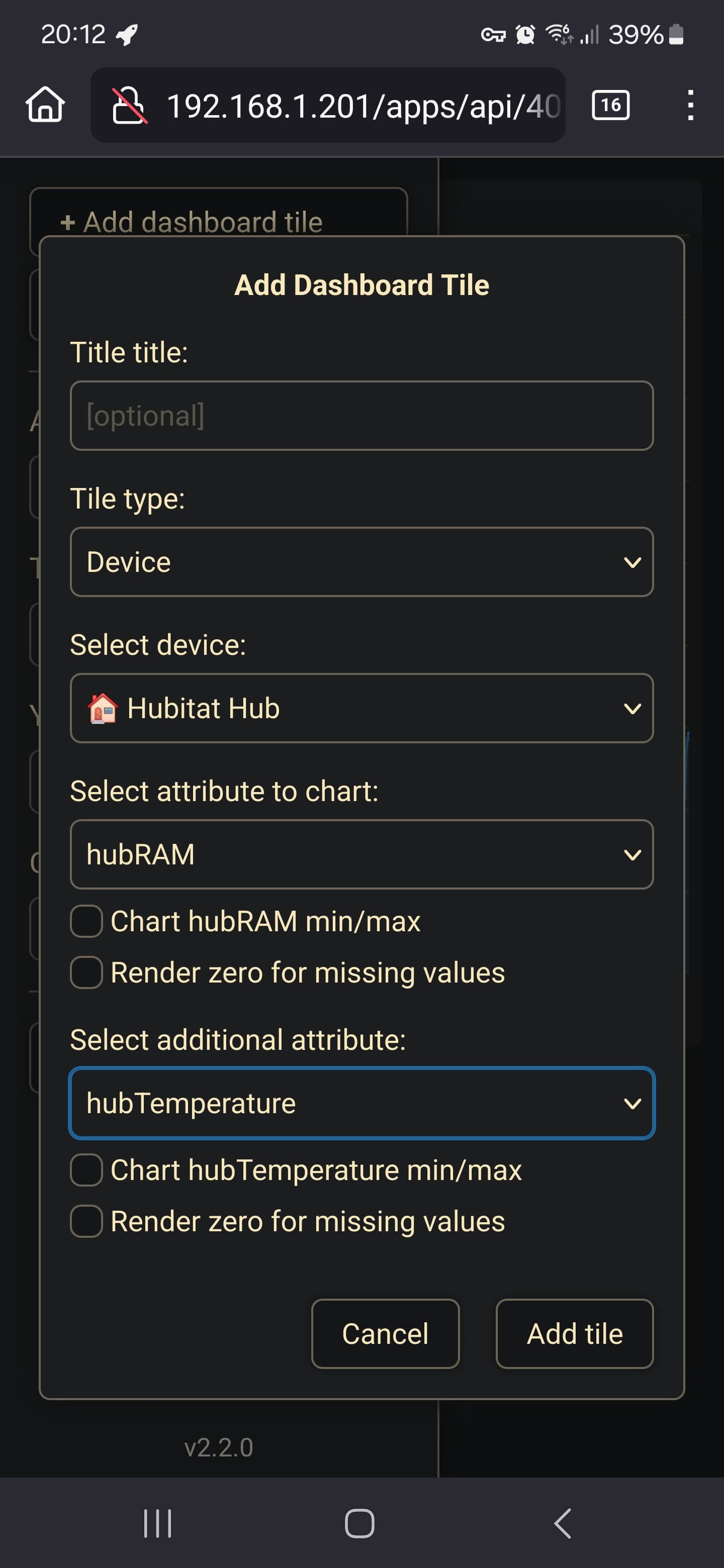
You should already be able to chart hub stats, not only current values. There is a special device named "Hubitat Hub" that has 4 metrics. Try to add a tile like this:
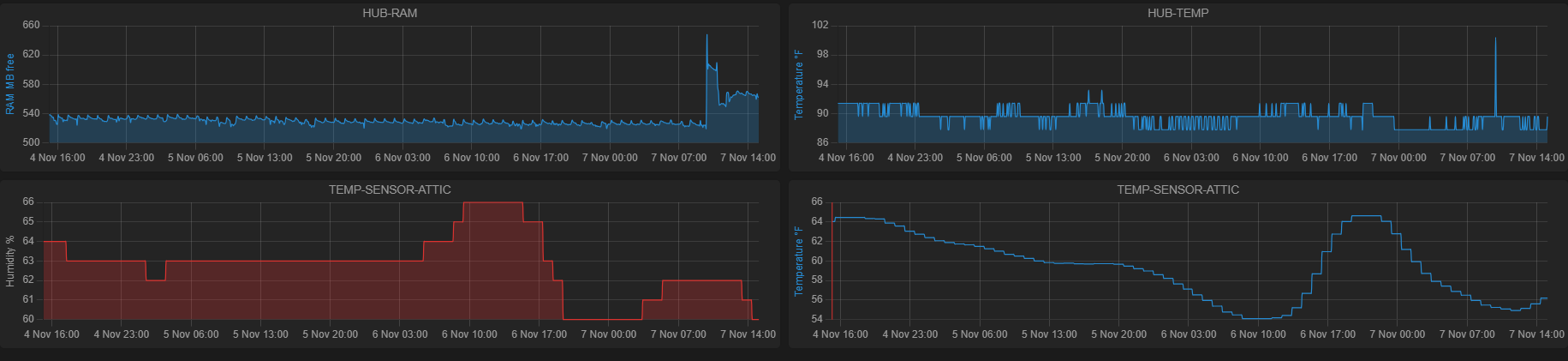
Got it .. I guess I added it wrong
Thanks for the quick response. Working great now
One thing as a suggestion .. Can we have the scroll wheel zoom like on [Hub-a-Dashery]
I kinda like the new way .. but the [Hub-a-Dashery] way was / seems easier somehow.
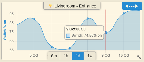
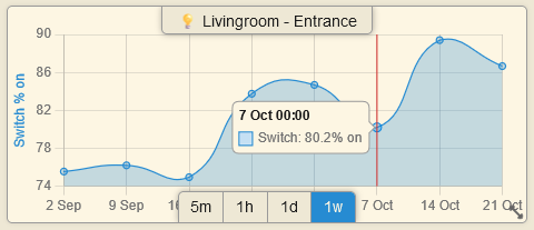
The new Status Map chart can render only non-numerical attributes that have 2 states (switch:on/off, contact:open/closed, motion:active/inactive, presence:present/not present, etc.).
This is how it looks with some lights in my apartment:
Sorry, not going back to that; it bugged me that the mouse wheel was zooming the graphs when I wanted to scroll the dashboard page. I believe that Hub-a-Dashery has only a few tiles available, not enough to require a page scroll, so it didn't bother me back then.
Plus, I believe that using the selection box, you have more control on the portion of the graph that you want to zoom in.
Thank you for reporting this . I will try to reproduce and fix it.