I modified the code and it's working great.
Thank you for taking the time to review.
I am seeing a number of log info entries such as "Publishing tile: 2 - Temp"
I thought I had all logging turned off in app. Is there a way to prevent these entries?
thx
The log entries you are seeing I believe are coming from the storage driver. You can set a log level of -1 to disable all logging.
I had look there and -1 wasn't an option. But it works. Thanks for quick reply.
1 Like
You are correct. -1 is not there because I'm not an advocate of turning off all the logging.
Tile Builder Rooms is now Available for Download via HPM.
TB Rooms allows you to construct tiles containing multiple devices intended to represent a room.
Tiles are placed on a grid using XY positioning to give exact control.
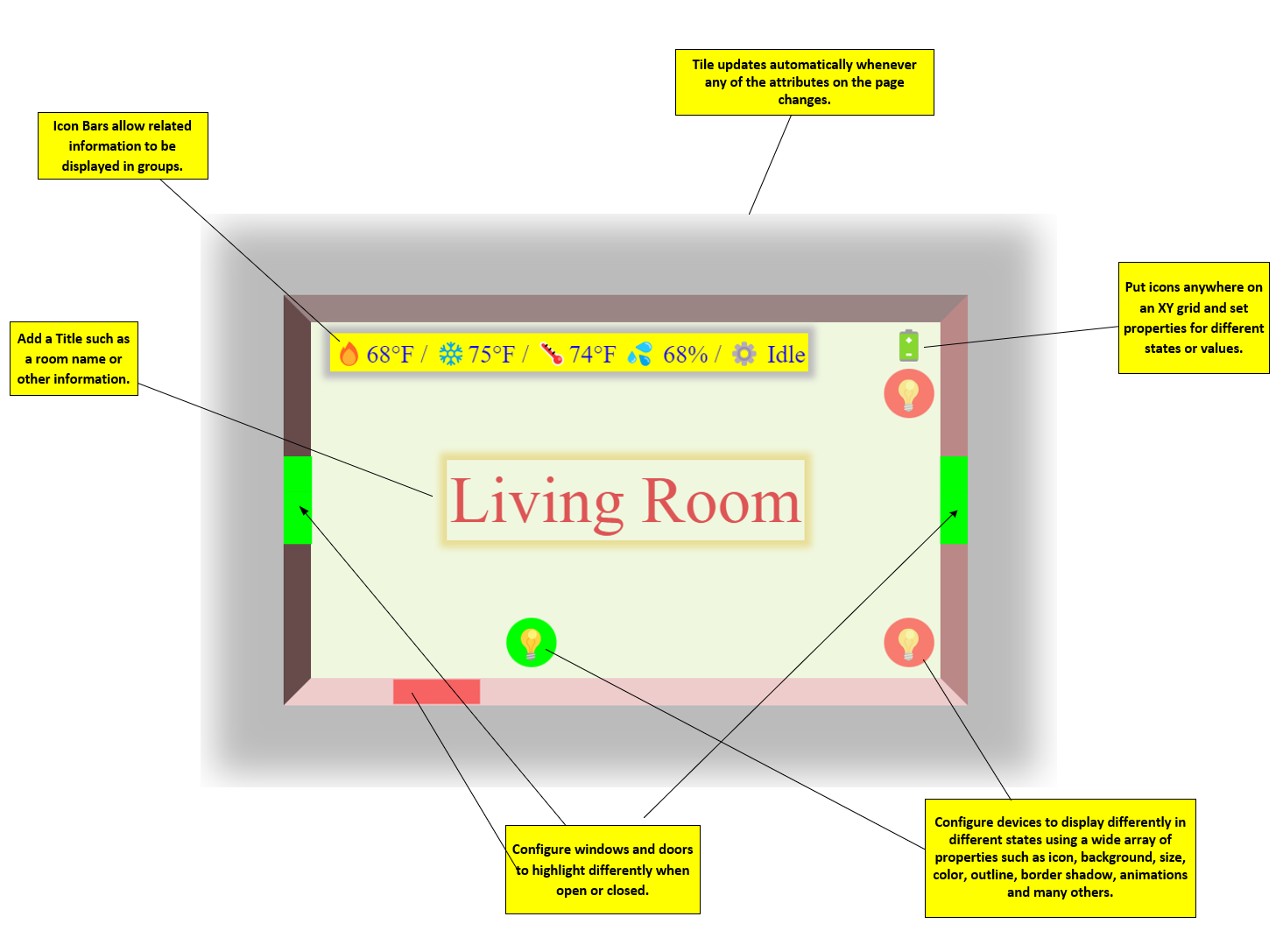
The appearance of each device is governed by the Device Profile that is applied to the device. For example the default device profile for a bulb looks like this (in short):
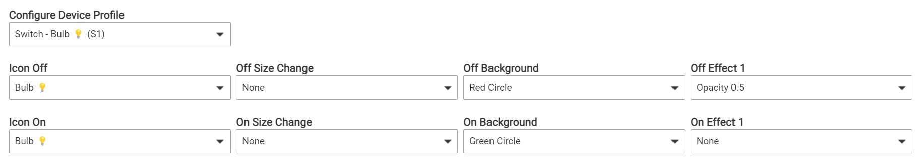
When the bulb is in the Off state it will have a red circle background and show at opacity 0.5. When it is in the On state it will have a green circle background and have Opacity 1.
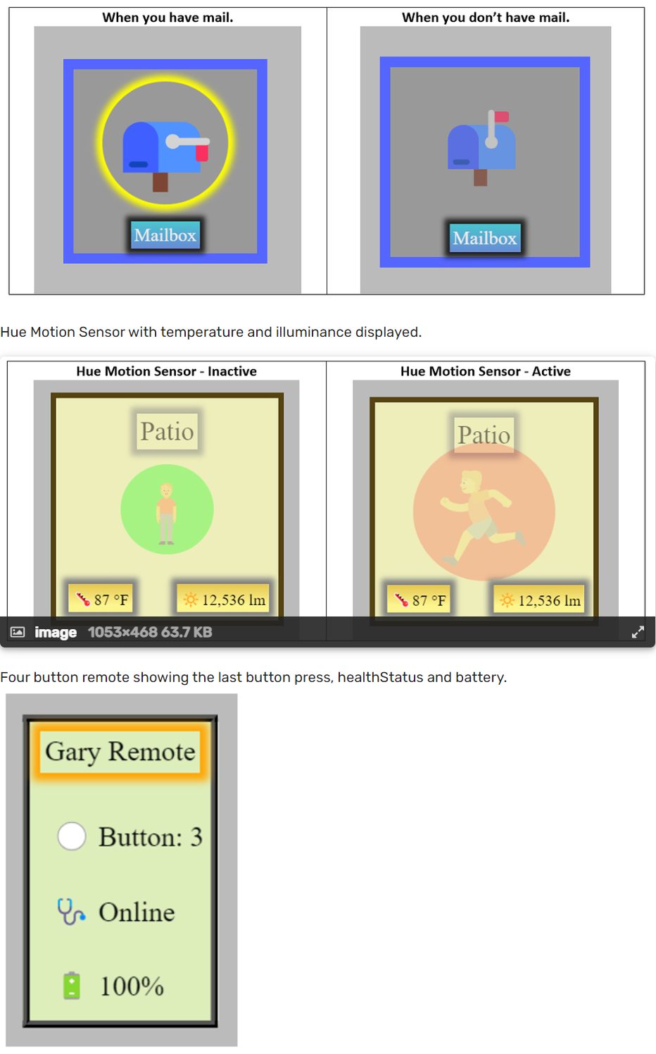
Data values can be displayed using the Icon Bar as shown above or using the device profiles Value Text or Value Data (shown below).
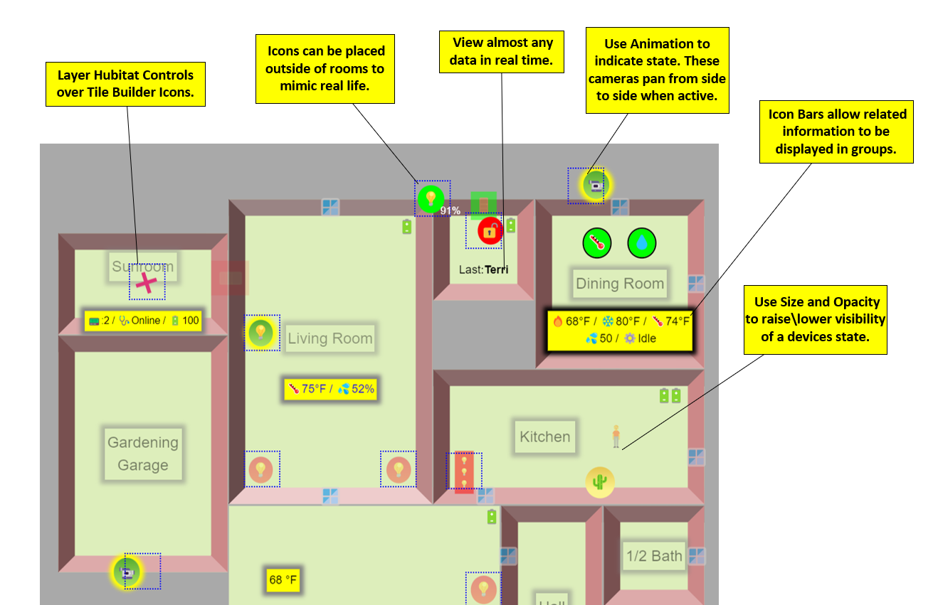
Connect multiple rooms together to layout your whole floor plan and layer on Hubitat controls (blue dotted squares) to add control to the elements.
Because all of these tiles are less than 1,024 bytes the dashboard renders and works perfectly in the Hubitat App, even over the internet. No Maker API or VPN needed.

Getting Started
You can find a one page Quick Start guide here.
And the full help file here.
"Standard Version"
The preceding tiles were made with the Advanced version which allows up to 10 devices and 2 Icon Bars per room. The Standard version is limited to 3 Devices but you can still do some interesting things. Here is a screenshot of some tiles I built using the Standard version.
A Final Word(s)
I definitely recommend using a desktop\large monitor to create your Rooms because of the width of the editing screen.
Just build something simple to start and experiment with customizing Device Profiles, placing Text and Numbers and using the Icon Bars.
Acknowledgements
The Rooms module came about as a result of an email thread I had with LibraSun about Tile Builder back in late June. Along the way he sent me a simple mockup of a 3D room he had created in SVG. It was impractical because of the size, but it got me to thinking, "How many Icons could I place on a grid and keep it under 1,024 bytes". The answer was "Enough" and now we have Tile Builder Rooms.
Along the way I recruited another willing helper in the form of @jshimota who had taken a strong interest in the earlier versions of Tile Builder. Shumo provided me with a lot of usability testing and bug hunting and would regularly challenge my thinking. The end result was a better product.
My thanks to both of them.
12 Likes
@garyjmilne question about having multiple instances: I used HPM to create a second instance of Tile Builder. It needs to be updated to Advanced. Do I need to pay the fee for each instance (which is OK), or is there some way I can look up my Advance License Key from the first instance?
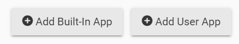
You shouldn't need to use HPM to install a second instance. Just click on Add User App and pick Tile Builder Again.
No, you can have up to 5 instances all using the same key, but you do need to activate each one separately
Yes, click on the gear icon in your first instance and copy it from there.
Yay! Thanks so much!
Hi Gary.
Would it be possible to blank out a wall/walls in a room?
My thinking is if you have a big room with lots of devices or an odd shaped room, you could use more than one tile and give the illusion that it is just one room.
Cheers.
Yes, if you have a room with a lot of devices, let's say the basement you can do this.
Make a room called Basement North and make it the full size with the walls on etc. Place all the items on north end. Place it on the dash.
Make a room called Basement South, disable the walls and make the background 100% opaque. Place this room inside the first. Place all you tiles on this end of the room.
It will now look like one room but with 20 devices.
You will have to basement south in front of basement north for the illusion to work.
Ah ha. Nice one.
Hadn't thought of that.
Yes, I like to have one main Tile Builder thread vs multiple so it's easier for people using Tile Builder to keep up with developments or answer questions.
2 Likes
You need to overlay a regular tile on top of the Rooms tile and use a custom icon, it'll look like my Garage and Mud room below (those are the only 2 rooms sorta functional at the moment). There is a section in the docs that details how to do this. I've only just started laying things out so it's not even close to good but it's taking shape. The real 'hard' thing is the alignment. You need to place the control tile over top of the device but it never lines up just right so there's a lot of tweaking the %x and %y locations.

2 Likes
As @wecoyote5 said you can layer on control elements. It might looks like this.
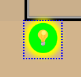
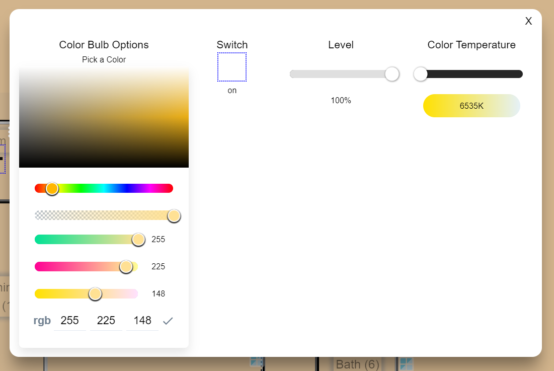
Clicking on it just brings up the UI for whichever template you have assigned. In this case it's a color bulb so it brings up this.
1 Like
One thing I just tried which seemed to work. I changed the CSS for the control tile to use opacity:0 and now it looks like you can just click on the light and it will turn on/off or bring up the UI. Obviously personal preference but when I have the layout completely done I plan to 'hide' all the blue boxes so I can just click/touch on the device, this bulb was turned on by the dashboard. @garyjmilne, this is really cool what you can do with this! Great work!
#tile-6 {opacity: 0 !important;}


1 Like
Excellent idea. I used the blue boxes to tell me/others what is clickable but I like your idea too. Im working on my layout right now and will post a doc when I’m done to help people get through it as it’s a bit tricky to get everything aligned.
Might be too late to benefit you Mark but I’m sure you are learning a lot and having fun!
Makes me wonder if I could do this though a switch placed on the dashboard. I can think of a few things it would be nice to quickly turn off and on. Something for the noodle list.
2 Likes
I've been designing HMIs for over 2 decades and, it's a completely personal preference, I've always strived for a clean/minimalistic look. Otherwise it can spiral and become a bit cluttered and confusing (what you've done here is amazing so please don't take this a criticism, just my preference). I've gotten way too many support calls over the years because there's too many things the user has to look at and comprehend. So when it comes to wifey using the dashboard it needs to be clear and concise  .
.
I don't have your experience, (had to google HMI) but I've been looking at UI's for 40 years and know a good one from a bad one. Hubitat is a pretty tech savvy bunch so the design UI can be fairly dense IMO if its well organized. What the wife sees is up to you.
But what I'm referring to dovetails into your situation. Imagine a button somewhere on your dash that said "Design View". Clicking that would show all the edges of all the devices and the three dot menu. Another might be Zigbee Details and the Zigbee details for each repeater would show, click again and they disappear.
Just a thought at the moment.
P.S. This might be useful re your question yesterday that I can't find.
I'm going to be visiting the same topic soon.
1 Like

