Although this is a module of Remote Builder I thought it worth creating a separate thread vs announcing it deep within a 6 month old thread where it may go unnoticed by many. In the vein of "A picture says 1000 words" I think this summarizes it pretty well.
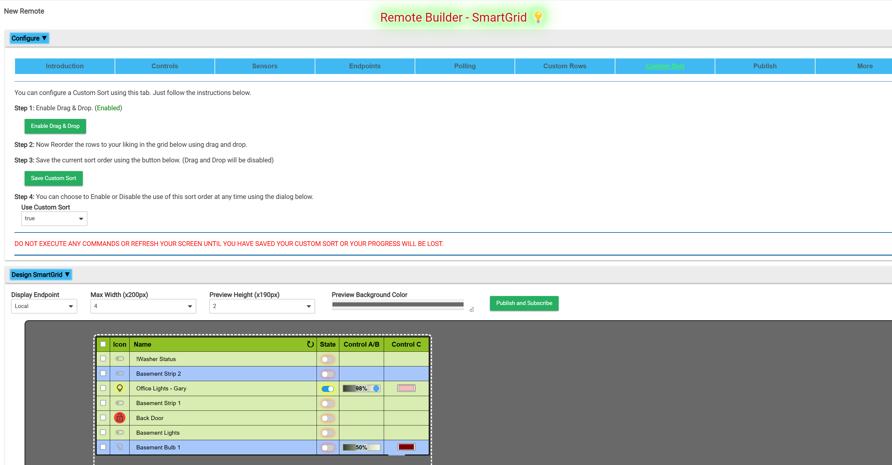
July 2025 - Version 4.X.X added Custom Sort order, Separator Rows, Customs Rows and Advanced Variables.
April 2026 - Version 5.X.X added the following:
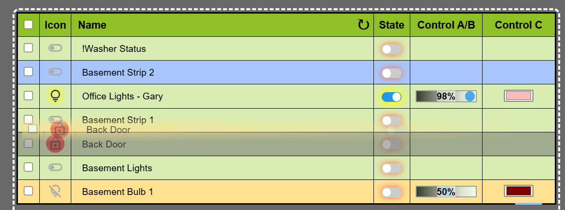
Implementation of UID as the sort key when manually sorting. This allows to attributes of the same device to be sorted independently.
Moved the HTML\CSS\JS template to the parent to shorten codebase.
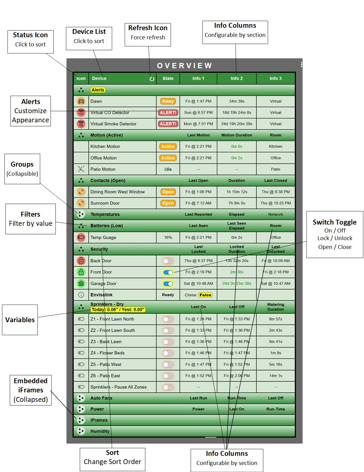
Fixed range for temp sensors. Added Humidity sensors. Increased variables and rename devices to 12. Added default formatting (N/A) for attributes when appropriate.
Added sorting to SubGroups when all of the values in the state column are numeric. Otherwise they sort Alpha based on device name.
User configurable color coding to temperature and humidity data.
Added battery and power sensors with some filtering.
Bulk assignment to groups by sensor type. Added filtering for all sensor types.
Customize Info1 - Info3 columns by Group if desired.
Implemented new defaultStateMap to improve visibility for abnormal conditions.
Added collapsible sections to the Sensors tab. Added Drag and Drop and Save Custom Sort buttons to the Controls and Sensors Tabs. Renamed Custom Rows tab to Group & Sort tab.
Documentation
You can find the SmartGrid 5.1.0 documentation here.
Video Tour
You can find a 14 minute demo video for SmartGrid 4.3.0 [here].(https://www.youtube.com/watch?v=E_eQKtyAx-Q?vq=hd1080)
Live Demo
If you want to try a running copy on my old C-5 you can do so here. They are all virtual devices so you can make any changes you want.
You can find the official Remote Builder thread here if you are looking for more information.
P.S. This has a very high WAF in this house. For some reason this appeals to her in a way that dashboards have not.
16 Likes
Thanks for your kind words. Actually it does not use 39501, just web calls shipping JSON back and forth.
Yeah, I avoided MakerAPI as it is just one more complexity and extra setup. This is much cleaner.
5 Likes
@garyjmilne - howdy G. I'd like to submit a feature request - extend the low end range of
Control Size.
In my tiles, I freely admit I push my dashboard to some extremes. My dashboard is HD+ and I pack a lot into a 27" 1080x1920 portrait mode display running at my desktop computer.
Because of this allocation of screen space, I have a lot of space to work with - and I like to compact it all.
When I push smart grid text sizes to their lowest values the icons and controls all seem at least double what the text height is. The result is causing a tile that I feel would fit nicely in a 2x1 to require 4x3 tiles.
I see your stepping is values of 2.5 starting at 15. Would you consider extending that to (guessing - ) 7.5 at the minimum?
Here is the smallest I can make it I think - note the same 3 devices are below which take a total of 3x1.
Thanks for your consideration.
Shu
2 Likes
Sure, there is no downside to doing that and it's about as easy a request to fulfill as any.
P.S. You are not on the current version. I can tell because your sort order header text is larger than the non sort headers. This is no longer the case in the current version 3.1.3. But don't sweat it, I'll have a minor update before the end of the weekend.which will include this request.
2 Likes
@garyjmilne - Master G - Big fan of your work!
The new update shaved 1x3 tiles off my tile size required to hold your smart grid output!
I can now go and INCREASE the values your tile build offers to fully utilize the tile space assigned! It's truly art - Thank you!
I'm inches from my goal line - hoping @jpage4500 will release soon the ability on his amazing dashboard to have Tile Builder and/or Remote Builder tiles allowed to by-pass the need to open a popup to use your tiles directly. It currently works great within the popup so I'm VERY excited about how incredibly well your tile generators' work on other dashboards.
THANK YOU.
2 Likes
@garyjmilne - I'm back ( and I can hear you say 'Already?').
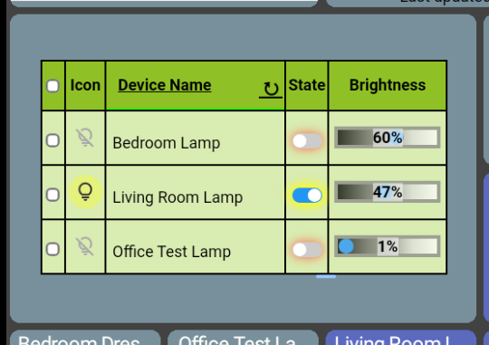
I'm unsure what I'm doing wrong. I want to have 3 columns on a smart grid for my CT bulbs.
Level (brightness), Color temp in Kelvin, and Color name. I can't figure out how to get the color temp numeric value. I'm assuming it's a slider but unsure what to expect - I can't get anything at the moment!
Using the Living Room Lamp for example:
Here is the tile output on my HD+ dashboard, and a MultiAttribute tile that shows the kelvin CT temp number
What am I doing wrong?!?
btw - @garyjmilne
COLORIZED Log entries?! Dude - you are a giant among men!
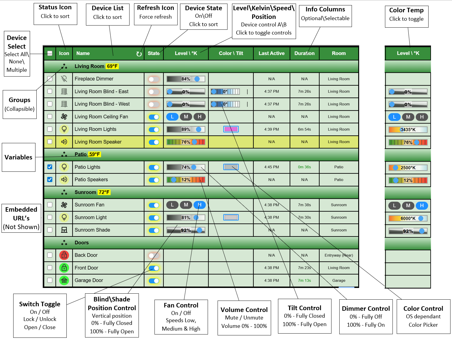
There are two Control columns (ignoring the switch). Because bulbs have 3 possible controls (dimmer, CT and Color) the first Control group (A/B) allows you to toggle between dimmer and CT. The second control group only has color so there is not toggle action.
So, it you only display one Control Group then you can toggle between dimmer and CT by clicking on the header.
If you were just looking to display the Kelvin value in an Info column I've added that as an option in the next release but it is already visible on the CT range slider.
Very easy, just wrap the log output in HTML. I started using that in my Tasmota driver years ago. Perhaps I'll make the log color user selectable in a future release.
It means that the app is not finding a definition that matches the output. So, if it were a contact it would expect "open" or "closed", anything else (or null) would fall through the code and pick up a default Icon. I just had the name of that Icon wrong. It is now fixed.
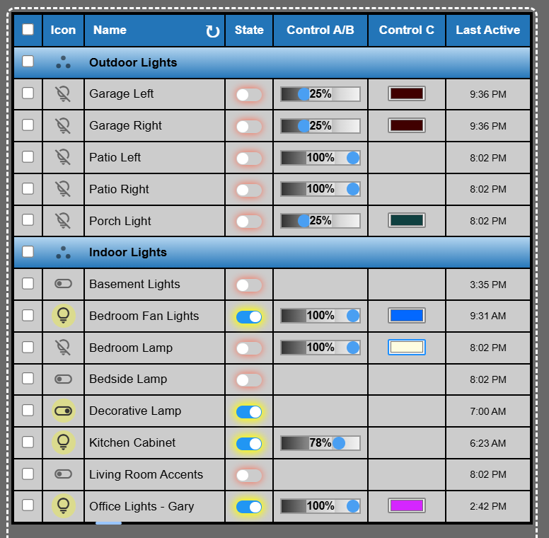
No, SmartGrid looks at the capabilities of a specified device and generates the controls to match those capabilities. For example RGBW bulb has Switch, dimmer, color and CT. By contrast an outlet plug will only have switch. So, depending the mix of devices you choose you will have empty cells to accommodate this difference. Currently only Blinds (Tilt) and Color bulbs use the second Control column so you may be be able to hide this in some circumstances.
Yes. The text element has some opacity so the slider handle is still visible behind the text.
1 Like
He just needs to pass the click through to the background but then he may need to add an alternate means to open the tile as you used to do.
All reported issues are fixed in SmartGrid 3.1.5 which was just released to HPM.
2 Likes
Well I'm back home and working on some of the improvements that were on my mental wishlist before I left.
I've rearranged the UI to provide more free space for editing the table.
I have Drag and Drop \ Custom Sort working (this was the big lift)
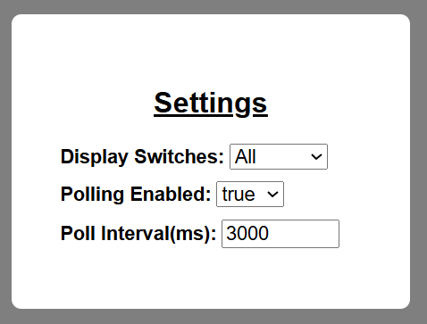
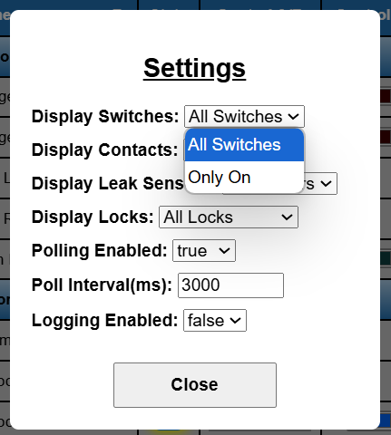
I've added a simple Modal window that allows you to Enable\Disable Polling as well as change the polling frequency directly in the SmartGrid. The "Display Switches" settings allows you to filter the display to only show ON or only show OFF is desired. Someone was using SmartGrid as a nighttime checklist to see what was still on.
The last thing I'm working on right now is Custom Rows. I see these mainly as section headers when using a Custom Sort but perhaps there is another purpose.
Not sure on the release timeline but I'd guess two weeks.
Just wanted to give you guys an update.
5 Likes
I won't quite make my two week estimate but the good news is that everything is working as you can see below. But I need to spend some more time making the whole editing process a bit more intuitive.
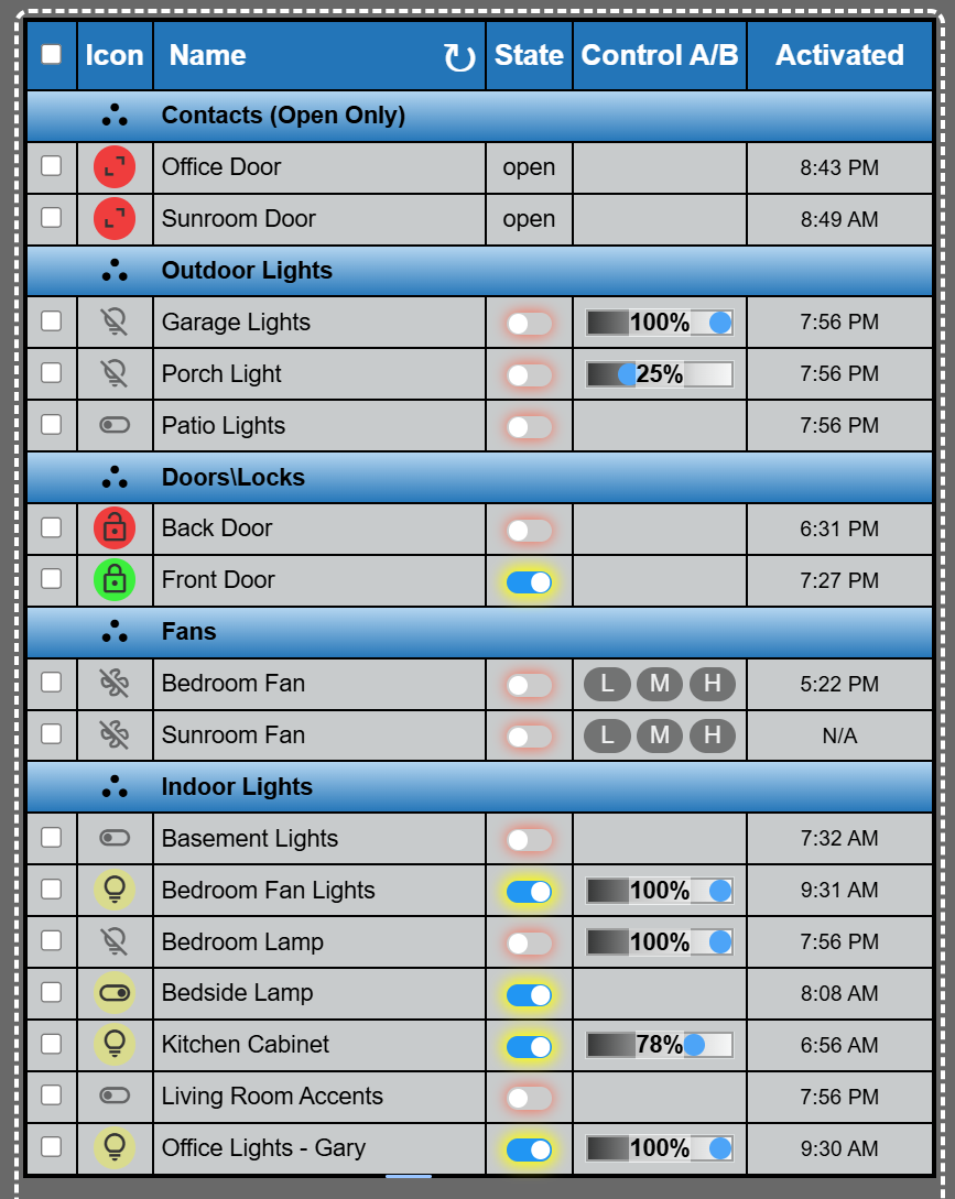
Notice on my Contacts group that it is a filtered view (open only).
How does this look for the default color scheme?
It also supports variables which can be created from attributes of Hub variables and place in the name column or the state column at present.
6 Likes
Welcome back.
awesome! you go the drag and drop to work!! I'm going to start playing around with this again in the next week or two. This is looking crazy good. Its a great default color. If you need a tester before the final release let me know.
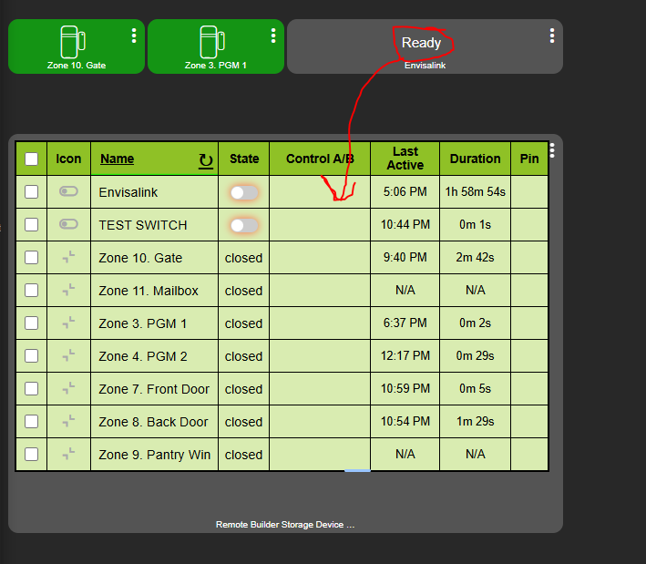
I'm busy setting up a grid as an Alarm Panel Status board. Would it be possible to have the attributes of a device selectable in a column?
The Envisalink is the alarm and I would need its "status" attribute to show up in a colum so i can see if its Ready/Armed/Disarmed....
Yes, when configuring a custom sort order.
I might take you up on that.
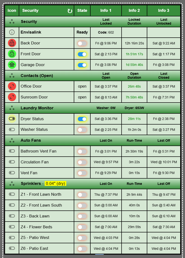
As it stands today you can configure variables (attributes or hub variables) that you can place within the sub-header rows like this:
"Ready" is my Envisalink Status which I threw in there for demo purposes.
But I can see that I need to have custom rows to represent some less common devices and not just to act as separators. Should not be too difficult to do that.
1 Like
I've been having fun condensing a bunch of standalone SmartGrids and Tile Builder Grids into something more comprehensive.
I have a couple of ideas for new features but I'm going to save those for the next release. Just a few smallish details to wrap up, but I'm targeting Monday (4/21) night for the release with docs and videos to follow.
5 Likes
Awesome work. Assume I could set something similar for switches to show “on only” as well? Or what about batteries under X%?
I have been wanting an exception type dashboard to see what switches are on and that should be off, contacts that are open, locks unlocked, etc.
Yes, you can configure local settings for a particular dashboard through the Applet.
Still trying to work through some issues relating to the saving of local settings that would allow two iFrames on the same page to each have their own settings.
Batteries and Inactive devices (like Activity Monitor) are two things I'd like to add in the next version. The trick is to get them to automatically filter into a sub group without the user having to do much manually.
2 Likes
I pushed SmartGrid 4.0.0 to HPM. This is a big update in terms of what is possible. I'm not going into the details right now and do not have any documentation, so only install the update if you have time to play around. The SmartGrids that you already have configured should migrate O.K.
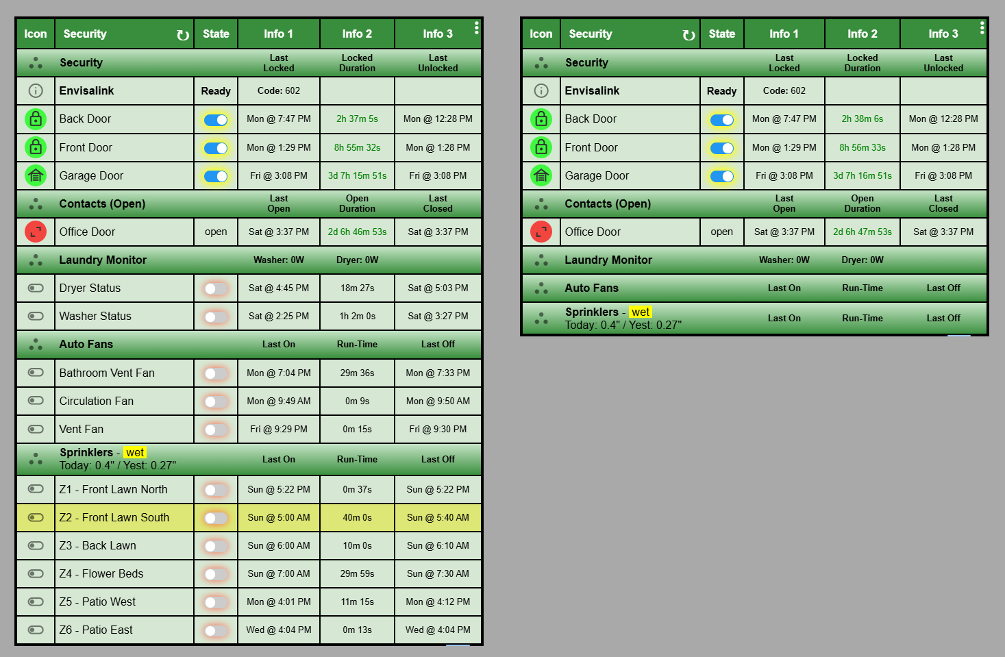
This is an example of the same SmartGrid with two different displays due to locally configured options. The SmartGrid on the right is the same but only shows Switches which are in the "on" position.
2 Likes