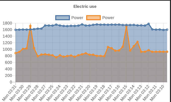
Actually, it looks pretty good using Smartly...
Nope
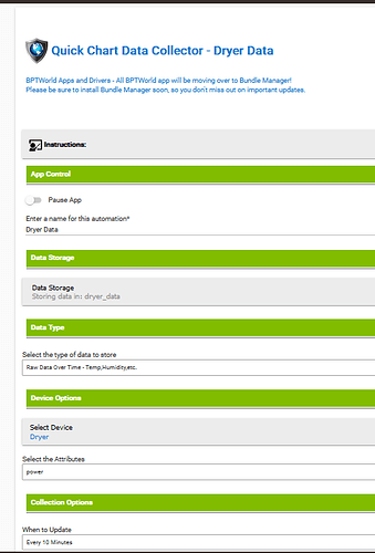
I cant seem to get the file to show up when I click Get List
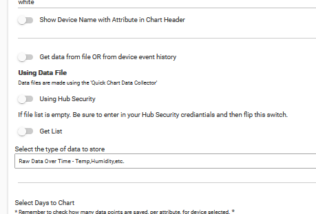
The child collector is
and there is a file created
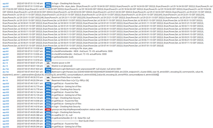
Here is the logs
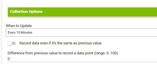
Another question...in regard to capturing data....if interval is every 10 mins ...does it create points every 10 mins if the value hasn't changed ? Assuming you only create points when the data changes,would it be possible to have some kind of delta criteria that would only create a point if the data changed X%. So if the power changed from 394 to 393, no need to create a new point
Thanks
Tim
File name must end in .txt
Like it says in the Collector app "(ie. humidityData.txt)"
yes, it does
Sure, no promises but I'll add it to the list
Thanks for the quick response...now able to get a graph : )
One suggestion would be to say (file MUST end in .txt)
One other question... Any chance of when on dashboard, when you click on the graph it get larger...(i know you can right click and open in a new tab)
Thanks again for the amazing work.
Tim
New beta...
0.1.6 - 07/30/22 - New Collection Options in the Collector app
I'm not really sure how to send a pull request with the files all bundled into zip files. It's a one-liner so it's not a big deal anyway though: Just propose to change
this line in the readFile(fName) function of Quick Charts Child
theDate = today - x
to
theDate = today - (x+1)
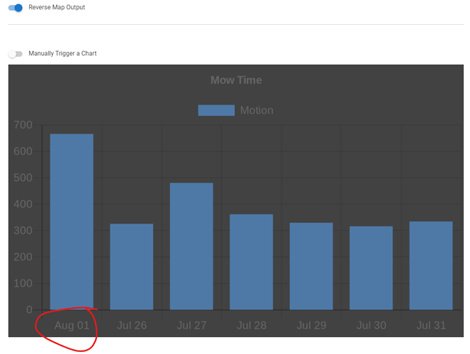
Since x is initialed to 0, the data from "today" is being double-counted. Changing to x+1 is one way to address that. Or just initialize x to 1 instead of 0.
Love the new options
Is the difference - percent difference ?
Sorry one more question.....is there any way for the graph to enlarge in dashboard when you click on it ?
No, value difference
Nope but if someone knows a way to do this, it can be added.
I don't know if this makes a diff, but my camera feed tile does this if you click on it. (Not sure how it's done)
New beta...
0.1.7 - 08/01/22 - Charts are now clickable (opens in a new window), option for Value or Percentage differences
Please check my math for the percentage difference:
theDiff = 100 * ((Math.abs(newReading - prevReading)) / prevReading).round(2)
Doesn't click on my iphone dash...
In firefox it does change to a hand but doesn't click
Frame is still cutting off info...
on dash tile (3 x 5)
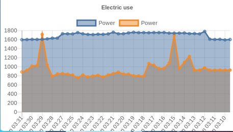
Should look like this
What if you make it 4 x 5?
Now it's back to not showing anything
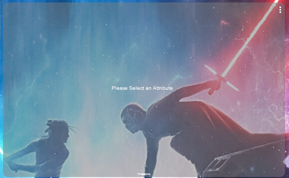
Edit: Now my chartlength is at 1937 so likely why it's not showing. Whats the best way to shrink it?
Only way to shrink chart size is to use less data
Is there a way to enforce (code wise) to use only the last 1024 bytes (is it bytes?) of the data collected? That is, say my data collected is 2000 but only up to 1024 will be shown?
Reason is , it seems like during the day my data collected changes it’s size and when it goes over 1024 I get an empty tile.
In case you aren't tired of sorting issues  This also shows today (Aug 1) being double counted due to the issue mentioned in a previous post.
That is a Hubitat enforced limit for a tile. You can still see the chart within 'Quick Chart'.
There would be no way to calculate how much data it takes to go over the 1024 limit. With Chart Titles, legends, X and Y-axis labels and then the actual data to consider, it can't be done. If you notice you're going over the limit, simply store less data points in the collection app.
Missed that one, fixed in the next release.

