Could it be possible to calculate (instead of displaying from device or provider) the dew point from the declared temperature & umidity sources? I'm currently using an external local device but I'm must use the provider dp that is not correct.
Thank for the tile!
You sir, are a super star.
Fantastic job.
Love it.............
4 Likes
Minor-ish update to Weather Tile (version 3.10)
- Enabled Main Icon to have colors (wife's request).
- Made Feels Like Temperature a bit bigger and heavier.
- Fix the dewpoint "text" to trigger when it is greater than 65 F. I have no idea what C is.
- Refactored the code so I can now easily support other data feeds and units.
Upcoming Features
- 3-Day forecast option
- Daily rain/snow prediction graph
- Full weather detail via pop-up when tapped
- Allow multiple sensor feeds to override "main" feed
2 Likes
Please pass on my gratitude to your wife for her excellent suggestions.
Thanks for the awesome app! Is there any way to copy a graph so you don't have to start over from scratch? Specifically, I have six temperatures (sensors) on a 7 day graph and would like to create a second graph (dashboard tile) showing a single day for all of the same sensors just for more detail - but I didn't want to go through all the settings, changing colors, etc. again if there was a quicker way. Didn't see anything searching through this post/the forum... Thanks!
1 Like
Using the latest version I'm getting some text overlap...is that expected, or am I doing something wrong?
Thanks for the awesome work, it is much appreciated.
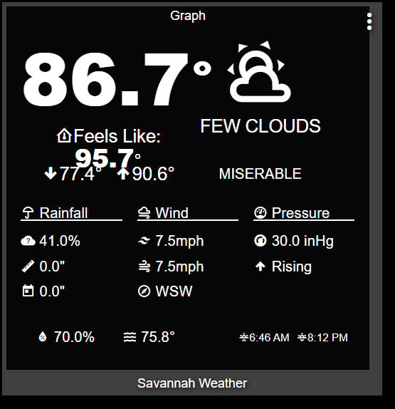
p.s. it does feel miserable outside 
Expected? No. Just give me a couple of hours and I will have a new update that allows you to change the text size so it will fit...
1 Like
Thanks, I appreciate it.
@thomas.c.howard Suggestion for comfort description:
If dewpoint < 60 and temperature >= 95, "HOT". Seems a bit odd to see PLEASANT on the tile when it's uncomfortably hot outside.
The tile description just responds to dewpoint temperature (as long as it's >65 F):
    if (currentTemperature > 65) {
        if (dewPoint < 50) return "DRY";
        else if (dewPoint < 55) return "PLEASANT";
        else if (dewPoint < 60) return "COMFORTABLE";
        else if (dewPoint < 65) return "STICKY";
        else if (dewPoint < 70) return "UNCOMFORTABLE";
        else if (dewPoint < 75) return "OPPRESSIVE";
        else return "MISERABLE"
    } else return "";
I think I'd choose some slightly different values, but there's no complicated formula.
Before this turns into a philosophical debate about dewpoint vs temperature vs humidity, let's just ask this:
- What controls do you want? Do you want to choose the temperatures/dewpoint combinations?
- Are there some scientifically supported algorithms out there?
- I can just add the ability to turn off the commentary?
Let me know and remember, "I do this for fun, don't make it un-fun"
4 Likes
I also wanted to mention that the Range Bar does not disable debug logging when "Enable Debug Logging?" is off.
I noticed because I keep seeing:
log.debug(graph_timespan);
in my logs. In my case it logs '2' since I'm rebuilding daily.
I think your formula is fine. It even corresponds to some online references I've looked at (at least roughly). My only request is that, when it is hot as heck, that seeing "comfortable" on the tile seems weird. So I'd add to your algorithm the formula I suggested--it's based on changing Comfortable or Pleasant or Dry to Hot when it's hot outside.
And I just picked the numbers I'm suggesting for HOT out of the air. No scientific basis. No philosophy. No deep thinking. Just, in my experience in a place that gets hot and dry (Sacramento region), once the temperature gets above 95, it starts to get uncomfortable even when it's dry.
Okay, for tonight's release I have added the following to Weather Tile
- Ability to "turn off the Dew Point Description" - I want some time to think and research the proper way to come up with a better "how is the weather measure". If it is on, it shows up next to the dewpoint and describes the "humid-feel" of the air (if the temperature is above 60 F -- 15.6 C)
- Ability to adjust the font sizes AND icon size - Note, the displayed values on the sliders are there to provide RELATIVE sizes. Weather Tile adjusts the spacing and font depending on the tile size. With this ability, you have the ability to cause wrapping and overlap. The default values should never overlap (unless you go crazy with decimal points) -- @pltaylor3 & @sburke781
- General clean up and prep work for expanded graphs and forecasts.
- Removed (I hope all the log.debug statements (@BrianP)
- Fixed partly cloudy color being RED
4 Likes
The reference you made to:
Is that in relation to anything like the request I made for a 5-7 day style forecast tile?
Yes
3 Likes
Thanks for making this tile, and I'm really looking forward to a forecast version.
Forgive my nit-picking, but....
could you put a space before mm, km/h, and similar please? (mbar is already good)
I think the convention is that percentage and degree symbols are not preceded by a space, but the other units......
Anyone seen any problems with their graphs since updating to the latest version of Hub firmware.
I have two hubs and only one seems affected. On my Hub in my shop I have two graphs, one that plots the refrigerator and freezer temp of a small refig I have out there, and another that plots temp of the shop floor, my storage building and the shop office. Both graphs seem to have lost all data prior to the update.
It is not a big deal and they seem to be loading new data, but the graph that monitors the Storage building and shop floor and office has another issue. If you hover over one of the lines on the graph it list the wrong item. The graph looks correct but the labels have been swapped around. Also if you hover over the legend it highlights the wrong line,
Below is a screen shot of the graph, The balloon should be the storage shed not the shop office. The shop office is the lower saw-tooth line. I have an potable AC unit in there I control with a Harmony hub and want to make sure it stays below 80 as the HE Hub and other electronics are in there.
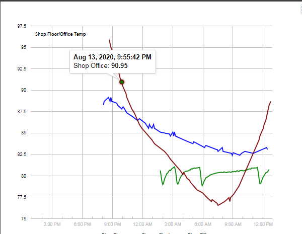
The losing data after an update kind of scared me, in that if that was going to be the case then my graphs on my other Hub logging energy were going to be useless if it loses data after an update. My graphs on the other hub, however, were unaffected.

