I've ran the update but regardless of whether I select 'Temperature Sensor' or 'Thermostat' I only see the current actual temperature (not the setpoint). I'll maybe deauthorise in maker, refresh devices, reauthorise, refresh again to bring the thermostats back in and see if anything changes.
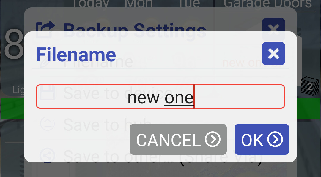
One issue I do have, that I also had in the previous beta, is that I can no longer rename a backup filename. I had been backing them up as 'ddmmyy_room' so that the backup name reflected the tablet location and date on the Hubitat File Manager. I can click on the name to change it, but it no longer automatically pops up the on screen keyboard so I can do nothing with the file name. I initially thought it could be an issue with my Fully settings but it's the same even when I open Hubitat Dashboard directly.
A couple of other things I thought about, not bugs or faults, just observations. They revolve around Empty Tiles and Section Dividers...
Empty tiles have no function other than to assist in arranging a dashboard tile setup in a particular order when there are gaps. It would be preferable when in normal use (not in Edit mode) if they did nothing when touched. Currently a popup box appears with nothing other than an Edit facility. IMHO as the Empty Tile can't do anything, it might be better if nothing happened when an Empty Tile was touched, unless you were in Edit Mode.
Likewise with Empty Tiles, they appear in the 'Manage Items' list in a folder. I'm not sure whether it is possible to make Empty Tiles an element that can only be added or deleted but not managed. I have some Empty Tiles in each of my multiple folders to keep the screens looking orderly. When I click 'Manage Folder Items', there are a lot of Empty Tiles cluttering the list - a number of them at the top reflecting the Empty Tiles currently in that specific folder, then even more at the bottom of the list reflecting those in all of the other folders.
This one is a long shot. I like all of my dashboards and folders to occupy exactly one screen. If an item is on the screen/in a folder it will be visible, with no scrolling needed. The section dividers are handy and I was going to use one to separate the icons that represent devices with my bottom row of icons which are either folders or app shortcuts. Unfortunately the section divider occupies space so that if I add one, my bottom row of tiles will not fit fully on screen. It would be great (but probably overly complicated) if adding one altered the inter row padding between icons, so as to not occupy additional space. A feature I requested on another dashboard was the ability to group a set of tiles. By that I mean just remove the spacing between them so I could have a block of similar device tiles without padding between them so as to visually group them.
No need - I just haven't finished (or figured out really) this one yet but wanted to mention it in case you noticed the change. I think I got stuck trying to figure out when to show the heating controls. I'm used to showing the controls when the thermostat is in 'auto', 'heating' or 'cooling' mode. Is 'economy' basically the same as 'auto'?
"thermostatMode": "economy",
I can no longer rename a backup filename. I had been backing them up as 'ddmmyy_room' so that the backup name reflected the tablet location and date on the Hubitat File Manager. I can click on the name to change it, but it no longer automatically pops up the on screen keyboard so I can do nothing with the file name
Hmm.. I can't reproduce this one. Do you see this dialog (below)? I think you do have to manually click in the edit field to show the on screen keyboard - at least on my test device.
Likewise with Empty Tiles, they appear in the 'Manage Items' list in a folder. I'm not sure whether it is possible to make Empty Tiles an element that can only be added or deleted but not managed.
Also makes sense.. I don't use that manage items too often but I've noticed that it can be confusing when there's multiple tiles with the same name (and empty tiles all have the same name I believe)
I will say that manage items dialog is meant to quickly add devices to a folder.. and back to the homescreen when de-selected. So, probably no need to show empty tiles in this list anyway.
Kind of related but I remember reading someone who removed some items from a folder and was surprised when they were added back to the main dashboard re-arranging the order of the existing tiles. I should probably re-add them to the bottom of the dashboard in this case..
I like all of my dashboards and folders to occupy exactly one screen. If an item is on the screen/in a folder it will be visible, with no scrolling needed
me too! I don't mind scrolling a little for some un-important stuff but I like to have all of the good stuff visible at a glance w/out touching.
Unfortunately the section divider occupies space so that if I add one, my bottom row of tiles will not fit fully on screen. It would be great (but probably overly complicated) if adding one altered the inter row padding between icons, so as to not occupy additional space
...
A feature I requested on another dashboard was the ability to group a set of tiles. By that I mean just remove the spacing between them so I could have a block of similar device tiles without padding between them so as to visually group them.
I think I'm following here although it probably wouldn't hurt to come up with some examples/screenshots of similar groupings just to make sure. The complicated part for me would be that everything is based on a grid of equally sized rows. I have a feeling grouping devices this way would end up making this difficult to keep.
I'll have another look. After I posted the issue I ran the update on another Fire tablet and did a backup before installing the new version. On that tablet (Fire HD 10) it was fine. So it's just my new (Amazon Prime Day bargain!) Fire HD 8 + where this is happening. I click in the dialogue and the Filename box opens. I can click in it and move the cursor but as the keyboard doesn't appear on screen I can't alter the name. I'll have a mess around tomorrow to see whether it's still happening.
Edit: Resolved for now. It's a Fire HD issue. I couldn't get the keyboard to pop up in any app or browser. Restart didn't fix, had to do a soft reset with volume & power keys.
Hey @jpage4500. Have you considered changing how the timeout for the screensaver is handled when used in conjunction with wake on device activity? Currently I believe the timer starts with the first event that wakes it and then it will run its course even if there are further events happening. Would it be possible to make so that the timer resets again every time it detects device activity?
Say that the screensaver is set to 3 minutes and the device that wakes it is a motion sensor. When motion is detected it wakes up the device. In my mind, the 3 minute timer shouldn’t start running at this point. The screen should stay on indefinitely at this point, because motion is being reported. Not until the motion sensor reports “no motion detected” should the 3 minute timer start. If motion is detected again before the timer runs out, the timer should reset again (but not start counting down again until no motion detected is reported). Similarly, with other device activity, the timer should reset if further events are detected while the timer is counting down.
I have a dashboard at the front door and in the mornings there is activity in that area on and off for a good 10 minutes. However, after the first 3 minutes the screen turns off even though there’s been movement around it during this time period. I’m usually the last one out the door and at that time I have to tap the screen in order to wake it up so I can arm the alarm. Not a biggie but I would appreciate if this would be considered.
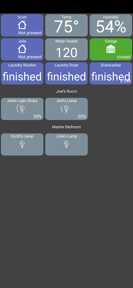
In the presence sensors, is there way to center the present/not present text? Same thing with the garage door actually.
The dishwasher shows 2.0 kwH in the bottom right. I just want that to go away. It's the exact same type of device as the washer and dryer and as far as I can tell is configured the same in the app. It's a power monitoring plug, but I just care about the state and not the energy usage.
The spacing in some of these bothers me (this one is definitely just a preference thing). For example, I feel like the numbers in temp, humidity, and water heater are to close to the label. But the washer, dryer, and dishwasher have the opposite problem and are to close to the bottom. Is there a way to center this text between the tile name and the edge?
Once I get the dashboard setup how I want it, to get it on my wife's phone can I just use the backup settings on my phone and the restore settings on her phone to import the file?
I'm sure I'll have more questions as I continue setting up my dashboard.
currently, the motion detection logic is only implemented on that screensaver screen.. once it detects motion and 'wakes' up the screen it stops monitoring.
It makes sense that it would keep monitoring for motion in this case - during 'off' hours. I'm not sure how easy it'll be to implement but I'll add a TODO item so it's not lost
I was able to get the latest v. 1.0.1615 this morning. I am "guessing" I was not seeing the first update because you made several updates close to each other, and now I can get the latest.
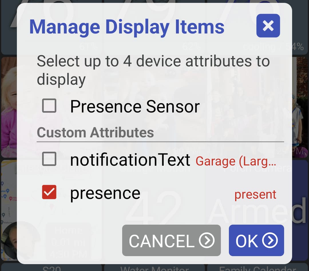
You can change these icons to anything else. There's also a "Custom" device type which does display text instead - you just need to select an attribute to display. I did just try it and noticed that I don't allow the 'presence' attribute (Present / Not present) to be selected (I'm trying to only show non-standard attributes that aren't already handled in the app).. but, I can change that in the next version.
That status text was designed to be small and right-justified (some other examples below). I have some other items that display on that same line (low battery, device updates) so if I center the text it would run into those items.
The dishwasher shows 2.0 kwH in the bottom right. I just want that to go away
I do automatically display some details here like temp, humidity and power usage for devices that support them.. For example I have some contact sensors that also track the temp. I can see if it makes sense to turn this off at either a global or device tile level
The spacing in some of these bothers me (this one is definitely just a preference thing). For example, I feel like the numbers in temp, humidity, and water heater are to close to the label. But the washer, dryer, and dishwasher have the opposite problem and are to close to the bottom. Is there a way to center this text between the tile name and the edge?
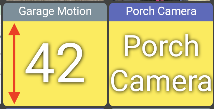
I will say the first thing I notice from your screenshot is the lack of tiles being 'square'. What device is this?
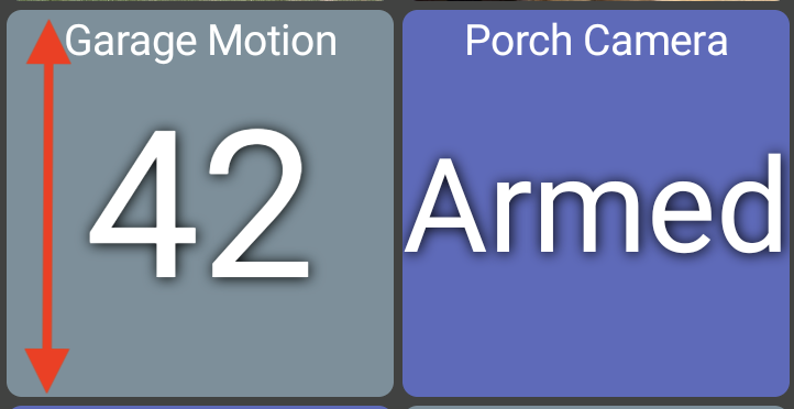
You're right about the text not being vertically centered though. Is this a 'custom' device type? I'll see if I can adjust it to be higher
EDIT: I see the issue.. long-story short, I can adjust the text for custom items only if you're just displaying a single text value. If you're displaying an icon or multiple values it has to remain to not block the tile name.
BEFORE (the yellow background just to illustrate how the text is centered:
Once I get the dashboard setup how I want it, to get it on my wife's phone can I just use the backup settings on my phone and the restore settings on her phone to import the file?
Yes, although it'll be easier to first back up to the hub and then restore from the hub on the other phone.
You will have to first login in order to use 'restore from hub'.. I should try to get it working when not logged in but it'll first require searching for the hub's IP address and then looking for the file manager.
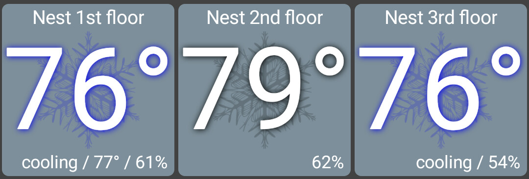
Sorry, I think I missed this question earlier. I've got 3 Nest thermostats and it depends on their current thermostatOperatingState what's displayed on the tile. 2 of mine are actively cooling and "76" is target setpoint. The other one is idle and it shows the current temp. I wanted to pick the most appropriate value to display on the tile.
I do also show the current temp on the status line when the device is actively cooling or heating but only if it's more than a degree different than the setpoint. ie: the "77" is the actual temp on the first thermostat below.
Anyway, there's several thermostats out there and I only have 1 type to test with. If you're able to send me the full JSON of the device as MakerAPI sees it I can try to make it work better
don't show empty tiles or section tiles on manage folder dialog
better center single text item on custom device type
allow any attribute to be displayed in text form (ie: "present")
update several libraries
Several smaller UI changes on this one including:
This should be fixed or at least better.. let me know if anyone sees any issues though. It'll only affect the 'custom' device type and only if it's just displaying a single text value
done
done
done - open the 'manage display items' dialog and select presence attribute to view the text. Use Presence Sensor to view the icons as before
Love the dashboard and how it's becoming better and better. A few days ago I added some RTSP cameras, getting live feed on the dashboard is awesome. But noticed that when the dashboard just starts up and tiles are being connected to cameras (or when dashboard wakes up due to motion detection), the tile displays the full RTSP URL. It's not a big problem to me but that URL does contain the username, password, and IP address to access the camera. It also shows the same URL at the top when clicking the tile to expand it to full screen. Maybe let us name the cameras and display the camera name instead in both of those places. Again, not a big issue for me but to be a little more security aware.
And thanks again for such an awesome dashboard.
Hey @jpage4500 - Another request regarding empty tiles....Well perhaps two requests actually, the second is a step further from a previous change:
1 - Purely for aesthetics, it would be great if we could change (while in edit mode) the colour of an empty tile and apply that colour change to 'this tile', 'all empty tiles', 'all tiles' as you can for other tiles. Where I use empty tiles to fill a gap, centre a non complete row and organise the dash generally, they would look better (IMHO) if I could match the colour of the surrounding tiles, rather than that of the background (others may like to use a completely non matching colour)
2 - I like that you've removed the 'tap' action from empty tiles (no pop up) but I'd like to go further than that if possible by doing the same for 'tap and hold' with empties. In fact it would be great to me if an empty tile didn't even react to touch (currently the colour changes to acknowledge the touch) so it's acts as dead space (apart from when in edit mode)
As always these are just ideas/observations/things I'd like to see. The the app is fantastic and I'm so impressed by how it's been developed and improved in the short time I've been trialling it
Hi, I have installed the app on an 8th generation HD8 Fire tablet. I installed Google Play on the tablet to download and install the Dashboard app which has been set up and is working well. How do I get 4 full-sized rows to display on the screen? 3 rows don't fill the screen and 4 rows overfill the screen. Thank you for your help.
I could be wrong but I think you might need to 'experiment' with what works for a particular device. I have Fire HD 10's (9th & 11th gen) and a Fire HD 8 (10th gen). I've got those set to 11 columns (which gives 7 rows) and they fit well. I did comment somewhere in this thread that one of my devices seemed to add a 'ghost row' where the active rows fit great but I could still scroll the screen to show empty space.
My advice would be to click 'Display Options', select 'Grid Size' and try a few different values for the number of columns to see what works best on the device you're using.
Speaking of sizing @jpage4500 can you fix the back button inside folders. #1 they don't go bigger than 2 x 2 for some reason. #2 it appears they are all copies and can't be sized differently in different folders.