@jtp10181, selecting "All values" fixed the issue - thanks
1 Like
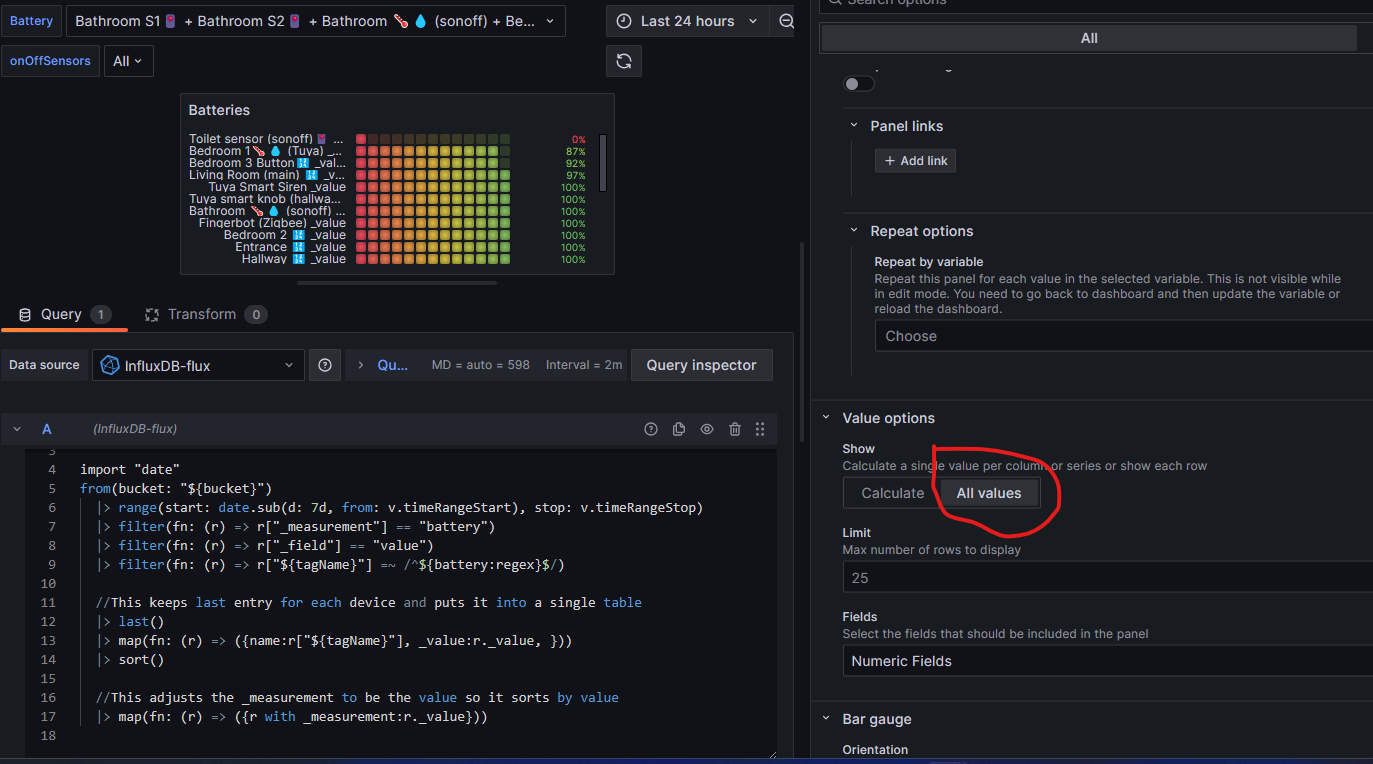
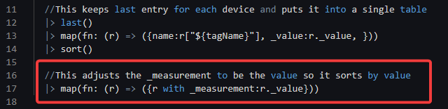
Great, FYI you still have extra code in there, surprised it works right with that in there still. Marked with Red box is not needed anymore. The sort() I added took care of the sorting by %
1 Like
Yep, all good - much appreciated. Looks much nicer than my Dashboard I created a while ago!
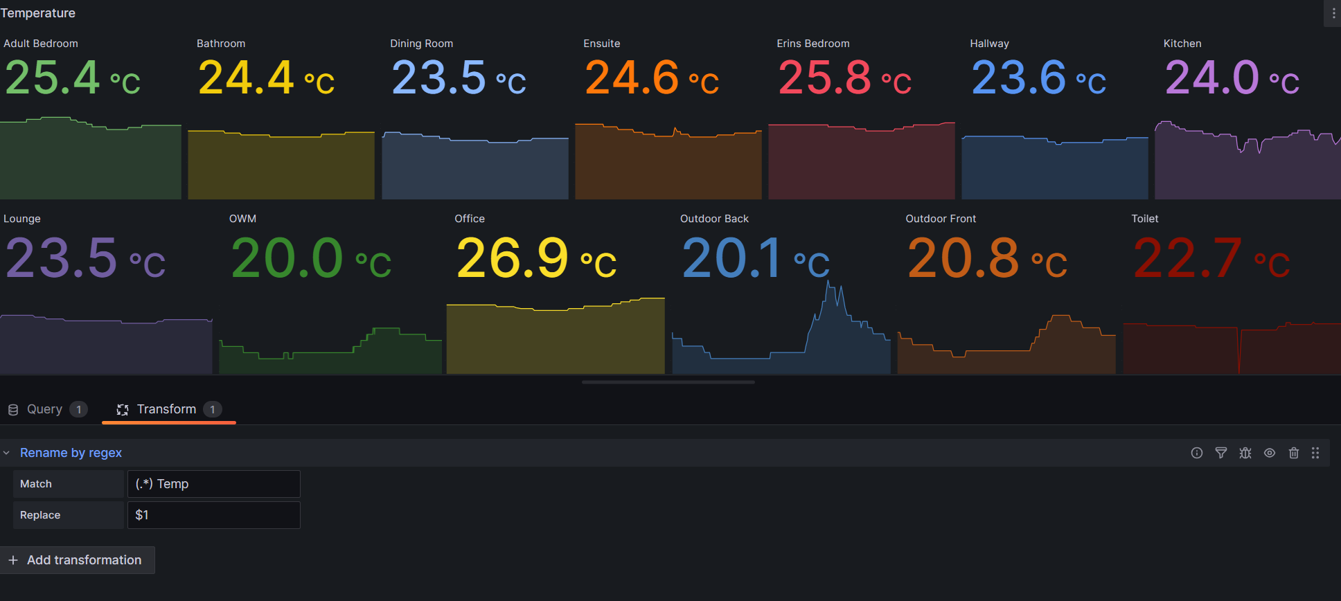
For anyone else interested, to Rename the labels 'rename by regex' worked for me in 'edit panel' > 'Transform' tab
E.G. In My Example I wanted to rename the legends Adult Bedroom Temp Living Room Temp etc. just to Adult Bedroom.
Match: (*.) Temp
Replace: $1
Yes, I was testing your code above in a new template. I just selected "All values" in my original template and it just worked!
I will update my current template or download your new template. Thanks
@jtp10181,
Sorry, one other strange behavior to report...
It's seems that if I select a time range of 2 days or less than the values of two radiator temp seems to be incorrect on the chart, see newly imported chart below to show the issue.
Is this an issue with my data or something else (both devices are online)?
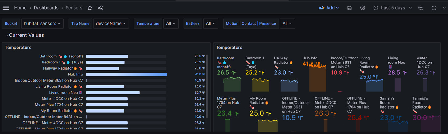
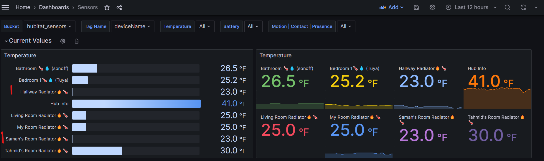
Looks like the hallway is the same but the scale has adjusted so it looks different. The value to the right is the same. The other one is only visible in one screenshot.
If you want a fixed scale you could set a min and max in the chart settings.
Flux really does get on my nerves; it was supposed to make things better in Grafana but from my perspective it makes things worse with all the pipes. Even on their forums it's hard to get a good response on why Flux. 
Entering zero or any number other than auto under min fixes the scaling issue, thanks.
@jtp10181,
Would it be possible to create a dashboard for switches/lights to monitor on/off times?
Thanks
that is an interesting idea. I was trying to figure out how to query this with flux, but was unable to get it to work. the cumulativesum argument will add up the values, but not the duration.
I’d like to be able to track how long various binary switches are on and off throughout the day.
Yea I have one already. I just need to convert it for sharing.
Good idea, I just recently figured this out for the HVAC dashboard, should be able to do something for switches as well.
1 Like
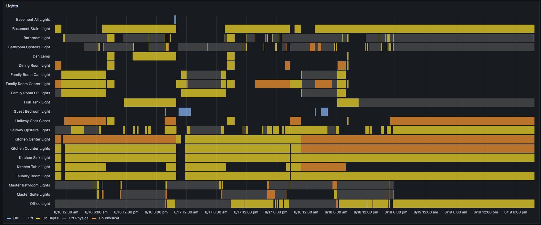
Sneak Peek
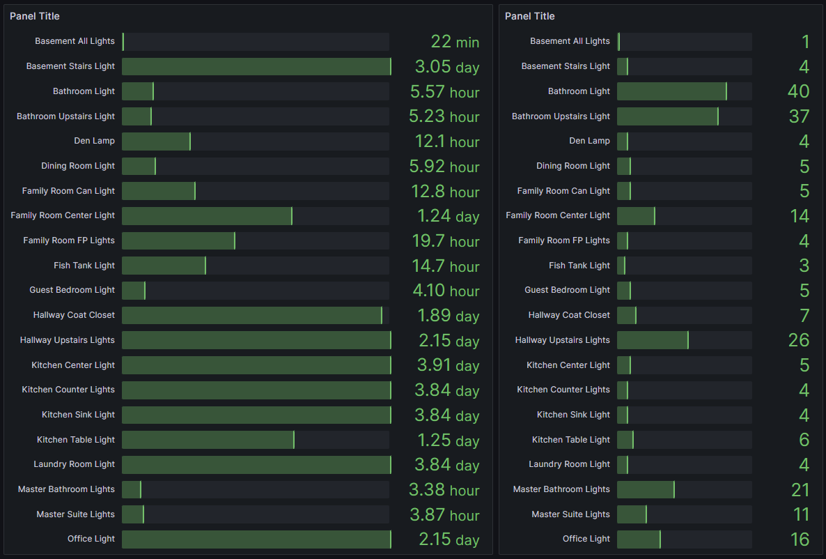
I am working on the duration and also I want to add the number of activations as well. I sort of got it figured out but I really want to get them both into one table. Need to learn a few new tricks with Flux and I think I can make it happen.
2 Likes
that looks great! how did you do that?
Mainly with events.duration() events.duration() function | Flux 0.x Documentation
Then I re-mapped the duration to the _value column.
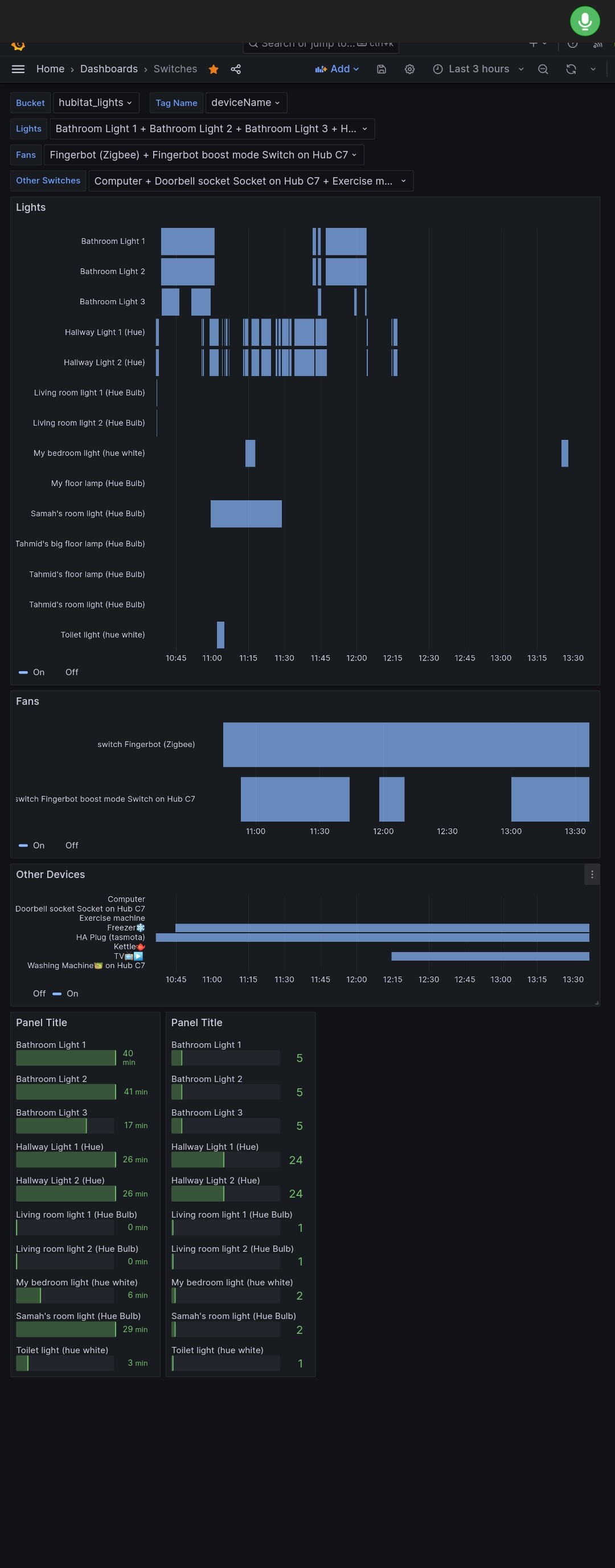
I just posted an Alpha version of the JSON. The fans section will show fans with speed and switch attributes twice, still working on that. The Duration and event totals is a mess still but seems to work.
1 Like
Nice! I’m getting the event durations, which is pretty cool. The visualization is a bit weird though. over a 24hr period everything greater than about an hour shows a full bar. but this is exactly the info I was looking for.
thanks
This is great stuff, just what I needed!
I can get rid of any apps and graphs as all stats can be viewed in the three grafana dasboards now.
1 Like
Yeah I cannot figure out why its doing that. Something to do with the math and units is throwing off its automatic max calculation for the chart. Once I get both the duration and number of events in the same table I will probably just make it a data table without the bars. I think the data tables are sortable so you could then sort high to low if you want.
@jtp10181,
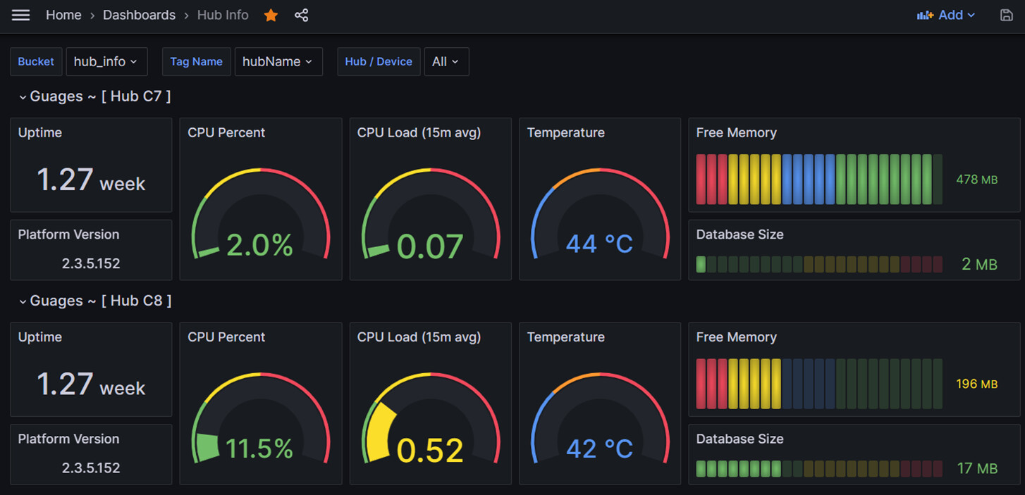
Just wondering if it's possible to display the uptime in the formattedUptime format as per Hub Info as it's easier to read than 1.27 weeks (8d 20h 37m)?
Thanks
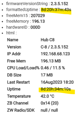
The formatted uptime has seconds on it as well, which is sort of annoying. I actually played around with the units and found something new. There are some formatted duration units:
In the chart options try changing the unit to one of these duration units
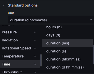
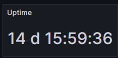
Here is the d hh:mm:ss one
1 Like

