Personally, I try to keep it short because of the way it expands the entire row of settings taller when you have one with a really long description. Maybe I am over thinking it.
Hmmm.. good ideas. A bit more complicated than I want to get into at the moment but definitely something to consider. I like the idea of being able to collapse it or maybe even have a little (?) with a mouse over pop up for the full details. There is a tutorial for adding a mouse over on here somewhere, also HE has been using it in the UI so might be able to just tap into whatever they use.
I would be fine with short descriptions so long as it’s easy to get to the docs (link on the driver page) and the docs will reliably be available for an indefinite amount of time.
My biggest fear with personal projects is abandonment and loss of knowledge (remote docs disappear because hosting goes away or other reasons). Building the documentation into the actual product minimizes the impact of any potential abandonment.
Something Hubitat would consider is a docs tab (up with events) where a developer can ship the documentation with (in) the app or driver but not crowd the main interface. This is not the same as a link (like what is in many apps) to externally hosted docs.
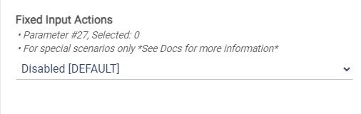
The link I have on the top of the driver goes to the community post, which then has links for the Zooz settings docs for each device. So there is a roundabout way to get there. Some drivers support multiple devices so putting a specific link to the docs per model would be somewhat annoying.
Short with a link or tooltip pop-up for me. The tooltip I did for my recent app development (not released yet) is a little too complicated for my liking, so I would like to make it simpler before suggesting too many people use it.