I have been developing a new App and wanted to add some tooltips explaining some of the settings with a link to more information, and after a long period of.... learning... I finally got it working the way I want it to 
There's a bit going on here in the code that is not immediately obvious, so it may take me a little while before I explain it all, and I may end up rationalising it even more than I have and produce a bit of library code and/or a CSS file that people can download.
String getZindexToggle(String setting, int low = 10, int high = 50) {
return "<style> div:has(label[for^='settings[${setting}]']) { z-index: ${low}; } div:has(label):has(div):has(span):hover { z-index: ${high}; } </style>";
}
String getTooltipHTML(String heading, String tooltipText, String hrefURL, String hrefLabel='View Documentation'){
return "<span class='help-tip'> <p> <span class='help-tip-header'>${heading}</span> <br/>${tooltipText}<br/> <a href='${hrefURL}' target='_blank'>${hrefLabel}</a> </p> </span>";
}
def pageDeviceConfiguration(params) {
String tooltipStyle = "<style> /* The icon */ .help-tip{ /* HE styling overrides */ box-sizing: content-box; white-space: collapse; display: inline-block; margin: auto; vertical-align: text-top; text-align: center; border: 2px solid white; border-radius: 50%; width: 16px; height: 16px; font-size: 12px; cursor: default; color: white; background-color: #2f4a9c; } /* Add the icon text, e.g. question mark */ .help-tip:before{ white-space: collapse; content:'?'; font-family: sans-serif; font-weight: normal; color: white; z-index: 10; } /* When hovering over the icon, display the tooltip */ .help-tip:hover p{ display:block; transform-origin: 100% 0%; -webkit-animation: fadeIn 0.5s ease; animation: fadeIn 0.5s ease; } /* The tooltip */ .help-tip p { /* HE styling overrides */ box-sizing: content-box; /* initially hidden */ display: none; position: relative; float: right; width: 178px; height: auto; left: 50%; transform: translate(204px, -90px); border-radius: 3px; box-shadow: 0 0px 20px 0 rgba(0,0,0,0.1); background-color: #FFFFFF; padding: 12px 16px; z-index: 999; color: #37393D; text-align: center; line-height: 18px; font-family: sans-serif; font-size: 12px; text-rendering: optimizeLegibility; -webkit-font-smoothing: antialiased; } .help-tip p a { color: #067df7; text-decoration: none; z-index: 100; } .help-tip p a:hover { text-decoration: underline; } .help-tip-header { font-weight: bold; color: #6482de; } /* CSS animation */ @-webkit-keyframes fadeIn { 0% { opacity:0; } 100% { opacity:100%; } } @keyframes fadeIn { 0% { opacity:0; } 100% { opacity:100%; } } </style>";
dynamicPage (name: "pageDeviceConfiguration", title: "Mobile Device Configuration", nextPage: "pageApplyConfiguration", install: false, uninstall: false) {
section("") {
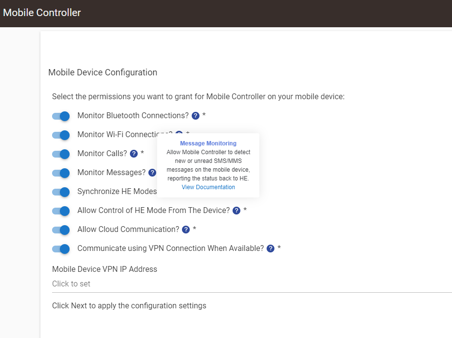
paragraph "Select the permissions you want to grant for Mobile Controller on your mobile device: ${tooltipStyle}"
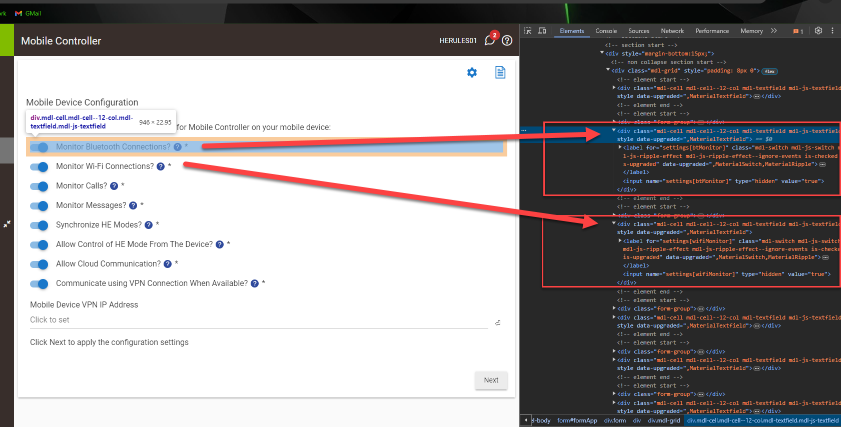
input ("btMonitor", "bool", title: "Monitor Bluetooth Connections? ${getZindexToggle('btMonitor')} ${getTooltipHTML('Bluetooth Monitoring', 'Allow Mobile Controller to detect devices paired to the mobile device. Child devices will be created in HE to capture the connection status for each bluetooth device.', 'https://github.com/sburke781/MobileController/blob/master/Settings.md#bluetooth-monitoring')}", required: true, submitOnChange: true, defaultValue: false)
input ("wifiMonitor", "bool", title: "Monitor Wi-Fi Connections? ${getZindexToggle('wifiMonitor')} ${getTooltipHTML('Wi-Fi Monitoring','Allow Mobile Controller to detect connections to a specified list of Wi-Fi networks, allowing easy switching between local and cloud communications and contributing to presence detection.', 'https://github.com/sburke781/MobileController/blob/master/Settings.md#wi-fi-monitoring')}", required: true, submitOnChange: true, defaultValue: false)
input ("callMonitor", "bool", title: "Monitor Calls? ${getZindexToggle('callMonitor')} ${getTooltipHTML('Call Monitoring', 'Allow Mobile Controller to detect incoming, ongoing and missed calls, reporting the call status to HE.', 'https://github.com/sburke781/MobileController/blob/master/Settings.md#call-monitoring')}", required: true, submitOnChange: true, defaultValue: false)
input ("msgMonitor", "bool", title: "Monitor Messages? ${getZindexToggle('msgMonitor')} ${getTooltipHTML('Message Monitoring', 'Allow Mobile Controller to detect new or unread SMS/MMS messages on the mobile device, reporting the status back to HE.', 'https://github.com/sburke781/MobileController/blob/master/Settings.md#message-monitoring')}", required: true, submitOnChange: true, defaultValue: false)
input ("syncModes", "bool", title: "Synchronize HE Modes? ${getZindexToggle('syncModes')} ${getTooltipHTML('Synchronizing HE Modes', 'Changes to the HE mode will be communicated to and stored on the mobile device, allowing use of the mode in custom automations on the mobile device.', 'https://github.com/sburke781/MobileController/blob/master/Settings.md#synchronizing-he-modes')}", required: true, submitOnChange: true, defaultValue: false)
input ("controlModes", "bool", title: "Allow Control of HE Mode From The Device? ${getZindexToggle('controlModes')} ${getTooltipHTML('Control HE Modes', 'Allows changes to the HE mode to be initiated on the mobile device through elements such as a home-screen widget.', 'https://github.com/sburke781/MobileController/blob/master/Settings.md#control-he-modes')}", required: true, submitOnChange: true, defaultValue: false)
input ("cloudComms", "bool", title: "Allow Cloud Communication? ${getZindexToggle('cloudComms')} ${getTooltipHTML('Cloud Communication', 'Allows the mobile controller to send status updates and other commands from the mobile device when not connected to the HE hub over a local Wi-Fi or VPN connection.', 'https://github.com/sburke781/MobileController/blob/master/Settings.md#cloud-communication')}", required: true, submitOnChange: true, defaultValue: false)
input ("useVPN", "bool", title: "Communicate using VPN Connection When Available? ${getZindexToggle('useVPN')} ${getTooltipHTML('VPN Connection', 'If a VPN connection is available (connected) on the mobile device, this will be used when communicating from HE to the mobile device.', 'https://github.com/sburke781/MobileController/blob/master/Settings.md#vpn-connection')}", required: true, submitOnChange: true, defaultValue: false)
input ("vpnIP", "string", title: "Mobile Device VPN IP Address", required: false, submitOnChange: true, defaultValue: '')
paragraph "Click Next to apply the configuration settings"
}
}
}
If you want the main tooltip CSS in a more readable format:
/* The icon */
.help-tip{
    /* HE styling overrides */
	box-sizing: content-box;
	white-space: collapse;

	display: inline-block;
	margin: auto;
	vertical-align: text-top;
	text-align: center;
	border: 2px solid white;
	border-radius: 50%;
	width: 16px;
	height: 16px;
	font-size: 12px;

	cursor: default;
	color: white;
	background-color: #2f4a9c;
}

/* Add the icon text, e.g. question mark */
.help-tip:before{
    white-space: collapse;
	content:'?';
    font-family: sans-serif;
    font-weight: normal;
    color: white;
	z-index: 10;
}

/* When hovering over the icon, display the tooltip */
.help-tip:hover p{
    display:block;
    transform-origin: 100% 0%;
    -webkit-animation: fadeIn 0.5s ease;
    animation: fadeIn 0.5s ease;
}

/* The tooltip */
.help-tip p {
    /* HE styling overrides */
	box-sizing: content-box;

	/* initially hidden */
	display: none;

	position: relative;
	float: right;
	width: 178px;
	height: auto;
	left: 50%;
	transform: translate(204px, -90px);
	border-radius: 3px;
	box-shadow: 0 0px 20px 0 rgba(0,0,0,0.1);
	background-color: #FFFFFF;
	padding: 12px 16px;
	z-index: 999;

	color: #37393D;

	text-align: center;
	line-height: 18px;
	font-family: sans-serif;
	font-size: 12px;
	text-rendering: optimizeLegibility;
	-webkit-font-smoothing: antialiased;

}

.help-tip p a {
	color: #067df7;
	text-decoration: none;
	z-index: 100;
}

.help-tip p a:hover {
	text-decoration: underline;
}

.help-tip-header {
    font-weight: bold;
	color: #6482de;
}

/* CSS animation */
@-webkit-keyframes fadeIn {
    0% { opacity:0; }
    100% { opacity:100%; }
}

@keyframes fadeIn {
    0% { opacity:0; }
    100% { opacity:100%; } }
 . Feel free to ask questions.... I would also add that with each of the solutions that I have "copied", there can sometimes be multiple layers to what makes them work, more than I am likely to explain because my code has evolved.