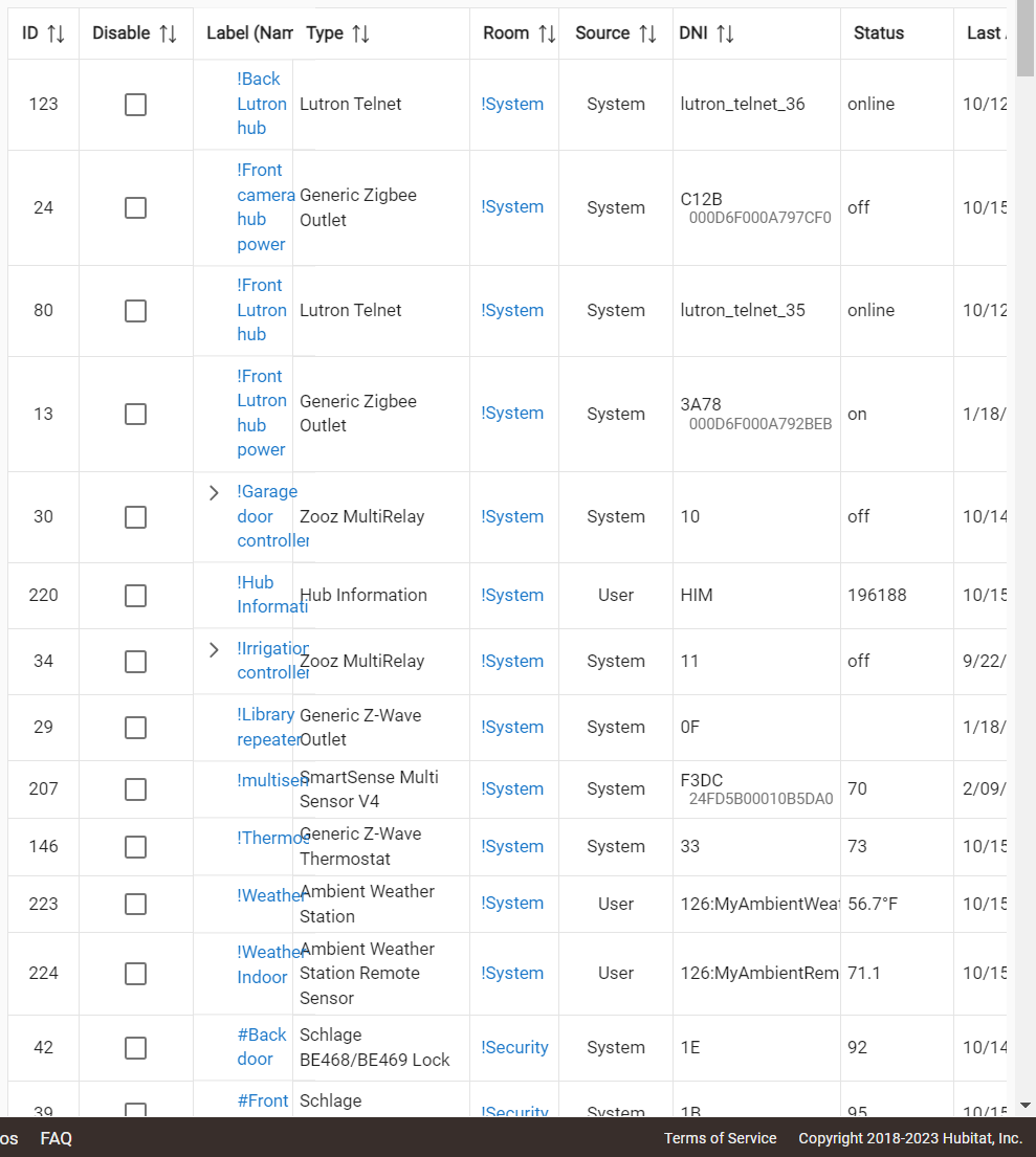
In the latest version with the (in some ways) much improved Device list, I was playing with the new controls - the ability to turn columns on and off. I found that the handling of the Name column is messed up. It can't be resized, its autosized size is often totally in appropraite, and it can overlap the column next to it. The columns to the right are off-screen (with no horizontal scroll bar) and attempts to fix it make it worse. The problem seemed to "reset" when I completely closed the Hubitat web page and then went back in. But I can get it screwed up easily, any time.
Also, are there plans to rework this better? Why can't we resize the name column? Why can't we separate name and label and sort by either? Why do the Name and DNI fields have to include line breaks, totally destroying the ability to simply highlight the table and export the data to Excel?
I realize what you have is usable, so it's hard to give it much priority, and there are a lot of aspects of your product that are really excellent, so I know it's a matter of focus of effort rather than ability. But frankly, your table editors (and some other aspects of the UI) are really, really bad. I also realize that grids are a lot easier in Windows than browsers, but when I had the job of designing and approving UI implementations, our grid handling was really good, and I would never have released your corrent implementation into the field, let alone leave it this way for at least half a decade.
Please, please put some serious effort into this. I'm confident that the awkwardness of your UI is a major reason why your product is mostly unapproachable to non-hobbyists.
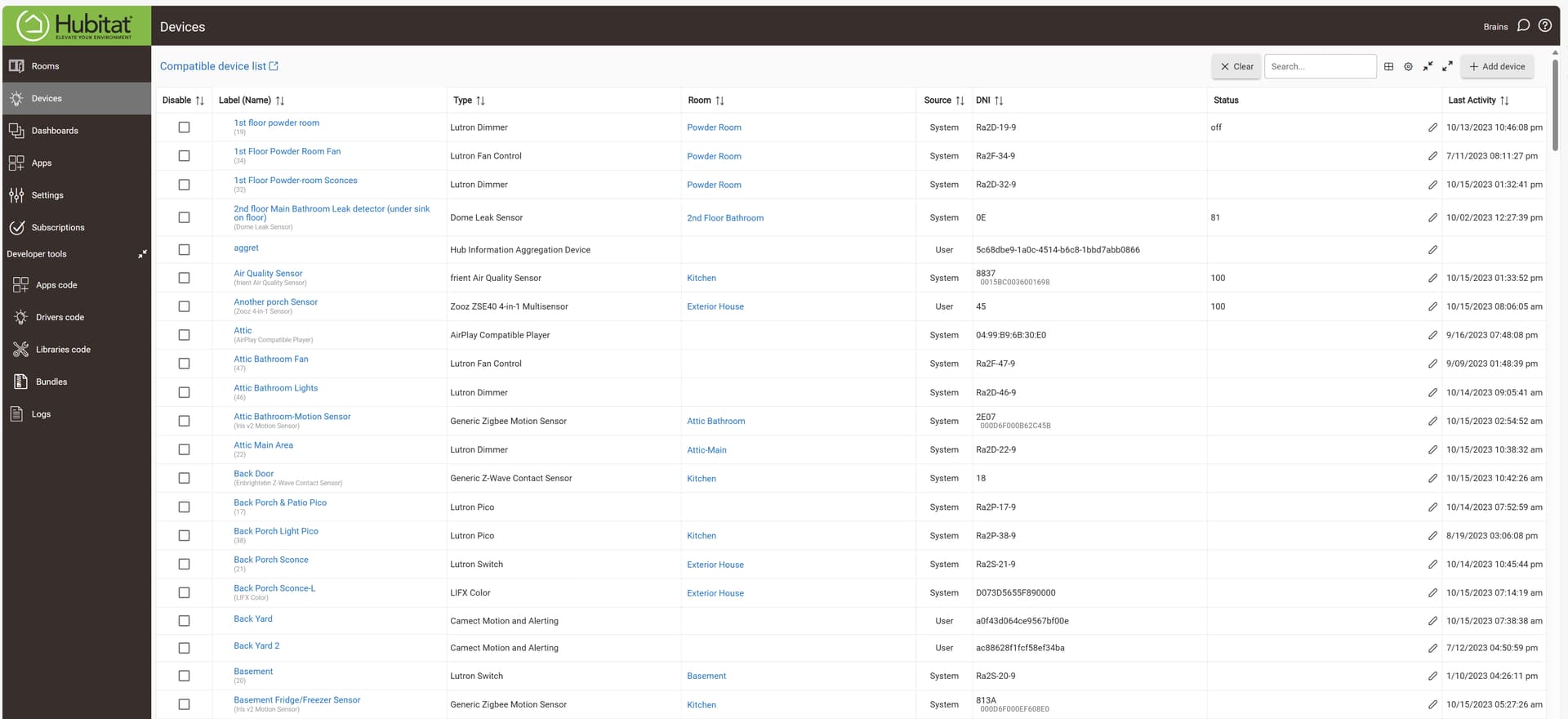
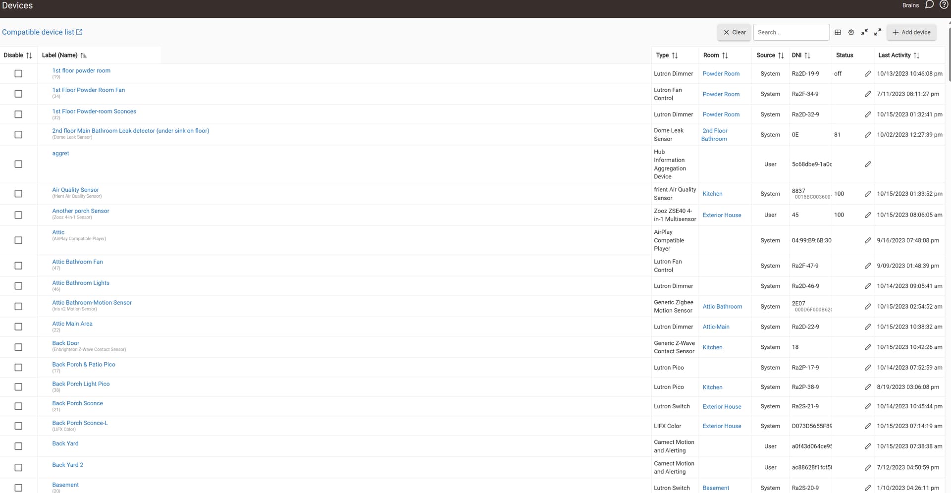
Yes, I reported something similar last week here, related to the tabular view in Rooms. In the case of the Devices table, I find that (a) the "Label (Name)" column header gets truncated, (b) that column only resizes once, then locks, (c) positioning the cursor at the transition between "Label" and "Type" shows a hand symbol, but the vertical separator remains static, and, (d) resizing other columns seems iffy.
Most of the problems I listed (inability to sort by either name or label, loss of sort order when you go into a device editor and back out, use of line breaks within fields making it impossible to cut and paste, lack of a dark mode, etc) have been in the product since I started using it in 2018. The problems with overlapping fields, the thin, unresizable name column with a big gap to the right and plenty of room, and the fields cut off to the right without a scroll bar, are new.
Browser is Chrome, version 118.0.5993.70 (Official Build) (64-bit)
OS is Windows 10 Pro, 22H2, OS build 19045.3570
Meanwhile, mine has become completely "locked" in the sense that I can no longer resize any of the columns. Refreshing browser page hasn't remedied, nor does switching between Table and Grid views. Hmm... I'm steadily disabling any Chrome extensions in hopes of identifying a potential cuprit.
My Name column cannot be resized... ever. All the other columns can be, and the action seems like it will work for Names but upon release of the mouse, nothing actually happens.
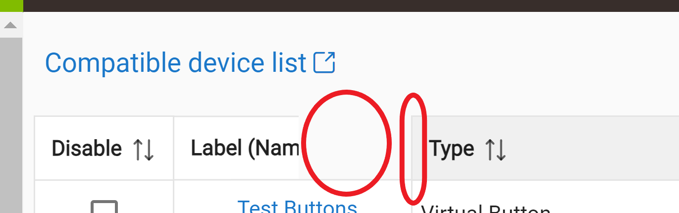
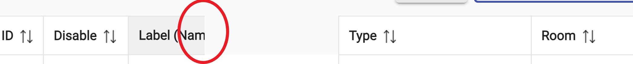
Done, and after returning to Devices, found that the LABEL (NAME) column remains borked, but at least two other columns - TYPE and ROOM - are now freely resizable. I notice that doing so "steals" space from column to the immediate left. Hence, shrinking TYPE and ROOM yield a super-long LABEL column, which I cannot unshrink. What's more, the LABEL column header still has this odd "gray patch" over its right half, obscuring the word "NAME". What's more, the "resize" symbol pops up along the left edge (red circle) of that dead gray patch, rather than between the actual columns:
Chrome, latest (updated this AM) on Windows 11 (also latest, Win Update last night). Latest version of HE (.144 IIRC).
Also can't resize Label, though my other columns are resizable. I get the handles on Label column and can drag like it's going to work, but when I let go, nothing happens.
Showing drag-line that appears when I grab the resize handles on Label column. Seems to confirm that the Label column will be resized, but when I let go nothing changes. Doesn't matter if I try to change the size just a little or a lot. Doesn't work for Label column.
maybe the problem is the table is not responsive? Besides using fixed font sizes and not REM? I don't see generic features like hamburgers for @media sizes etc. I just chalk it up to 'meets needs, not exceeds' design.
That depends on your definition of "need". I have over 160 devices. I don't know if that's a lot or just typical, but the device editor gets used a lot, and it's my primary source of frustration with Hubitat. I can see that the latest version has some improvements, but it's also badly broken. If I were a new user with limited computer experience, and the first thing I had to do was use this editor in its current state, I'd send it back, assuming that if the most important, forward facing aspect of the product is bug ridden, then the whole thing probably is.
As a user with almost 5 years experience with the product, I know that isn't true- but "meets needs (if you can figure out how to get it to work)" is way too low a standard for this product.
I hear what your saying - we all have our own priorities we'd like HE to work on - a long time ago I got annoyed at the 'hit enter then search for the cursor' problem. then I got upset over no auto page refresh. Now I just deal with it!