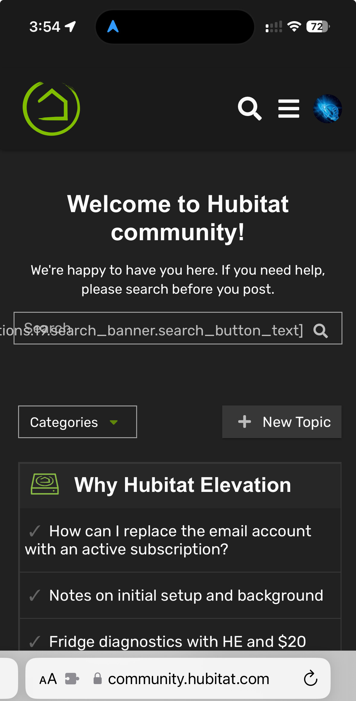
On both mobile and desktop I’m seeing a giant Hubitat logo and some odd text in the search box.
1 Like
Mine is fine.
Maybe a browser issue?
Duckckduckgo browser on Android
I just noticed the same thing, using Chrome on Win 11
1 Like
I’m seeing it on Safari and Firefox.
I don't see it in Edge, but I wasn't logged in to the Community when I opened it in Edge
1 Like
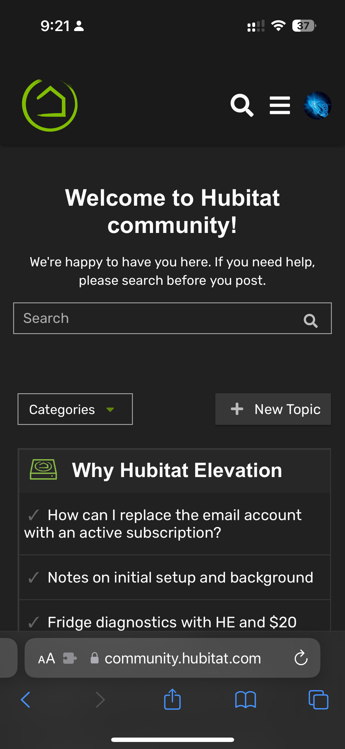
The icon is large but the search field and rest of the page looks good.
[en.theme_translations.19.search_banner.search_button_text]
Showing in the search field, Chrome on Android.
Still seems to work fine though.
3 Likes
It broke yesterday after applying a minor update to the search box plugin. It's odd that is affecting only the dark theme but not the light. I am using the light theme, so I didn't notice. Will look into it. Thanks.
5 Likes
The header seems bigger because it's missing floating text in the middle, but with text is proportional:

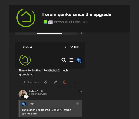
Thanks for looking into @bobbyD much appreciated.
1 Like
Should be fixed
2 Likes

That's how it is now... The image is larger, but the header has the same height.
The search text has disappeared for me... Thanks @bobbyD
2 Likes
Fine, you win! How does it look now? ![]()
4 Likes
It's a slippery slope once you start bowing to user-demands.... ![]()
3 Likes

You're lucky this time...
3 Likes
In my defence, I was a business analyst* specialising in redeveloping apps on new modern platforms. So I do have a rather large UX stick up my a$$. ![]()
*10 ish years ago
1 Like

