Dashboard Enhancement Suggestions

I finally spent a bit of quality time with the Hubitat® Dashboard tool and I have some suggestions - these may be appropriate for the Hubitat Team or perhaps for some enterprising third-party developers (and I haven't looked at any of those third-party dashboard tools yet).

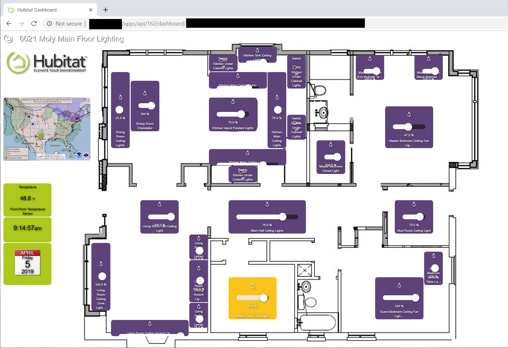
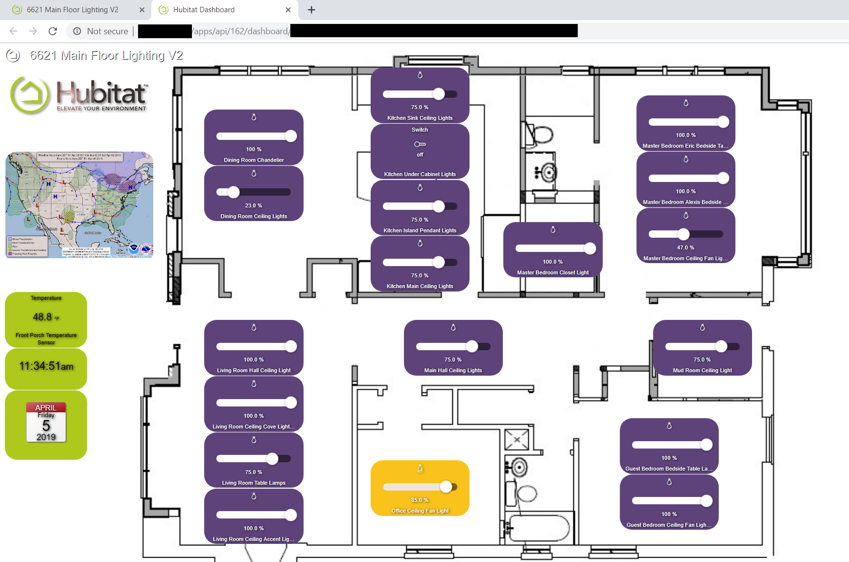
My project yesterday was to build a lighting dashboard overlaid on a floorplan of the house. It's something I have wanted to do for a while. This is just the first round of experimentation and I have a bunch of ideas for round two. In the process, I've made some observations that I would like to pass along and share before I lose them.

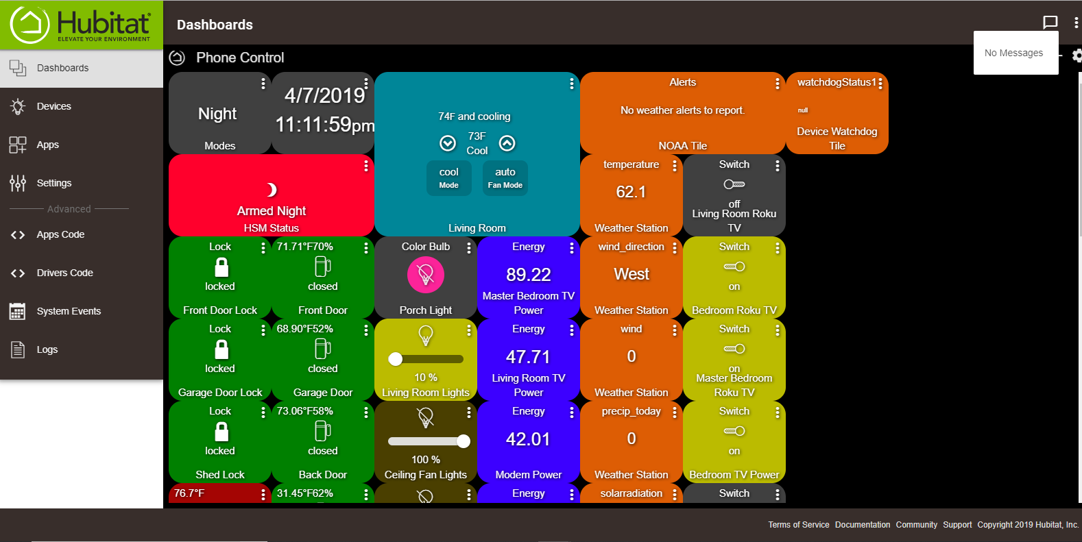
Navigation in the Hubitat® Dashboard tool. While the rows and columns approach works with the small matrix that you would probably use for a small form factor, it doesn't work very well for a large canvas. The concept of positioning by rows and columns becomes really slow when you have a lot of rows and columns. Drag and Drop, optionally with a Snap-to-Grid feature for easy alignment would be very helpful.

Sizing tiles by rows and columns doesn't provide the granularity in size that you need. Being able to stretch by vertical or horizontal dimension (or both) a la Windows, would be very useful.

The slider, on the tiles that use one, should either be intelligent enough to align with the longer dimension of the tile, or be user configurable in orientation.

The slider doesn't scale down well and it doesn't play well with the other information on the face of the tile. Even on a tile that appears to be large enough, often the slider is partly cut off.

I think a useful alternative approach for some of the types of tiles, such as the dimmer, would be something similar to the Lutron Caséta app - when you click or touch the icon, it pops up a new box with the on/off, up/down, and slider functions. Once adjusted, this box can be dismissed. This also makes the face of the tile much simpler since it doesn't need the slider.

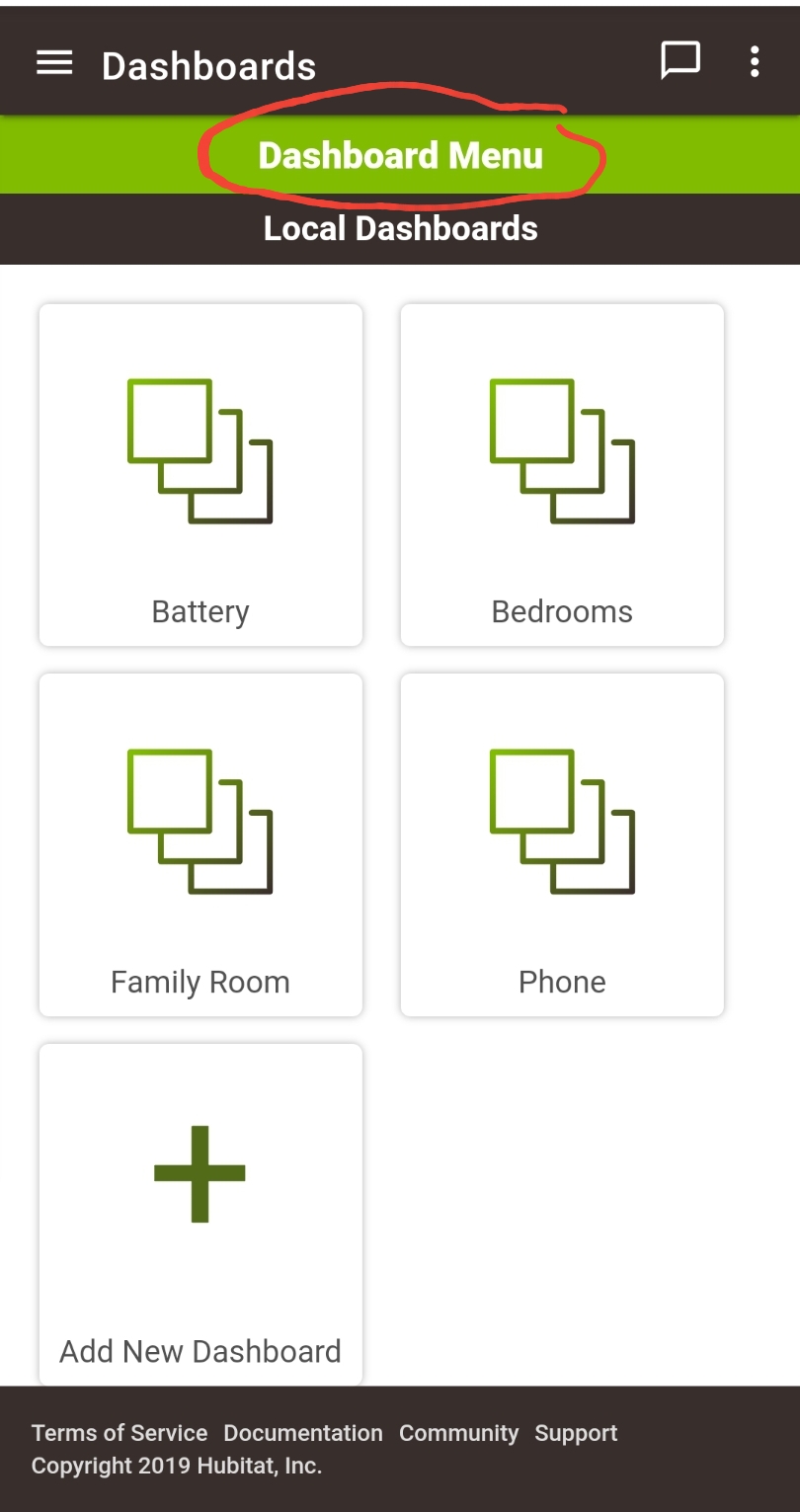
When working with a large matrix, the navigation screen to position and size the tiles is right in front of what you are trying to work on. I found I was constantly struggling to move it to one side or the other so I could see the effects of the changes I was making. I found the map of squares with the green and gray squares to be useless when navigating a large matrix. It worked far better to just increment the columns and rows and watch the tile as I moved it into the position.

I wasn't sure (and I'm still not sure) how to best size the background image. The Hubitat® Dashboard tools seems to do some resizing but I never really got a handle on exactly what it's doing. Just need some more guidance and documentation on that.

Another thread mentions the drop shadow effect on the lettering. It's a neat look but it really impacts readability of the smaller font sizes. That should be a configurable option.

I hope this doesn't sound like a lot of complaining - I was actually quite impressed with how close I was able to get to my desired outcome . . . and I'm not done playing with it.

I like the ability to customize the colors of the tiles based on the device template. I like being able to bring in the background graphic as well as some random graphics (for fun) like the Animated Hubitat Logo and the National Weather Service surface forecast map.

5 Likes

Great job!! I am inspired to look further into something similar. I especially like the suggestion for the popup. To me, the sliders have always felt awkward in the interface.

So here is a modification. Here I use only 6W x 4H tiles for all the dimmers and switches. With the number of cells in my matrix, that is about the smallest size that provides enough tile real estate for the slider and for readable text. I didn't attempt to put the device in a location in the room, there isn't enough space for that but each control is located in the room where the controlled device lives. It's probably a little less intuitive but also less busy and more workable in terms of the dimmer sliders.

By the way, thanks to the Hubitat Team for exposing the JSON so I was able to make a second version of this dashboard to play with in 10 seconds with just a cut and paste!

2 Likes

Based on the second experiment (immediately above), I have another enhancement suggestion -

Logically, I would like to separate the tile used for indicating the status of a device from the tile used for control of the device. In other words for a dimmer circuit, I would want a tile representing the light fixture or lamp and a separate tile with the dimmer control (slider). This would be a "poor mans" way of getting functionality similar to the Lutron app. I may be able to create it myself but it would be nice to have it "out-of-the-box".

Then I could imagine this floor plan with the control tiles (dimmers) arrayed around the outside edges and the indicator tiles close to real world position in the rooms.

Maybe try the color bulb template, since it has the popup for on/off and slider for level if no color or CT attributes available.

The defaults are to use the CSS property "cover" for background-size and position of "center center" which means the center vertically and horizontally will be used to place the background image and the cover command means it will be sized to fit both horizontally and vertically without stretching.

The drop shadow is there to make sure white or black text doesn't disappear if the user selects the same background color. However, for advanced users, a css editor will probably make its debut in the next release that will allow further customization.

That's what its there for. And of course, sections of it can be shared like the customColors section for your templates.

3 Likes

That would be amazing.

Keep in mind, its not going to allow you to edit the css built in, but add / override css. Essentially a blank insert css text box.

3 Likes

Thank you!

Wow, the popup for the color bulbs is cool but it's also HUGE! It also had me stuck for about a minute as I couldn't figure out how to get rid of the popup. Something like that, but considerably more compact, would be really useful (IMO).

Each time I have experimented with a dashboard I come back to this one -

Definitely would be nice to be able to select/define the orientation of the dimmer tile (vertical or horizontal) . . .

Vertical sliders in HTML are really difficult to do right and create cross browser issues. Is it technically possible but only really works if it's the only element in the tile, which means no icons, no tap actions, etc.

I didn't realize that was so difficult. A pop up, similar (but a bit more compact) to the one you showed me with the color bulbs, would be just as good - maybe better. I assumed (always problematic) the pop up was more work.

Regardless of doing a popup or not, vertical sliders are a challenge. Especially on mobile devices, hard to tell the difference between a finger scrolling the window and on the slider adjusting the slider.

But since I've already solved that for horizontal sliders, its possible to do it for vertical sliders. Just takes a good chunk of cross browser testing.

I'm very sympathetic on that count. Been there. It's a huge pain.

Enhancement suggestion I would like is the ability to go full screen with a dashboard or at least reducing the header/footer/borders significantly.

Not sure what you mean? There is no header / footer or borders. Do you mean from the /dashboards link in the hub UI? You can escape that iframe by clicking the "Dashboard Menu" at the top of the dashboard menu list.

What I'm referring to is if you look at this screenshot, roughly about 20% of the entire screen has the header with nothing but the Dashboard name and a repeat description of what section of the left sidebar you've selected stating "Dashboards", then you have the left side bar taking up the majority of the 20% which I could see that sidebar being adapted to say a tile similar to the "color bulb" or "Mode Manager" tile that once you select that tile then a pop up happens like those to where you select the side bar Devices, Apps, Settings, etc. from that similar to selecting which mode you want.

Just a good bit of unusable space without currently scrolling across and down of course.

As I said before. You can open the dashboard menu in "full screen" by clicking on Dashboard Menu at the top of the list of dashboards.

Just in case you aren't sure what @Patrick is referring to (I scratched my head for a bit until the obvious presented itself).

1 Like

Thanks for that , you were correct......I had no idea what he was referring to and clicking that is exactly the enhancement I had in mind,.....and never knew it was there until now.