Hi,
The Easy Dashboard feels overly simplistic and, in my opinion, is still in a beta state. For example, TRV tiles display errors because they don't report the fan state—a feature they don't even possess. The tiles themselves resemble those from Windows 8: unattractive and not very user-friendly.
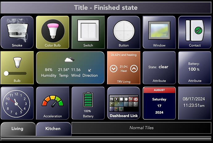
I've been experimenting a bit with CSS and managed to create some more aesthetically pleasing tiles using simple tweaks. It didn't require extensive resources or advanced skills, even for someone like me who's not an expert in CSS. This makes me wonder why Hubitat doesn't offer straightforward styling options in the user interface. Features like different icons for various states, custom icons instead of the limited built-in selection, borders, 3D effects, gradients, font styles, display names, and more would greatly enhance usability. Implementing these features directly into the internal HTML code builder would be much easier than having to modify them later using CSS.
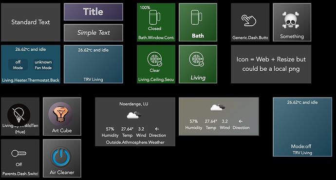
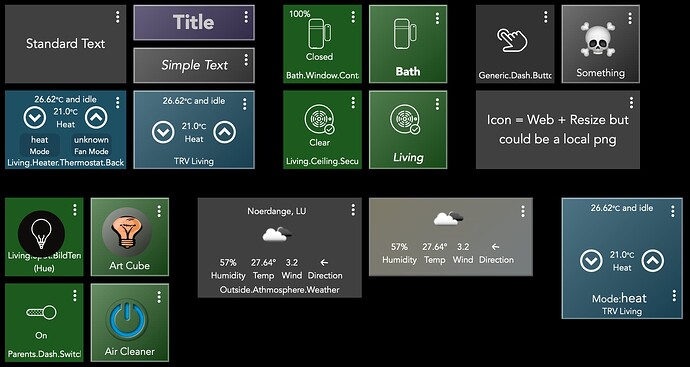
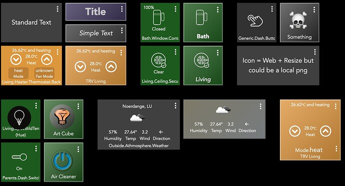
Here are some images of a test dashboard I've been working on. The original and modified tiles are displayed in various states:
Buttons, switches, and TRV OFF :
Buttons, switches, and TRV ON :
TRV heating :
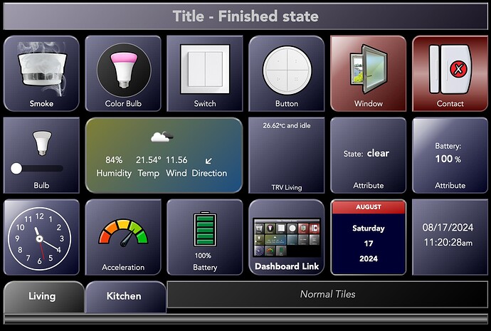
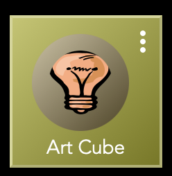
An example of the bulb tile for those who like it brighter :
And a more colourful weather tile :
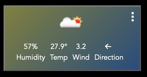
This is an experiment in progress, may actually nor win a design award, but as told uses basic CSS to get an improved visual. Gradients can be adopted, as borders can. States can be shown or not. Titles can be replaced and styled. For TRV tile the fan option is removed, and probably much more and more to come.
So Hubitat, if it's so easy for a noob, what holds you back to implement more features ? Easy dashboard may be a good initiative, like simple rules is for beginners, but not an alternative for advanced dashboards.
