Hello
Why Hubitat don't use graphic interface, like scratch?
is useful if you need to guide the user like hubitat do, but is faster and easyer..
What do you think?
If you want something like that to make rules I suggest you look into Node-Red. You will however need a local machine to host it on, it does not run on the hub itself.
As for why Rule Machine, as I understand it one of the founders of Hubitat had created the original Rule Machine app as a custom user app on Smart Things but it was having issues due to the cloud system. So that was one of the catalysts to make a hub with fully local processing.
5 Likes
I think the owners have acknowledged the UI isn't the best. I've been running node red for a while which is cool, although I do spend too much time making my flow look pretty instead of practical
6 Likes
Yep. 100% agreement on that.
1 Like
I use visio for a living so its my thing. The flow method is a great way to automate though. Although it's a little complex on node red getting all the nodes
1 Like
Hubitat never said the UI is not the best, we said that may not be the friendliest for some users. However, the current UI is the best at rendering the Groovy backend. Making it "friendlier" would mean adding a new front-end layer much like what WebCore, Node-RED and other interfaces are offering.
7 Likes
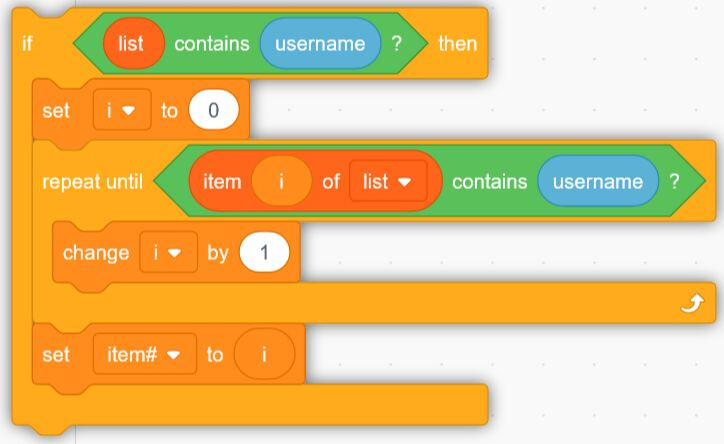
For my needs, I don't need current apps, like Rule Machine, to have an additional layer to make it "pretty", especially if that additional layer is going to consume CPU cycles. Personally, I find the Scratch interface (shown in the first post) confusing to work with.
With that said, I think it would be worthwhile revisiting the appearance of Dashboards, which should translate to a new UI for the mobile apps.
7 Likes
I'm a crusty old dinosaur who prefers command-line in linux, and wants a simple editor to enter code. I'm probably in the minority...
6 Likes
Front panel toggle switches. That’s what is needed.
2 Likes
And more blinking lights.
2 Likes
The point is not to make it pretty but easier.
For Example insert multiple condition is a very long operation.
Re-Edit is also a bit tricky..
The block editor was just a suggestion, maybe there are UI's more compliant whit HE
This idea born from my brain after 30 minute of coding for 10 line of code. ![]()
Some things can take a bit of time, but I'm unsure what you mean exactly. You can create conditions and then build the rule if this is the way you want to work. On the surface, it can seem faster with a graphical flow, but you still need to define the devices for the conditions and their parameters.
1 Like
I think this should be the real take away from this conversation. The current implementation of the dashboard is lacking. I shouldn't need to be a web developer and know CSS to get a decent dashboard.
What I would suggest is this. The update that was just made to select a status to display on the device page should be enhanced to allow selection of multiple attributes. Maybe a limit of 5 or something like that. Then the dashboards should be revamped to be dynamic similar to most other options I have used. They should probably naturally create tabs of some kind from each room and then allow the status to be displayed in a tile based on the status setup from the device page.
I think we make dashboards way too complicated because we want to make it so flexible. For the average user that is too much. I know i mostly stopped using the built in dashboards once i realized i needed to learn CSS and have separate dashboards for any device with different screen size/resolution/ratios.
A user starting out user should be able to add the devices, assign them to rooms, then select the status's they want to to see. Then all the devices appear in beautiful tiles on a dynamic dashboard that shifts the tiles based on whatever screen they are using. I honestly think that would fix most of what people complain about when they talk about the UI.
8 Likes
Thank you! You have expressed, more eloquently than I can, exactly what I’d like to see in a dashboard implementation.
4 Likes
OK nice for Dashboard
But abot blocks code for Rules?
Opinions vary. I find the Scratch interface you showed to be cumbersome.
4 Likes
More than what we have to do now?
I use MIT App Inventor is a fast pick and place
Yes. I can definitely see the value of easier to configure dashboards that are more visually appealing.
But I prefer the textual appeal of the current automation apps.
5 Likes
I'd also add that... while I'm mostly a "data guy", my involvement in producing an meaningful graphical interface has lead me to believe that getting an interface precise and just what the end-user will want is a time-consuming process, mostly due to the tooling involved, nothing to do with the users.
One could easily do blockly in node red if they really want that sort of rule building interface.
I know you can do blockly, I haven't looked to see if there's a scratch node set.
That style is interesting for learning and education, but I don't find it very useful for production implementations.
But that's the good thing about hubitat. Since it is easy to get the data into home assistant or node red, those that want other options can do so.
4 Likes

