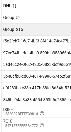
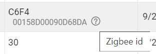
In my device list, the column of DNI shows the zigbee id - then a 'question mark' in a circle.
Anyone know what it means?
In my device list, the column of DNI shows the zigbee id - then a 'question mark' in a circle.
Anyone know what it means?
Built in help...if you hover over it:
But I don't think that's it. That title is over the Zigbee ID, not just the question mark. Just like the title "Device network id" is over the whole field.
So you could hover over the Zigbee ID and get the same thing without the (?).
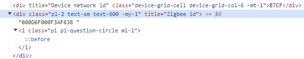
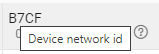
I think they add the "?" just to make it obvious that there is help available for that particular item. Everything on the screen doesn't, the "?" helps to call them out. That's how we did it at my last employer. But they may have a different approach here...noticed that the DNI has a hover as well, but lacks the "?." Typo? @gopher.ny - can you explicate? 
thanks all - seems stupid - if I hover over the number itself I get the field name, why add the ? mark - it's just redundant, and further, why isolate and bring attention to only the Zigbee ID, and not have a question mark for all others as well?
If you hover over it, it says "zigbee id", explaining what that second line is.
Maybe it's better to get rid of the question mark and display a hint on hover over the id itself, since all the question mark does is add confusion.
Hi - yes - it really seems redundant. without debugging the html the hover alt value is the same for both items - seems truly unnecessary and since there is similar functionality over the DNI value (I don't have zwave so can't comment to it) - its just a few less char for HE to process and less questions someday... thanks. ta.
Depends...without a visual cue to inform users that hover help is available, folks will be much less likely to even discover the hover help at all. We did user testing on this in my previous career, and text that didn't have an associated hover icon or other "marker" just looks dead, and users didn't spend time looking for more help.
Other finding - If you have hover help available on a subset of screen items and there's no way for the user to tell which items have it and which don't, you can end up frustrating users who have to blindly "hover around" trying to figure out what items are included.
The only really confusing aspect of the hover help in HE is it's inconsistency - it works for the "?", but also fromthe text in the same column. That's what makes the function of the "?" confusing - since the hover help is already provided by the text the "?" feels odd/redundant (or maybe even broken), since it doesn't add any additional info.
If you use the "?" consistently folks will get it, at least that was the result from our user testing. We set it up so that only hovering on the hover marker would display the help, not when hovering over other text/content. That helped to ensure the pupose of the hover icon was clear, users "got it" and preferred that experience. YMMV, of course. ![]()
Since there is a title (hover) over every value, I definitely think the question mark adds nothing.
Download the Hubitat app

