Hello,
I just started using the Hubitat hub. I have setup dashboards.
Is there any roadmap to make improvements to the UI? A responsive user interface and drag and drop would be nice.
Thanks
RT
Hello,
I just started using the Hubitat hub. I have setup dashboards.
Is there any roadmap to make improvements to the UI? A responsive user interface and drag and drop would be nice.
Thanks
RT
Historically the team tend to keep their cards close to their chest when it comes to a roadmap for the product more generally. So any opinion I offer would be just that, an opinion... so here goes... 
Well more of an observation. Development, as I see it, for a long time has focussed on expanding and improving the offerings in automating the home, so fleshing out Rule Machine and the simpler variations, Motion and Mode Lighting, to which you can now add Room Lighting...etc. Add to that improvements in the Mobile App and Remote Admin, huge improvements in the new user experience, etc, etc... So there has been no shortage of improvements that have added plenty of value to the platform.
By comparison Dashboards have received much smaller updates over time, some quite useful, but still not the same attention. Whether this is a conscious choice, the nature of having to prioritise what adds the most value to the platform, or other factors, I can accept the focus on the areas that have been developed further compared to dashboards and other aesthetics. I expect there will come a point where these will get some love, but I am not sure when that may be.
There are other options available, whether they be customising native HE dashboards, Community developed solutions, third party platforms that can receive details from the HE hub.... There are a variety of options available.
Who knows... They may surprise us in the next release...
Dont know yet in the process of a migration.
Just be aware, if you have any failed z-wave pairings, STOP!! Check your z-wave details pages for ghosts (they won't have anything in the route column) . Power down the device, remove ghost, power back up the device and factory reset and attempt to pair again. Ghosts will mess up your mesh...
Thanks for the heads up. All the devices are going to be new as the old was Wi-Fi. There are 15 Zigbee sensors. I have set these up with not issue.
Yeah those won't cause ghost issues. You might look at this too for best practice
https://docs.hubitat.com/index.php?title=How_to_Build_a_Solid_Zigbee_Mesh
As noted, above, HE has added so much functionality to the product... and the Dashboards have been largely ignored. I really wish Hubitat would provide some love to the Dashboards. Specifically, the ability to add or delete Rows and Columns.
I would also love to see the ability to "Freeze Rows" in Excel terms... Like freeze the top 2 rows with buttons to other dashboards on your mobile app, but the rest of the visible dashboard scrolls down.
I have done something like this recently. I might try to post this on the noobs css thread later.
I meant to post this on the CSS thread... but when I try to delete this and repost it is too similar.... Sorry @RichT ....
I may have gone off a little early with my suggestion I had done something similar that could apply in your case. What I was able to do was fix tiles to the top of the screen positioned relative to the left or right extremities of the screen. I then had my dashboard setup to scroll left to right. Scrolling top to bottom, with what I have currently done, results in the fixed tiles overlapping the other tiles below as you scroll up or down.
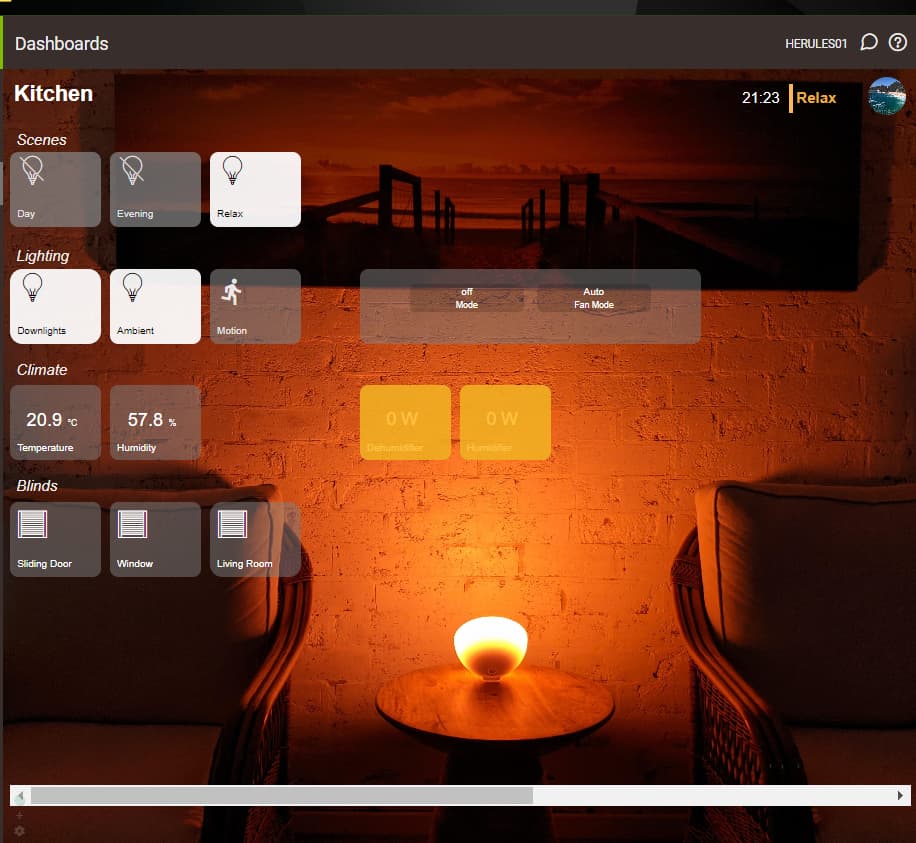
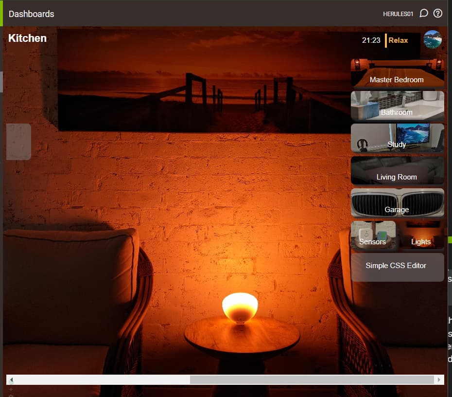
The dashboard heading of Kitchen in the top left, the time, mode and avatar tiles in the top right are all fixed to their position within the window. So as I scroll left and right they remain on screen.
Scrolled to the far left:
Scrolled to the far right:
If we use the mode (Relax) as an example, it has this custom CSS applied:
#tile-62 { position: fixed;
                   top: 18px;
                   right: 75px;
                   width: 80px;
                   height: 35px;
                   z-index: 999; }
with the position, top and right the key settings that fix it in place.
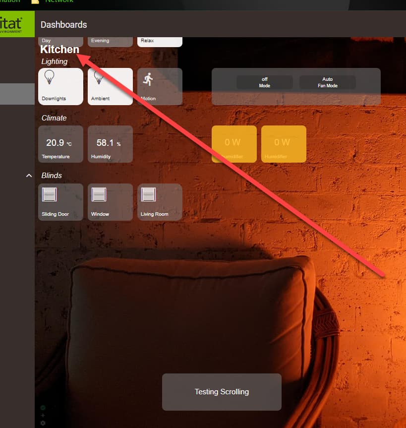
If I add a tile below the bottom of the window and scroll up-down I get this, with the "Kitchen" title overlapping the scene tiles. So I have perhaps a starting point to explore, but unfortunately not quite the answer you may need at the moment. I did feel a little better when I saw the same problem in HA's built-in dashboard ![]()
Instead of having the different dashboards on the right like you, I have tiles with links for each of them across the top, so this code actually works for my use case. I don't mind that the other tiles are quasi-visible underneath, as I use a gradient background for my dashboard link tiles. See below for how it looks - not bad, and the tiles to the different dashboards still work/override the tiles underneath.
The white on black and white is really hard to read for these old eyes...
Hah, yeah... I am still setting all my dashboards up, and have decided I'm going to want something different for a background... but that's a quick/easy swap.
Download the Hubitat app